
Useful Stuff About:
DIV or Box/Container Model
The web is made up of boxes that contain content (text, images, music, videos, etc). This boxes or containers are created with the HTML <div> tag.
<div> is how you create a box, just be sure to close the HTML tag with </div>
Divs have CSS properties of WIDTH, HEIGHT, MARGIN, BORDERS, PADDING. Understanding all of these properties will ensure that you can precisely layout content with the pixel perfect TRUE WIDTH and TRUE HEIGHT. (Note: this method was used prior to CSS3)
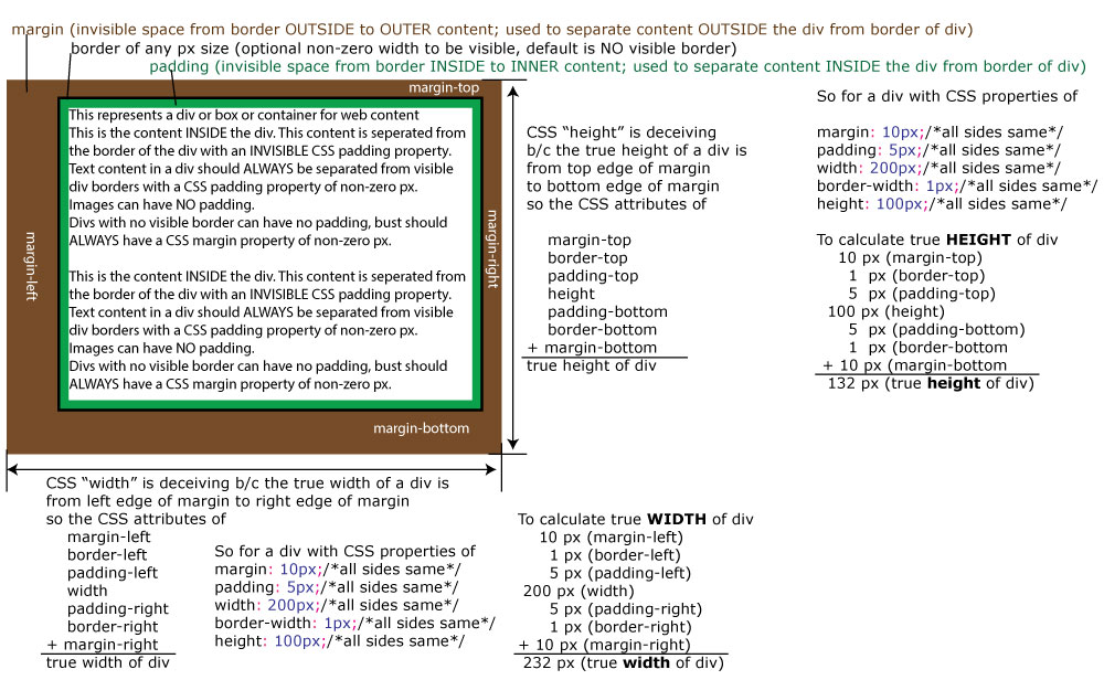
Note these variations in the attribute value - think this SPECIFIC order of Top, Right, Bottom, Left or TRBL or “TRouBLe”:
- Attribute variation #1 - margin: 10px;
/*ONE number is same for all sides TRBL and a unit such as px, em, or % is required for any non-zero number*/
- Attribute variation #2 - margin: 0;
/*a unit such as px is not required for 0 but a unit such as px, em, or % IS required for any non-zero number*/
- Attribute variation #3 - margin: 0 10px;
/*0 is for top and bottom and 10px is for right and left*/
- Attribute variation #4 - margin: 0 5px 10px 15px;
/*0 is for top, 5px if for right, 10px is for bottom, and 15px is for left*/
- Attribute variation #5 - margin: 0 auto;
/*0 is for top and bottom and auto is for right and left - used to center a div with specific defined width*/
- Attribute variation #6 - margin: auto 0;
/*auto is for top and bottom and 0 is for right and left - unlike auto for left and right, auto for top and bottom does NOT vertically center a div*/
All of the above to set a div to a specific target width width padding and borders were the methods web designers used PRIOR to some features of CSS3.
Here's a more SIMPLE way to think about all of this using CSS3 ...
Why use CSS of box-sizing: border-box ?
When you create a div for content with a specific width and some padding, the total width of the div is the width + (2 x padding) and this can be problematic because adjusting the padding then requires adjusting the width also to get the final result of a div with a particular width.
The solution to this double adjustment is to use this CSS * { box-sizing:border-box; } where the * is the CSS wildcard that refers to EVERYTHING and box-sizing:border-box; sets the DW LIVE or browser rendered view of the div to the actual CSS width no matter what the padding.
* {
box-sizing:border-box;
}
div {
width:600px;
height:600px;
background-color:rgba(255,0,4,1.00);
padding:100px;
margin:50px;
border:10px solid #000;
}
This div has box-sizing:border-box applied to it and it's rendered width is truly 600px.
If you change the padding or border width, the rendered div will ALWAYS have a width that matches what you set in CSS NOT adding any padding or border width to the rendered width of the div
* {
box-sizing:border-box;
}
div {
width:600px;
height:600px;
background-color:rgba(255,0,4,1.00);
padding:100px;
margin:50px;
border:10px solid #000;
}
#div2 {
box-sizing:content-box;
}
This #div2 has box-sizing:border-box NOT applied to it and its rendered width is NOT 600px but 720px because
padding left + border left + width + padding right + border right
100 + 10 + 500 + 10 + 100 = 720px
If you wanted a div at 600px with padding of 100px and border width of 10px without using box-sizing:border-box; you would then need to set the width to LESS than your target width like this
padding left + border left + width + padding right + border right = rendered width
100 + 10 + 280 + 10 + 100 = 600px
CSS of box-sizing:border-box; eliminates the process of having to change the width when you adjust the padding or border width.