Skydiving: A Junior Conceptual Project by Karna Chelluri (2015)
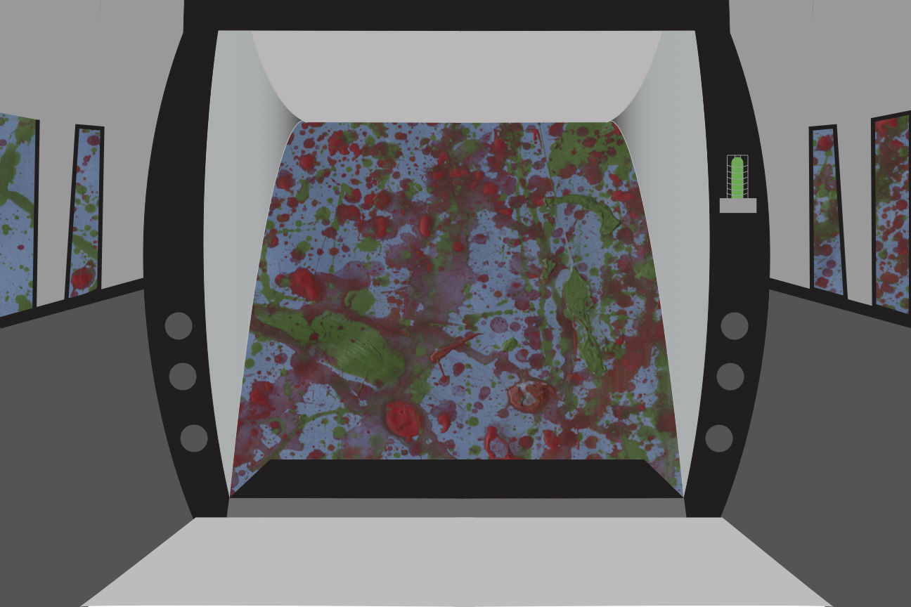
I am exploring nervousness through the experience of taking a risk. For this project, I used spray paints, splatter paints, and Adobe Illustrator to communicate the statement above. I spray painted blue on a white sheet of paper and then splatter painted red, green, and orange on top of it. I used these colors in this pattern to communicate nervousness because it effectively shows nausea and confusion; feelings one will feel when being nervous. After the paint had dried, I scanned my painting into the computer and added the rear of the airplane in Adobe Illustrator. Since I do not have firsthand knowledge of the structure of the back of a cargo plane, I found a picture of the rear of an airplane and then traced and modified it. The combination of digital media and fine art shows contrast between the sky and the airplane to show a difference in setting, imposing the concept of inside and outside.
I used the visual of the back of the plane because skydiving might make one nervous because he/she is taking a risk by jumping out of an airplane. In order to make sure the viewer could understand that the piece is a first-person view of what it would be like to skydive, I used a sky blue and an earthy green to make the sky. Originally, I didn’t think I’d want to be this abstract and rather use pastel to draw a more real version of what the ground would look like from an airplane, but I decided against it because it wouldn’t have communicated the degree of nervousness I was aiming for. The combination of the portrayal of nervousness through color and the background and the display of risk through the act of skydiving shows the blend of literal and figurative meaning I was aiming for with this particular piece.