Cards: A Junior Design Student Conceptual Project by Tara Popovic´ (2017)
I am exploring the feeling of belonging through the experience of isolation.
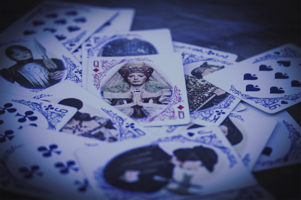
My photo consists of a loosely-arranged pile of playing cards, all of which are blue except for a lone red facecard on top. Also, a grouping of them on the surface - including the single red one - are face cards. Another important compositional element in my photo is the background, which there isn’t much of. I purposefully filled up the entire photo frame with the cards so that the focus would be solely on them, so the viewer would feel as engulfed in the feeling of the piece as the red card. Furthermore, I controlled the lighting of the photo to add to the effectiveness of its visuals: shooting outside in the late afternoon to obtain maximum natural lighting and making a blue tinge through a tungsten light filter. I manipulated the light as such so that my photo would be dark emotionally and figuratively but not literally. I decided to angle the camera in such a way as to create an extended depth of perception to convey isolation more effectively through the appearance of a more vast card pile.
The central red face card is isolated from the other cards because it is the only one of a different color - and a strikingly different color too - yet it is belonging at the same time because it is still a card just like the rest of them. Face cards are royalty - king, queen, etc. - and belonging plays a big role in royalty because it is a wealthy and coveted position that one attains by being born into a royal family. This way, the central card that is different still belongs with them because it is also royalty, yet this arrangement and the role of face cards also demonstrate isolation because all the face cards are facing away from the central card. Both the difference in color and connotations that come with royalty and its social structure help to create the feeling of belonging through isolation that I am trying to convey.
Through the editing process in Adobe Photoshop, I manipulated color balance in order to achieve the final feeling that I was looking for to represent my concept statement. I did all the basic exposure and framing correction in camera raw and added vignetting later in addition to other things, but the central focus of my editing was to make the red color of the isolated card stand out in contrast to the ocean of blue. The way I did this was incredibly time-consuming and meticulous, but very much worth the effort. I zoomed in a lot to the image and selected by hand all the areas of lacy red fringe on the card with the quick selection tool, saved the selection, then increased the saturation of the red in that carefully selected area. This created the final effect of highly contrasted red against the rest of the blueish image, helping me emphasize my concept of belonging through isolation. This process really taught me that there is nothing that can’t be done through editing and that the particular way one edits a photo - even minor edits - can make a huge difference in the eyes of the viewer.