Conceptual: A Junior Design Student Conceptual Project by Tyler Buhr (2017)
I am exploring the feeling of adoration when learning to love.
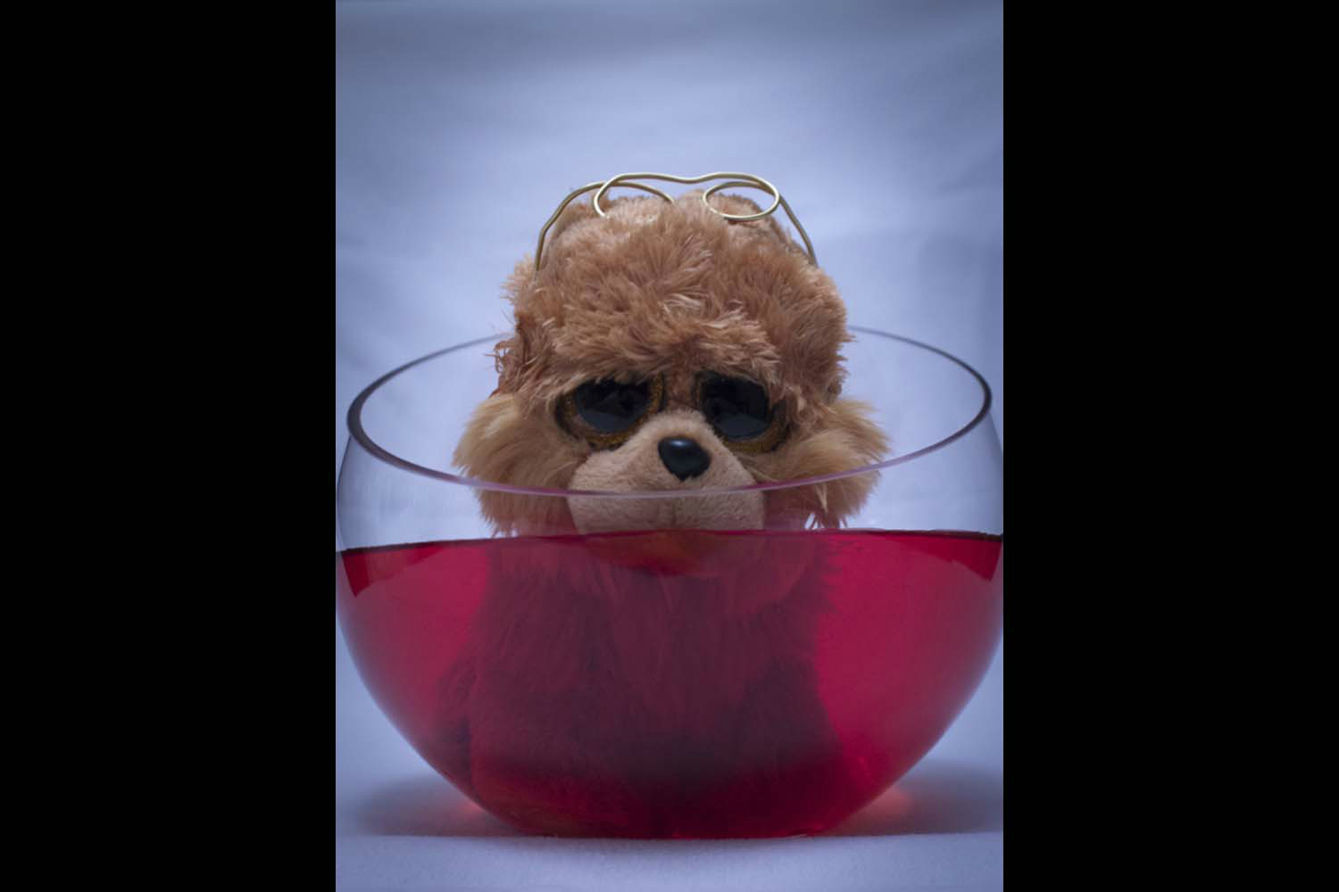
The photograph I took contains 4 major aspects that come together to support my concept statement. The main object that stands out in my photo is the stuffed animal puppy. When I hear the word adoration, my mind shoots to things that I adore or find adorable. I know everyone loves puppies and all puppies are adorable, so I found the cutest toy puppy to represent this feeling. The puppies big eyes really add to the cuteness, which made the decision easier on which puppy to pick. The puppy has a pair of reading glasses rested upon his forehead, as someone would do when taking a break from reading or writing. The glasses themselves represent the aspect of learning, but I wanted them resting on his forehead to show that during the process of learning to love there may be times to take needed breaks. The puppy is sitting in a bowl that is filled with red dyed water. I wanted the water to be red because you usually associate the color red with hearts, roses, and others things love related. The water represents the feeling of love itself, as when you learn to love you can get encased in it, like what the water is doing to the puppy. The water level is up to the snout on the puppy and can be interpreted in two different ways. Some may see it as drowning, while others may see it as being perfectly immersed. I wanted this effect to let the viewers mind pick which part of love they want to see. If they see drowning, they may think that love is overpowering and controlling, even possibly taking over someone's life. Others may see it as being perfectly immersed, associating love with being submerged up to your head in a warm bath. These people may see love as a joyful or happy aspect to one's life. The glass bowl holds everything in this photo together. I wanted the glass bowl to represent a relationship, as it is strong but can be very fragile. It holds all the components together. The glass bowl has an uneven brim with one side higher than the other. The water reaches close to the brim on one side, almost spilling out, but on the other side the water is far from reaching the top. I wanted this to represent how uneven love can be, and how through the process of learning to love you may not have a perfect symmetric relationship and that isn’t a bad thing. The bowl is not perfectly balanced at the top, but still is able to contain all the water. Showing that even if you do not have a balanced relationship, you can still find love. The white background is a bright color to make everything in the foreground pop. I did not want it to be distracting and thought that the white background complimented the red, making it more vibrant. While shooting my photo, I experimented with many angles. The one angle I really liked was a front on point of view, facing the puppy’s face. This way you could see every aspect of the photo, including what the puppy looked like above and below the water. I lowered the camera down towards the surface more, just slightly below the water line. This gave the effect almost as if the puppy was looking directly into the camera, which allows a deeper connection to the viewer. This intimate eye contact with the viewer can give off a feeling of adoration. The lighting I used needed to be above the bowl so that I had no shadows on my background. Conveniently, I had a table in my house with a light hanging above it.
When I first opened my image in Photoshop, I knew my first step was to find a way to lighten the whole thing. I played around with a few knobs and nothing really had the effect I wanted. Out of annoyance, I dragged the temperature slider all the way to the leftmost point possible. Surprisingly, this was the exact change I wanted. Turning the temperature down “cooled” my photo, bringing out the blues and whites. My original photo was supposed to have bright white background, but they turned out more yellowish. With the added cooling effect, my photo now has a bright white background and looks like it had studio lighting. This allows the viewer to focus more on the actual objects in my photo rather than being distracted by an ugly background. The next thing I did was to touch up on some little details that I felt were necessary to remove. There were little pieces of fur on the puppy that stuck out and were distracting so I used the Healing Brush Tool to remove those. The Healing Brush Tool takes whatever is around the spot you are trying to remove and covers it with similar textures and patterns. I used the same tool to remove a glare that was reflecting off the glass as it brought too much attention to the wrong areas of my photo. The background of my image was basically just a white sheet that I had found in my house. I tried to set it up as best as possible to make sure there were no wrinkles, but that was almost impossible. One thing that I have learned about Photoshop is that nothing is actually impossible. Photoshop allows us to edit in so many different ways that allows us to put our “impossible” ideas actually on the photo. To remove these wrinkles, I used the Healing Brush Tool again. I traced over the lines with the tool a few times and they were gone. Without the wrinkles, the background looks very smooth and is even less of a distraction.