Blushing Mannequin: A Senior Listener Lyric Photographic Diptych by Patrick Gaffney (2017)
The purpose of the lyrical essay was to get the perspective of someone different from you. For my essay, I interviewed a friend of mine who is a woman in order to get an idea of what it is like to be objectified. By interviewing this woman, I was able to learn about her experiences, and I found out that many women are objectified simply because of their appearance or actions.
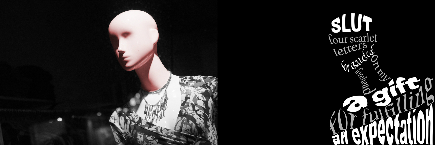
To inspire my photography, I chose one of the most impactful passages in my essay. The passage reads “Slut. Four scarlet letters are branded against my forehead, a gift for fulfilling an expectation”. I pulled this passage from the section in my paper where I address the judgement that is brought upon a woman when she loses her virginity. My interviewee talked about the expectations of a girl dating a guy in high school, and how the girl is expected to have sex with the guy. When it actually happens, the guy is praised, but the girl is looked down upon for being “slutty”. The purpose of a mannequin is to show something off. It is an object to be judged, a device for forming opinions. The viewer forms an opinion of the mannequin with a simple glance, deciding if it looks good or bad. The mannequin itself is innocent and unable to control what a view thinks of it. My interviewee said that she feels the same way when she is objectified, which often occurs on a daily basis.
To create an emphasis in my photo, I made it black and white, then colorized the head and neck. I applied a hue filter to this area, giving a it a light crimson tint. This color has a duel meaning in my photo piece. The red tint of the head and neck represent the “four scarlet letters” that are constantly branded onto woman for doing something expected of them. The color is bright and visible, and often associated with shame and hatred. The red tint on the mannequin also represents embarrassment that comes along with being viewed as promiscuous. On the other half of the diptych is my passage transformed into the shape of the mannequin. I use three fonts: a bold and striking font, a casual font, and a script font. I used the bolder font to represent the sharpness and weight of the word “slut”, while also adding more impact to the last phrase of the passage, “an expectation”. The casual font represents how widespread objectification is, and its normalization. I use the script font to emphasize the word “branded” representing how a woman is expected to act with grace when facing judgement and objectification, a topic I address in my personal essay. I warped the text in order to fit it to the shape of the mannequin.