Mood Boards:
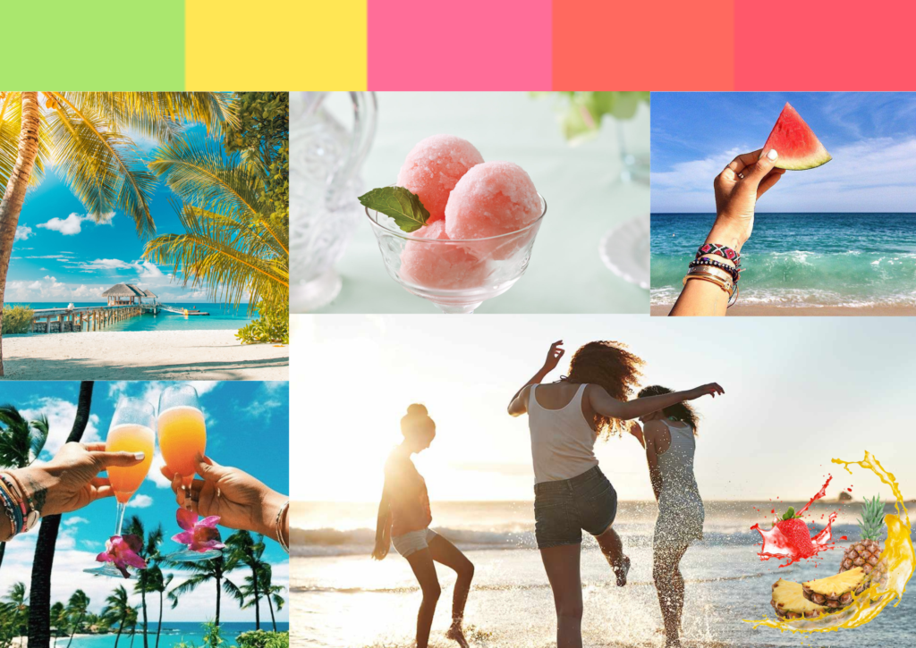
Before designing what we are actually going to make, we have to create something called a mood board. Mood boards are just a combination of pictures that gives you a general idea of what you want to make. These pictures can consist of similar designs you are going to make, the general mood or theme of your design, and/or even what colors you are going to use in your design. For this mood board, I was planning to create a sorbet that consists of tropical fruits.
Product Logo, Label, Triptych
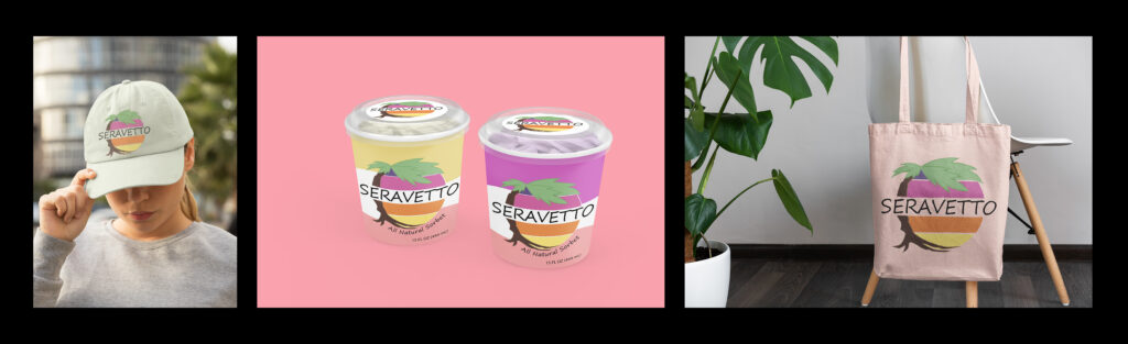
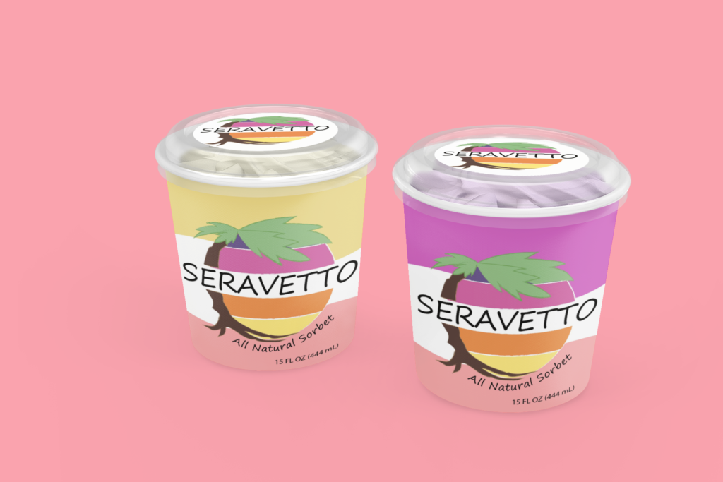
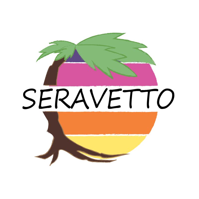
For my project, I created a sorbet brand called Seravetto. Throughout the brainstorming process, I was conflicted between choosing either a tropical or vintage/old fashion theme. After some consideration, I decided to incorporate both into my design. I was inspired by Miami Vice and was able to match colors to get that tropical 80’s vibe. I wanted my product to make adults of all ages feel like they are riding along the beaches of Miami. To get that feeling, I used a palm tree and made a sun using 4 different colors to incorporate a sunset.
Unfortunately due to COVID-19, our class was not able to complete the full extent of this project and missed out on the magazine portion. If I were to make a cover though, I would use the techniques transfer and plain folk. Transfer would be a useful technique because I can associate my product with summer and tropical weather which is a great way to persuade my audience. Plus, I can use plain folks to show people enjoying my product to show how delicious it tastes.
From this project, I learned that making a logo takes a lot of thought and consideration. Throughout this project, I had to find ways to simplify my design because of the limited time I had. Since I am a first-year senior, I had some trouble figuring out how Adobe Illustrator worked. The main tool I used was the pen tool which took a couple of hours to figure out, but once I figured out how to use it, the project was relatively easy. In the end, I had a lot of fun creating my logo and also learned so many valuable techniques.
Movie Poster
For my movie poster, I decided to create an animation film called Xenologue: Requiem. The movie takes place during a great war between two kingdoms, Altaria and Folkenburg. At a young age, the main character, who is an Altarian Noble, was kidnapped during a raid by Folkenburg and was raised as a Folkerian Noble. As the main character grows up, he learns of his past and attempts to reunite with his original family to learn about his past. As the fog of war consumes all, the main character has to decide whether to fight for his birth family or the family he grew up with.
For this movie poster, I decided to make an animation poster because I really enjoy animated movies, like Ghibli, and wanted to make my own adaptation of one. In my head, I wanted to make a movie that incorporated both fantasy and action because those are my favorite types of films. In my poster, the main character has to make a decision of which kingdom he will fight for and so I decided to make him fall down an endless pit to symbolize being trapped. No matter what side he chooses he will always feel like he is betraying the other kingdom. I also decided to add chess tiles in the background as a way to symbolize that there are two parties at war similar to a chess match. For this project, I only used Adobe Illustrator since I wanted to make an animated film. I used the brush tool to draw my characters and the tiles and then traced them over with the pen tool so I could add color.