
The Conceptual Unit introduced the students to a myriad of different technical applications and pieces of equipment, and also encouraged personal touch on all of the products. During this unit, we were able to work with Adobe Photoshop, ProTools audio editing, Tascam Audio Recorders, DSLR Cameras, etc. Through this, we had a relatively comprehensive understanding of a wide breadth of medias, and we were able to take our own style to a similarly wide selection of works. We also, in typical fashion, wove together all the different class contents to create products that were intertwined with multiple skills. Unfortunately, when working on this webpage I was out for much of class time, and in the final stretch got sick and had issues with the Adobe license at home. Because of this, only the works are shown here, and none of the “behind the scenes.”
I personally had a lot of fun in this unit, but particularly held on to learning the workflow of freestyle. This sort of pacing and load is something I was unused to, but jumping straight into it was effective and let me start producing pretty quickly. Since Design and Digital Media cover similar things at the same time often, it was often interesting to combine the skills from both classes in the same projects. As a whole, it simply feels like I’ve gained a whole slew of skills to use, and I’ve become much more an expendable person than before.
Project Poem
The Project Poem that I wrote was an Ekphrastic Poem, or poetry written in response to art. Entitled Familiars, I wanted to capture the ideas and flow projected by the piece
“Monster,” by Mark Bradford, in words instead of line. I also used Photoshop to composite the work in conjunction with the poem.
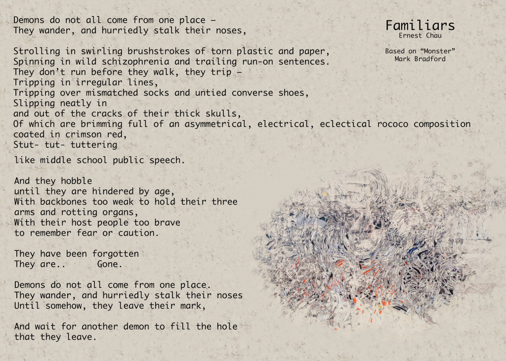
This project was wildly entertaining for me to do, as I have been listening to various spoken word artists and have always loved writing different lines and also listening to others perform. The highlight of this production for me was certainly the writing, as it was one of the areas this unit where I got to feel completely in creative control of the outcome instead of being put into completely unfamiliar territory.
Photo Haiku and Video
This project was based on the Haiku poems we wrote in English, and was fully produced by the DSLR photography, Audio recording, and Video editing skills from Digital Media to create one cohesive video.
As the first real project that I had done in Freestyle, this project was sort of my litmus test of how Freestyle was going to go for me. I got quite behind and managed to pull this together, but this video gave me a feel for the workflow of Freestyle, which was probably the biggest adjustment I had to make since coming into this program.
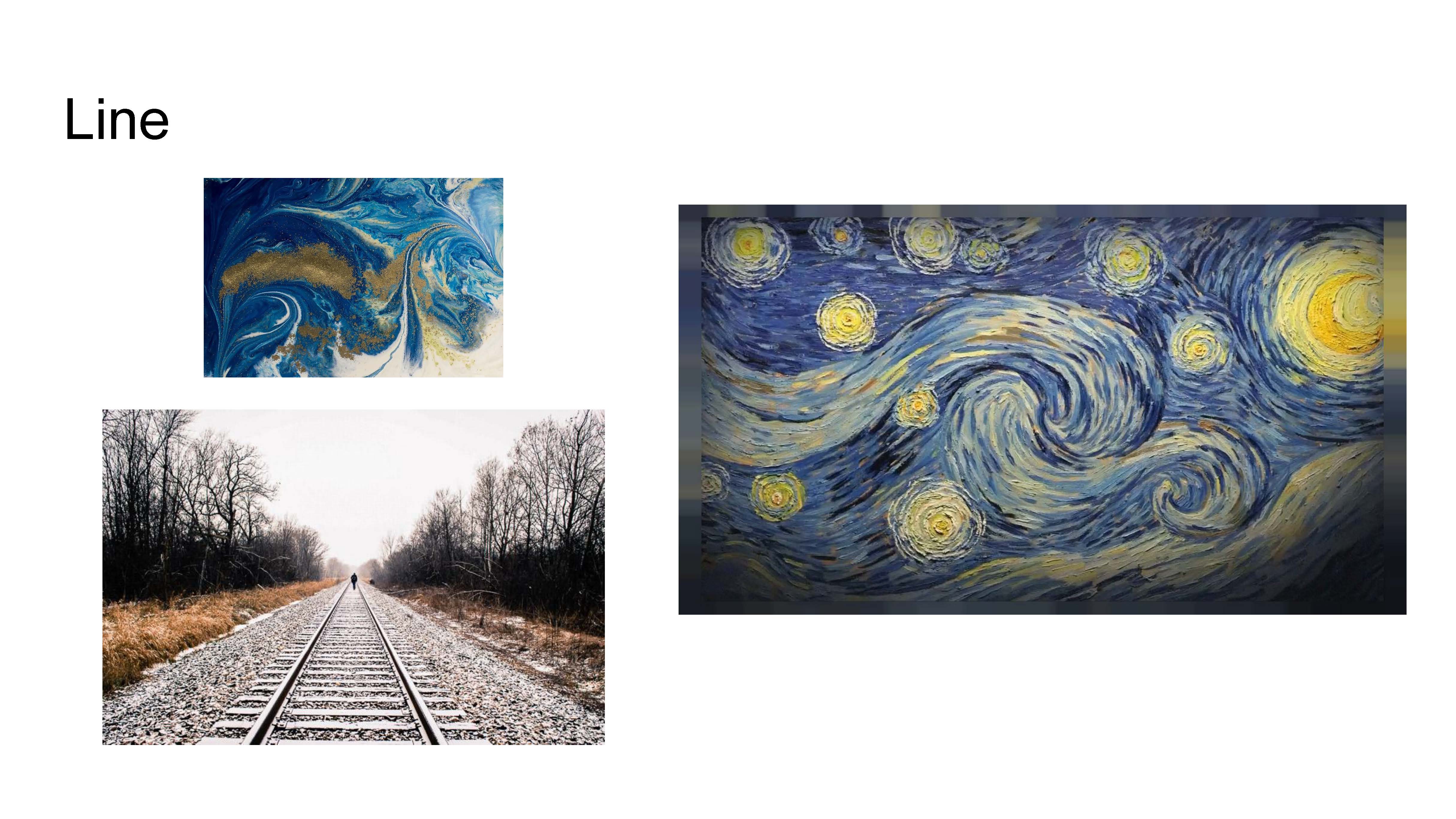
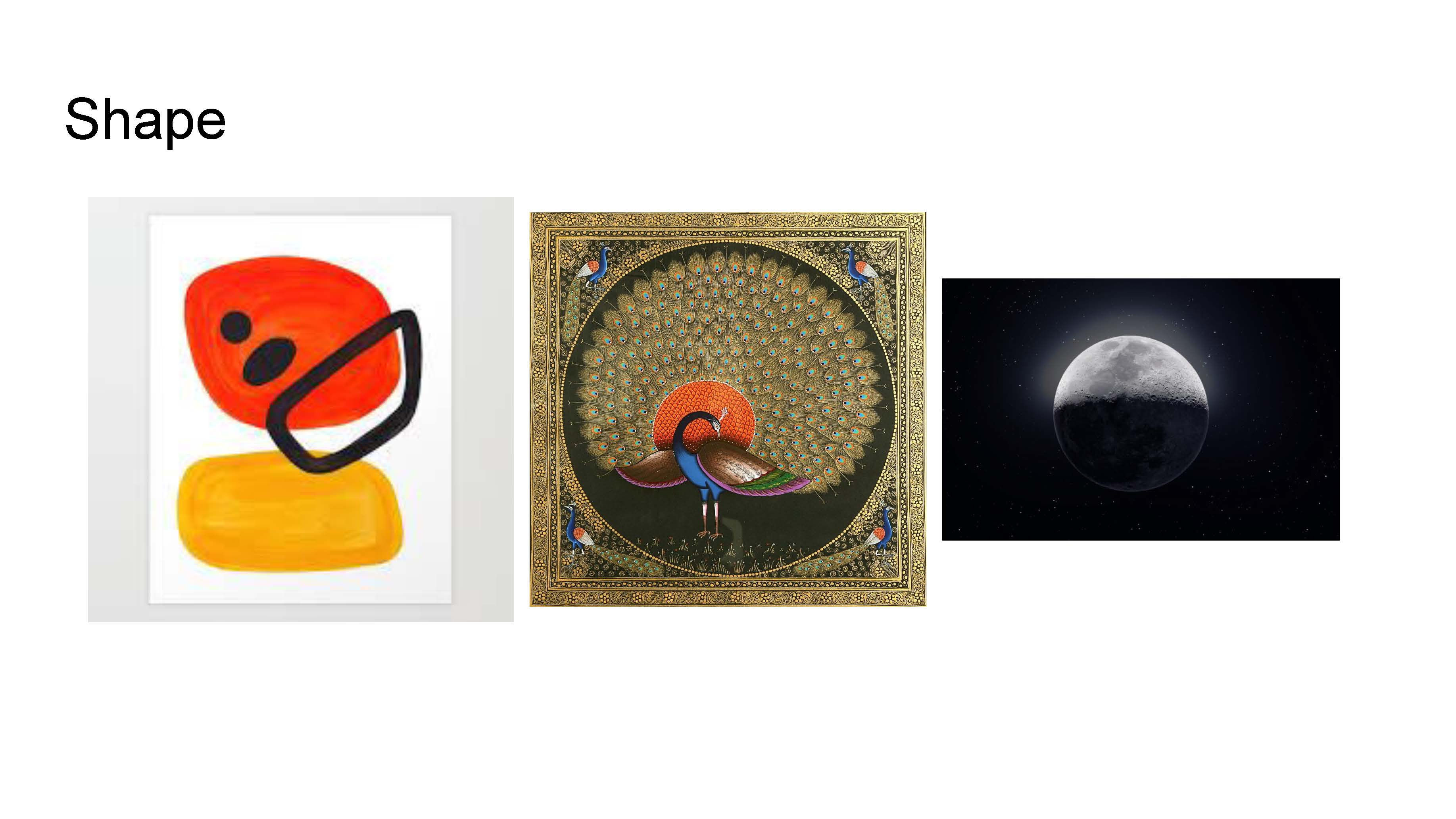
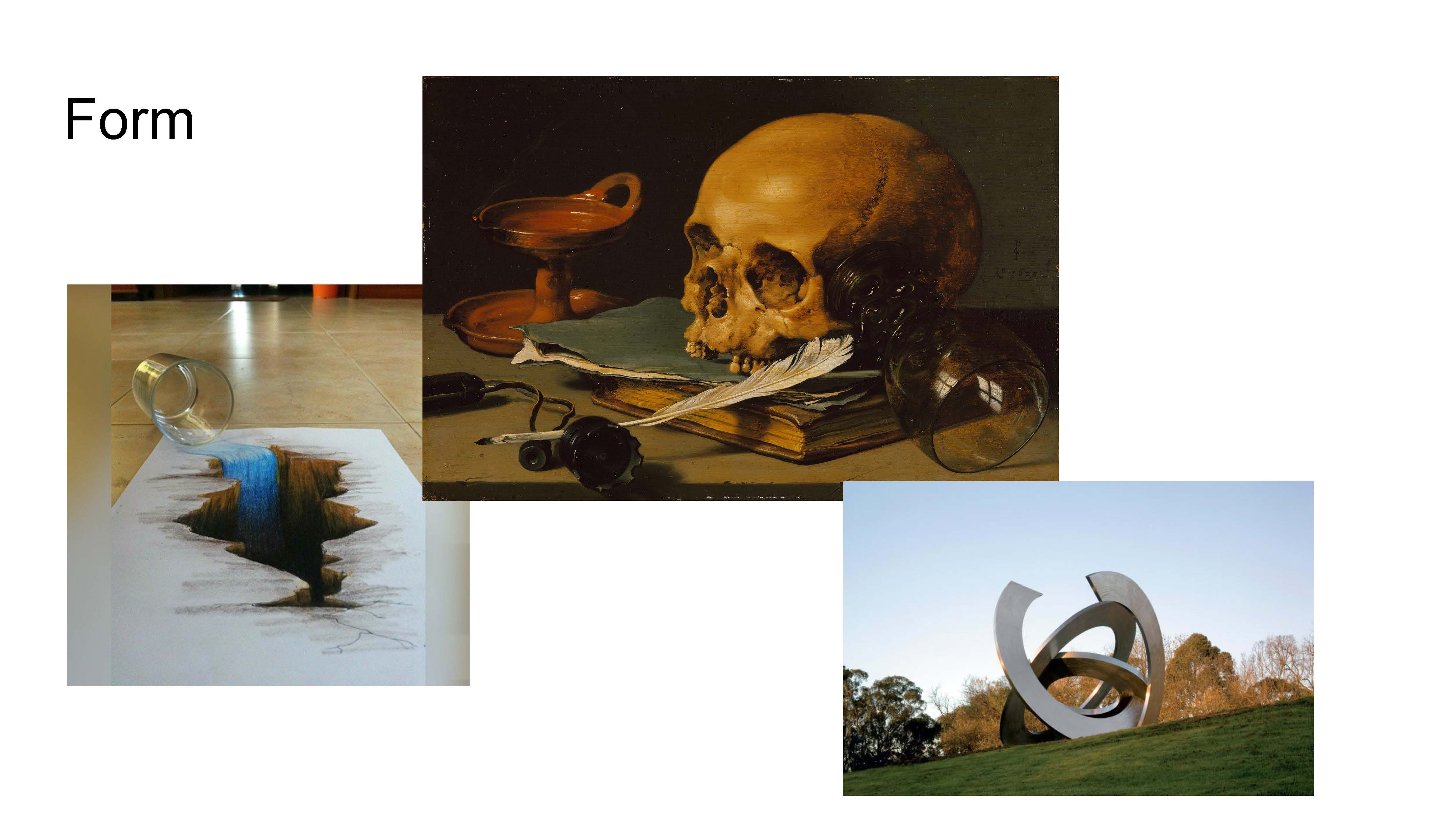
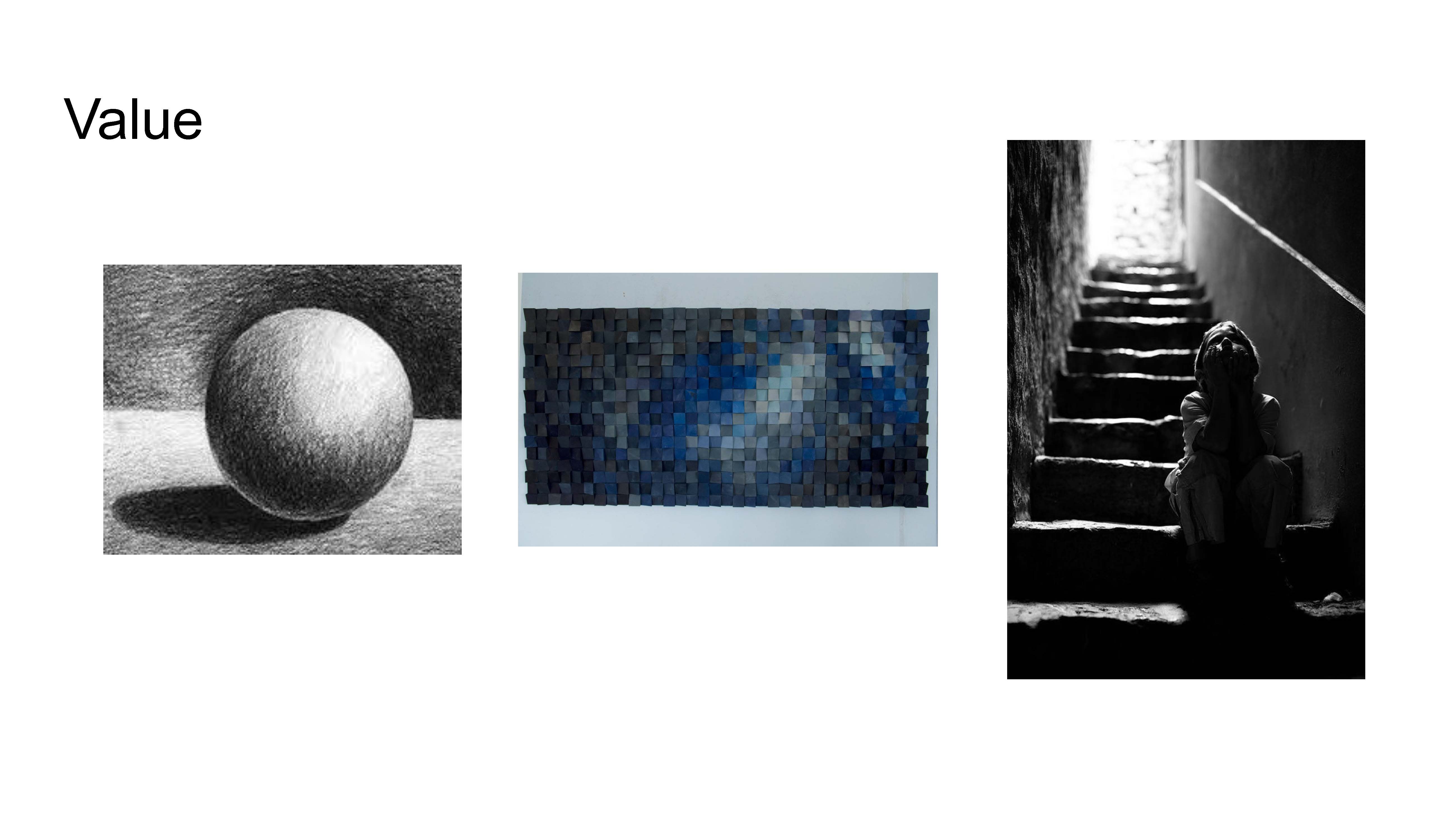
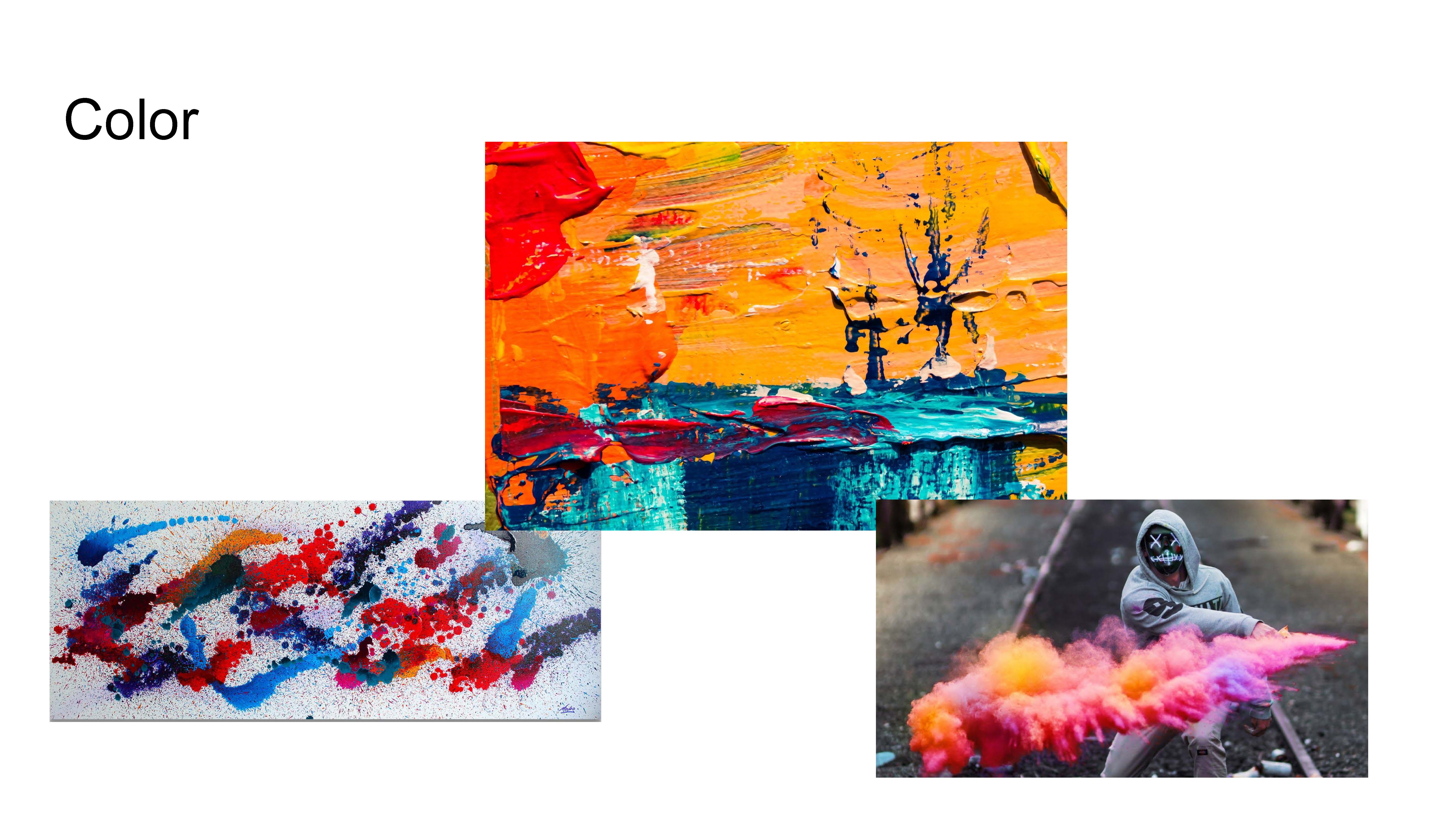
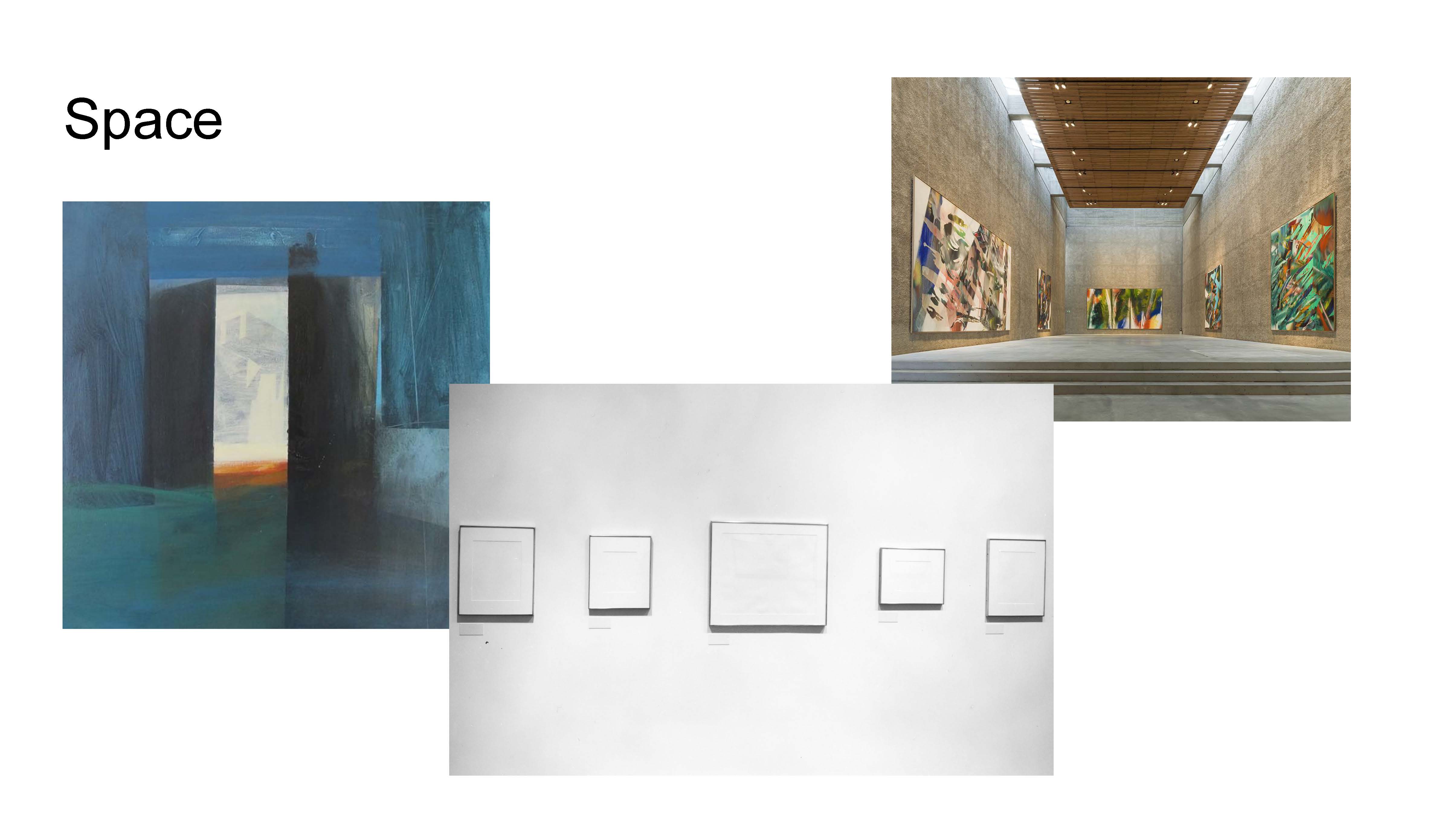
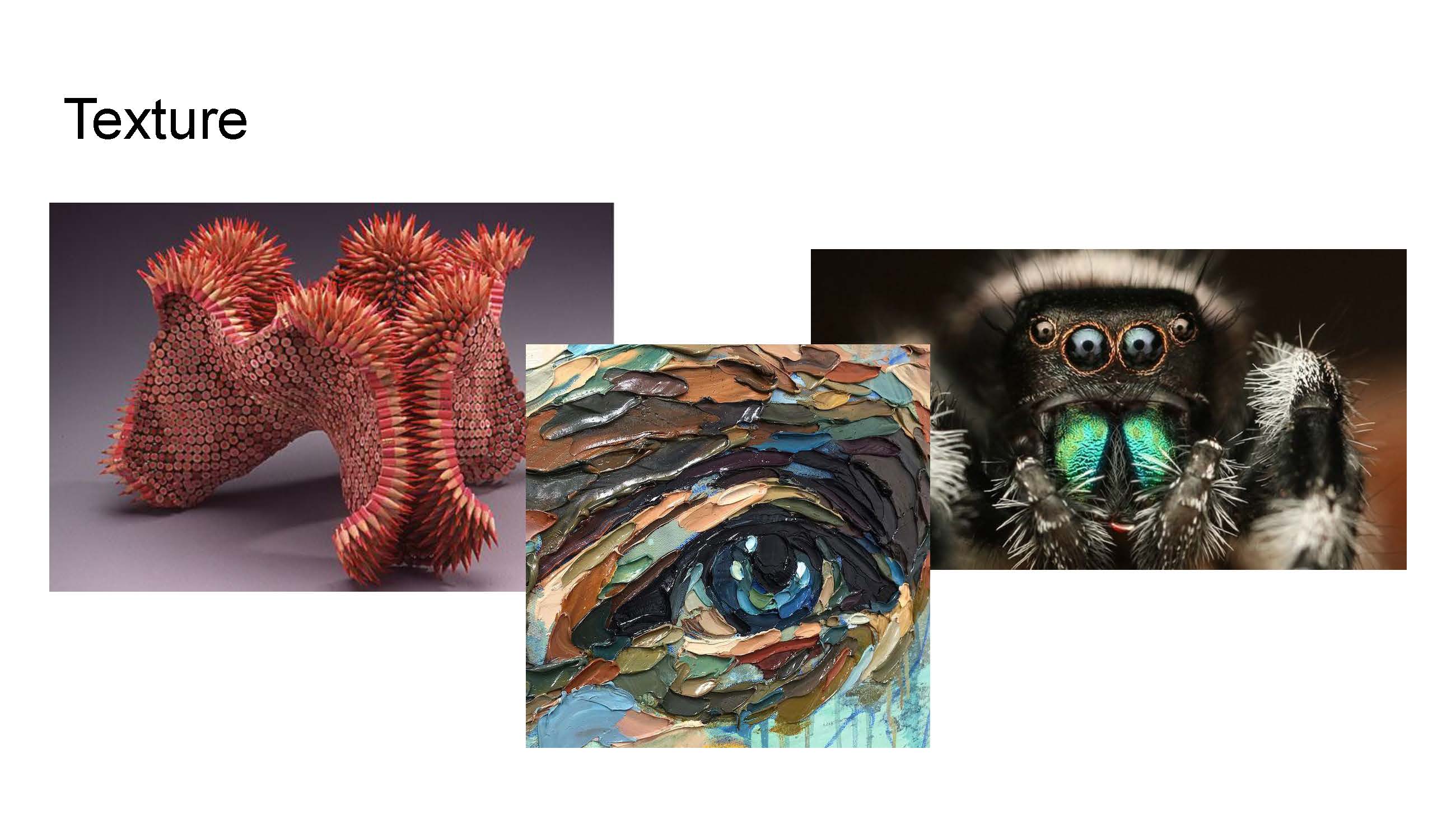
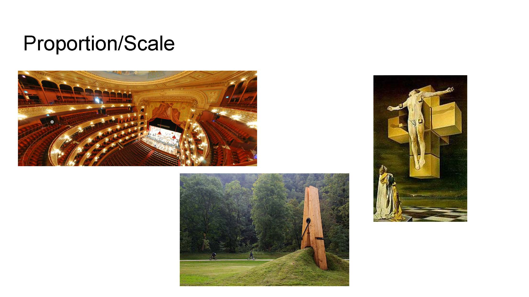
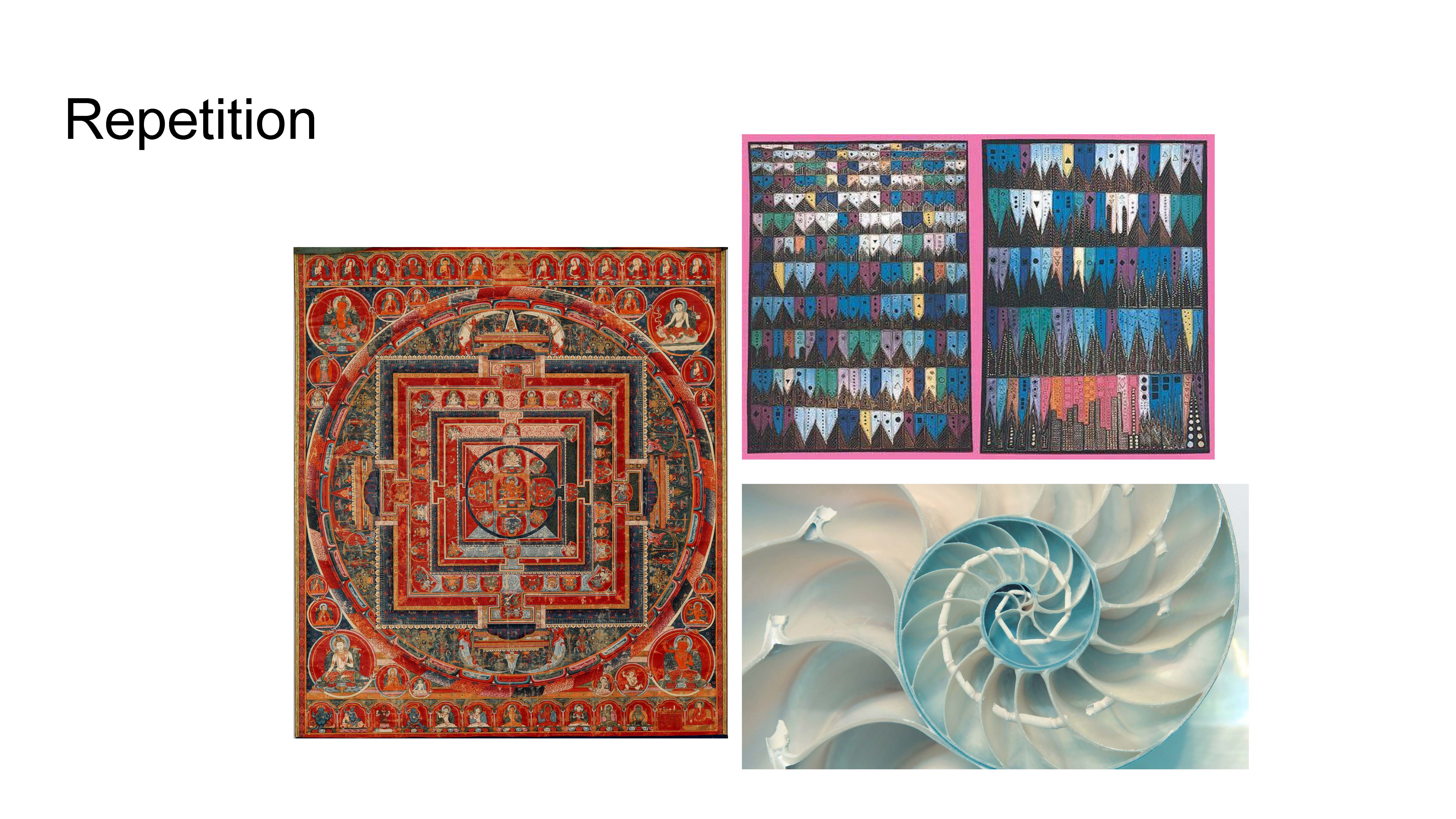
Elements and Principles of Art
This assignment was to create a slideshow of works that exemplified different Elements of Art and Principles of Design. We found examples from modern art, photography, and traditional art to display each aspect.
Design Conceptual Productions
In Design, we have done a range of works and this unit was primarily focused on Adobe Photoshop and Photography. We have done three projects to exercise these skills, and worked with taking a lot of photos and doing a lot of photo editing.
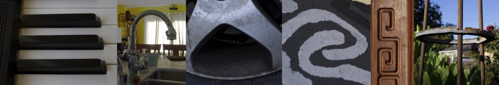
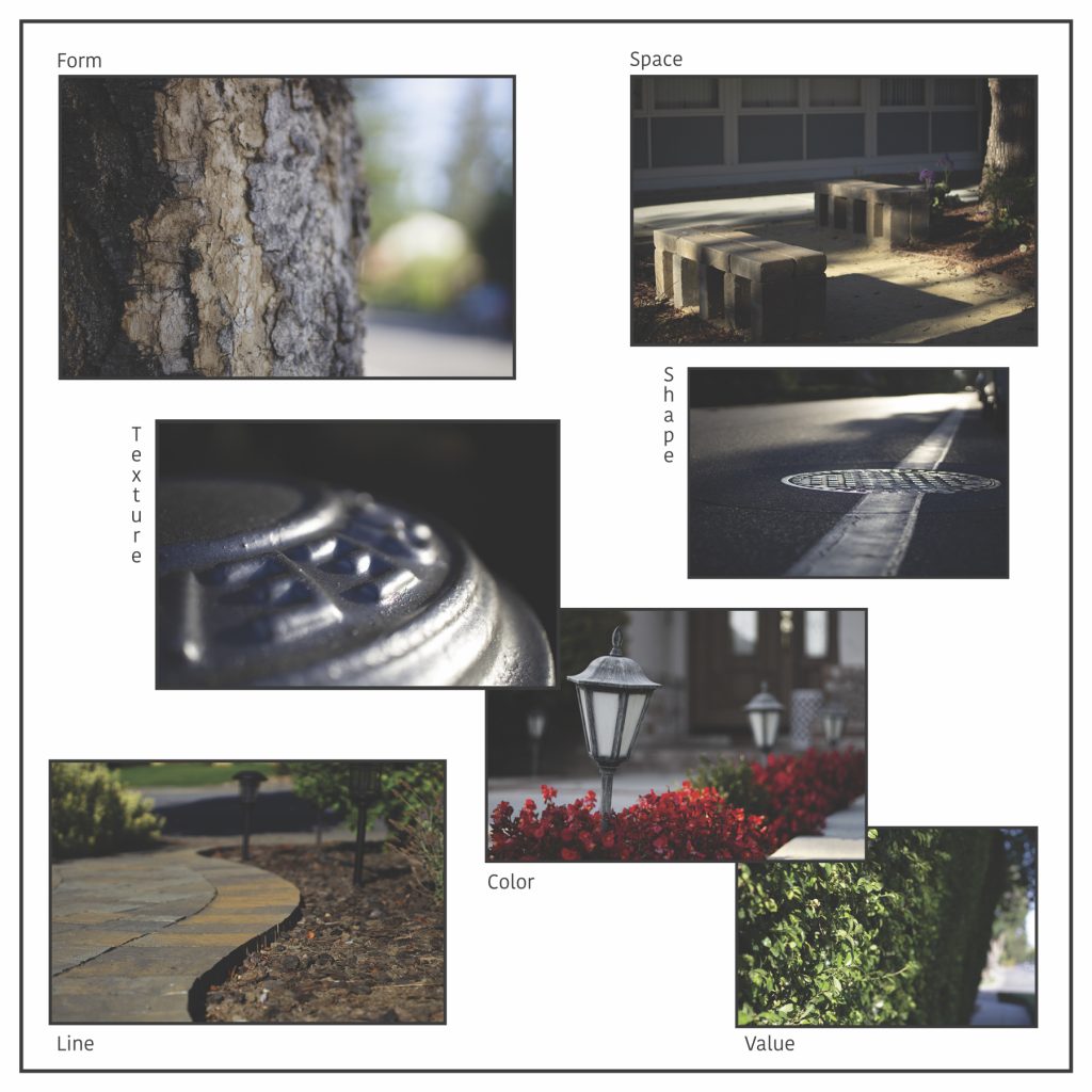
In the Elements of Art Collage project, we went around and shot photos to try and exemplify each of the seven elements of art. This was very similar to the slideshow project in Digital Media, however instead of trying to find all of the examples, we went and shot all of the examples ourselves. We also worked with the Principles of Design for aligning our collages, which I felt was very challenging.
Below is the Artist Statement for my Conceptual Final Photo.
I am exploring the feeling of uncertainty through the experience of coming and going.
I chose to use a scrambled Rubik’s Cube as well as a water system as the two objects for my photo. The toy has a lot of bright colors, that provide a nice focal point for the eye to be drawn to. The water system sort of provides a nook for the Rubik’s Cube to be nestled in to, which helps add unity to the photo and shows that the two of them are intertwined. The lighting was relatively dark, and the reason for this was to help give a slightly sinister underlying tone juxtaposing with the playful colors of the Rubik’s Cube. I also attempted to accentuate the shadows with the lighting and the angle, and it also skewed the main lines to make them a little bit more interesting. The shadows help with the juxtaposition and further helps establish tone. This proved ineffective, however, as the picture lost detail with the lack of light.
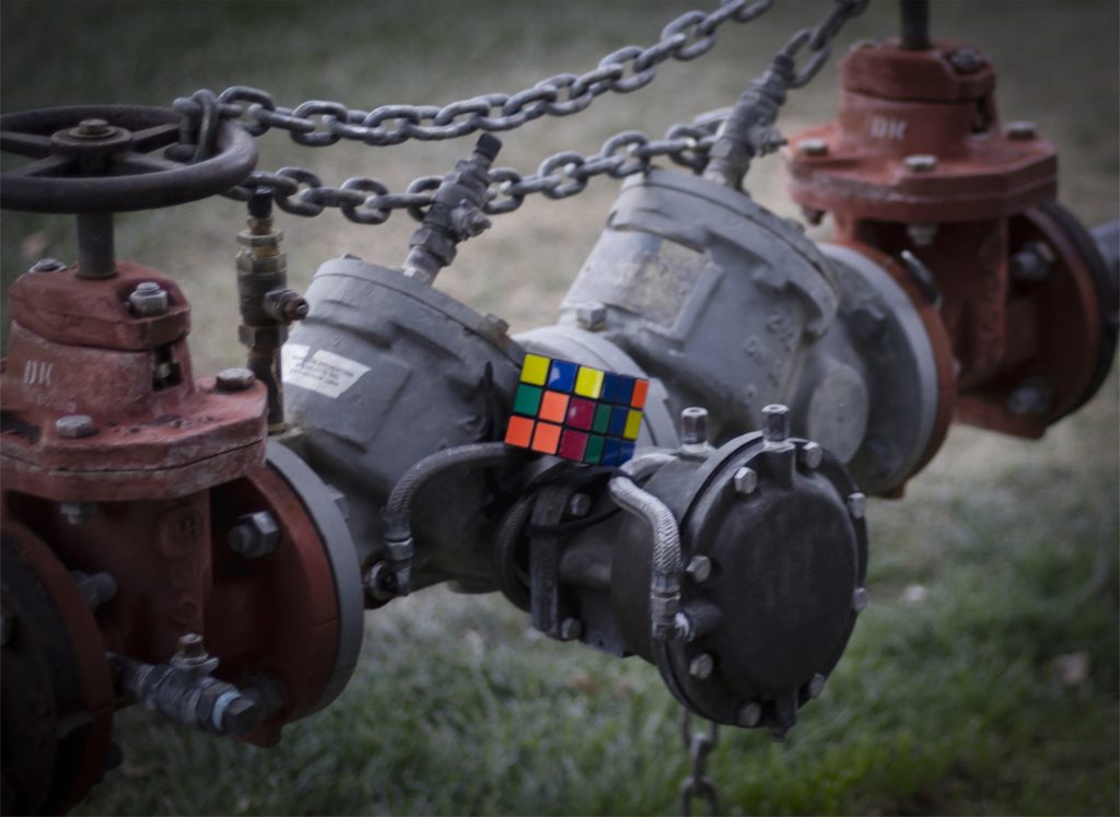
The Rubik’s Cube and water system are meant to represent two pieces of the concept statement, where the Rubik’s Cube shows uncertainty and confusion, and the water system shows the idea of coming and going. A Rubik’s Cube is a common puzzle toy, which is either scrambled with all of the colors mismatched or satisfyingly solved, so I wanted to leverage the ubiquitous nature of the toy to show confusion, as many people do not know how to solve this puzzle. The water pipes are meant to portray a cyclical theme, as water is constantly moving through the pipes. These both tie into my concept statement and my Ekphrastic Poem, titled “Familiars,” as that poem shows fear and chaos coming and going through people’s lives; I tied together the Rubik’s Cube and the waterway to connect these two concepts and give a similar message.
I used Photoshop mostly to add emphasis as well as to alter the photo to hide some of the issues I had while shooting. One of the most notable errors that I had was the low exposure, or dark quality to my photo. This swallowed some of the details of the photo and made it difficult on the eye, so I used the curves function in Photoshop to help brighten the photo. I also cropped the photo to get rid of some distracting, misused negative space, as it detracted from the focal point of the photo and made it more difficult to find. I also did a desaturation of everything in the photo except for the Rubik’s Cube. I did this by selecting the Rubik’s Cube, inverting the selection to take the background, and then desaturating that mask. This would help draw more attention to the vibrant colors of the toy and help guide the audience to the focal point, without being too extravagant about it. There is also a dark vignette around the photo to help frame the photo in a subtle fashion. The importance of most of these edits is to guide the eye to the Rubik’s Cube, and allow the audience to observe the picture from there outward.
Overall, the Design Projects gave me a lot of practice for my photography and photo editing skills. Nothing is perfect, but being able to work through these skills multiple times over with prompts (such so there is no lack of inspiration) let me improve a great deal from before this unit.