Introduction to Story Process
The Narrative I unit was a series of projects mostly based around a short story that we wrote in English which, in my case, was titled “The Uneventful Life of Fruehauf.” In this process, which will be detailed throughout the page, we mostly practiced using all of the softwares we had learned before during the conceptual project, which for the most part was Adobe Illustrator (which is also currently my favorite software we’ve used here).
With the exception of the Geometric Light Cover and the Adobe Illustrator Production, all of the work this unit was working toward productions based on the short story from English. We started by dissecting the key components and examples of narrative writing (ie the hero’s cycle, idea of exposition/climax/resolution, etc.) From there, I wrote “The Uneventful Life of Fruehauf,” which is based around a baker who has a habit of hurling various objects around his kitchen and a law intern who finds himself stuck with this short-tempered baker.
To record this, I took multiple audio files each with a separate character’s lines and synced them up in Pro-Tools, and after that added music and effects. Below is the file in which you can see how all the different characters line up with each other.
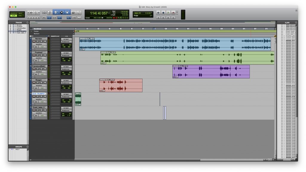
And below is the audio production. The text version can be found under the Narrative I tab in the menu at the top of the page.
For Honors English, we also wrote an imitation piece based off of our choice of playwright/writer. My selected playwright was Samuel Beckett, who was known for his absurdist commentary, and that was the main guiding idea for my sketch entitled “Circle Walk.” The text version can be found under the Narrative I tab in the menu at the top of the page.
Digital Media Projects
For Digital Media, aside from the audio for the story, we also did a Geometric Light Cover as well as a Illustrator project of choice.
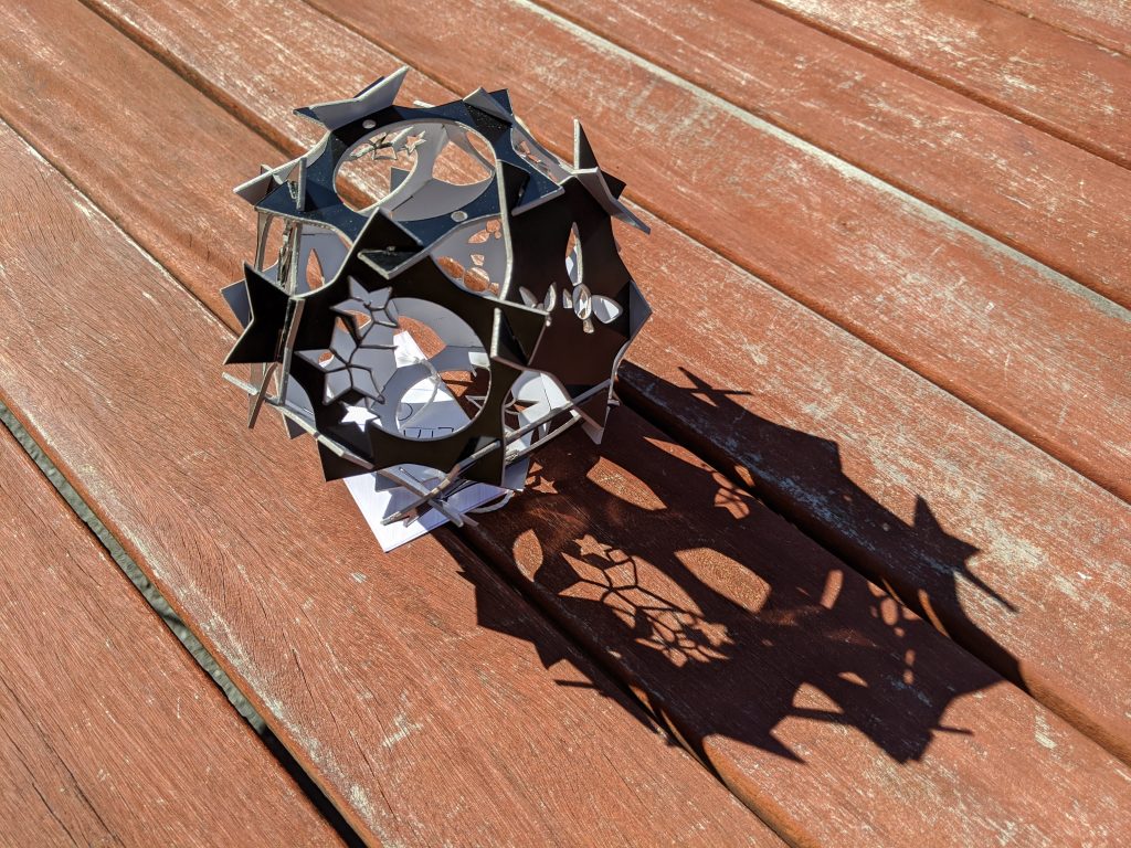
Geometric Light Cover
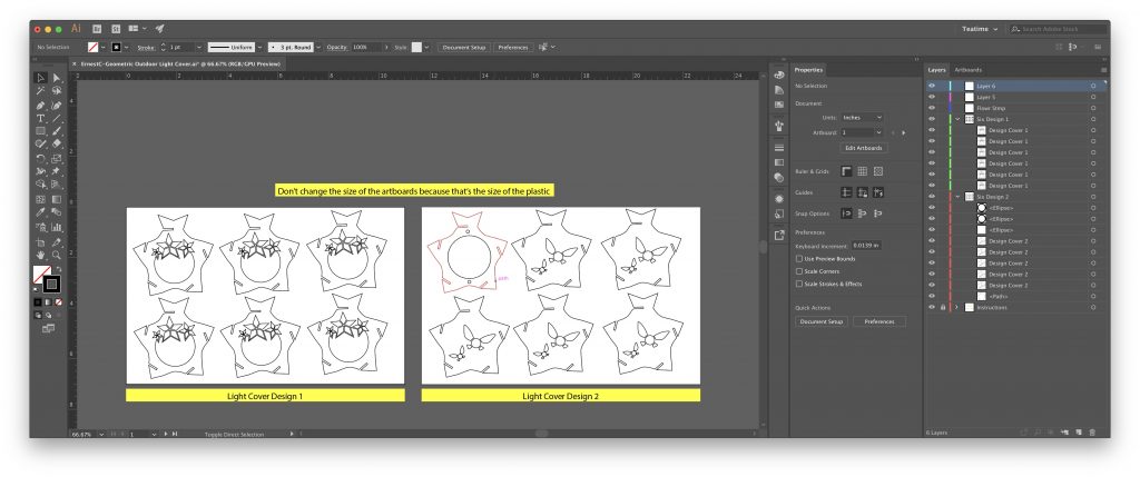
When I first started working on this project, I wasn’t really sure about what to do, but I did know that I liked the idea of using flowers similarly to the original light cover that we saw before we began. Starting with that, I tried to make some stamp-like flowers, which unfortunately lost a lot of detail in physical printing, as my design used a lot of thin lines to define the petals (though they were very simplistic beforehand anyway). After this, I wanted to continue the aesthetic of having sort of whimsical, simple designs so the second type of panel was based off of the fairies from the Nintendo franchise, The Legend of Zelda. To make these, I drafted all of the art on Post-It papers by hand and then translated them into Illustrator, and from there they got printed. Though I am pretty happy with how the final product turned out, I also wished I had more experience working with the laser cutter, as then I would have dealt with the lines a bit better so they wouldn’t have been melted off. I also wanted to create more area for the light to pass through, as I feel like that would have given more of the effect I was looking for, and also be more interesting to look at as opposed to having too much area without any light coming through (and thus being just swaths of boring black).
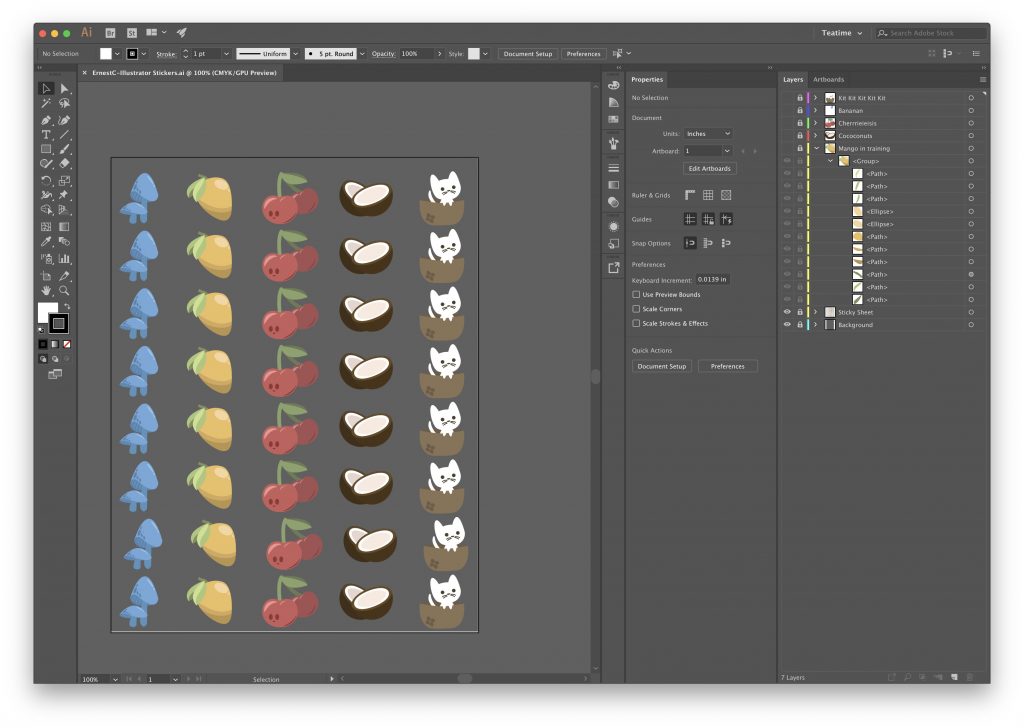
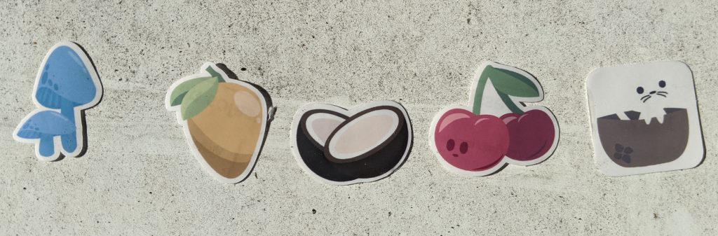
Adobe Illustrator Choice Project: Stickers
I was very excited for this project, as it was one of the first things that I wanted to do in this program. I didn’t originally know we were going to be able to make stickers, but I do remember on the first day of school the teachers announcing that we had a die cutter that would work for stickers at Freestyle, and so it was something that I knew I had to do at some point. When actually starting however, I wasn’t super sure where to start. In being lost, I set a couple parameters: try to keep a simple and clean design motif, use lighter colors that lean toward paste, and when it doubt, draw a fruit. Through this, I drafted a few designs and decided on these five- among the designs that didn’t make the cut included bananas, oranges, and strawberries. From that, I had a lot of fun using the pen tool and picking out colors in Illustrator (though I would argue that it didn’t practice color theory). This project helped me become more efficient and precise with the pen tool, and also allowed me to make some tangible art. In terms of what I wanted to communicate, there really was no deeper meaning or symbolic connection when I set out to work on it. That is probably how it should be though; after all, they’re just stickers. I’m hoping that the designs are all agreeable to the eye, and would be able to fit into a clean aesthetic on many different surfaces.
Design Projects
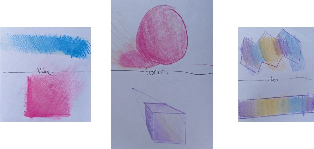
For Design, our works were going to all accumulate into the Narrative Production, a project where students created creatures from existing parts, such to represent our main characters from English. We started with a fair amount of learning and prep, and learned how to use Illustrator along with the guidelines of art and design, including things like color theory. Below are some exercises on color theory, through working with tints/tones/shades as well as hue, saturation, and value. Despite them being exercises, I still don’t think I did a great job with the “Color” page in these studies.
After this, we worked on the Narrative Project. Mine was titled Litterbox.
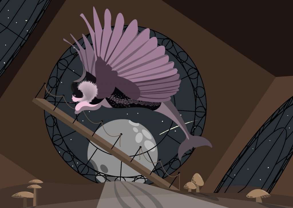
This work is based around The Uneventful Life of Fruehauf, in which a young law intern (who does nothing but work and correct others) is fired out of his firm and finds himself working under an aggressive baker, after aloofly wandering into the kitchen. The scene that this piece is inspired from is from when the main character, Fruehauf, ends up stuck working in the kitchen, and considers himself trapped; the baker has a chronic habit of throwing objects across the room for no regard for safety, so the main character is intimidated into simply doing what he is told to do.
In this image, made in Adobe Illustrator, the cat-like creature is meant to portray Fruehauf through its different features: the cat components are meant to show his distant mentality, the bee-fuzz and hummingbird wings are meant to show his work ethic and tenacity, the dolphin tail is meant to show his intelligence, and the garter snake scales and gazelle horns are meant to show his caution and desire to flee. The background is that of a fallen clock tower, to try and resemble how Fruehauf’s situation falls apart and that he is stuck there for what he feels is far too long. To create the creature, I traced different animals to get certain parts and fit them together based on reference images to place them logically. I made the snake scales separately using varying ellipses, and the whole animal recolored based on a Pantone color palette, thus making no part feel out of place. I created the clocks using symmetry tools and the sort, and afterward resized them to make them fit the room. I used indoor perspective to make the walls and clocks logical, and then used ellipses to create the moon in the background. To tie it all together, I went through briefly with a brush to create the stars in the back, and also places dirt and mushrooms throughout using the pen tool. I finished those components with shadows afterward.