Documentary
For this unit, we were required to choose a person who we found to be important in some way and highlight something that makes them stand out, and make them a significant person. For this project, I chose to represent my dad, Steve Yaskin. He co-founded a healthcare company called Health Gorilla which has impacted many people and continues to, today. His persistence and diligence have made him the successful person he is today, and this is why he is in the spotlight of my documentary unit.

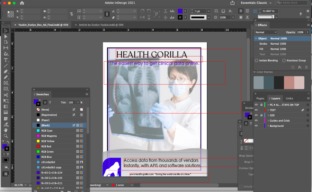
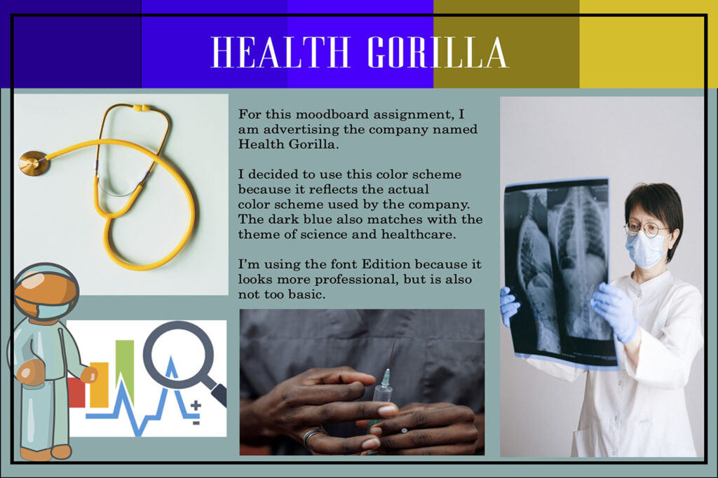
For my elective class of Design, I created an advertisement using Indesign. In this documentary AD, I wanted to create an advertisement showing off the company Health Gorilla that I wrote about in my profile article. I chose a more professional and medical theme for this advertisement, including the company’s logo and a picture of a doctor analyzing data. This relates to the company because it’s a medical records database. I began by creating a mood board that would include the basic layout and color scheme that I wanted to incorporate into my AD. Initially, I created a color scheme on the Adobe Color website and incorporated that into my mood board. Then, I found a stock photo on pexels.com, to use for the background, as well as a basic graphic design element that I wanted to use. I used Adobe Illustrator to create the graphic design element. I found clipart online of a doctor and a clipboard and traced it with the pen tool in Illustrator. In the real ad, I had just copied the graphic design element into the AD. Additionally, in the real AD, I struggled with finding a way to use the yellow color which I had used in the original mood board, so I switched it out with another shade of blue. This actually made my AD look more unified and aligned. I also changed the picture. Initially, I had aligned it to take up half of the space of the AD, however, there was too much negative space so I instead made it the background and lowered the opacity so that the text would be more visible. A problem I encountered was that I had used a dark blue for the headline text, and it wasn’t visible enough, so I changed the color to be lighter in order that it would show up clearer, as well as adding a white drop shadow.
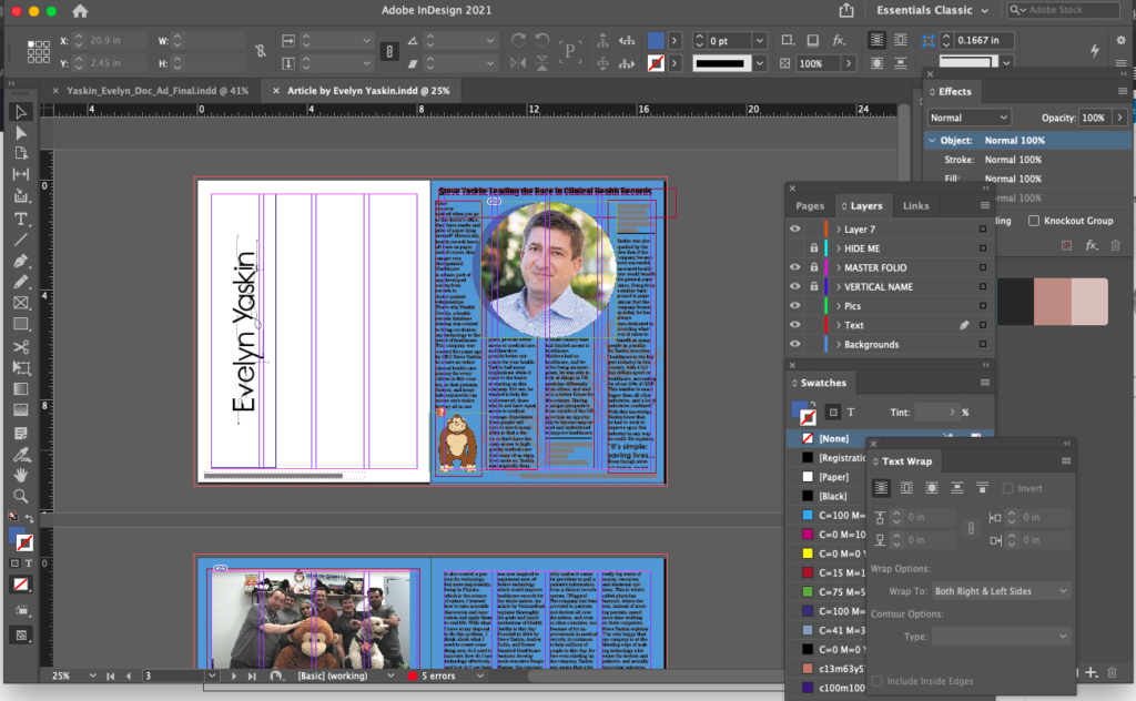
Additionally, for my documentary advertisement, I created an article with the report that we had written in English class. I featured this report in a layout in InDesign to look like a real magazine article. I included pictures of Steve Yaskin and of his company and staff.
(Click on the image above to view the magazine).
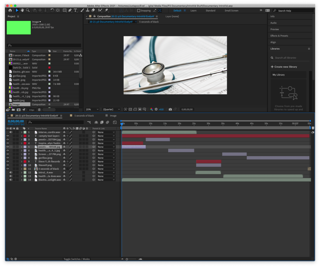
Behind the Scenes