Narrative Visual Perspective in Design
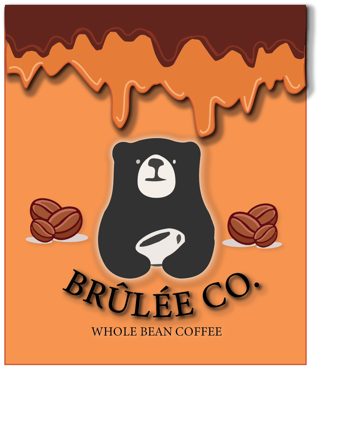
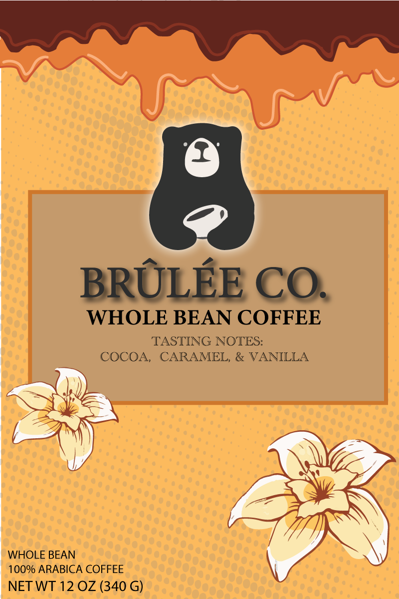
In Design class, we created our own products and designed a logo, and triptych to show it off! For these projects, we used Photoshop and Illustrator. I created my own coffee company, called “Brulee Co.
For this project, I started out by choosing which product I wanted to use. I ended up going with caramel and chocolate-based coffee bean company. I then created a logo, a label design, a triptych, and a magazine advertisement. For my triptych, I used three different products with my logo on it. I used a picture of the basic beans, and a coffee cup. I also used a basic tote bag, as well as a sweatshirt. For my magazine ad, I then used a picture of the coffee cup and beans, and I placed the logo as well as some other graphic elements, to sell my product! I also included the company’s tagline: “The friendly coffee,” as well as a blurb about where the beans are produced, and what comes into making the product.
To create my triptych, I began by using Placeit.net, and placing my logo and label design onto different images, such as the sweatshirt, beans, coffee cup, and tote bag. I downloaded these photos, uploaded them into Photoshop, and formatted them into one document with borders on either side. For my magazine ad, I started out by making a new blank spreadsheet in InDesign. I created a gradient for the background, as well as pasting in my “coffee drips” from my original logo. I chose a font that I liked for all of the text. I also placed an image of my coffee cup and included writing with more information about the coffee beans. I also included a drawing of two coffee beans that I drew in Illustrator. I really enjoyed this project overall and I would love to do something similar again!
Mood Boards
To start off with all of these projects, we created mood boards that let us put together our inspiration as well as a color scheme.


The next project that we did in Design was a movie poster!
A description of my movie:
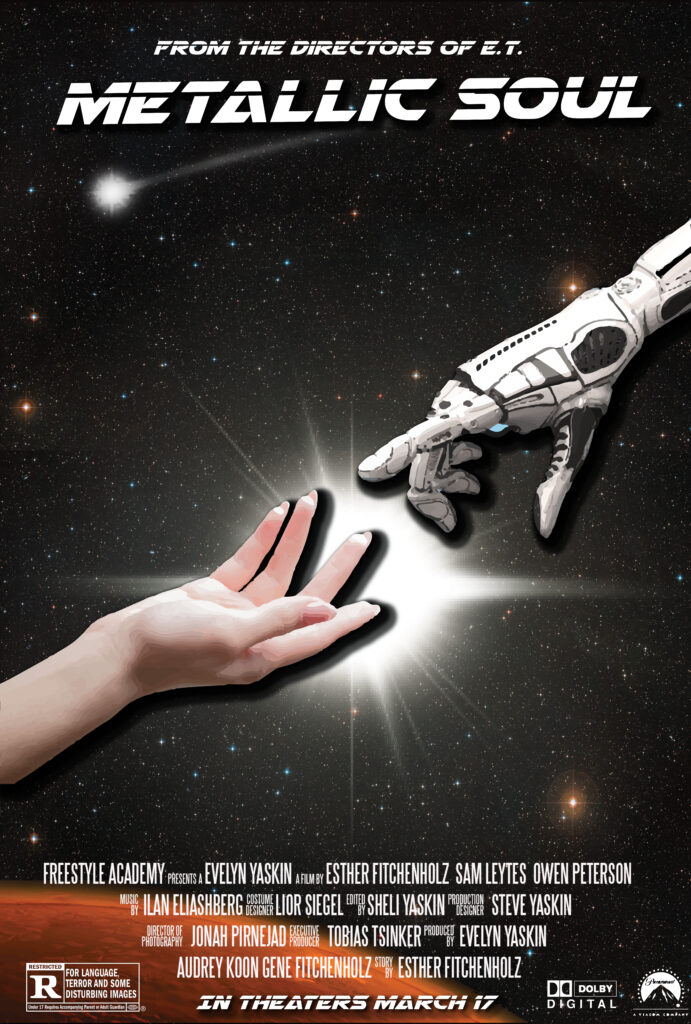
It’s 2080 and robots have officially taken over the universe. Many see them as evil and unstoppable in their malicious intentions. Except for Abby, who falls in love with Speedy, a robot named after his habit of running away from guards. Abby will do anything to save Speedy from being unplugged and makes many sacrifices along the way. Abby has to keep her romantic life a secret, as they go on adventures through space.
I created my poster by starting with a blank canvas in Illustrator. I was inspired by Steven Spielberg’s “E.T,” especially the movie poster’s highlight of the special relationship between the human and the “monster.” I took inspiration from this, in drawing a human hand reaching out to the robots. I added a drop shadow under both of these objects to make them stand out against the background. Since the movie doesn’t only take place on planet Earth, I drew an outline of Mars, from the perspective of outer space. I added an outer glow as well. I then added a stock photo of the stars from space. I thought this was a perfect background and didn’t take attention away from the main subject of the hands. I then chose my font for the movie title, which was a sci-fi-inspired font found on Dafont.com. I also created my credit block in Photoshop, using a specific font created for movie credit blocks. I then added PNGS of movie logos, such as ‘Dolby Digital’ and ‘Paramount.’ I hope you enjoy this tale of “two star-crossed lovers”.
Below is my final movie poster and moldboard!


From this project, I valued learning new professional skills, in creating our own products, as well as a logo and label design. I also enjoyed taking up a new style of art, which was creating my own movie poster. I developed my skills in Illustrator and Photoshop. I had a lot of fun creating different design elements, practicing my marketing and professional skills, as well as learning new things about movie poster production. I would definitely enjoy doing another project similar to this one.