In English
For the Narrative 2 unit, we were challenged to write a Lyrical Essay and explore lyricism in literature. We were given freedom of expression for our topic and I chose to write about the way bras have been implemented into the structure of our bodies as well as society.
Structure.
Slightly stretched and discolored, the bra you’ve worn for years brings nothing but discomfort.
You press your back with one hand trying to make the aching disappear. Your other hand pulls between the left side of your neck; your shoulders try to straighten out your spine. You anticipate the moment you can separate the hook from the eye.
You’ve survived so many days of discomfort, and you will survive so many more, but only to avoid being told to:
“Cover up.”
“Avoid creating a distraction.”
“Make sure you’re dressed appropriately.”
Entering the privacy of your bedroom, you sigh a breath of relief as you toss your ill-fitting bra onto your bed.
Your mom asks you what is so hard to accept about this simple act of “decency.”
You look down at the part of your body Victoria’s Secret confidently labelled the letter C, but Target labelled an A. You look back up at her.
“What is so hard to accept about it?”
What is hard to accept is the time your debit card declined because the only bra in the store that you didn’t hate was too expensive.
Or the time you had to walk out of a store because you weren’t sure whether this brand’s sizes run big or small.
Or the time the metal wire snapped in the middle of your final presentation, poking through your flesh so violently you could not bear the pain while speaking.
Or the time you woke up in the bra you forgot to take off last night with indents on your chest from the pressure.
Or the time you had to turn back home on your way to work because you were trying to avoid any comments being made about your body.
What is hard to accept is your newfound lack of sense of self. The intention of your actions only promote what society wants to see from you.
“Nothing. I guess. I just wish it wasn’t necessary.”
“I know but you don’t have a choice. It is not an issue of preference.”
Why? Is that not exactly what it is? Why spend our lives being cautious of what society might think? Why have we not just held each other accountable for giving into a distraction that stems from immaturity? We allow an overpriced, optional piece of clothing to not only structure our bodies but our society as well. It’s practical need has been washed away by the flood of expectations set for breasts.
In Design
Product Logo Project
Logo and Advertisement Product Pitch
- What is your product?
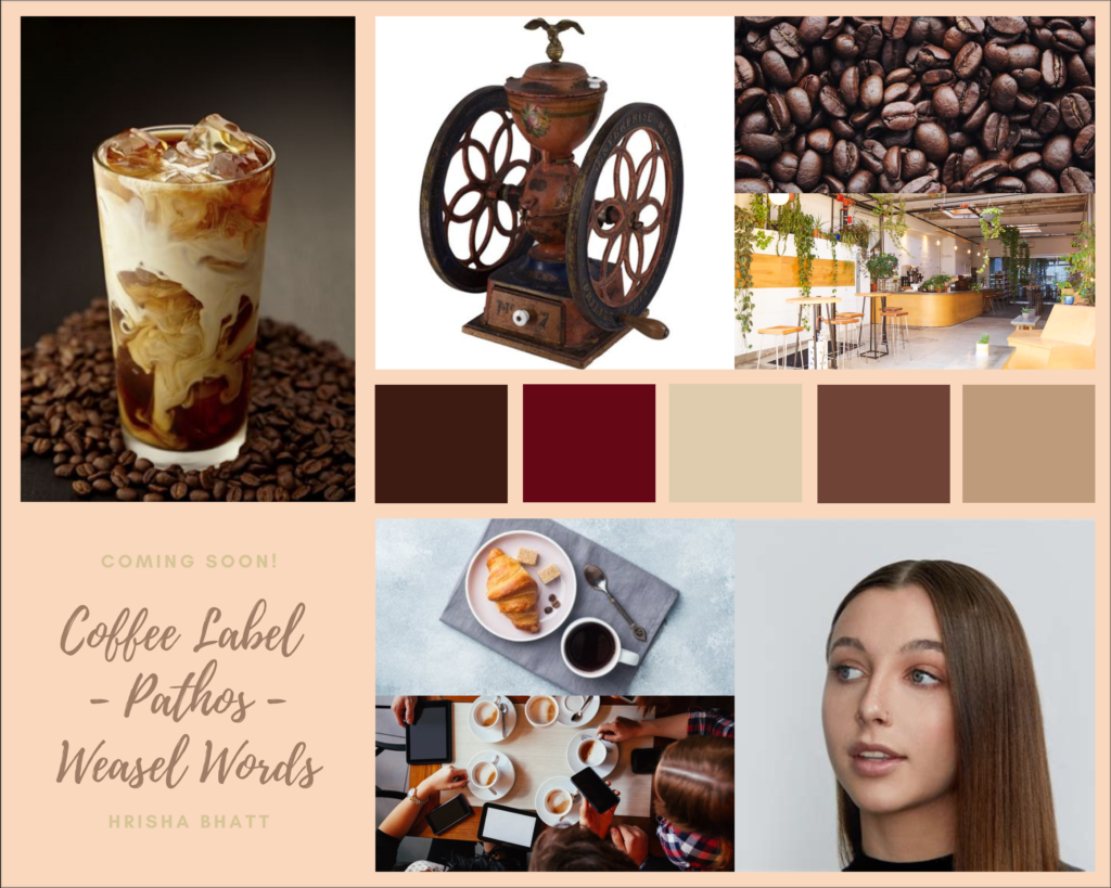
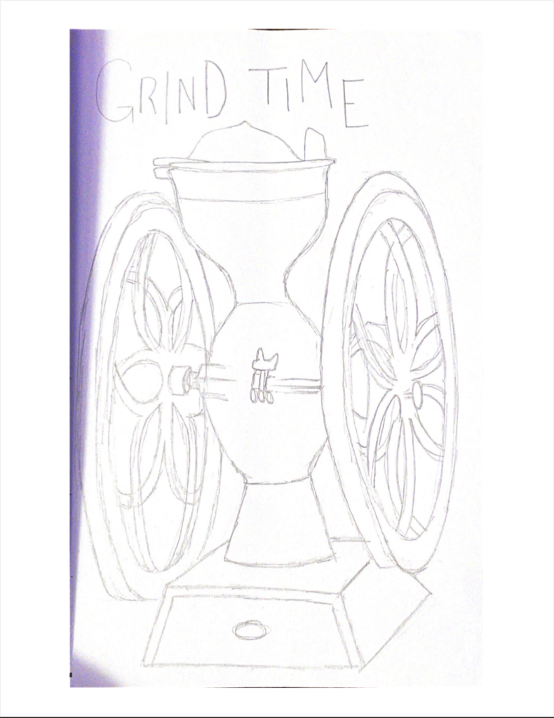
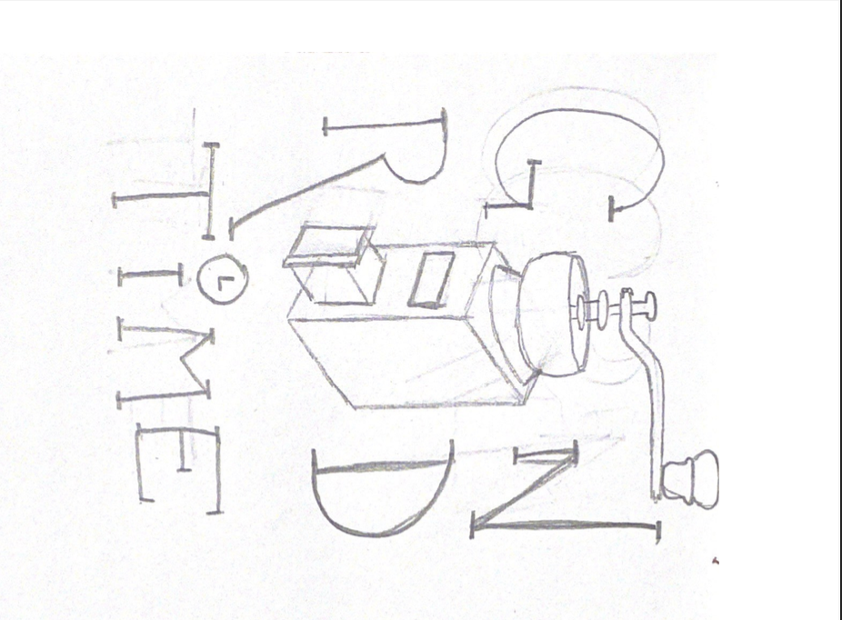
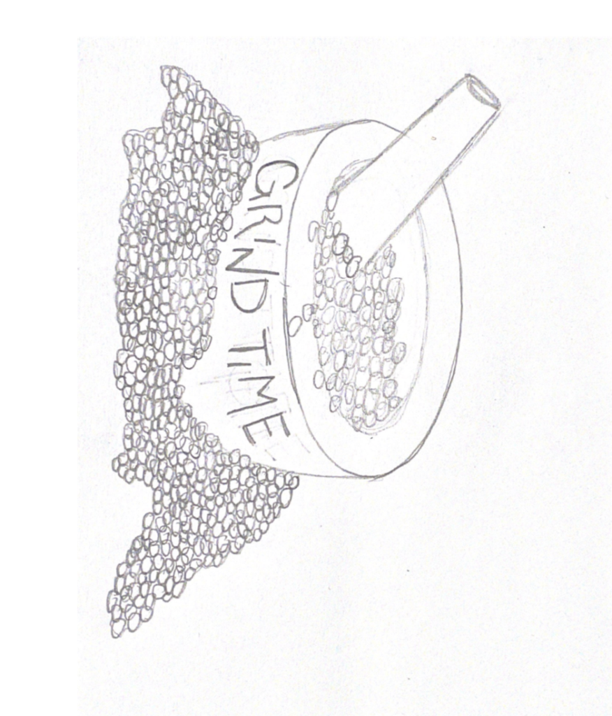
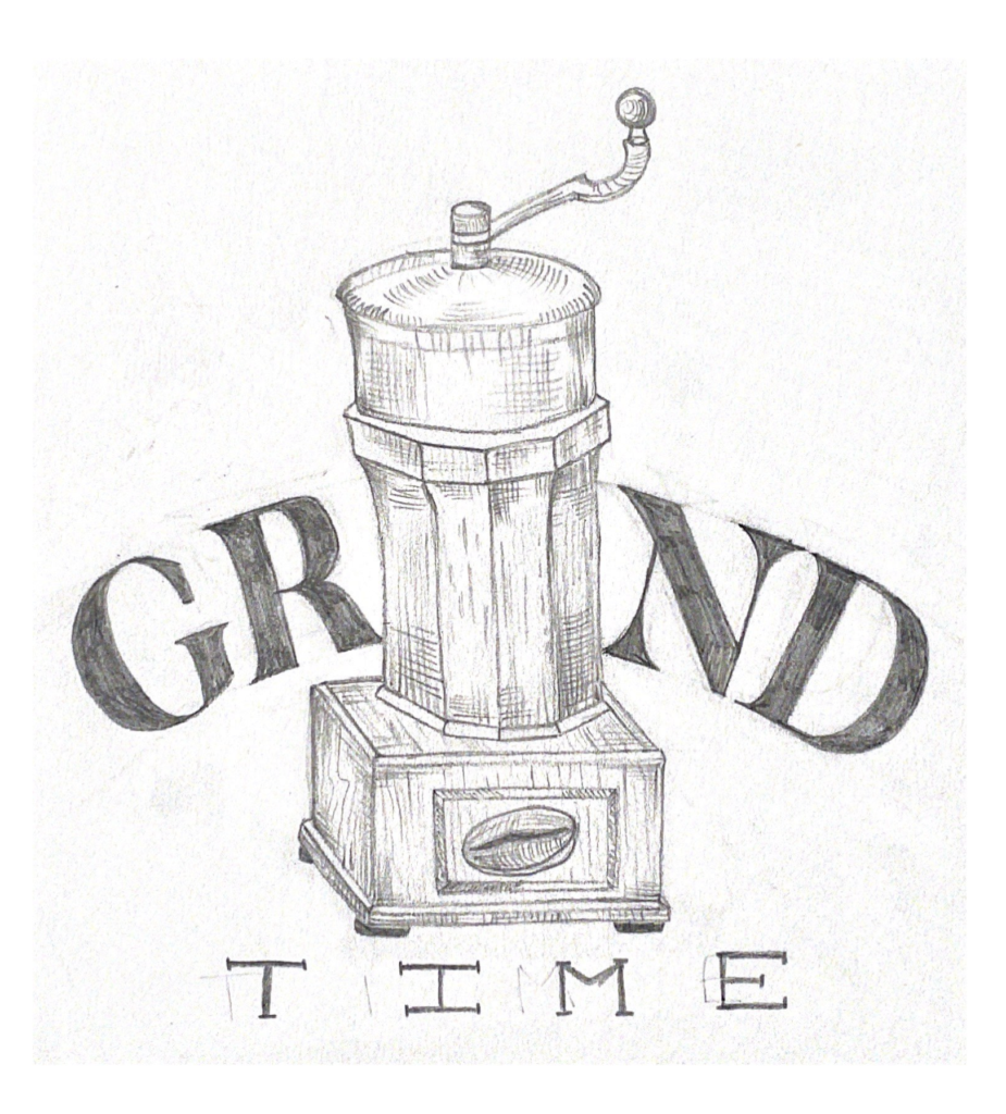
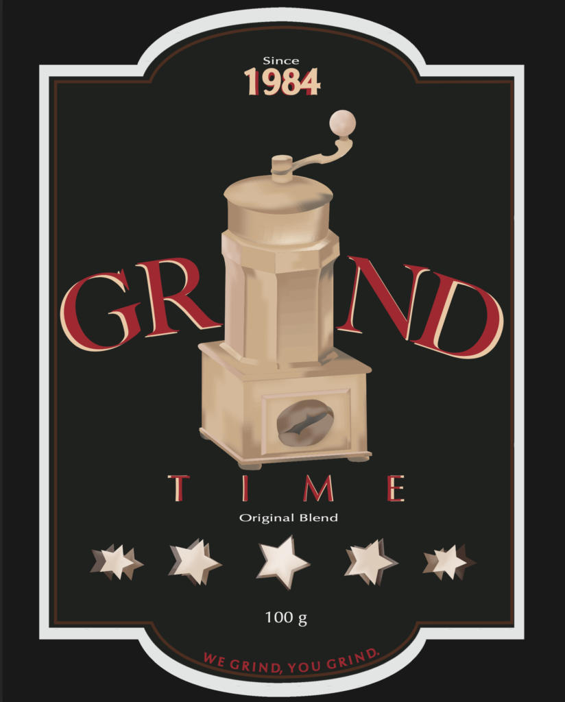
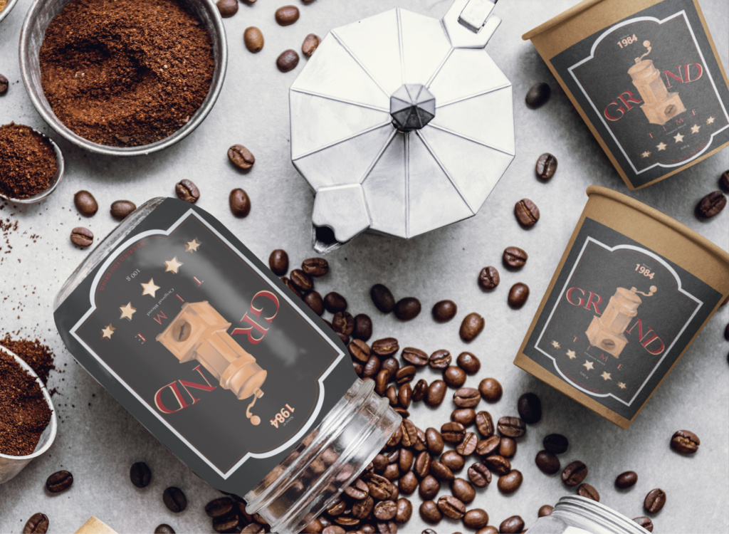
Coffee (Grind Time)
- Who is your target audience (age/SES/gender/etc)?
Teenagers
- Are you using Ethos Pathos or Logos? WHY?
Pathos – make consumers feel inclined to buying my product because it will be more beneficial to them than competitors
- Which advertising method are you using? Is it more than one? WHY? Be specific!
Weasel Words (maybe Bandwagon)
- WHY are you choosing these?
Weasel Words – ensure stability in the mind of the consumer that the product is going to help them and exaggerate a tad in order to tip them into buying the product
Bandwagon – talk about the extent to which it has helped other consumers and encourage them to do the same in order to be on other’s levels
- What is your color scheme (insert your color bar at the end of your response)? WHY did you choose these colors?
I chose brown to be my main color because it is the classic color of coffee.
I chose mainly darker primary colors because I want to target teenagers using color.

- What is your slogan or tagline?
- We grind, you grind.

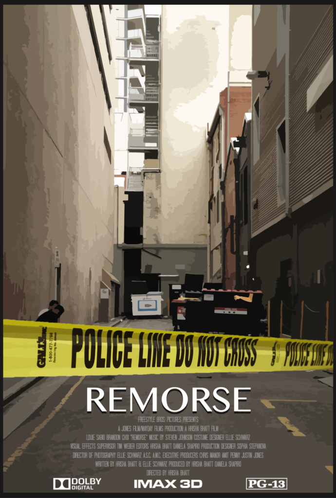
Movie Poster
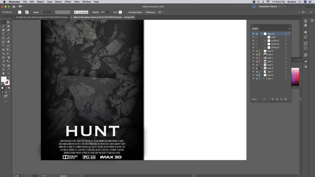
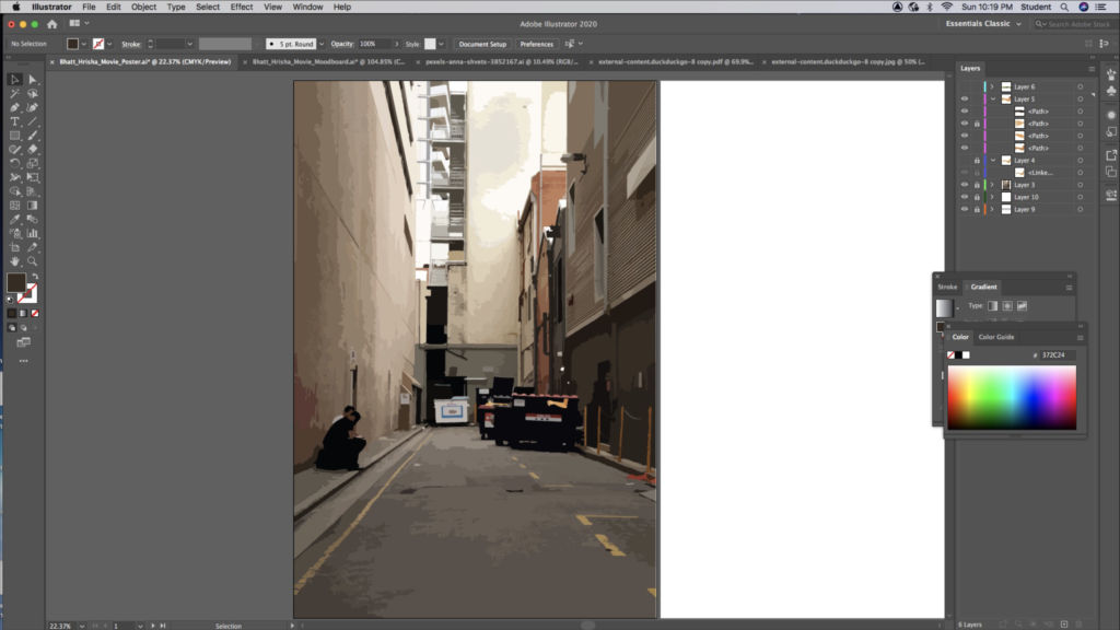
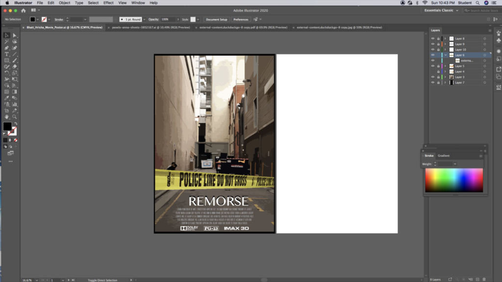
My movie is about an undiagnosed mentally ill man turned serial killer. It is a horror film that goes inside the history of this man and how every instance of his past is reflected in his murders. It starts with an eerie scene panning multiple dead bodies in the alleyway behind the neighborhood high school. A boy and his friend stumble upon the bodies early in the morning on their way to football practice. Two were laid out on the cement with their arms crossed over their chest, and one had an arm hanging out of the dumpster. All were shot once in the head. The boys were so invested in the truth behind this murder, and one of the boys father being a police officer helped gain some insight. The movie goes on through the perspective of the boys and what they are doing to help solve this case. They start to find various clues about the murderer that can help them uncover their identity. He is a homeless man, he is remorseful, he is mentally ill, he is a war veteran, and he does not want to be killing. By breaking into the crime scenes and tailing the police in an unrecognizable car, they were able to follow the police investigation while searching for clues of their own. At the end of the movie they find the killer in action on the third floor of an abandoned parking garage. A gun was pointed at the son of the police officer when the authorities showed up to arrest him.
As I was working on this movie poster, I was bouncing between applications from start to finish. Initially, I uploaded a stock image of an alleyway with dumpsters onto Photoshop to edit the brightness of the image. Then, I opened it in Adobe Illustrator and turned it into a low fidelity photo. I sketched out an arm using the pen tool and placed it as if it was hanging out of the dumpster. I found a reference photo in order to capture the lighting and I added pieces to match the low fidelity pattern. I opened a photo of crime scene tape on a different Illustrator document and made it a low fidelity photo. Then I opened it in Photoshop and cut out the excess part of the image and placed the tape all the way down the poster.
In Digital Media
Watercolor Portrait
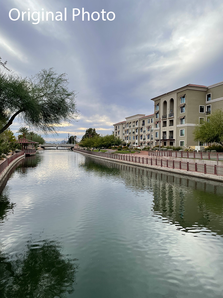
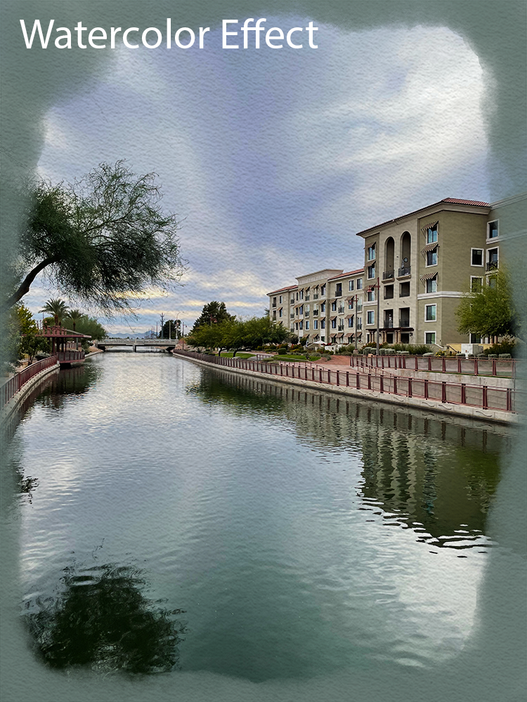
For part of this unit, we were challenged to create the effect of watercolor on multiples photos of ours. This photo is one of my favorites and the watercolor design makes for a very interesting piece. The slider can be used to compare the original photo to my edited version.
My Painting

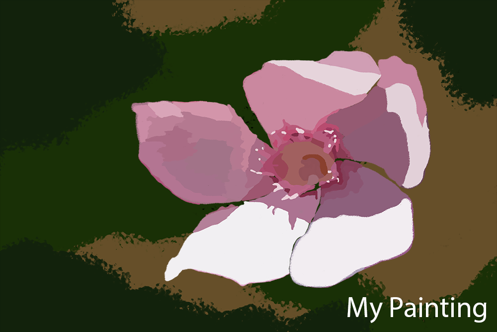
We were also encouraged to paint a photo of ours using the Photoshop brushes. We found and implemented several techniques to make something that we are proud of.