The Reflections unit mainly served as a reintroduction for Seniors into the groove of Freestyle, after the long summer break may have dulled some of our skills. The first assignments of the year were comparatively rather light. We developed our Illustrator and Photoshop skills in Digital Media, began writing college essays for English (the fact that I got to work on that in class was awesome), and we made some simple PSAs for Design.
The overarching theme of the unit was “Who am I?” I suppose I’ve answered this prompt in my work, but I couldn’t really give a satisfying answer in a couple sentences without either showing everything I’ve made in response to the prompt or delving deep into my own psychology. For English, we were tasked with identifying our “essence objects,” or objects that hold sentimental value to us and represent a broader theme in our life. It was hard to come up with a list, since I don’t really get too attached to material objects in that way. A much more useful exercise, I think, was identifying our core values. I have come to realize that empathy is one of the most crucial attributes that I value in myself and others.
Mandala
The Mandala project was our first foray back into Illustrator after the break. Luckily, I use Illustrator frequently in my spare time, so my skills with the program never really became rusty. In any case, I did learn quite a bit about new functions in the software, specifically new interesting ways to use clipping masks.

Initially, I took the photos with a red light, but I was disappointed by the result because the red light wasn’t bright enough, resulting in a mandala that felt borderline Satanic. I opted that dark blue was a more acceptable color, and of equal intensity.
I am very happy with the way this project has turned out, and am proud of every step of the process. I think my mandala lends itself very well to the medium of plastic engravement, and it looks especially good under intense lighting. I have learned a lot about Adobe Illustrator and Photoshop from this project, and I will most definitely be revisiting the techniques I used here in my own personal art.
Photoshop Art
Our Photoshop productions served to teach us a bit more about Photoshop, and to get more familiar with the different functions of the brush tool specifically. We covered quite a broad range of applications for the brush, and made use of the WACOM tablets and pens. I have mixed feelings about them.
This project was very challenging because the WACOM brushes are unintuitive and not at all analogous to how real paintbrushes behave. It was frustrating and tedious to try to get colors to accurately match the photo and to fill all of the negative space. I did not enjoy the process.
I chose a photo of myself and a few of my friends as the basis on which to base my “painting.” Due to time constraints, I was only able to complete a portion of it. I was going for an impressionist painting kind of feel, but I don’t think I achieved my desired effect. I am very disappointed and wish I had more time or instruction to make this project into something I can be proud of.


Design Work
My work for Design this year has been a very natural evolution from the curriculum of last year. Continuing with out explorations of Illustrator and Photoshop primarily, we have produced multiple elaborate and complex pieces of art in both mediums.
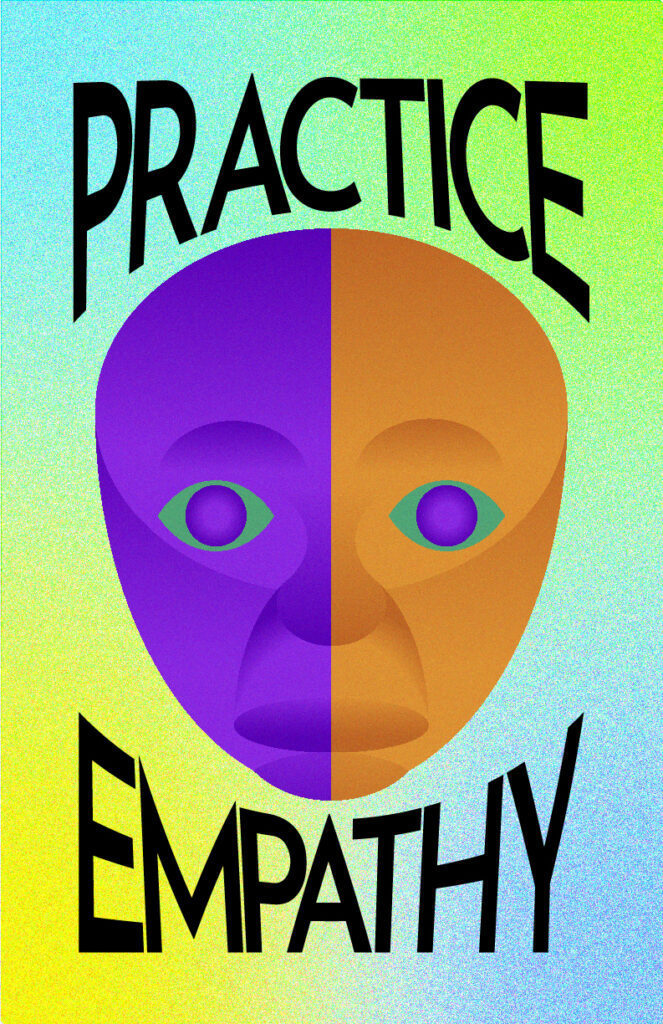
Our first major project of the year was the PSA based on one of our personal values. It is obvious from my final product which of my values I chose to represent, and I did so through the visual metaphor of a dual-colored face. This was to show the similarities that are shared between all people despite superficialities such as color.
The concept for my PSA evolved multiple times, and this one is most assuredly the most refined, focused and clear distillation of the theme: empathy. The face is two colors, but aside from that small difference they are the same. They even have the same colored eyes, which are said to be the windows to the soul. This is to show that arbitrary differences do not prevent us from understanding each other and putting ourselves in other peoples’ shoes. The text “PRACTICE EMPATHY” solidifies this point.
This was a very fun project to work on, since I decided to give myself the challenge of making the face using only ellipses. It was an interesting challenge, but very rewarding considering how the end result turned out. I also enjoyed working on the background and playing around with gradients and filters.
The next project we worked on in Design was the Aboriginal Art project. Despite my trepidations about the moral responsibility of the project, I am happy with the end result and how it reflects my unique character traits.
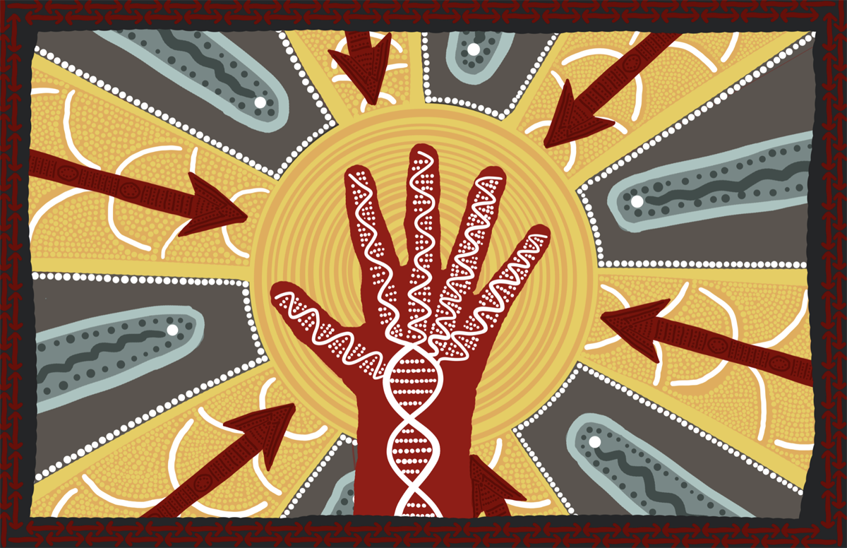
My aboriginal artwork symbolizes me in the most accurate way that I could think of. It is at the same time carefully composed and rough around the edges, methodical and loose. Instead of a zodiac sign, a double helix represents me, as I believe in science and empiricism over superstition. A human is my spirit animal, because of my great appreciation for the human species and my experiences as a member thereof. The juxtaposition between sun and rain represents the highs and lows of life, and the outstretched hand despite oncoming spears represents determination even in the face of great adversity.
I am very pleased with the way this piece came out. What I initially thought was going to be a total chore to complete ended up being a surprisingly fun and relaxing experience to work on and gradually improve. Some very valuable feedback from my classmates and Ms. P helped me shape the piece into the best version of itself. I’m very happy with how it’s turned out, and I think I implemented a good balance of dots and lines.