The portfolio project differs from the other units of Freestyle in that its primary focus is not on learning new skills or forms of expression, but rather reflecting upon the growth and accomplishments of the past two years. By focusing on one particular type of project, specific areas of improvement and change can be highlighted. I chose the area of illustration (which falls under the category of "Design") to look back on, and It's been quite an enlightening experience. I can clearly see how much more confident and competent I've become with programs such as Photoshop, and with creating a finished piece.
The culmination of this unit was a presentation about the aforementioned topic, delivered via this website. The second tab above (labeled "Works") contains the text of that presentation for your viewing pleasure.
Overall Reflection:
The past two years at Freestyle have been incredible not only as a learning experience but also as an opportunity to be a part of this community. The people I've met here have definitely helped to shape who I am for the past two years, and I'm so glad I decided to join Freestyle after sophomore year. With all of the skills I've learned here, I know I'll have a head start at college, and I can't wait to get to use them there.
Portfolio Presentation
1. The Pieces
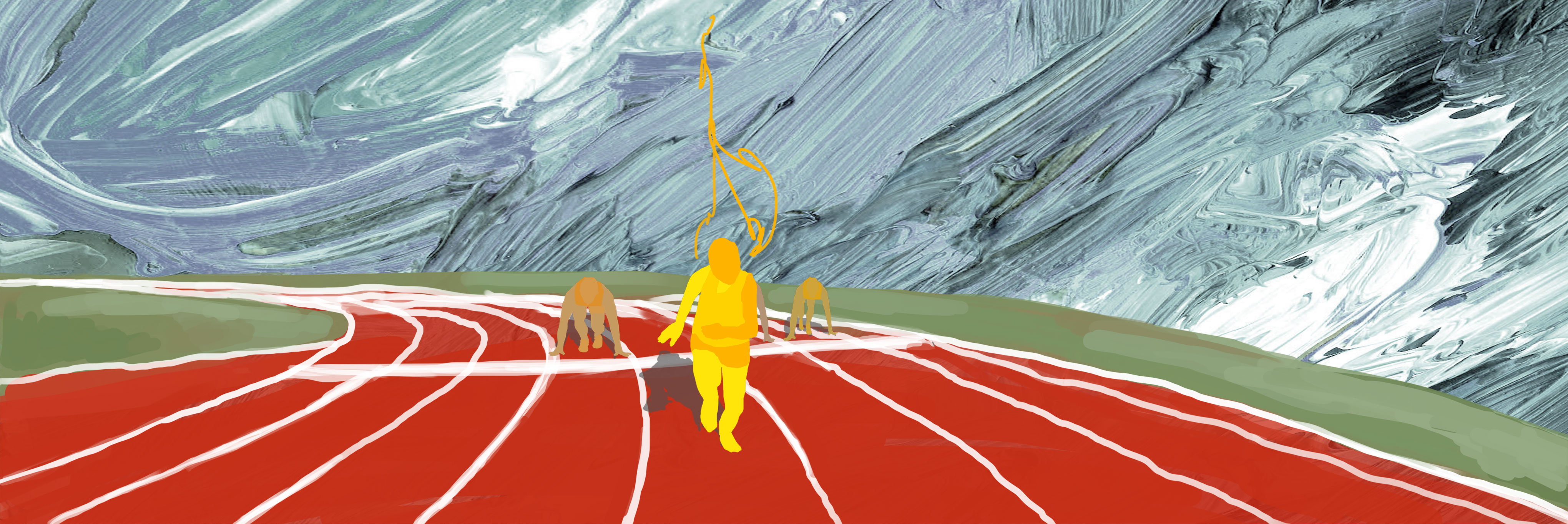
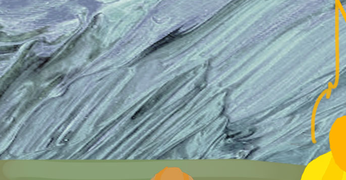
The concept from which I worked for this semester was “impatience because of the desire to rebel.” This piece is my interpretation of that. The setting of a racetrack implies impatience like in the anticipatory moment at a starting line, right before the race begins. The runners are all tensed up, waiting for the gun to fire. The one runner at the forefront of the piece represents impatience when it causes one to jump the gun, so to speak. It’s the inability to resist impatience. The runner in front also exemplifies the desire to rebel in that instead of waiting in a row behind the line like the others, they have begun already. They have refused to conform to the rules which would have allowed them to succeed, which is the heart of rebellion.
The colors and mediums I chose reflect this idea. The simple, flat colors and imperfect, wiggly lines are themselves an expression of impatience in that an impatient person might not want to refine shapes or add depth. I highlighted the energy of impatience by using bright, primary colors (especially for the runner in front) and long flowing lines suggestive of motion.
The image is based on lines; used to move the eye along
Bright colors were also a main focus, especially the yellow of the runner
The impression of movement was the ultimate goal of the piece, created mostly by the use of lines
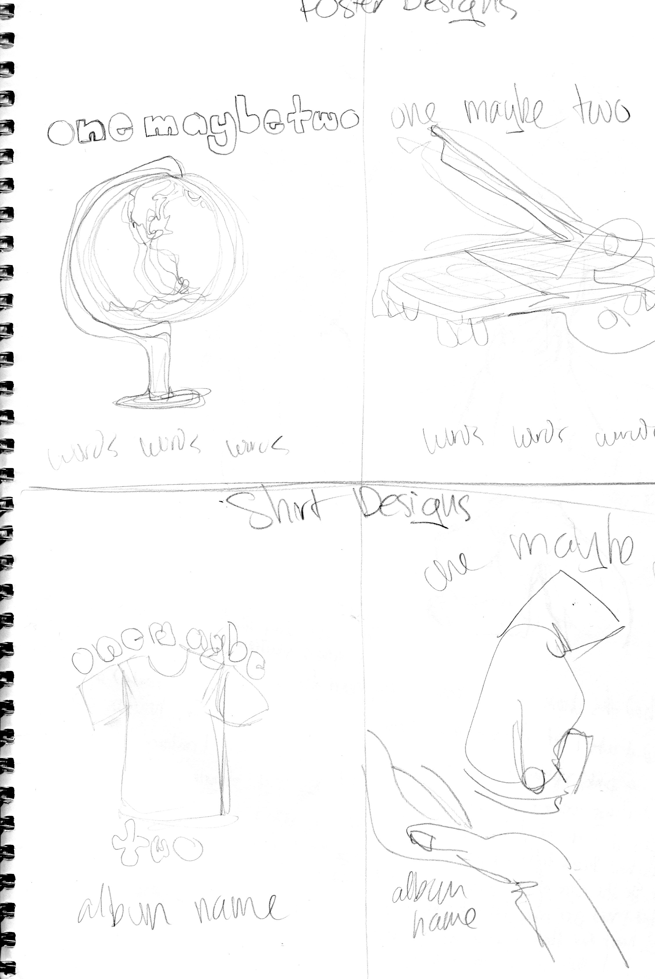
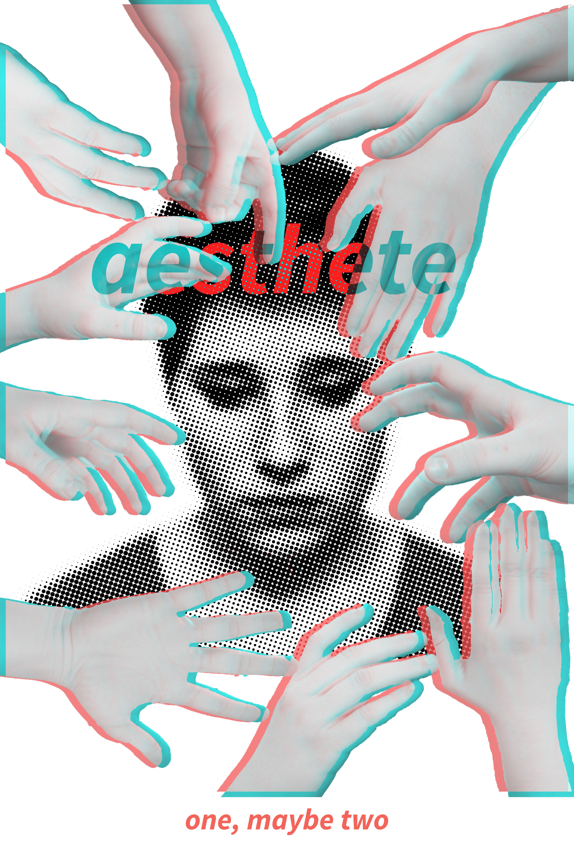
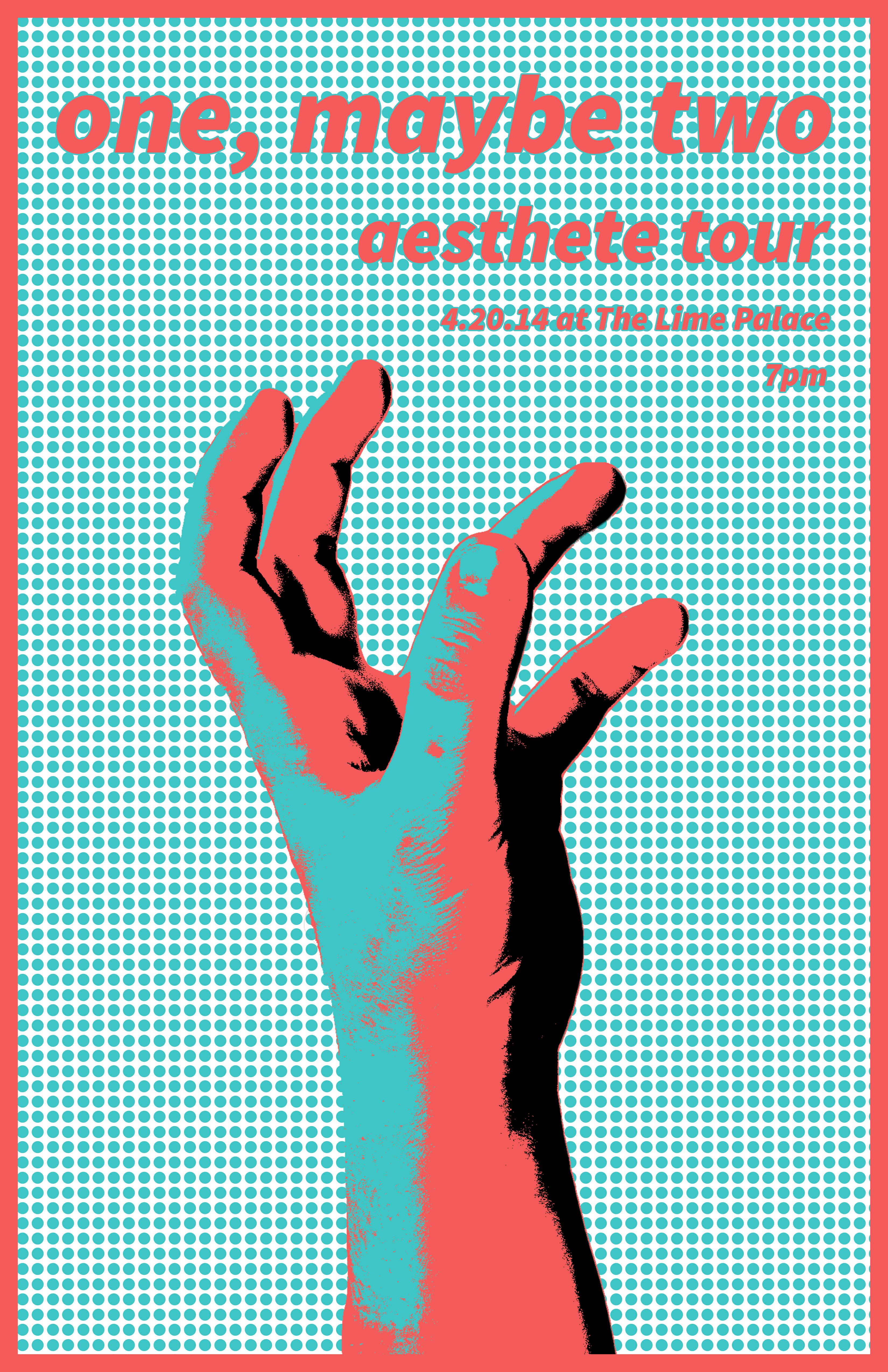
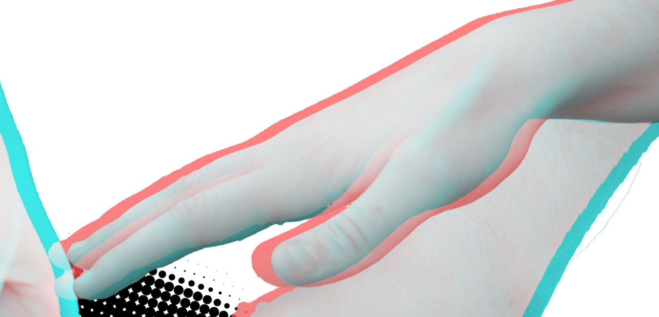
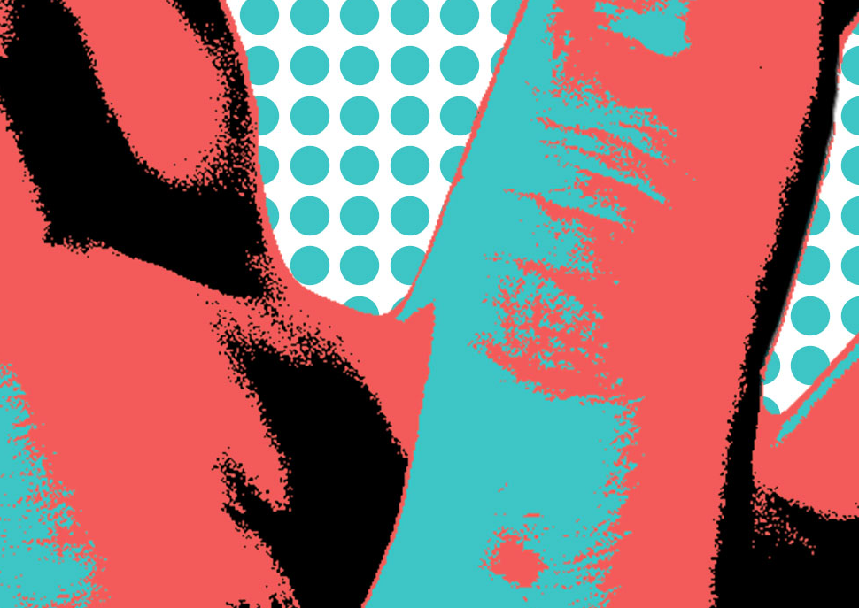
One, Maybe Two drew inspiration from the alternative music genre. Particularly, it was influenced by bands such as Everything Everything and Jukebox the Ghost. Although it doesn’t fit neatly into an established genre, One, Maybe Two certainly used ideas and styles present in these bands and in the alternative genre as whole. My poster and T-shirt were designed to echo the simultaneous multiplicity and simplicity of our song and band. The themes present in the name One, Maybe Two are displayed through the 3D effect on the hands on the T-shirt, and more subtly in the 3D image colors of the poster. The few colors and simple lines of the poster reflect the song in how its bright nature is emphasized by sparse instrumentation and inelaborate visuals. The very basic, unadorned font serve to offset the dotted patterns in both the poster and T-shirt, remaining easily readable and putting focus back on other aspects of the design. I further tied together the two images by using the reaching hand in each, albeit in slightly different ways. Together, they are unified, two images as one, as the band’s name and the music video’s constructions suggest.
Because the t shirt and poster can be considered a diptych of sorts, the most important aspect was harmony. this was based on:
Colors, which were consistent but not the same in each. the t shirt put focus on a black and white part, while the poster drags the eye with a single bright red
Texture. the dotted pattern appears in both works, tying them together and creating interest in each.
2. Comparison and Growth
Integration of photography:
experimental: Pixelated, shoved into the background, edited inelegantly.
music video works: Edited with simple effects, crisp, contributing actively to the effect of the final image.
Filters and effects:
experimental: None except for the picture, whose colors were edited to shades of blue. The other parts of the image don’t go well together, with starkly contrasting hues.
music video works: Tasteful and consistent. The overlapping red and blue shades in the T shirt design don’t overpower, but rather double up on the lines angling toward the central face. The poster is somewhat simpler, with a background made with a colored pattern and a focal point edited to include only a few colors.
Emphasis:
experimental: All colors were very bold, with emphasis based on placement.
music video works: There are hands literally pointing to main image, which is in the center and larger than any other one thing. Emphasis is based on placement, size, and a hefty amount of movement.
3. Skills for the Future:
Self-direction:
I'm going to college undeclared, so self-direction is doubly important. no path set out, have to make every choice for myself
Creativity:
Technical skills are great but creativity is what makes them useful in a broader context.
Technological literacy:
Technology and computers aren’t going away anytime soon, so it’s incredibly important to be able to use them to the fullest extent.
A More Complete Timeline of Illustrations
Click on each image for the larger, full-color version.
1. Self-Portrait Illustration
Created in the Fall of 2013, this was the first design piece from Freestyle. It was meant to represent the idea of holding onto bright memories and experiences when faces with negative ideas or circumstances. A full explanation may be seen on my self-portrait website.
2. Exerimental Illustration
This is the second illustration from Freestyle, created in the Spring semester of 2014. It was built off of the concept statement "impatience resulting form the desire to rebel". Further explanation may be found in the second tab of this website, or my experimental website.
3. Music Video T Shirt
Along with the music video poster, this was part of the music video project, from late 2014 and early 2015. The design of it represents hte duality of being. Further explanation may be seen on my music video website.
4. Music Video Poster
See above: Music Video T Shirt.
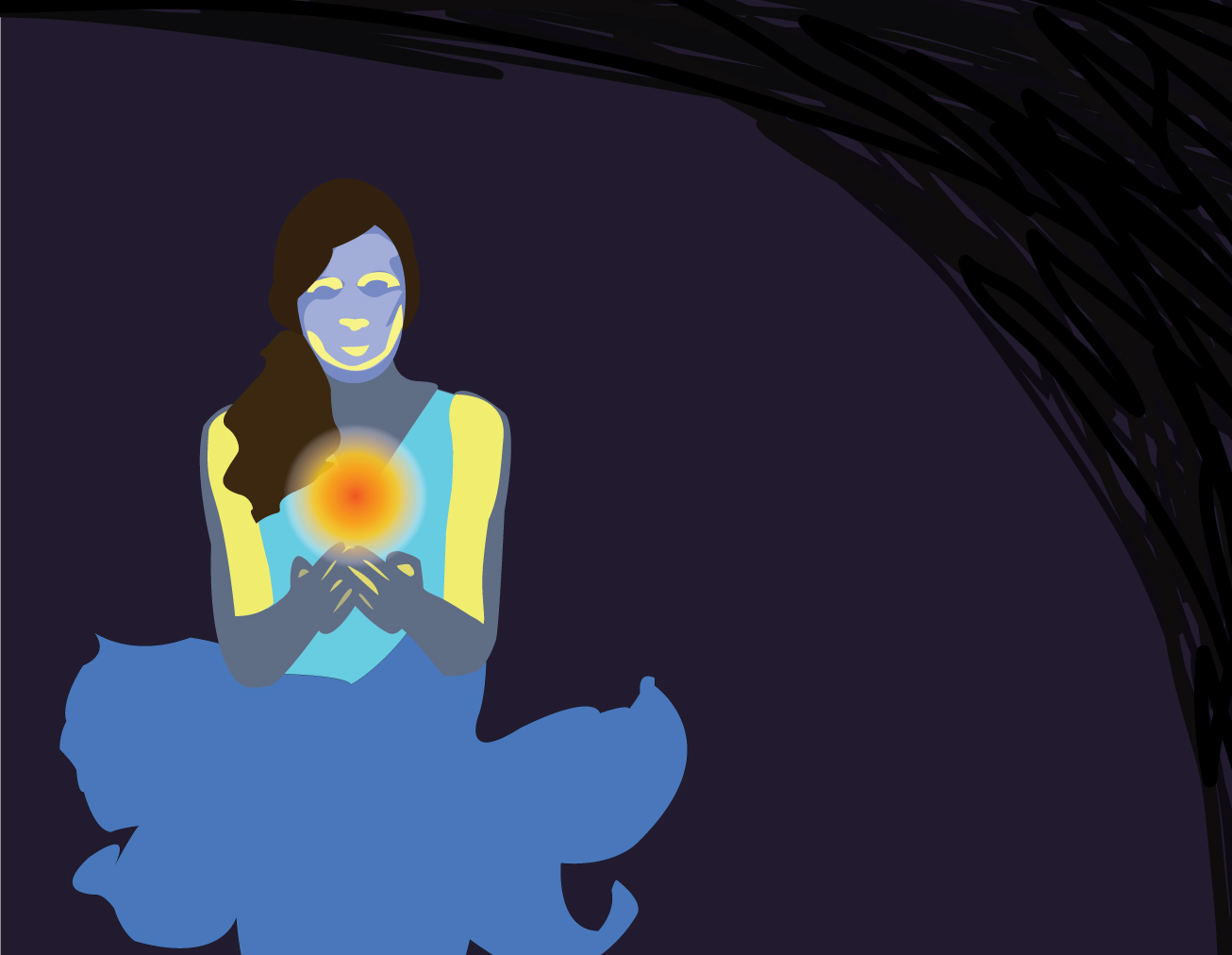
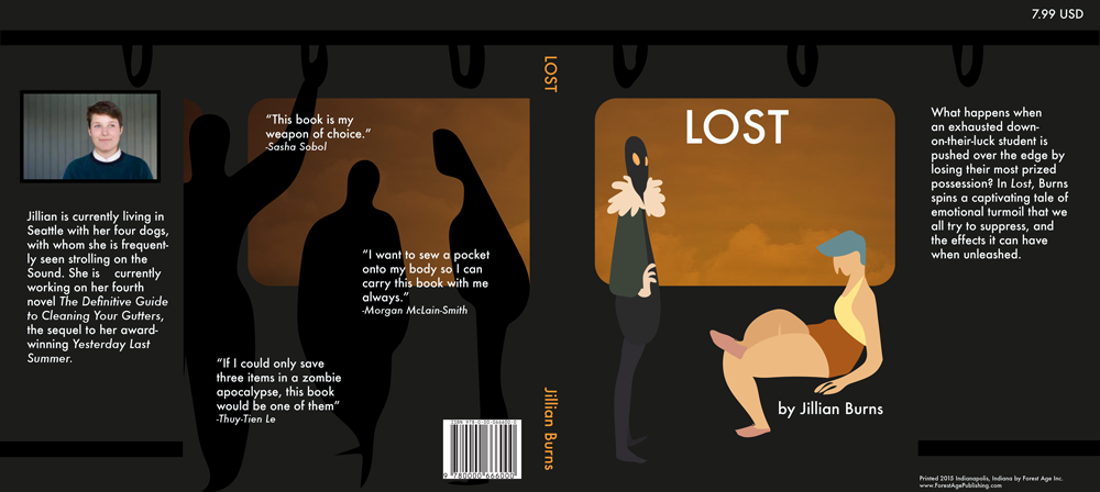
5. Narrative Book Cover
This book cover hails form the narrative 2 unit, which occurred in the Spring of 2015. It depicts a scene from my story, of the protagonist and the antagonist, although the latter is never actually seen in the story. More about this can be found on my narrative 2 website.
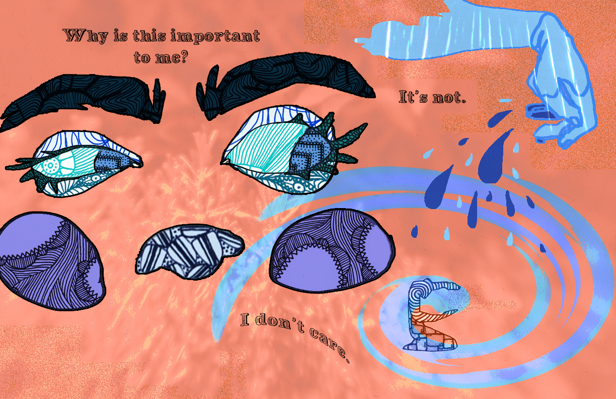
6. Blink Illustration
Created in the Spring of 2015, this image was part of an extension of the Blink unit, which is named for the book Blink by Malcolm Gladwell. The words and images are taken from a quick-write and various art pieces made with traditional media (pen, watercolors, and colored pencils). More about this project may be seen on my narrative 2 website.