Back To Projects
Project Listing Page
For this project our goal was to make a melodramatic piece. After we all submitted our ideas of the song, we voted originally on a song dramatizing break up. Later after editing my music piece, Cameron combined mine, Taylor and his own song into one. We took a more comical approach and made a melodramic piece about the terrors of dropping ones ice cream. In the production we divided the work up relatively evenly
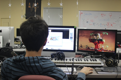
, where Cameron and I edited the music, yet this was primarily Cameron, I did the acting in the video, while Austin took production shots, Taylor worked on the music video. We also all help each other troubleshoot when we had an issue. What I mainly learned was how to work as a team, and some new java script transitions while making my website. I learned how to edit out some background noises as well.
Click here to download the video

Verse 1:
Em G Cadd9

It’s clear in review..
The path we chose to walk on
And all we went through...
Another stain on the sidewalk

Switch to strum
Lost without you is all I will ever be
it seems like falling is all of the journey
And you can try to stay to stay warm..
And keep away from the cold...

Chorus:
Em Dsus4 Cadd9 Em G C again *up in the air still* (Em Dsus4 Cadd9)? G Dsus4 Cadd9

And the snow will still fall
A screen to keep what was at bay.
And I can scream until I remember (G Dsus4)
I’m better off this way. x2 (hang on C)
*Tag?*
*Fix this*

Verse 2:

The rain is falling
It’s washing you away.
What’s frosting over     3
My heart’s forgetting how to beat

Silently fading in front of me
Bleakly drifting into eternity
Bittersweet as you go astray
Lost without conviction

Chorus:
Em Dsus4 Cadd9 Em G C again *up in the air still* (Em Dsus4 Cadd9)? G Dsus4 Cadd9

And the snow will still fall
A screen to keep what was at bay.
And I can scream until I remember (G Dsus4)
I’m better off this way. x2 (hang on C)
*Tag?*
*Fix this*

Bridge:
(D Cadd9)

It’s temporary....
Your barely there at all.
like gravity you don’t hold back
You’re there until you’re gone

Chorus/Verse


Outro: finger-picking

Production Shots

Click Photos
Change this caption in HTML code
For this poster I want to rip off the band Lincoln Park. As such, I put violent things like a nuclear weapon going off in the background, and had a friend holding the picture frame to represent a self reflection. The planes are a nice detail to the poster with the war-like theme. I chose a primary color scheme with the addition of green, which I feel is better suited to this project. I don’t care for green, so I chose it as a color for distaste, in addition, it complemented the red in the photo well. The blue of the frame is a world surrounded in tears along with the man looking as if he’s molten, and breaking through his self-made prison of emotional torture. I mainly made this is Adobe Illustrator which is where the colorizing happened. In Photoshop I did some minor edits such as using the patch tool to edit pieces that looked wrong. Lastly, the resolution of the text looks a bit grainy because it was made in two programs. For my CD, I want it to look similar to that of my poster. Originally I wanted to do a curved text around the hole in the CD, however Photoshop wouldn’t let me type on a path that sharp. So I decided the flat text on top would look much better. If I were to change anything, I would put the same icon of the man I had on my poster on the CD itself as it would then follow my red, green, yellow and blue color scheme. A happy accident was the swirl effect when the middle of the explosion was cut out as it made a very cool circular effect, and since the shape was a circle, it had great synergy.