

During the Visual Narrative unit, we explored how to tell stories across English, Digital Media, and Design using tools like Adobe Illustrator, Photoshop, and Pro Tools. The unit pushed us to convey meaning through visuals, audio, and symbolism rather than direct explanation. In English, we analyzed short stories and flash fiction before writing our own, focusing on deeper meaning and narrative structure. In Digital Media, we converted those stories into audio pieces with original cover art, while also creating additional illustration projects. In Design, we illustrated aspects of our narrative. Throughout the process, I improved my ability to express emotions through symbolism, strengthened my storytelling logic, and developed strong technical skills in Illustrator.

The assignment in English was to create a short story of 700 – 1000 words. I found this constraint difficult to navigate, as I found my story too short, but feared that adding more elements would make it too long. The inspiration behind my story was a political cartoon about Boss Tweed in my history class, and I decided to transform him into the mayor of a small town.
Then, I recorded my story in an IsoBooth and edited it using Pro Tools. Instead of only editing my voice like in the conceptual unit, I added sound effects and background music to enhance the recording.
I feel like I told my story moderately well. I am satisfied with the music and SFXs I chose, as I feel like they help to provide a greater sense of environment to the listener. However, one detail I believe I could improve on is the quality of the narrating audio. Since I was too nervous in the IsoBooths, my audio came out louder in some regions and quieter in others, which made the narrating voice sound quite unstable.
I think I am most proud of my SFX clips in audio production. Even though I could not find the exact audio clips of the objects and events in my story, I managed to edit other sounds to make it sound like something else. This was something that really pushed me to be more creative with adjusting volume and panning, so it became something that I was very proud of.
I value the amount of detail that can go into an audio-only story that includes music and SFXs. Even without visuals, the music can truly immerse a listener into another world, time period, or into a character’s shoes. The SFXs also help to give the listener a sense of their environment, through sounds of the setting, or objects, and combined, an audio-only production can go much further than just a writer reading their story.
Heaven Avenue
Mike watched himself stare back from the wall of the old can factory. He had seen his campaign poster a million times over, but the ones pasted on the factory walls had to be his least favorite rendition. His smile was a little too clean, and his teeth too white. The bricks flaked around his ears like old skin. He unfolded the small step stool from his brown leather briefcase. His briefcase, his stool, his campaign; they were the things that traveled with him like nervous habits. The jar hissed when he opened it. Julie had called it her “elixir”, awed by how she’d even managed to make something so strong. He scrubbed at the angry howls of red and black paint until even his tooth faded into the color of the wall. Then he pressed on a new poster, smoothing the edges to bandage the wound.
He swiftly gathered his things and paced himself back to the main road. It held the perfect name, “Heaven Avenue”, lined with dozens of faded beige apartment buildings that blinked their yellow windows like tired eyes. Mike didn’t make it five steps down Main Street without someone stopping him. Mrs. Carrow with her perennial grocery bags, high-school twins who always argued with their tender mother, Mr. Ramon with his newspaper folded like a secret. Mike listened to each of them with the patience of a man who understood that attention was its own small currency. He leaned in, nodding, absorbing their worries as if they were stories told by distant relatives he hadn’t yet grown tired of. He laughed easily. It was that soft Mayor-Mike laugh that gave both him and his people a certain comfort. He practiced it religiously, ensuring it was neither mocking nor simulated. Even when Mike slipped away, he did so gently, like he was gently patting someone on the shoulder.
Over the past few weeks, Mike had been restless. His wife, Julie, had told him it was his campaign, but Mike was certain something was wrong. Anything that threatened his campaign threatened him. It threatened his people. That was the order of things. He suddenly thought longingly of Julie: her perfect ringlets of copper hair, her perfect auburn eyes, her perfect, dangling, pearl earrings that made a tinkling melody when she laughed. She’d told him the restaurant was nothing but a nuisance, that the owner was past his time, that the food was never made fresh. Delinquency, she’d called it. Mike had laughed along. Julie had a talent for ending conversations before they began.
In the distance, exactly three blocks down, Mike saw it. It burdened his eyes. It was a mixture of soot and smoldered wood that had accumulated over two weeks, and the smell of anchovies and Parmesan cheese still lingered in the air. If he was being honest, the takeout was always cold, and he felt great pity for the waitress with the green eyes. The customers were always too brash with her. Taking larger strides, Mike glanced at the restaurant’s carcass. He set down the bouquet his wife had arranged near the picture memorial, with a printed card tucked among the stems of a dozen crimson roses. As he leaned closer, a sharp chemical scent drifted from the paper. He straightened his collar quickly, unsettled by how easily his mind seemed to recognize it.
He hopped over the worn yellow tape and into the soft field of ash. There was no harm, Mike supposed, glancing around in case anybody was watching. A moment later, the softest crunch echoed from under his loafers, the new pair that Julie had brought for him. It was the sound of a falling leaf, so fragile that Mike almost let it slip by. Crouching down, he saw the white jewelry, impossibly bright against the gray. He paused for a moment. A car door slammed somewhere beyond the yellow tape, reminding him that he wasn’t meant to linger. He needed to act swiftly. He must act swiftly, he thought. Pressing his palm down, Mike ground the earrings into the soot until they vanished, as if he were tidying up after her. Mike grimaced slightly as the shards cut ever so slightly into his skin, staining them with blood and soot. He stayed there in the foul air, letting the ashes breathe faintly around him. When he finally lifted his hand, the pink specks clung to his skin. Brushing them off gently, Mike watched as the shimmer and ash spiraled into the breeze. He loved his people, and his people loved him. Mike said it once, then again, and again, as he strolled back to his house.


One of the primary ways we practiced our creativity was through the use of Adobe Illustrator. I had learned an overview of it from Design, but Digital Media taught me a lot about the incredible array of tools that Illustrator offered.
For the Exquisite Corpse Project, we were paired up into groups of 4, then individually created our own illustrations. At the end, we got to see how they all connected. It was super interesting to see how everyone came up with such different ideas. I did mine late at night, so I decided to draw an exhausted Snoopy lying by his house.


We also practiced by making covers for our short story productions, in which I chose to illustrate the pearl jewelry at the end of my story. I had to learn how to use a gradient mesh, which definitely had a learning curve, but I am incredibly happy with how realistic the end result is. I think that one thing I would like to change is adding more depth and detail to the background, because I feel like just the pearl alone looks a little too flat.
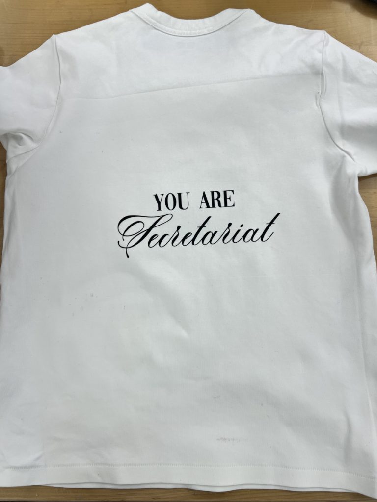
For our final project in Adobe Illustrator, we were given a choice to make a piece of artwork that could be stuck on a shirt, tumbler, glasses, tote bag, etc. I really enjoyed this project because we were given a lot of creative freedom, and we got a physical end result to take home!


Using Adobe Illustrator for image creation as opposed to Adobe Photoshop feels more precise and flexible. What I appreciate about Illustrator is that it uses vector graphics, so images can be resized without losing quality, whereas Photoshop is better for editing detailed photos and working with pixels. In comparing the two, Illustrator is better for clean designs like logos and icons, while Photoshop is stronger for realistic images and photo manipulation. Digital drawing in Illustrator is different from analog drawing with pencil and paper because it relies on shapes and paths rather than freehand texture, making it easier to edit but sometimes less “natural-feeling”.
I chose to create clothing art because I have always loved cool or interesting graphic t-shirts. Most shirts sold commercially have mixtures of photos and graphic elements, but I wanted to make a graphic shirt with a simple illustration. With the freedom to make any design I could, I decided to make silhouette art to put on a t-shirt that comes from a show that I recently had finished, called Bojack Horseman.
In my production, I only used the pen tool to outline my initial sketches, and then imported custom fonts for my text. The pen tool was a bit of a learning curve to use, but I think I really improved my skills through drafting my ideas on illustrator. I learned that rounding out edges can help soften sharp corners, but it could also lose angles of a drawing very easily. My overall thoughts about the illustrator project was that it was difficult to learn to use the tools, but I learned a lot about Adobe Illustrator and how to use the pen to make an effective design.
Overall, while learning the many tools of Illustrator was a long process, I really liked my end results from my projects. My favorite one is probably the Exquisite Corpse, just because I had a fun time drawing and colring Snoopy.
Illustrator and Photoshop differed a lot in their tools. While basic functins like cropping, moving, copy/paste, etc. were all the same, the main tool in Illustrator was the pen tool, which had to be utilizied through clicking and dragging. The main illustration tool in Photoshop is the brush or the pencil tool, which are used to primarily make small edits, not to draw.

During the Narrative Unit, we got to explore different ways of making and editing music through Pro Tools. First, we formed groups so that Mr. Flo could record us singing, which we would then learn to mix on our own. My group was me, Sophie, Mehr, Diana, and Anoushka, and we chose to sing Dancing Queen. We then individually edited the Music Recording file through Pro Tools.
▶ Dancing Queen
⏸ Dancing Queen

Our main takeaways were the technology setup of the recording studio. We had a lot of fun singing, and learned quickly that it was a lot easier to sing if we were more relaxed. One thing that particularly stood out to us was the headphones and the system that allowed us to hear individual voices and adjust the volumes accordingly. Another interesting thing was that while originally recording, we had separated verses, but we learned that we could all just sing the whole song, and later edit/mix it to cut out mistakes. A third takeaway was working with mics, and how we had to have ourselves and our head positions at a certain distance away from the mic filters to ensure the best audio quality, and avoid any drastic volume changes. Overall, it was very fun and interesting to see the mic and studio setup of the recording studio.


The goal of the experimental music project was to create original music using MIDI blocks in Pro Tools. This was done through the use of a MIDI “piano”, which could also be used for instruments like bass, drums, strings, trumpets, and countless others. We could choose between 4 interstitials or one long piece, and I chose to do a longer song.
▶ Experimental Music
⏸ Experimental Music

My inspiration was primarily the soundtrack for the musical The Phantom of the Opera, and its mix of classical and electronic sounds. There are a variety of instruments, such as an organ and a piano, but it is also accompanied by synth basses and the boom drums. I am most proud of the opening few bars of my piece because I really like the way the vacuum sounds. I learned that sometimes isolating an instrument can sound much cleaner than having all the instruments play at all measures. I value the fact that this project helped me to go outside of my comfort zone when working with digital music and instruments. I have typically done music through orchestra, band, and piano, but this was my first time being able to “make” my own music using the MIDI blocks and the Pro Tools program. It was challenging to try to manage several different instruments by using my computer and MIDI keyboard, but I enjoyed being able to experiment with so many different options for sounds.


Working with Pro Tools in music production was challenging at first because of the technical skills needed for recording, editing, and using effects like EQ and compression. Over time, I became more comfortable with the software and was able to record cleaner audio. MIDI production gave me creative freedom to build music with virtual instruments, helping me improve my understanding of how music is produced.

In the Design Narrative unit, we were challenged to produce original artwork through the use of a new platform, Adobe Illustrator. First, we learned how to use the pen tool through tracing images like a rubber duck, as well as creating a practice underwater scene. It was a very different experience from using Photoshop, so I relied heavily on YouTube tutorials to teach me tips and tricks.

I learned linear perspective in Adobe Illustrator by using tools like the line and pen tools. Through practice, I understood how horizon lines and vanishing points control how objects appear smaller as they move farther away. This helped me create more realistic and visually balanced designs with a stronger sense of space. To create the background for my narrative creature, I referenced the beginning scene of my short story, in which the main character walks through the town. I think I got a little too ambitious with the background, as I drew too many buildings than I could color with enough detail, so they came out much simpler than I had hoped.

In our narrative creature project, we created a creature out of five different animals that represented our character’s personality traits. Looking at examples from the past classes, I was nervous about the difficulty of the project, as I was not yet comfortable with Illustrator. However, I think this project really pushed me to learn how to use the pen tool efficiently, as well as coloring through the live paint tool.
In Heaven Avenue, a mayoral candidate named Mike investigates a burned-down restaurant on his street and discovers a secret that could ruin his future. My background depicts the introduction of the story, when Mike is strolling through his town to put up his campaign posters.
For my creature, I used a chicken head, the body of a skink, the wings of a Green Lacewing, the legs of an octopus, and the tail of a skunk. The chicken head was used because Mike is a very personable individual. He tries his best to uplift his townspeople and believes that he is going to be the perfect mayor. This aligns with his trait of loyalty, which is represented by the skink’s body, and his compassion is shown through the wings of the Green Lacewing. However, Mike is more deceitful than he appears to his people, which is portrayed by the octopus legs. This mainly stems from his insecurity, represented by a skunk’s tail, an animal known to attack opposing threats. For my background, I used an exterior one-point perspective setting. This is because the majority of the story is set on a street in Mike’s town, Heaven Avenue, as Mike narrates his thoughts.
Some problems I had with my final plan were just adjusting all my “features” of both the creature and the background to be three-dimensional and more realistic. I found that with just base colors and the outline, the creature and the background were extremely flat. One way I combatted this was by using effects on Adobe Illustrator, and I found that using the feather and drop shadow effect on my different creature parts was the most effective. I feel like my background is still very flat and two-dimensional, but I think that the shadows of the buildings I drew using 1-point perspective help to make them appear more realistic. If I could change something, I think I would make the background a single building/room in one-point perspective. I found that making too many buildings and details led to the background lacking extensive coloring and decorative details, and I feel like the background does not have any “personality” or charm of the town in my story.


Overall, I had a pretty fun time learning about all the different features in Adobe Illustrator. I had previously used digital art tools like MediBang Paint and Kleki, but I found that Illustrator’s tools were significantly different. I like that Illustrator is a mix of art and editing/effects tools, which allowed me to do things like add shadows to feathers, create my own textures, and play with opacity.