Mood Boards
During this unit, we were assigned to create mood boards more than ever before. For the majority of each production we were required to create a mood board, but for good reason. The purpose of mood boards are to establish solid themes and ideas in an effort to properly prepare for a production.
Product Logo
The first production of this unit was our product logo. This production involved creating any product of our choosing (ice cream in my case) and then creating a logo that we’d later put on actual products. This process involving creating multiple sketches and then finalizing a logo on Illustrator.
Product Logo Label
For this part of the production, we made our logo more product ready by adding information such as the product website, dimensions, and flavor.
Product Logo Label Artist Statement
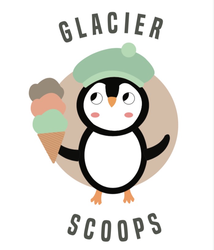
The product I created was an ice cream logo and label for cookies and cream ice cream. More specifically, I created the logo and label for quarts of ice cream found in grocery stores. On my logo/label I have a penguin holding an ice cream cone as the main subject. My market is essentially anyone who likes ice cream, but the design I created tailors more towards younger kids.
If I were to make a magazine article I would use pathos because it has been most effective with selling other ice cream products. The persuasive techniques I would use would be claim and positive transfer because I feel they would work well with my use of pathos.
To create my logo/label I went with the idea of using an animal as my main subject, which was important because initially I didn’t have a clear idea for what my logo should be. After creating my penguin, I then added smaller details such as the hat and the cone. After finalizing the basis of my penguin, I used the gradient tool to add slight shadows. As far as the background I added subtle elements using colors from my color scheme. I used a light blue, but left some white space to create a “cold” feeling. In addition, I added a beige circle with some gradient to emphasize my penguin. Lastly, I used the text wrap tool to write my product name. I had the product name wrap around my penguin which helped the whole label look unified.
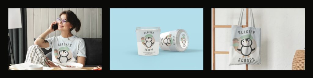
Product Triptych
To wrap up this production, we created a triptych to show how our label would look on multiple products.
Movie Poster
For the last production of this unit, we were prompted to create an original poster. This involved creating an original storyline for a movie that we’d eventually make a poster for. The genre I chose was cyberpunk, and my setting was in a futuristic city. We created these posters in Adobe Illustrator using a combination of stock images and our own illustrations.
Reflection
During this unit, I valued being able to implement the skills that I have learned in the last couple years in productions that I would see more in the real world. With different types of productions come new obstacles that I haven’t faced before, but as I’ve said in the past, these challenges have only made me value productions that much more.