This website is a project that was assigned to us during the Conceptual Unit. The website contains works from all classes at Freestyle Academy. It is our digital portfolio that showcases everything we have learned. In our Design class, we had two different assignments, the Transport Photo and Conceptual Photo, which are both displayed in the Art Section. In our English Class, we wrote many different poems. If you visit the Haiku and Poem sections, you can see the Video Haiku, Ekphrastic Poem, and Free Verse poem. In our Digital Media class, using Adobe Dreamweaver, we made the Conceptual website. We also made videos with Premiere Pro and used Pro Tools to make music for it. It was very cool to make my own website displaying other things that I made.
Poems
In our first unit of English, we were assigned a concept statement in which we were to use as the prompt for many things that we made at freestyle. We used it to make many poems. In digital media, we added visuals to them. For my spoken word poem, I added text that would fly across the screen at important points. For my free verse poem, I recorded myself with music in the background and chose meaningful pictures to go along with it.
Ekphrastic Poem
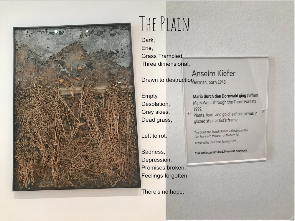
An Ekphrastic Poem is a vivid description of a scene or, more commonly, a work of art. For this assignment, we went on a field trip to the SF MOMA (San Francisco Museum of Modern Art). We had to pick out an art piece that stood out to us and write a poem about it.
Ekphrastic Poem Art Insperation
Dark, Erie,
Grass Trampled, Three Dimensional,
Drawn to Destruction.
Empty, Desolation,
Grey Skies, Dead Grass,
Left to rot.
Sadness, Depression,
Promises Broken, Feelings Forgotten,
There’s no Hope.
Free Verse Poem
For our free verse poem, we had to make a video containing visuals and a song that went with our poem.
Spoken Word Poem
After watching videos of others with great spoken word poems, we were challenged in English to write our own. In Digital Media, we created a video using Premiere pro with moving text.
Haiku
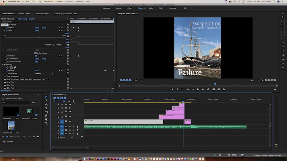
My haiku was based off of the Concept statement I mentioned above. We wrote and revised it in English, then made a Ken Burns type video, while we read it, in Digital Media. It was very fun learning how to use premiere pro for the first time.
This is a screenshot of my haiku video production in Premiere Pro.
Art
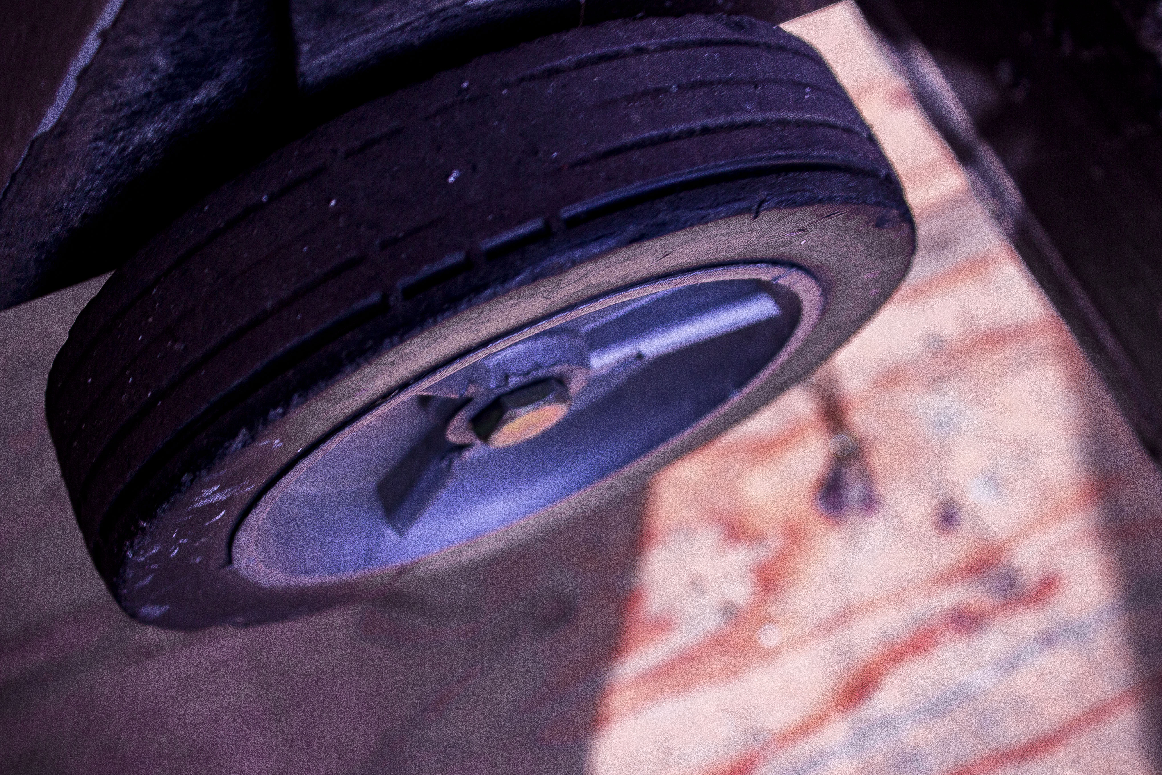
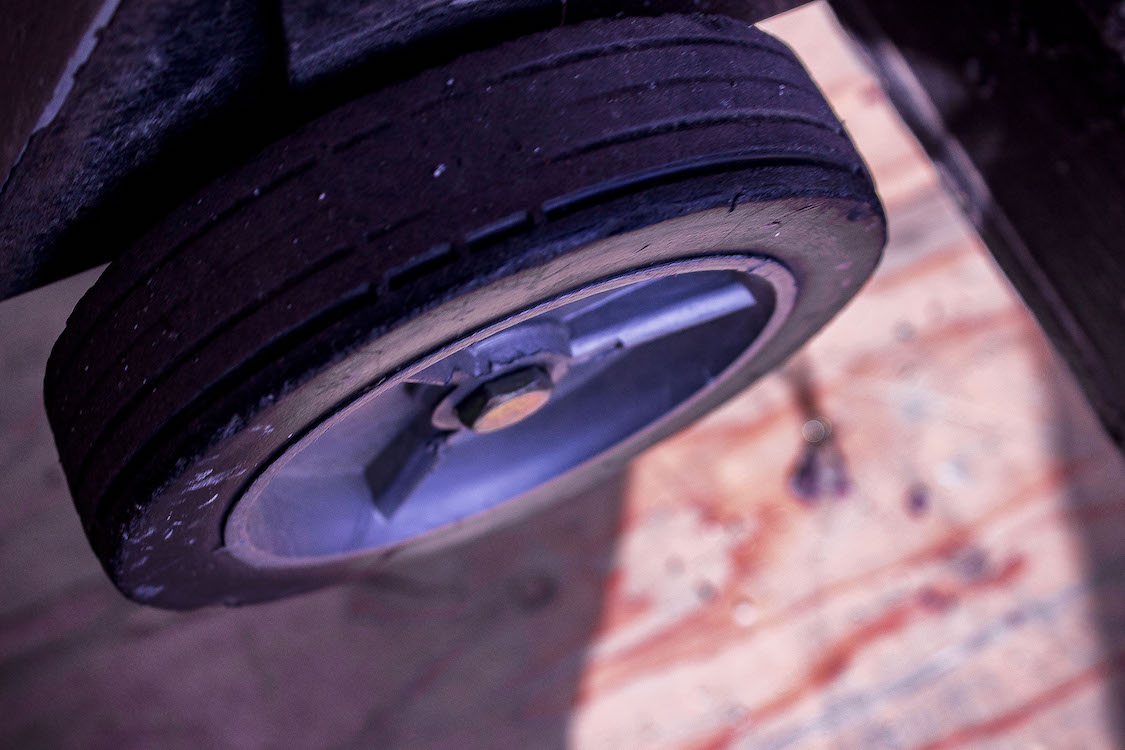
In our Design class, we had two main projects. The transport photo and the conceptual photo. The requirements for the Transport photo were to take picture of wheels that are used to transport someone or something. We then put the picture into Photoshop and learned how to edit it. The Conceptual Photo was based on my concept statement that was given to me in the beginning of the year. After discussing our plans with the class, we had to go out and take creative and unique photo.
Transportataion Devestation
Photo of my Wheel
My photo was a wheel of a cart used to transport instruments for band. I took at the angle because I really liked the wood floor that it was on and I thought it would be a good contrast against the dark tire. I also really liked the lighting because while it was partly inside, the door let the stream of light in that made the colors pop. The wheel caught my attention when leaving school one day and I went to go look closer at them. I felt a connection with it more than any other wheels I had found before. I’m not a big biker and I don’t use a wheelchair. It reminded me of being in middle school when I was in band. I had quit band when I went to highschool and taking a picture of it for a class that had replaced it felt pretty cool. Like it had come full circle.
Wow. Photoshop is amazing. I never knew how much you could do with it. All i thought you could do was do basic cuts and color changes. Plus it’s pretty simple once you can memorize keyboard shortcuts. Learning how to edit in camera raw was a big help as I did a lot of editing in it. For this photo, I tried messing around with color a lot. It was a dull grey when I started and pretty boring. I toned down the highlights and white so you could see the red and other colors of the wood floor while lightening the shadows to show the colors in the wheel. I did my best to sharpen the image to show most of the detail on the wheel because I thought that that was an important part of the project. The bumps, scratches and paint splotches give the wheel life and a story. It's what made me feel more connected to the wheel.
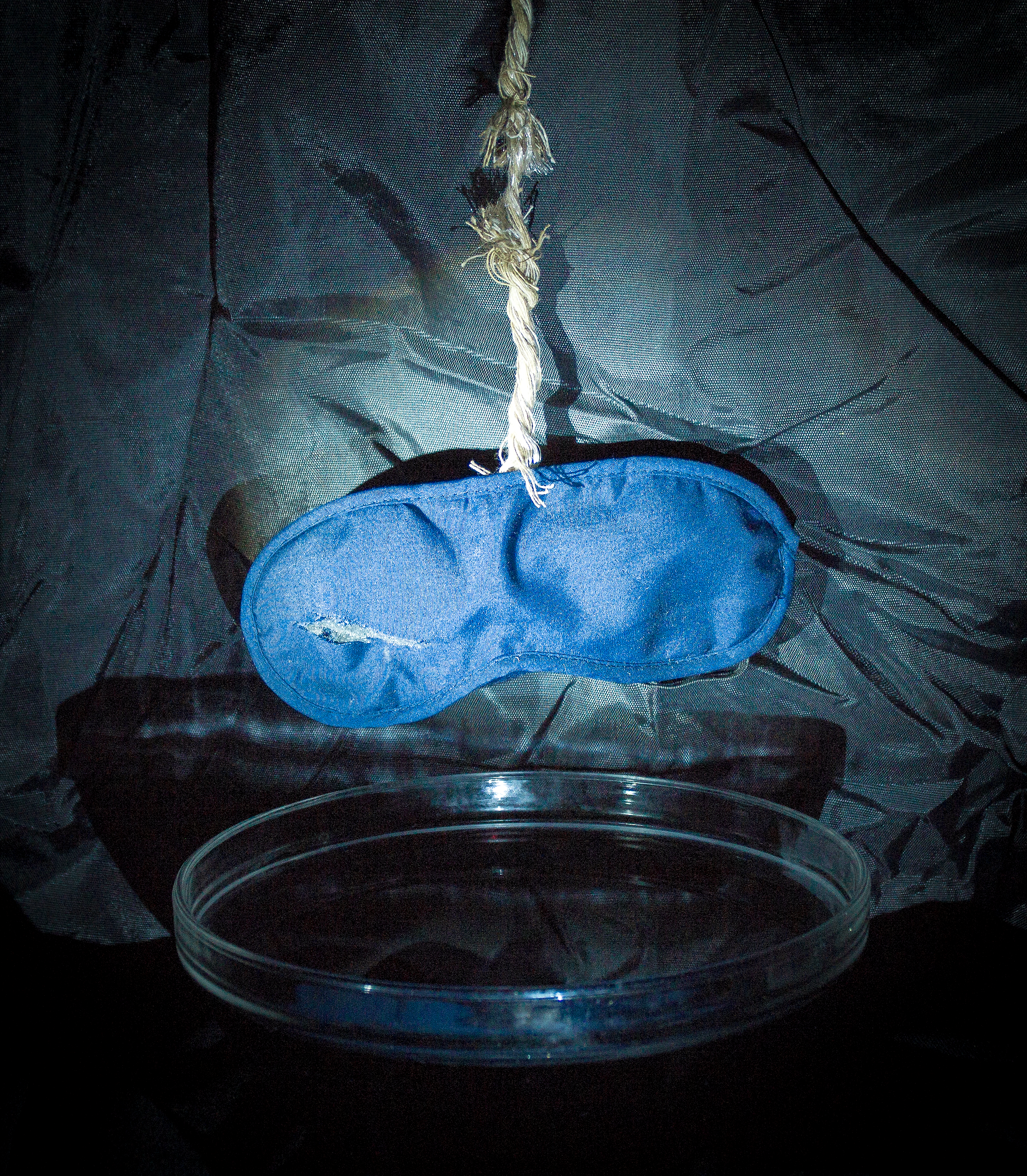
Conceptual Art Diptych
My Conceptual Photo
I am exploring the feeling of annoyance through the experience of taking a risk.
To represent my concept statement, I took a frayed rope that was hanging a torn sleeping mask over black water. The rope was frayed in a way that showed a single strand that was holding it together. The rope was keeping the mask from falling in the water, but the rope is close to breaking and the mask is in danger of falling in the black water. I used a black background with led flashlights because the light is white and it gave the objects a sort of spotlight look that I was trying to achieve. When I first thought about how to represent taking a risk, I thought of the risk in putting your trust in someone else. That is what the sleeping mask and rope represent. Trust is blind and when you put your trust in someone, it can be very easily broken. The rope is very close to breaking and dropping the sleeping mask into the black water. The black water is meant to represent the lies, heartbreak, sadness, betrayal and other feeling that you feel when trust is broken. The sleeping mask is ripped on one of the eyes to show annoyance. It is still somewhat usable but it lets a small amount of light in.
For this project, I did most of the editing in camera raw. The picture was dark so I tried to raise the exposure and lights and lowering shadows. I couldn’t really get the balance right until it was suggested that I try using the auto setting. It made the picture much brighter but also added a lot of noise. Although annoying at first, I ended up keeping it that way because I liked what it did to the photo. It wasn’t what I expected but it turned out to be okay. I also changed the color of the mask to a more bright blue. I thought that the original color of the sleeping mask, dark blue, was to close to the background black and didn’t stand out like I intended for it to. To me a brighter color represented a more innocent, naive representation of trust that was soon to be spoiled in the black liquid.
Music
For our first project with Pro Tools, we were told to make experimental music. We were able to make whatever we want and explore Pro Tools to its fullest.