maya batra
freestyle academy graduate with a focus in design
years of study: 2022-2024
This page showcases a collection of my most rewarding works completed at Freestyle Academy, all of which have increased my proficiency in working with industry-level programs while broadening my holistic skillset. Reflecting on this collection, I feel proud of the way in which I conquered the learning curves of these projects, but would graciously consider any and all feedback/constructive criticism that could deepen my perspective. Upon viewing my work, if a reviewer is interested in business inquiries regarding creative projects in any of the following disciplines: digital marketing, graphic design, industrial sales material production, social media management, logo/brand design, or website design, I would be more than happy to consider and kindly ask that they refer to the message below. The art pieces below appear in no particular order. THANK YOU!
TO COMMUNICATE ANY BUSINESS INQUIRIES OR REVIEWS OF MY WORK, PLEASE SEND A MESSAGE TO THE FOLLOWING EMAIL ADDRESS WITH “FREESTYLE PORTFOLIO” AS THE SUBJECT LINE:
*Alternatively, these final pieces can be viewed in more depth at various other locations of my website. Hyperlinks to each respective unit can be found below.
DOCUMENTARY • VISUAL PERSPECTIVE • REFLECTIONS • SHOWCASE (MINI PORTFOLIO) • NARRATIVE • ZENITH • EXPLORATIONS • CONCEPTUAL • HUMOR •
#1 surreal composition
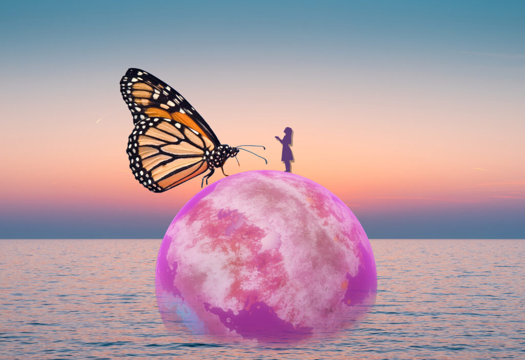
artist statement
For my surreal composition, I was inspired by the world-building idea of constructing my own ideal universe with elements from various fictional stories. I found myself coming across the idea of cotton candy clouds and a purple-pink sky in my childhood favorites, which inspired me to represent the Earth as a dark pink, candy-like ball encompassed by a light pink sunset. Sitting on top of the planet is a girl with big dreams, intended to represent myself, and an unrealistically large butterfly looking down at her. I included the butterfly to symbolize hope and transformation of our world to a better place.
#2 documentary book
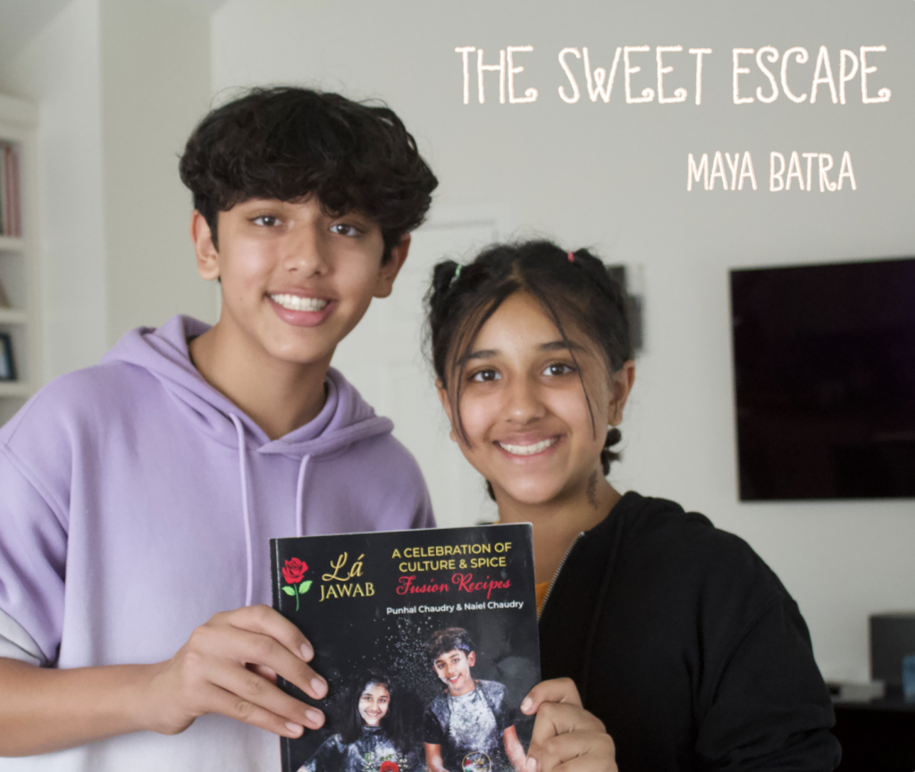
artist statement
In my documentary book, I cover a young baker and his journey to stardom, as well as family members who venture alongside him as he bakes his way from a home kitchen to Food Network’s Kids Baking Championship. This initial stages of the process consisted of coordinating and conducting interviews, researching the life of my subject, and producing a 10-page outline of my book’s text. It was only after this that I began the design aspect of the project, for which I created graphic design elements, structured the book layout, worked with backgrounds, created color schemes, and edited photos. Regarding applications used to facilitate each component, I used Adobe Illustrator for the GDE’s, backgrounds, and colors, Adobe Photoshop for the photo editing, and InDesign for the book and photo layout.
#3 mandala
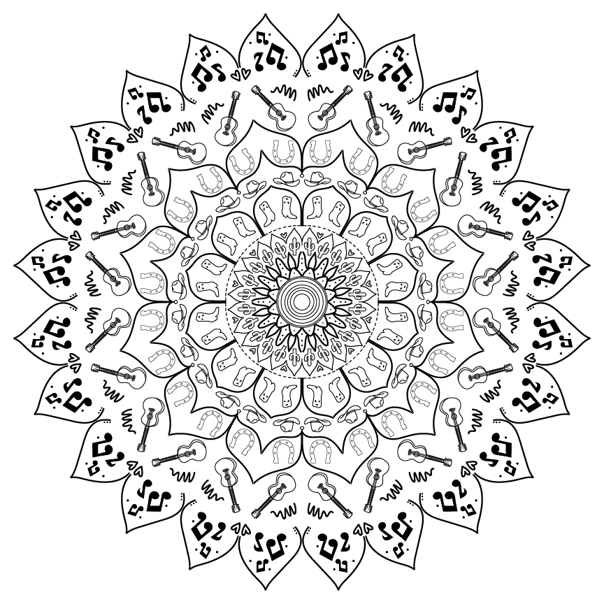
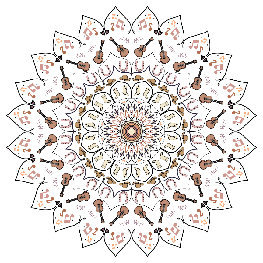
artist statement
While designing my mandala, I was greatly inspired by my love of music and a trip I took to Nashville Tennessee to explore the country music scene. I not only have several references to music, such as the group of music notes and acoustic guitars, but also several country-specific references that I drew from my visit to Music City such as cowboy hats, boots, and hooves. The objects come together in a mandala to form a sunflower shape in which the smaller parts are encompassed by larger flower petals.
#4 product logo design + advertisement
artist statement
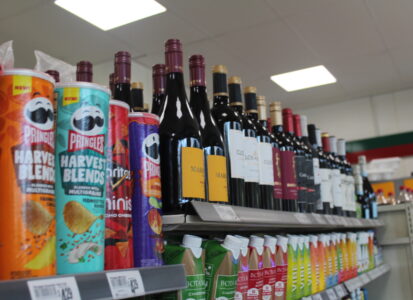
In my product logo, I advertise the Chardonnay variation of white wine, as sold by a fictitious company called Wine & Vine. I was inspired by an elegant dinner party that I attended, and took it upon myself to create a product that appeals to young adult women. To further gain ideas for my logo design, I created a moodboard to capture the elegant, vintage feel that I wanted to invoke with my wine logo. In creating my color palette, I used a variety of yellows and greens to represent the lemony hue of Chardonnay and the green grapes from which they are made.
I decided to make the central focus of my logo a large bunch of green grapes, encompassed by a yellow sun with lengthy lime green rays. I created the design using the pen tool in Adobe Illustrator, and was satisfied with its simplistic nature and effective incorporation of my initial color palette. I then added texture to the key details and drew an additional outline on the individual grapes to portray a hint of depth. My primary font was curvy and elegant, whereas my secondary font was inspired by the vintage hatch show print fonts of Nashville, Tennessee, where my Chardonnay is from. I used a grey image-traced photograph of a vineyard as the background, to further amplify the old-fashioned nature Wine & Vine.
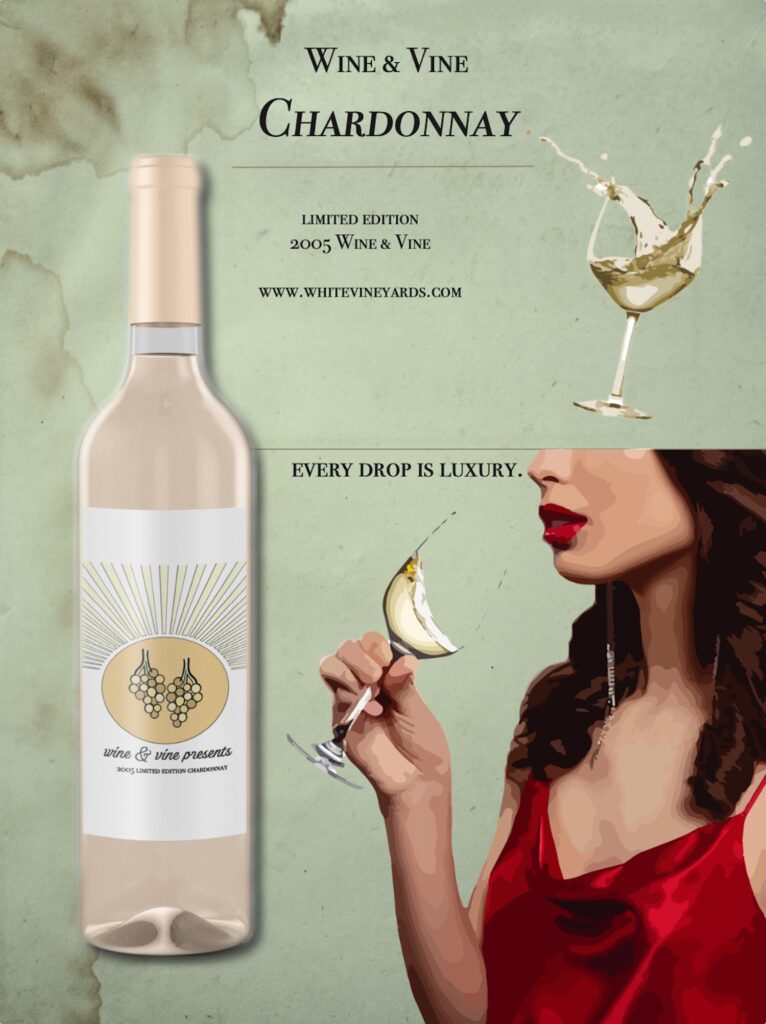
After designing my product logo for Wine & Vine, I created a magazine advertisement for the product (Chardonnay), which includes the product logo, a slogan, and other eye-catching elements that cater to my target audience. I maintained a vintage and elegant look as I incorporated an old paper texture and model wearing a bold red, atop softer shades of the greens and yellows associated with white wine. These variations in color, texture and size draw attention to the women drinking Wine & Vine Chardonnay, which ideally makes viewers want to pertain with such boldness and elegancy.
#5 book jacket
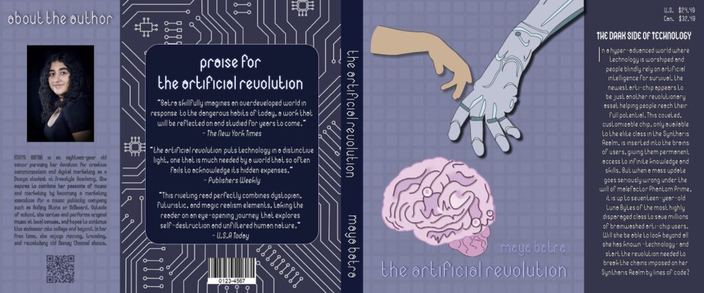
artist statement
To compliment the narrative that I brought to life in my English world building project, titled The Artificial Revolution, I designed a book jacket for a hypothetical book that follows this storyline.
“The Artificial Revolution” follows a young girl named Luna Bytes who grew up in an underdeveloped, technology-deprived neighborhood that surrounds a hyper-advanced futuristic city called Quantum Heights. However, after secretly getting her hands on a series of gadgets and devices from former elite-class residents who are lost along the borders, she begins to devise a plan to enter Quantum Heights and experience the beautiful city for herself. Not only is this mission inspired by her love for tinkering and technology, but also her hopes of making a better life for her family. However, when she finally crosses the border, Bytes realizes that this realm is not all it’s cracked up to be. Its people are slaves to technology, and the newest AI implantable devices are increasingly serving as a tool for the city’s leader and antagonist, Phantom Prime, to take over the world.
I used Adobe InDesign for the layout of my book jacket, including separators for the front, back, spine, back flap, and front flap. I designed individual elements, such as background patterns, objects, and visual effects in Adobe Illustrator and Photoshop. My final book jacket conveys the themes of space and technology, containing numerous shades of blue and grey. The tech-infused glove reaching out to the brain represents the dangerous hold technology has on users, and circuit board pattern represents the takeover of increasingly advanced computers.
#6 movie poster
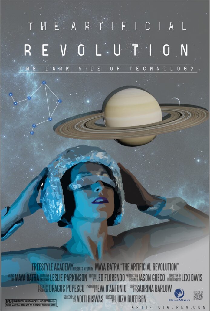
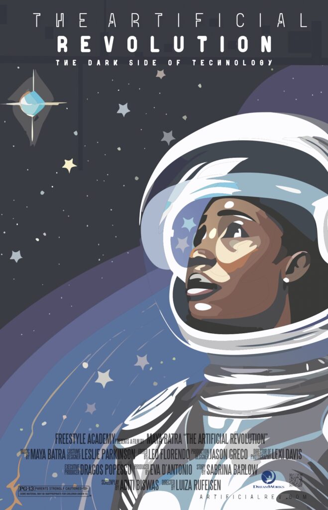
artist statement
To further develop my English world building narrative, I created a movie poster that portrays the imagined world of The Artificial Revolution and its storyline. My movie poster heavily draws from dystopian, futuristic, and science fiction influences, which are prominent in this world.
“The Artificial Revolution” follows a young girl named Luna Bytes who grew up in an underdeveloped, technology-deprived neighborhood that surrounds a hyper-advanced futuristic city called Quantum Heights. However, after secretly getting her hands on a series of gadgets and devices from former elite-class residents who are lost along the borders, she begins to devise a plan to enter Quantum Heights and experience the beautiful city for herself. Not only is this mission inspired by her love for tinkering and technology, but also her hopes of building a better life for her family. However, when she finally crosses the border, Bytes realizes that this realm is not all it’s cracked up to be. Its people are slaves to technology, and the newest AI implantable devices are increasingly serving as a tool for the city’s leader and antagonist, Phantom Prime, to take over the world.
In order to visually maintain the central themes of the story as I crafted my movie poster, which include technology, space, and dystopia, I used Adobe Illustrator and Photoshop to create an image in which young dreamer Luna Bytes has her gaze fixed on the futuristic, artificially-intelligent world that she longs to be a part of. However, as represented by the shield guarding her eyes, she is blindsided by the dark side of innovation which slowly begins to reveal itself. I used a technology inspired font called Ultra for the title and tagline of my movie poster, and a neon blue and white color scheme inspired by the tech noir film Tron. In Adobe Photoshop, I created a smoke-like gradient to represent my protagonist’s emergence into the otherworldly city of Quantum Heights, as well as the outline for the woman herself. I amplified my color scheme through the use of fidelity-lowering tools which incorporated additional tints, tones, and shades of blue, white, and grey into my piece. I applied drop shadows and used the selection tool in Adobe Photoshop to create the 3D planet, as well as the constellation, further enhancing the space background.
*Following the completion of my custom movie poster, I experimented with Adobe Photoshop’s new AI tool in order to recreate my design as an illustration. I then made slight adjustments to my most favored result, which appears alongside my custom designed movie poster (above).
#7 stacked wooden art
artist statement
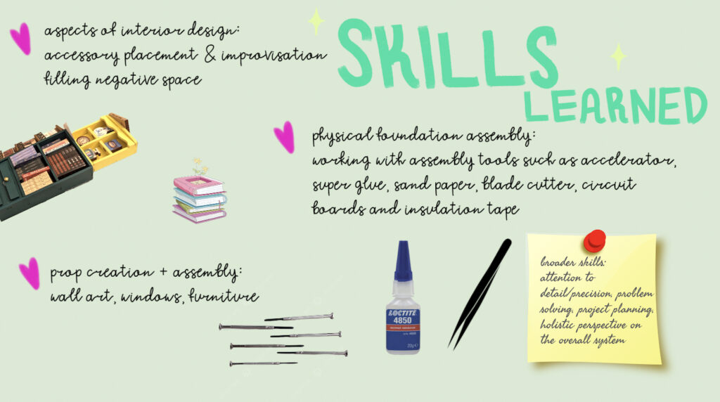
My Stacked Wooden Art Project was inspired by the idea of an “artificial intelligence takeover” in a technology-driven world. It is also intended to symbolize the dangers of blindly submitting to technology, the primary theme of my world-building project. For instance, the gears positioned at the top of the head represent how misuse of technology increasingly pushes us towards becoming emotionless robots who lack originality and creativity, as we fall into a mindless pattern of relying on technology for aid and blindly believing what the internet tells us. The computer chip labeled ‘AI’ at the bottom of the face not only represents a mind + life fueled by technology but also a primary aspect of the world that I built, in which wearable technologies, such as microchip implants, are the newest trend. The story that takes place within my world is called “The Artificial Revolution”, and follows a young girl who sets out to rescue her city from the dark side of technology. The illustration stage of my 3D stacked wood art project challenged my knowledge regarding layers in Adobe Illustrator, an experience that brought me to work with them more comfortably and creatively. In producing various media to showcase my art, I was introduced to 3D space in film-based special effects program Adobe After Effects. This gave me a deeper understanding of the program and allowed me to bring my art to life in a brand new way. Overall, this project allowed me to express my creativity and compliment my world-building project in a unique manner, all while equipping me with skills that I will continue to use at Freestyle and beyond.