intro

The Explorations Project is the last project of my junior year at Freestyle. Our prompt was to explore a subject we are particularly interested in, or felt we didn't get to do enough of this year.

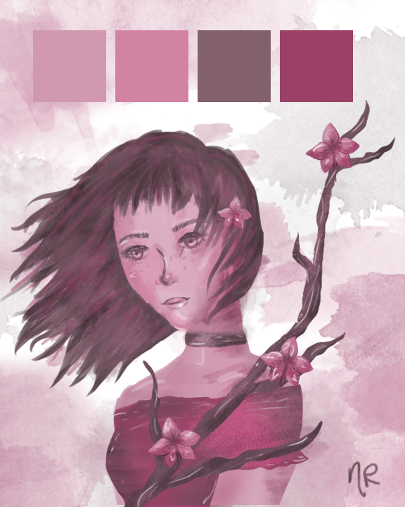
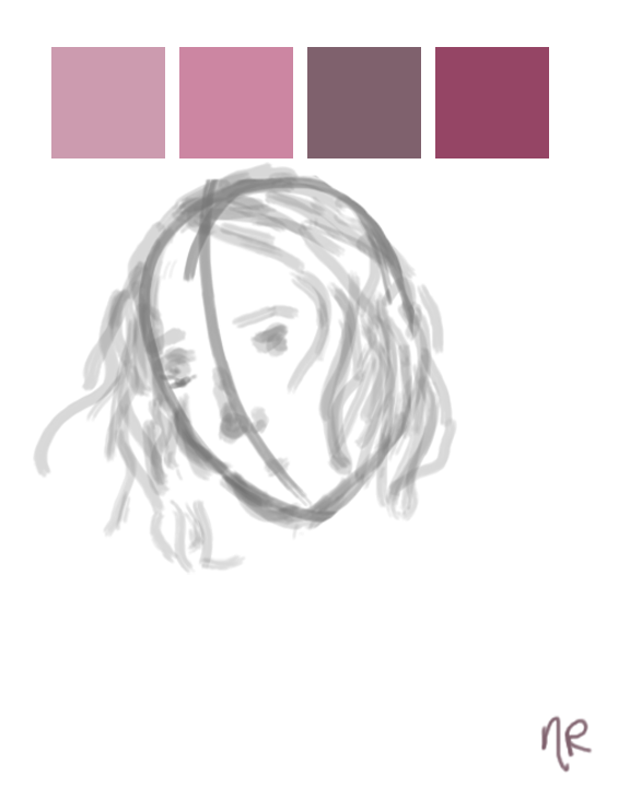
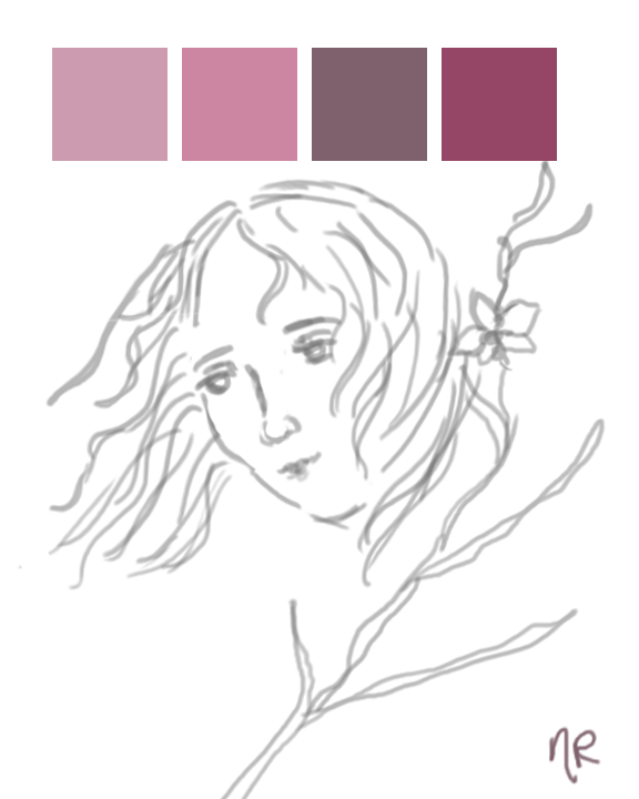
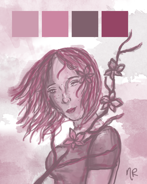
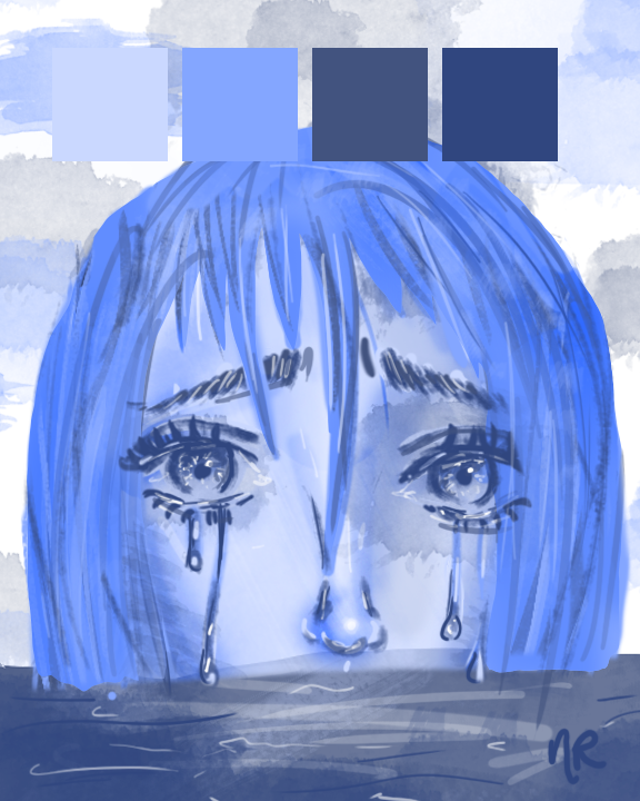
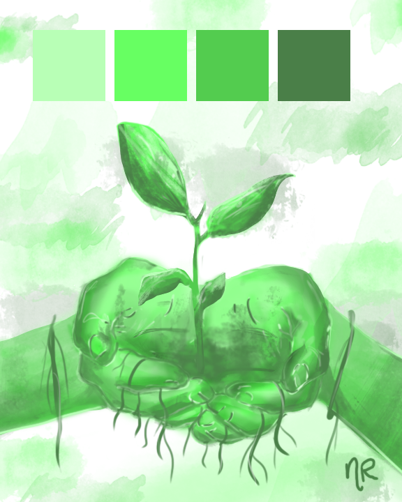
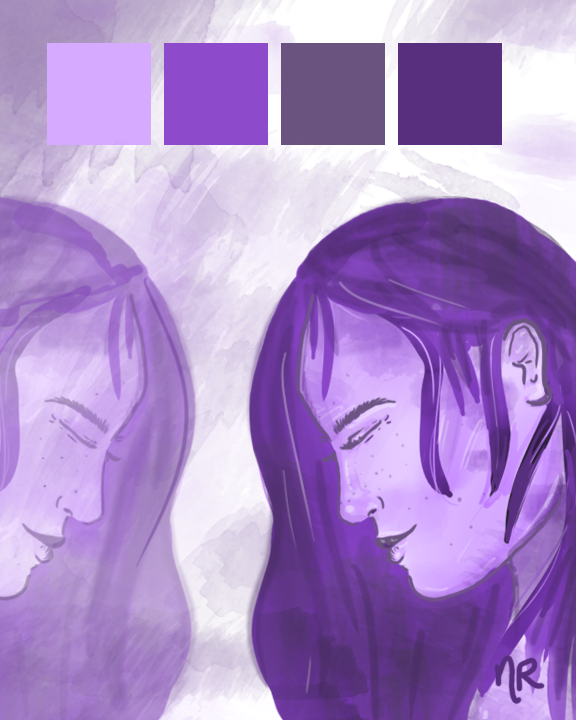
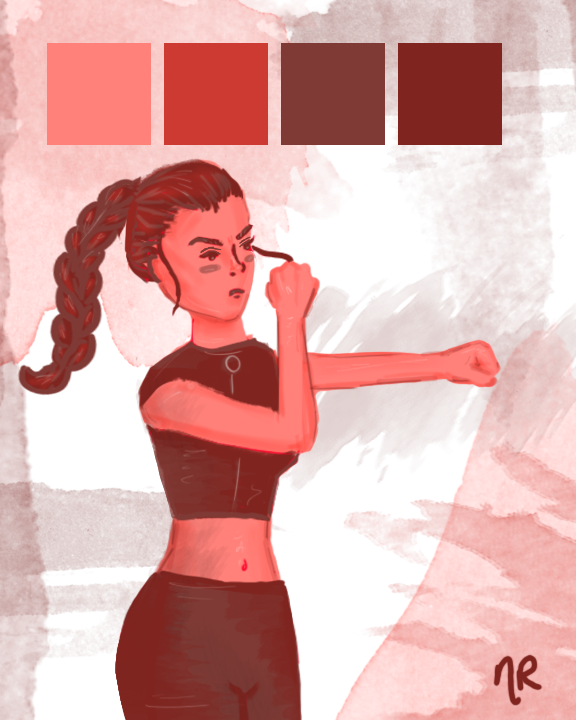
I have always been interested in Digital Art, specifically drawing in Photoshop, which isn't something we've done this year at Freestyle. I wanted to create several pieces with a unifying theme, and decided on the theme of color.

I made a plan: I would create 5 seperate pieces, each with a different color scheme that I had to work from. Each piece would convey a unique mood.

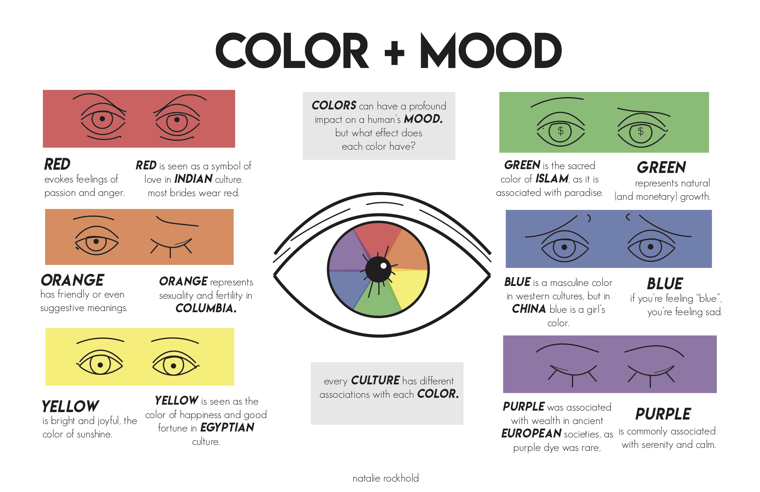
For our Design class, we also had to create an infographic that expained a research aspect of our topic, to show what we learned. Click on the image below for a full size version.

pink

With the pink piece, I wanted to convey the feeling of serenity, and also incorporate a quince or cherry blossom plant into the picture. The style of the branch reminds me of Asian art, which I love.

While creating this piece, I found some watercolor brushes for Photoshop online. I really liked the texture they brought to my art, and ended up keeping them as a running theme throughout these 5 pieces.

Click on the image to the left to show a larger version of the piece.

Here are some screenshots of my progress, through rough sketching to a first draft.

blue

With the blue piece, I wanted to convey the mood of sadness and loneliness while also maintaining the watercolor and color scheme motifs that I began with the pink piece.

Click on the image to the left to show a larger version of the piece.

I originally started with a different concept for this art, but decided to go with half of the girl's face being submerged. You can watch a sped up video of me creating this piece in Photoshop below.

green

The green piece was all about nature.

I had done faces for the last two pieces and wanted to do something with hands, because they are more of a challenge for me to draw.

Click on the image to the left to show a larger version of the piece.

purple

The purple piece was meant to show self reflection.

I enjoyed creating an expression of peace on the woman's face, as she comes to terms with herself.

Click on the image to the left to show a larger version of the piece.

red

The red piece shows a female fighter, with anger and passion.

This is actually my least favorite piece, because I feel that it doesnt match the style of all my other pieces. All the others had several drafts, but this piece only got one.

Click on the image to the left to show a larger version of the piece.

reflection

This project was really fun for me to complete, and the freedom that Freestyle gave us on our schedule and checkpoints meant that we had to manage our own time. This was a little daunting at first but I stayed ahead of deadlines over the weeks we were given.

Showing my art to people has always been a little scary for me, and I was always frustrated that I didn't have a distinct style. Throughout the course of this project, however, I gained a lot of confidence in myself and my art, with the help of my peers. Everyone in my classes was super supportive and offered constructive criticism on how I could make my pieces better.

Every piece made for this project was created using only a Wacom tablet, whether a Cintiq or a classic Wacom.

I'm super proud that this is the last thing that I will make my junior year, and excited for what senior year will bring.Thank you to all my teachers and classmates at Freestyle for making this year amazing.