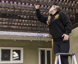
Me hanging up some lights
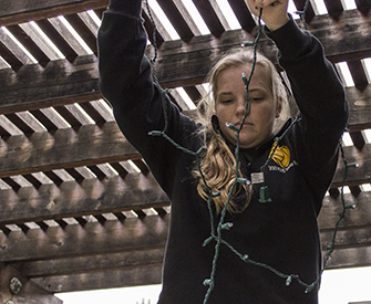
I am straightening out the lights
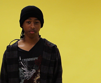
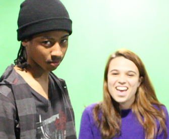
Kiyoshi during a break
Us just having fun
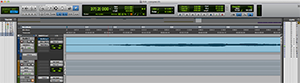
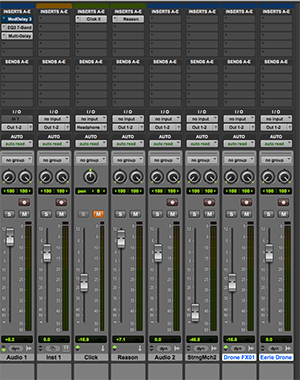
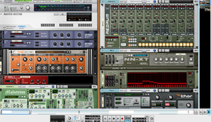
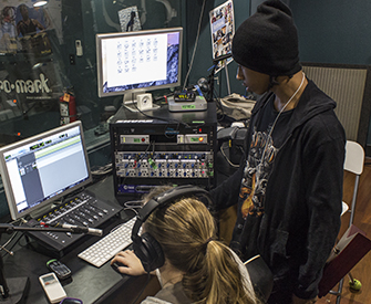
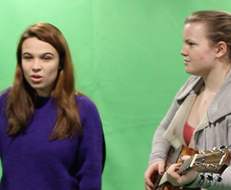
Us recording the guitar loop in the studio
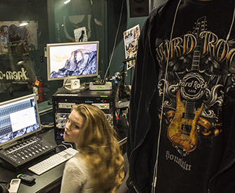
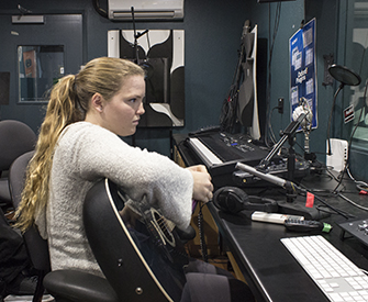
Kiyoshi setting up the recording mic
Kiyoshi working hard
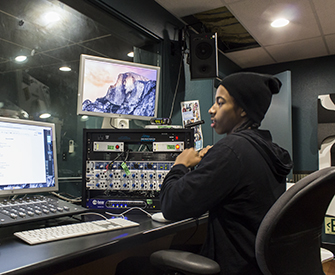
Me recording the guitar loop
Deep Focus
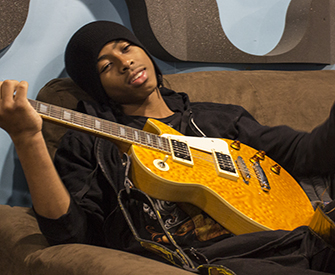
Kiyoshi messing around
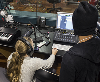
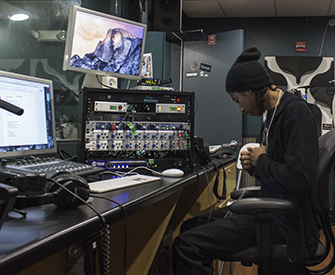
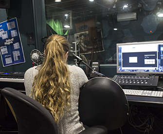
Us editing the loop
more editing
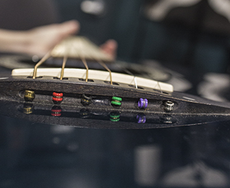
My guitar
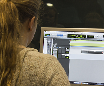
more editing
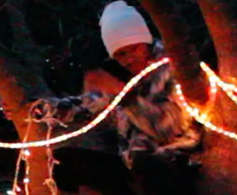
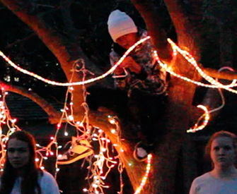
Kiyoshi hiding in a tree
Kiyoshi during a take
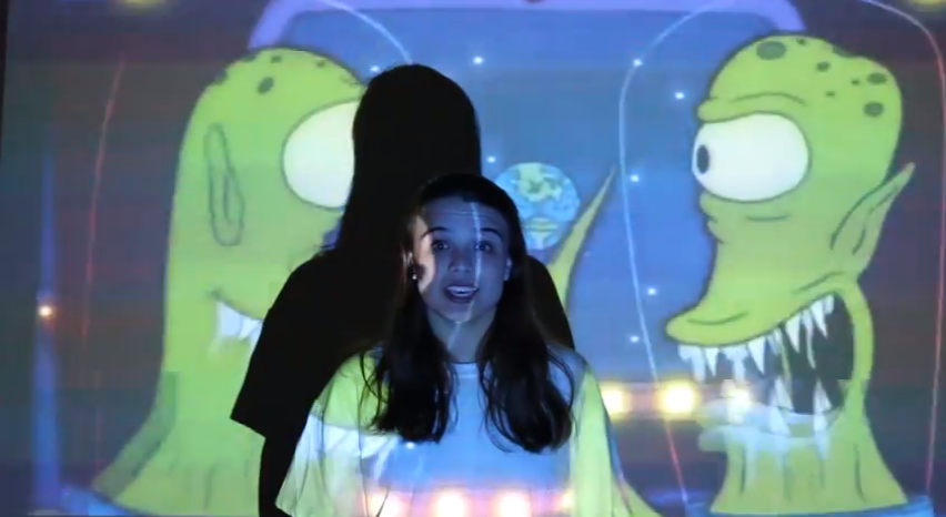
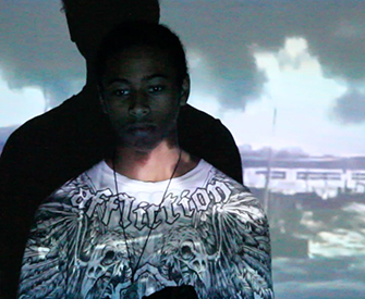
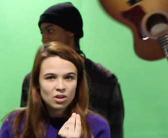
Some green screen stuff
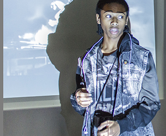
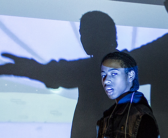
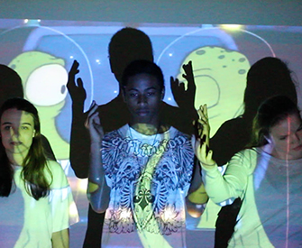
Casey, Kiyoshi and I during a take
Another take
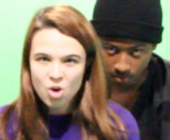
Kiyoshi being a creeper
Casey rocking it, me being wierd in the background
Kiyoshi being knocked out
Well thats not creepy at all
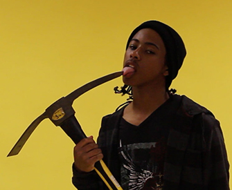
Kiyoshi about to need a tetnus shot


 1
1 2
2 3
3 4
4 5
5 6
6 7
7 8
8 9
9 10
10 11
11 12
12 13
13 14
14 15
15 16
16 17
17 18
18 19
19 20
20 21
21 22
22 23
23 24
24
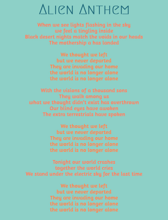
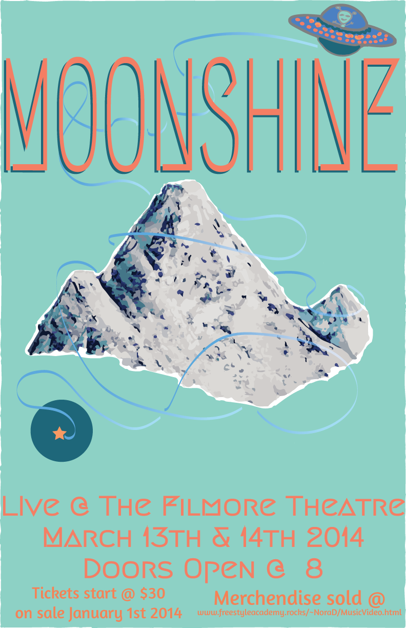 Our group decided to follow the theme of aliens and space, so we named our band Moonshine, and our son Alien Anthem. I wanted to do something that would contrast with the sound of our song, so I choose my favorite color scheme blue and orange. I picked multiple shades and tones of blue and orange, which gave it some visual interest. For my image I choose a mountain, and I did a image trace in Illustrator with 16 colors, the effect made it more abstract. I used a effect on the UFO’s trail, which gives it a glow effect, I learned this during our practice poster. I choose the fonts, based on the shades of my colors and the theme of aliens, so I picked one that was more geometric, a cursive one, and a san-serif regular font that had some curves to match the cursive. I really enjoyed creating this because I did something a little different from the rest of my group, but it still had some unity with theirs.
I really love using Illustrator because it has its challenges, but it is just so much fun to use. I really loved discovering the different techniques from the practice design that we did and applying them to my poster and shirt designs. When I started using Illustrator I really struggled, but now I really have come to love it, and learning to use it with photoshop to create images that appear as drawings, paintings, and other things.
T-Shirt:
Our group decided to follow the theme of aliens and space, so we named our band Moonshine, and our son Alien Anthem. I wanted to do something that would contrast with the sound of our song, so I choose my favorite color scheme blue and orange. I picked multiple shades and tones of blue and orange, which gave it some visual interest. For my image I choose a mountain, and I did a image trace in Illustrator with 16 colors, the effect made it more abstract. I used a effect on the UFO’s trail, which gives it a glow effect, I learned this during our practice poster. I choose the fonts, based on the shades of my colors and the theme of aliens, so I picked one that was more geometric, a cursive one, and a san-serif regular font that had some curves to match the cursive. I really enjoyed creating this because I did something a little different from the rest of my group, but it still had some unity with theirs.
I really love using Illustrator because it has its challenges, but it is just so much fun to use. I really loved discovering the different techniques from the practice design that we did and applying them to my poster and shirt designs. When I started using Illustrator I really struggled, but now I really have come to love it, and learning to use it with photoshop to create images that appear as drawings, paintings, and other things.
T-Shirt: 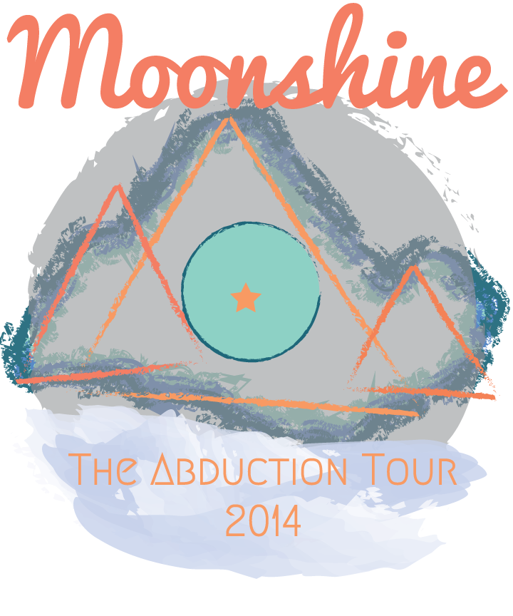 For my t-shirt design I really liked the mountain that I had created for my poster, I couldn’t incorporate it because the designs are supposed to be different but look like they belong together. To still keep the mountain, I traced the mountain with the three shades of blue and added a charcoal stroke, to make it more abstract. To make it more different I drew 3 triangles and added my three different shades of orange and made them fit on the mountain, and by using an organic stroke with some geometric patterns gave the image an ominous vibe. The font that I used for the band name was the cursive one, and I made it a more red orange to show contrast on the moon that was overlaid on the trace of the mountain. I took the planet in the middle to represent a world in another, which sits atop a cloud like shape that holds a geometric text with the tour name.
This was a bit of a challenge to achieve, mostly because I wanted to use a lot of the same elements and images in the shirt design that I did for the poster, but I couldn’t because of the rubric. It actually worked in my favor though because I had a really great time re-working my design, and I really like how it came out.
For my t-shirt design I really liked the mountain that I had created for my poster, I couldn’t incorporate it because the designs are supposed to be different but look like they belong together. To still keep the mountain, I traced the mountain with the three shades of blue and added a charcoal stroke, to make it more abstract. To make it more different I drew 3 triangles and added my three different shades of orange and made them fit on the mountain, and by using an organic stroke with some geometric patterns gave the image an ominous vibe. The font that I used for the band name was the cursive one, and I made it a more red orange to show contrast on the moon that was overlaid on the trace of the mountain. I took the planet in the middle to represent a world in another, which sits atop a cloud like shape that holds a geometric text with the tour name.
This was a bit of a challenge to achieve, mostly because I wanted to use a lot of the same elements and images in the shirt design that I did for the poster, but I couldn’t because of the rubric. It actually worked in my favor though because I had a really great time re-working my design, and I really like how it came out.