
.
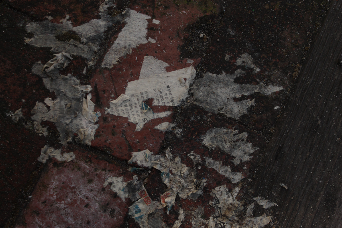
Original picture: White Balance: Shade, ISO: 400, Shutter Speed 1/512, Aperture: 5
(Please refresh your screen if the picture above is not present. It takes a while to load)
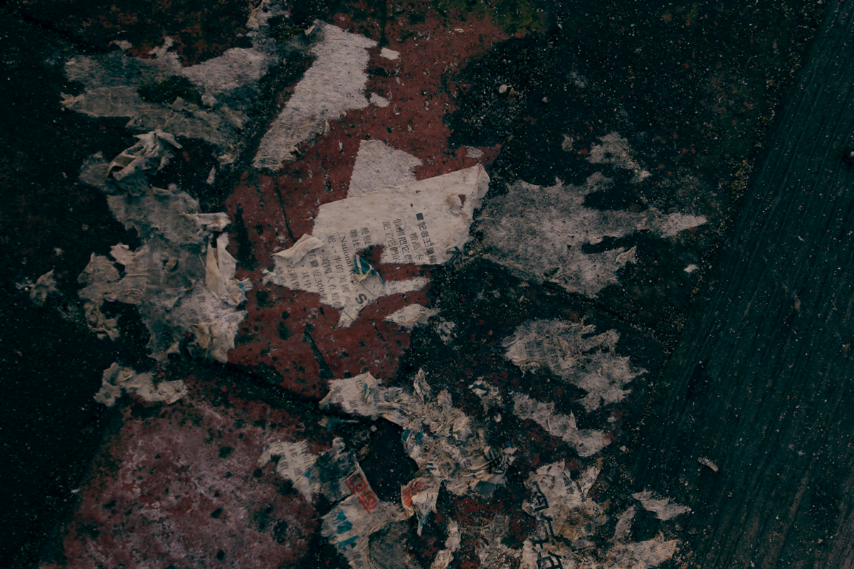
Color grading was not a term I knew was used outside of film, so when we were instructed to make a “cinematic” image with color theory in photography, I was a little bit confused. A quick Google Search and a video tutorial set me on the correct path right away, though, as I learned with the video on the left that you can use a Levels adjustment layer for more than controlling the black and whites of a picture (shockening), and seperate the effect to control an image’s Red, Blue, and Green channels individually (even more shockening), and then play around with those to get really cool color combinations (crazy)?! I took a picture that I had really liked but didn’t know what to do with and decided to use it to try out this new technique. It’s just a newspaper that I found destroyed by humidity, rain, and little kids’ shoes in a park. But I thought it had a lot of personality, and I really liked how the white of it contrasted with the red of the bricks, so I decided to photograph it. I used the newfound technique in photoshop to push the red in the midtones (to really emphasize that stripe of red) and simultaneously bring out the blues and greens in the shadows. I really like how the dust on the blue wood is so rough it almost looks like stars or galaxies. (I’ve displayed each photo separately so you can take them in properly)