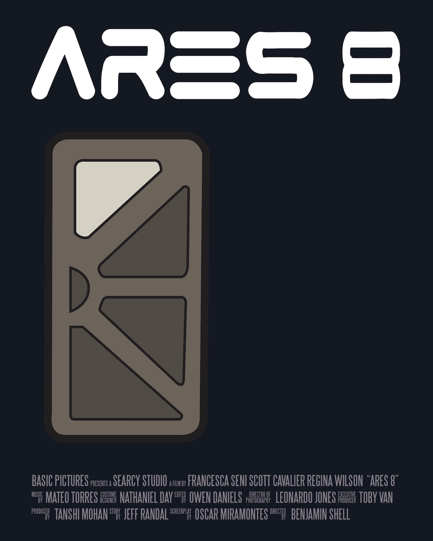
The year is 2047. Our story follows a retired astronaut who gets called back into action when the International Lunar Station sends out a precarious distress signal. Our hero puts together a crew to mount a mission, entitled Ares 8, launched to investigate the distress signal. Upon arrival, the crew discovers that the station was attacked by extraterrestrials. The story follows our hero and his crew through the perilous station, seeking to put an end the Martian foes.
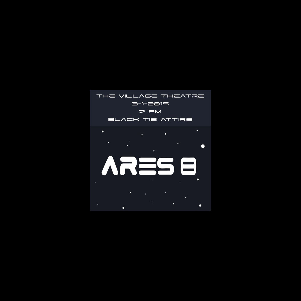
To create a minimalist poster, ticket, and package, I had to think hard about the theme and message I wanted to portray. For example, to give off an eerie, space theme, I choose a dark blue/purple color as my main color. Keeping the mission in mind, I created a title font that was similar to the old NASA font, with my twist on it. For my packaging and ticket, I continued the dark space coloring with little accent dots to create a star array. A key part of a minimalist design is that the main “object” or centerpiece has to have enough detail for the viewer to understand the movie’s plot while also not being too complex or obvious. For this, I looked to an intense scene in my film. In the scene, our hero is walking down a corridor in the station towards a door with blood lining the corridor and extraterrestrials can be heard on the other side. To capture that scene, I designed a space station door and paired it by itself on the poster to emphasize the intensity of the scene.
The hardest part of this production for me was creating the font. To create my font, I took inspiration for NASA’s old font and drew into on the poster in my own manner. Unfortunately, this was easier said than done. I took great time and pain to try and get the lines and curves as systematically smooth as they were for NASA. In the end, I am very pleased with how the font and poster turned out.
Related website