Warning: simplexml_load_file(): I/O warning : failed to load external entity "XMLs/19206l2.xml" in /volume1/web/artm-package.php on line 18
Call Stack:
0.0001 362000 1. {main}() /volume1/web/artm-package.php:0
0.0008 363376 2. simplexml_load_file($filename = 'XMLs/19206l2.xml') /volume1/web/artm-package.php:18
Honey Jar Label Mockup Triptych: A Senior Product Label by Astrid Huang
Freestyle Academy proudly presents
Honey Jar Label Mockup Triptych: A Senior Product Label by Astrid Huang (2020)
Warning: Undefined variable $type in /volume1/web/artm-package.php on line 56
Call Stack:
0.0001 362000 1. {main}() /volume1/web/artm-package.php:0
Warning: Attempt to read property "art" on bool in /volume1/web/artm-package.php on line 61
Call Stack:
0.0001 362000 1. {main}() /volume1/web/artm-package.php:0
Warning: Trying to access array offset on value of type null in /volume1/web/artm-package.php on line 61
Call Stack:
0.0001 362000 1. {main}() /volume1/web/artm-package.php:0
Warning: Attempt to read property "userName" on null in /volume1/web/artm-package.php on line 61
Call Stack:
0.0001 362000 1. {main}() /volume1/web/artm-package.php:0
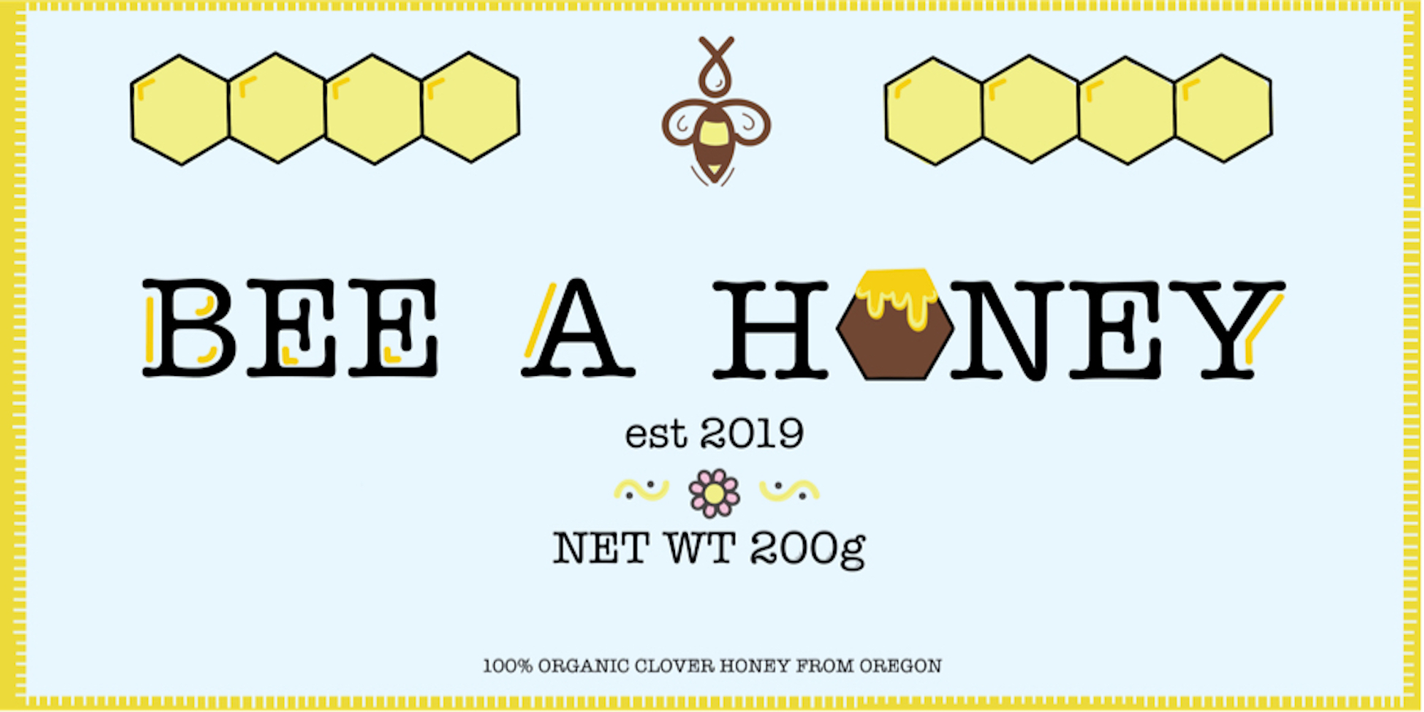
I decided to make a honey jar label for my label project. I wanted to design a cute label that would fit on a small jar. I started with the name of the honey company. I want my name to spread positivity and chose the name “Bee a Honey”. I kept a minimalist design with my label and took inspiration for my design from honeycombs. For color scheme, I wanted to keep the traditional yellow and orange of a honeycomb and incorporated a blue to represent the sky and contrast the yellow and orange.
I started with doodles that were related to honey. Once I figured out which doodles I liked, I started sample sketches of the label. I then took my design and drew it in Adobe Illustrator. A major issue that I faced with colors. Though I had determined a color scheme early on, I wanted pastel colors so that the label is bright and easy to see on the shelves. I used too many bright colors though so there was no emphasis on anything so I switched the background to be darker so there is emphasis on the label itself. After seeing the printed label, I should have made the background even darker because the background printed almost white.
I have always had an interest in marketing so this project was really exciting. I learned over the years from successful companies like Apple and Microsoft that more simple design has become a trend. Because my honey jars are small in their markup, I wanted my other merchandise to not take the whole picture either. After playing with options, I decided on a mug and a tote bag that was on plain colored background to keep the minimalist design. The mug and tote bag’s mockups kept a similar color scheme to the honey jars’ label so that the three pictures balanced each other well. Related website