Warning: simplexml_load_file(): I/O warning : failed to load external entity "XMLs/19206l2.xml" in /volume1/web/artm-package.php on line 18
Call Stack:
0.0001 361992 1. {main}() /volume1/web/artm-package.php:0
0.0007 363368 2. simplexml_load_file($filename = 'XMLs/19206l2.xml') /volume1/web/artm-package.php:18
Beer Bottle Label Mockups: A Senior Product Label by Kerby Gerughty
Freestyle Academy proudly presents
Beer Bottle Label Mockups: A Senior Product Label by Kerby Gerughty (2020)
Warning: Undefined variable $type in /volume1/web/artm-package.php on line 56
Call Stack:
0.0001 361992 1. {main}() /volume1/web/artm-package.php:0
Warning: Attempt to read property "art" on bool in /volume1/web/artm-package.php on line 61
Call Stack:
0.0001 361992 1. {main}() /volume1/web/artm-package.php:0
Warning: Trying to access array offset on value of type null in /volume1/web/artm-package.php on line 61
Call Stack:
0.0001 361992 1. {main}() /volume1/web/artm-package.php:0
Warning: Attempt to read property "userName" on null in /volume1/web/artm-package.php on line 61
Call Stack:
0.0001 361992 1. {main}() /volume1/web/artm-package.php:0
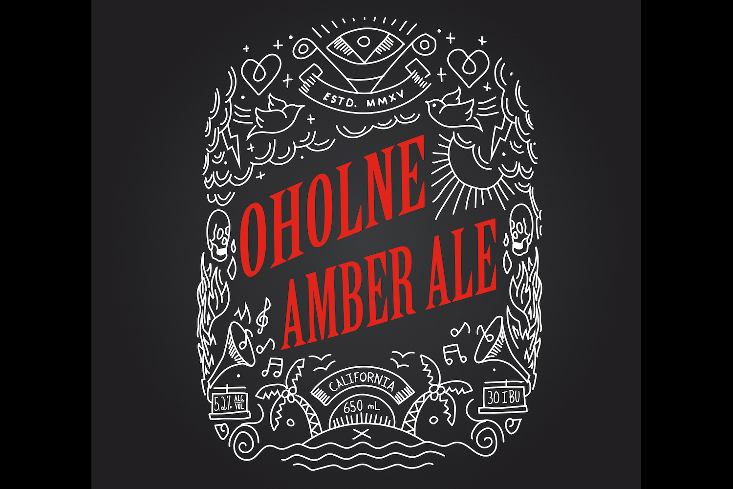
My inspiration for my label was a T-shirt from the Cal Poly Newman Center. The T-shirt had a very similar style to my label; purposely hand-drawn white doodles. I chose to do a monochromatic color scheme because I wanted it to be very simple. The choice of red was so the label would be very eye-catching if you were to see it on a shelf. The font I chose for my title was a fairly heavy serif font. Serif fonts have better readability and are associated with older design styles. The juxtaposition of the contemporary artwork and older font provided an intrigue to the design. For my sub fonts, it was my handwriting stylized to match the illustrations. I think this was the best choice because it adds more continuity to the design.
My original concept for the label was all of the information inside the silhouette of an animal. I struggled to find a way to make all of the information in the label fit and look cohesive. After many hours of trying different arrangements, I abandoned this design realizing that there were no arrangements of the type would provide a balanced design. I moved on to my current design concept. This concept made a lot more sense and I was able to make the design with a lot less frustration. I’m not content with the name of my beer so putting more time into thinking of a better name would have been beneficial. When I originally designed my concepts I started with the name and designed around it. When I restarted with my new concept I designed first without the name. I had to choose a name that somewhat related to my design because of this the name and design don’t have complete unity. I should have started with the name and designed around that.
Throughout the many revisions of this project, I learned a lot about the actual design process. I learned that not every idea turns out, sometimes you have to abandon a design and come back to the drawing board. I chose a T-shirt and hoodie for my triptych because they are very marketable products. I could have chosen a bag or cup but I felt that the clothing would market the brand better. Related website