Warning: simplexml_load_file(): I/O warning : failed to load external entity "XMLs/19206l2.xml" in /volume1/web/artm-package.php on line 18
Call Stack:
0.0001 361992 1. {main}() /volume1/web/artm-package.php:0
0.0007 363368 2. simplexml_load_file($filename = 'XMLs/19206l2.xml') /volume1/web/artm-package.php:18
Ink: A Senior Product Label by Max Mayer
Freestyle Academy proudly presents
Ink: A Senior Product Label by Max Mayer (2020)
Warning: Undefined variable $type in /volume1/web/artm-package.php on line 56
Call Stack:
0.0001 361992 1. {main}() /volume1/web/artm-package.php:0
Warning: Attempt to read property "art" on bool in /volume1/web/artm-package.php on line 61
Call Stack:
0.0001 361992 1. {main}() /volume1/web/artm-package.php:0
Warning: Trying to access array offset on value of type null in /volume1/web/artm-package.php on line 61
Call Stack:
0.0001 361992 1. {main}() /volume1/web/artm-package.php:0
Warning: Attempt to read property "userName" on null in /volume1/web/artm-package.php on line 61
Call Stack:
0.0001 361992 1. {main}() /volume1/web/artm-package.php:0
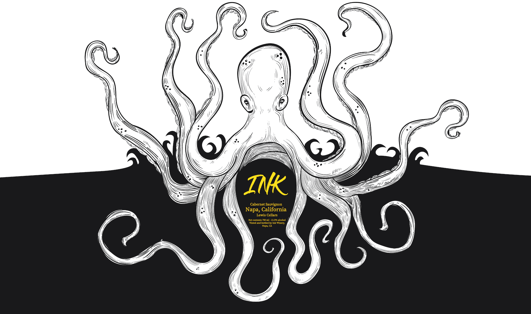
My design concept is based off an expensive wine. The wine is called “Ink.” The inspiration behind my wine comes from the dark color of cabernet sauvignon. Cabernet sauvignon’s dark purple/pink liquid reminded me of the black ink of an octopus. I researched other expensive wines, and noticed the repeated use of gold and monochromatic color schemes. The color gold obviously gives the impression of something expensive. This is why I chose a grayscale logo and bright gold text. The gold text stands out in contrast with the background.
I created a custom brush on Adobe Illustrator that is pressure sensitive and allows me to draw with varying width of stroke. After tracing my sketch. I added the black ink background and text. I then placed my logo onto a mockup of a wine bottle, t-shirt and bag. I brought my photos into Adobe Photoshop to add more features. This included the wine bottle cap. I did this by adding my tentacles and using an overlay layer. An overlay layer allows me to sample the light and shadows from the wine bottle. This is useful because it looks as if the label was wrapped around the bottle.
I learned in marketing and label creation the importance of hierarchy. In visual terms hierarchy is the first thing you notice. Hierarchy can be achieved through size or color. Hierarchy is something to be aware of, because it determines what the buyer sees first. Related website