Warning: simplexml_load_file(): I/O warning : failed to load external entity "XMLs/19206l2.xml" in /volume1/web/artm-package.php on line 18
Call Stack:
0.0001 362000 1. {main}() /volume1/web/artm-package.php:0
0.0007 363376 2. simplexml_load_file($filename = 'XMLs/19206l2.xml') /volume1/web/artm-package.php:18
Zestic: A Senior Product Label by Priyah Koren
Freestyle Academy proudly presents
Zestic: A Senior Product Label by Priyah Koren (2020)
Warning: Undefined variable $type in /volume1/web/artm-package.php on line 56
Call Stack:
0.0001 362000 1. {main}() /volume1/web/artm-package.php:0
Warning: Attempt to read property "art" on bool in /volume1/web/artm-package.php on line 61
Call Stack:
0.0001 362000 1. {main}() /volume1/web/artm-package.php:0
Warning: Trying to access array offset on value of type null in /volume1/web/artm-package.php on line 61
Call Stack:
0.0001 362000 1. {main}() /volume1/web/artm-package.php:0
Warning: Attempt to read property "userName" on null in /volume1/web/artm-package.php on line 61
Call Stack:
0.0001 362000 1. {main}() /volume1/web/artm-package.php:0
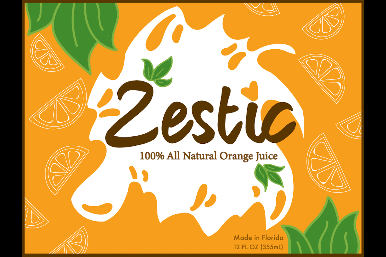
The concept behind my design was to keep the label super welcoming and juicy. The point of food label design is to get customers to buy the product, so by making the food tempting, more people will buy it. I used very organic shapes to please the eyes along with easy to read, calming text. The big orange juice companies inspired me because they have many customers for a reason. I also knew I wanted to have a cut-out and some green leaves, which would make the bottle more appealing. I choose green and orange because green is the most appetizing color for food and orange because of the product I was making. The white oranges inside the juice create a break in all the orange used.
The first step I took was that I collected photos of labels that gave me ideas. Then I took those and sketched out a rough idea of what I wanted to do. Using Adobe Illustrator, I created the different patterns adding the juice, leaves, and other contents. Illustrator was extremely helpful because of the paintbrush tool that smooths out the strokes. In the end, I added the text, which, in my opinion, makes a massive difference in the message you want to get across.
One issue I faced was the placement of everything. One thing I would have liked to change is either the complexity of my piece or making sure that my label was coherent all together and that my different styles were not colliding with one another. By completing this project, I learned what colors are appealing in the various projects you are asked to do. For example, for this food label project, you would try to steer clear of blues when making an organic product to avoid making it look processed. Using this method, I chose more organic colors like greens and browns. I choose the bag and the hat as my additional merchandise because they followed the color scheme I was looking for. The two items looked good together in my triptych to create a calm autumn/summery feeling. Related website