Warning: simplexml_load_file(): I/O warning : failed to load external entity "XMLs/19206l2.xml" in /volume1/web/artm-package.php on line 18
Call Stack:
0.0001 361992 1. {main}() /volume1/web/artm-package.php:0
0.0007 363368 2. simplexml_load_file($filename = 'XMLs/19206l2.xml') /volume1/web/artm-package.php:18
Food Label: A Senior Product Label by Syd Johnsen
Freestyle Academy proudly presents
Food Label: A Senior Product Label by Syd Johnsen (2020)
Warning: Undefined variable $type in /volume1/web/artm-package.php on line 56
Call Stack:
0.0001 361992 1. {main}() /volume1/web/artm-package.php:0
Warning: Attempt to read property "art" on bool in /volume1/web/artm-package.php on line 61
Call Stack:
0.0001 361992 1. {main}() /volume1/web/artm-package.php:0
Warning: Trying to access array offset on value of type null in /volume1/web/artm-package.php on line 61
Call Stack:
0.0001 361992 1. {main}() /volume1/web/artm-package.php:0
Warning: Attempt to read property "userName" on null in /volume1/web/artm-package.php on line 61
Call Stack:
0.0001 361992 1. {main}() /volume1/web/artm-package.php:0
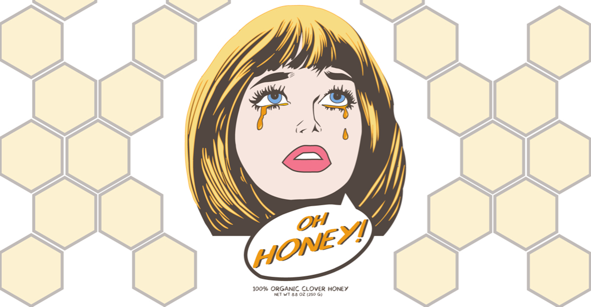
Through my brainstorming and research process, I found inspiration from Roy Lichtenstein to design a honey label using pop art. Lichtenstein used bright expressive colors to portray different moods, and I wanted to do the same. Ultimately, I chose a color scheme based on the product, honey, with emphasis on the colors pink and blue. I chose to work with a chocolate-brown outline instead of black to keep the colors for the honey color scheme consistent. Lastly, the font I chose to work with was an all-capital cartoon font, similar to the typography Lichtenstein used in his pieces.
I worked with the pressure and time constraints of the project instead of letting it overwhelm me with stress. After finding my inspiration, I created a color scheme to work with and then used Adobe Illustrator to draw the woman’s face. I used the pen tool to illustrate a traditional pop art look of tears running down the face to incorporate honey. The most challenging obstacle was finding a font that worked with the pop art theme. I needed to find a font that would emphasize the product but not take away from the art of the label itself.
I learned that if I had chosen colors that didn’t resemble honey, the label would not have emphasized the product well enough. The font was also key in expressing the pop art look I was going for. If I had chosen a cursive font, for example, it would not have had the same effect as the all caps cartoon lettering I chose. Everything needs a purpose. Working with the product and choosing specific aspects of the design is crucial in helping to express the correct message to buyers. Finally, I created a triptych of mockup products with my label on them. I chose to put the honey jars in the center of the triptych and the mug and gift bag on the sides to emphasize the product, honey, that the labels are meant for. Related website