Isolation v Solitude: A Senior Explorations Amplified Piece by Gabrielle Makower (2014)
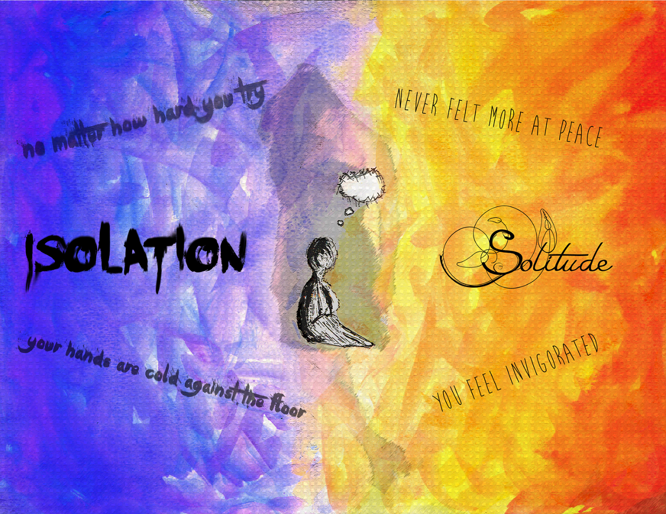
For this piece I decided to explore the feelings of isolation and solitude. On the left half of the image I aimed for a very cool and dark color scheme. I wanted this side to resemble isolation and the loneliness and distress one feels when isolated. On the right side I wanted there to be a very warm color scheme. The right side represents solitude, and I wanted to use bright colors to make the viewer feel happier. In the center of my Amplified piece I put a drawing of a person facing towards solitude. The back side of them is shaded, which represents how isolation is not prefered. The person is facing towards solitude, since it is the more desirable of the two.
For my creation I used Photoshop, watercolor, and a calligraphy pen. I used the watercolor and pen initially, then scanned the image onto the computer. I then took a photo of my friend in an empty field, lowered the opacity, and placed it behind the person in the center of the image. The text on both sides emphasizes the meaning behind the image. I downloaded some of the fonts from dafont.com. Finally, I watched a YouTube video on how to use the smudge tool, and I played around with it on my text.