You are a Lightouse: A Senior Explorations Amplified Piece by Katherine Higgins (2014)
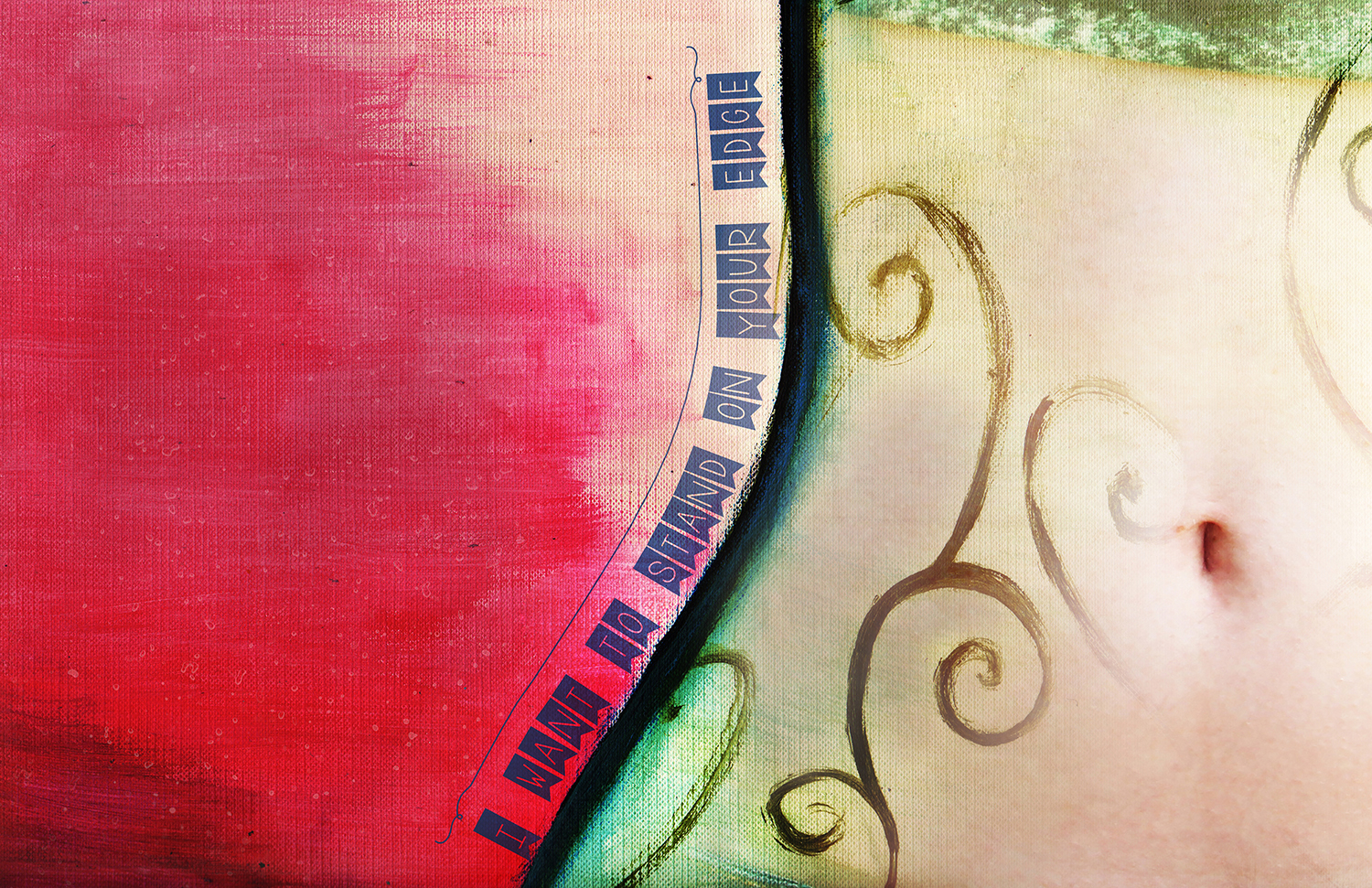
My Blink Amplification piece is based off our second post-meditation prompt: ''I want to stand as close to the edge as I can without going over. Out on the edge you see all the kinds of things you can't see from the center.'' - Vonnegut. I wrote about boundaries like self control and consent, as well as physical boundaries. One phrase of my freewrite really stood out to me: ''I want to stand on your edge''. It seemed to me the kind of thing I could amplify for English, so I tried to mimic that line in my automatic art for the day, which became the base for this piece. I tried to illustrate the physical boundaries of a person, as well as use colours to further differentiate between the inside and outside of the person I'd painted. In the end I was super pleased with the physical piece of art. Once I'd scanned it in, I upped the contrast, added a photo of Lora's belly to create a dreamy effect of mixed reality and unreality - surrealism, a little bit.
The first step in creating this piece was the fine arts work. We used acrylic paints on heavy paper, which wasn't too hard to figure out. Some of my favourite elements of the basic automatic art piece include the gradient effect I achieved with the pink, and the swirls that I definitely didn't mess up and fix later in Adobe Photoshop. Additionally, I loved the way the paper created a definite texture when I scanned it into the computer to ''amplify'' my art. Once my piece was in Photoshop, I knew I had a lot of work to do. I took a photo of Lora's belly, scaled it to the correct-ish size, and masked out all the parts of the photo I didn't need with a soft brush to blend the photo and the painting almost dreamily. I also duplicated the photo layer, brought the opacity down on both layers, and set one layer's compositing mode to ''soft light''. This helped me achieve the smooth blending effect seen in my final piece. When I went to place my text, I knew I wanted it to run along the edge of the torso, but whatever I tried looked too harsh. After a quick YouTube search for tutorials, I decided that overlayed text would look best as it let some of the underlying colours show through the font. I also used a font that, while sharp and ''edgy'', had some blank space to let even more of the original image shine.