The Rogue Hog: A Senior Narrative Book Jacket by Jeremy Cliff (2017)
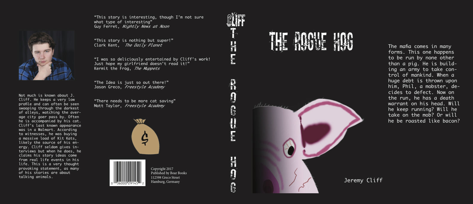
I got more insight into how the design can either attract or repel people from looking through a book. I chose a black background because to me, they tend to attract my attention the most. The biggest challenge I had by far was that I cannot draw very well. Therefore, I decided to only draw half of the pig’s face in a very simple style. I also added a shadow effect to give the book it’s dark feeling. It was not an easy story to visualize in one picture so I made everything simple. I guess one thing I’d definitely change is that I’d add much more visuals and images. Again, the reason there were so few is that I struggle heavily with drawing, especially on a computer. I’d probably also add a little more color the aspects like the font. I’d still use the black background but it would nicer if the font was red instead of white. I could have also benefited from using red boxes for the title and text. Next time, I’d try to make the book a little more colorful but also keep the dark tone. That’s why using red instead of white would work instead of a color like yellow. The back side could have also had more objects instead of being just a bunch of text. I’m a very visual person so books with a few pictures always helps me grasp the story better, whether within the pages or on the front and back. This project gave me an interesting view on how effective book design’s need to be. For example, the Harry Potter books always had interesting images on the front that illustrated a key scene from the story. Other books just use the title and author and nothing else, which can be really uninteresting. I’ve always been fascinated with the designs of not only books but DVD’s, movie posters, magazines, etc. This project definitely gave me more experience with the design aspects used in these platforms.