Transport: A Junior Conceptual Transport Project by Adam Galles (2017)
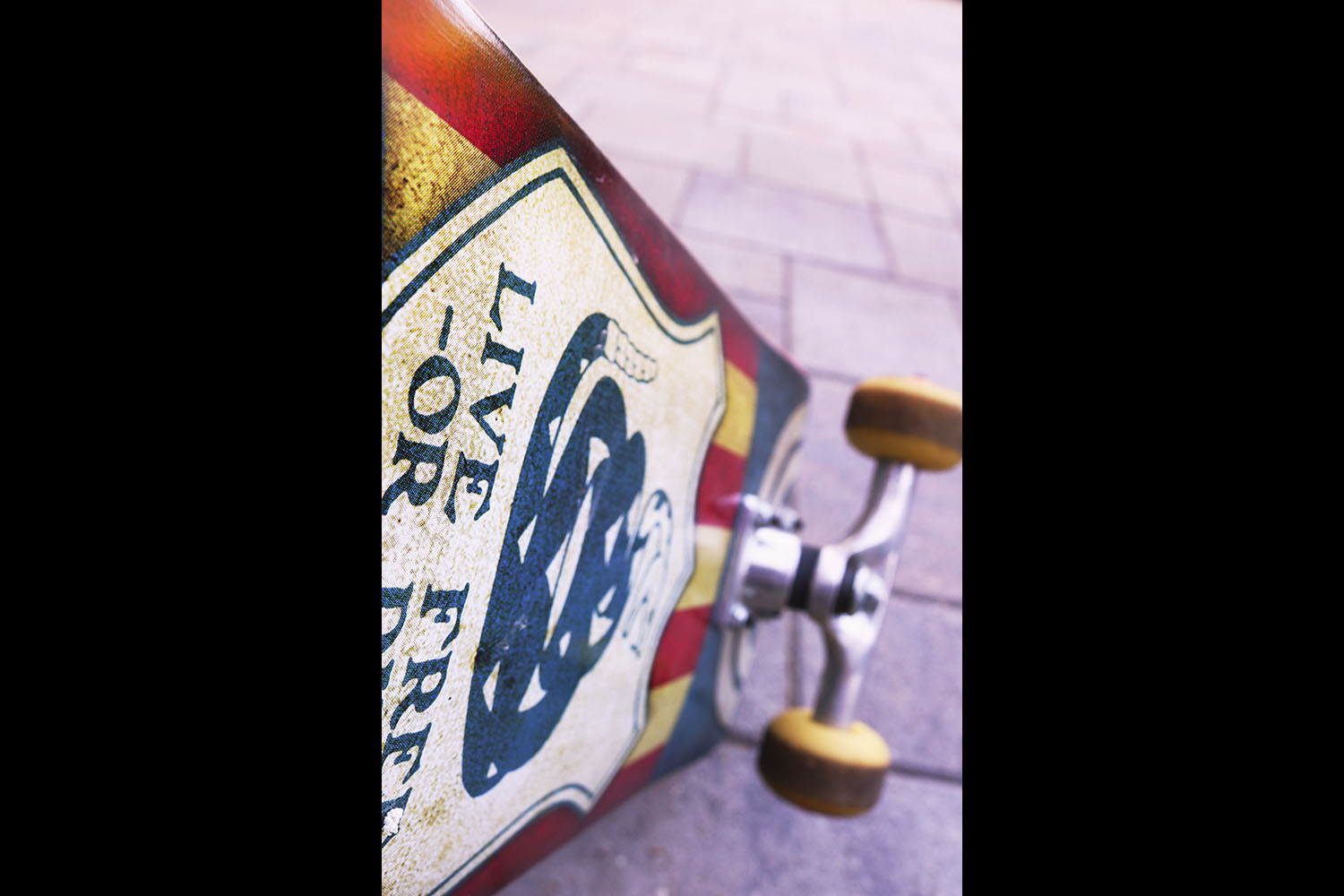
The lighting of my shot is coming from the back because it was taken at sundown, which makes the colors of the photo more dark and light. The sunset makes the photo better because a bird's eyes view would have made everything the same and the shadows would be not as interesting. The angle I used was tilted birds eye, down towards the ground along the bottom of the skateboard which provides a unique angle of the print and wheels. This and the plain background draw the viewer's eye to the main object in the photo and the bright colors of the skateboard. I chose the skateboard because it had the best colors and there are more ways that you can set it in a unique situation compared to larger vehicles that I could have chosen.
For Photoshop, originally I wanted to only change a part of the photo. I used a small aperture, so the background became more blurry and the selections would not be accurate, therefore instead of editing only parts of the photo I edited the entire thing. If I brought out the hue and saturation up, then the concrete would become purple-ish which is not the effect I wanted. To counteract this, I increased the heat of the photo, making the concrete look more normalized. I increased the brightness and the hue and saturation to make the colors pop more because the color is what really made the skateboard contrast heavily to it’s surroundings. The mix of red, blue, and the tanned paper color go well together. Overall, I learned that photo’s should be bright so that the color can be brought out and not washed out.