Transport: A Junior Conceptual Transport Project by Kyra Palmbush (2017)
Our assignment for this project was to select a non-motorized vehicle with any number of wheels and shoot the object from an unusual angle. The assignment permitted us to show any part of the object we desired, as long as the wheel was featured in a significant way.
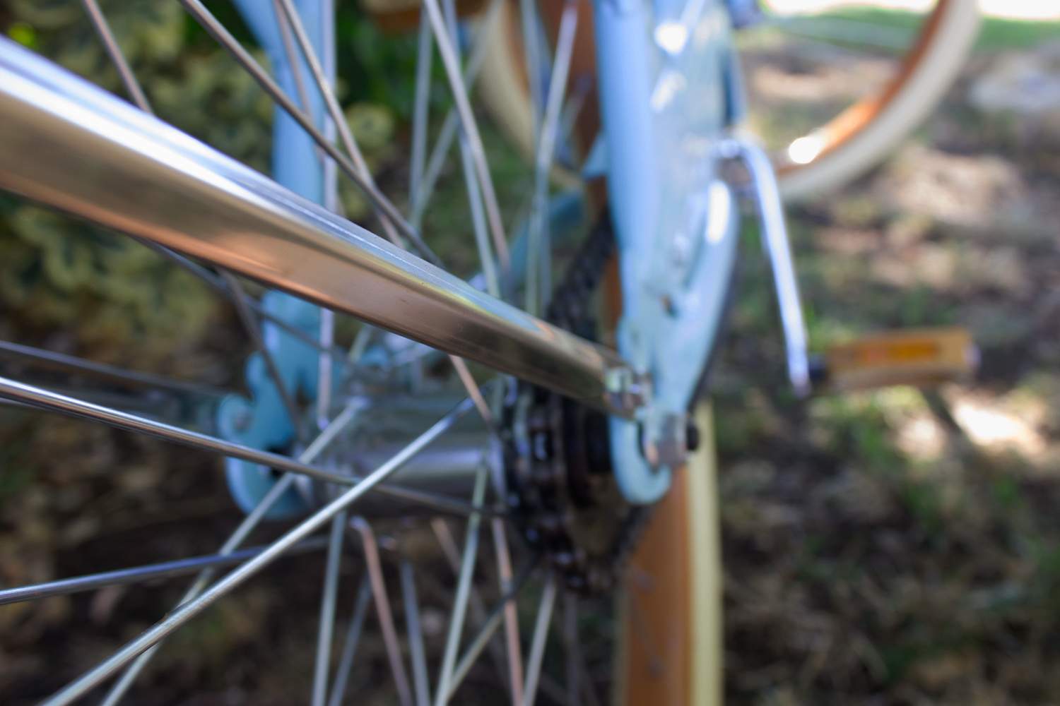
For this project I chose to use a bicycle because I was fascinated with the metal spokes and wires. My placement of the bicycle was intentional, as I did not want to have one flat background but instead I wanted to add texture and interest by including bushes on one side and grass on the other. Shadows are very fascinating to me as a photographer, and so I intended to use them in my image by placing the bike in the shade but having light shining through and hitting a few key areas. Often people are blinded by things that appear to be new, advanced, and modern, and they fail to recognize the innovation of inventions such as the bike which has been providing transportation since the 17th century. My concept for this piece was to help communicate how it is a common theme in our world to overlook and under appreciate things that we see as simple, and instead always be looking forward to the next, best, great thing, which leads to a life in which it is impossible to be satisfied.
When using Photoshop, I learned the importance of selections and how the quality of your selection can make or break a piece. In my case, I wanted to focus on making selections that exemplified parts of the image that I believed were the most critical to the concept. For example, I wanted to make the spokes very bright and shiny, demonstrating how people are often distracted by the outward appearance of objects, rather than their purpose. In order to achieve this goal, I also wanted to mute the colors in the background and I used the selection tool to lower the saturation of the green bushes and further push the viewer towards the wheel and spokes of the bike--the main point of focus in the image. Visually, I loved the combination of the blue and green in the image and how they blended together when they were not in focus, and I wanted to emphasis this by adding saturation and vibrance to the image as a whole.