Exploring Motion: A Junior Conceptual Transport Project by Benjamin Cornell (2017)
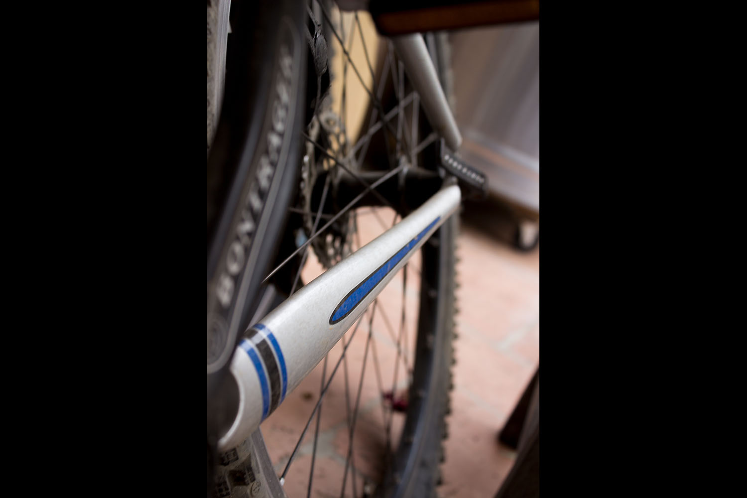
For this project, the subject we were photographing had to have wheels and could not have an engine or be motorized. With this knowledge I immediately decided to take an interesting angle of what is otherwise an obvious two-wheeled object; a bicycle. I took the photo from an angle in which I framed the tire using a portrait shot of the back half of the bike. I cut the tires out of the frame of the shot and as a result this left the back half and the front bottom corner of the tire revealed. The angle the shot was taken with also shows the beginning of a bar leading towards the back tire which creates movement from the bottom left of the frame to the top. The eye is then lead around in circles by the elliptical shape of the wheel. I kept the tire, spokes, and pedal blurry while focusing in on the unmoving component; the bar. The blurriness on the moving parts of the wheel really show the motion of the bike despite it being completely still when the shot was taken. Its as if you can imagine the wheel spinning rapidly with each rotation of the pedal. To further the feeling of motion I made sure that the bike had drab colors and that on the bar there was a bright contrast to focus onto. For this subject, the entire bike is grey with streaks of blue on the bar. This draws all of the attention to the bar which emphasises the blurriness of the tire and pedals. Overall these effects were combined in order to show the motion of the bike and create the feeling of speed within a completely still object. Another conscious decision is the bright lighting to reflect off of the blue. This makes the color pop even more and makes it easier to experience. Additionally, the background was intentionally drab and uninteresting, but blurry. This was to make it seem like it was flying by which again emphasises the movement of the bicycle. The bike itself was placed at an angle which offsets it from the background and allows one to imagine that a biker could have just, in this moment, put his weight on the pedal of the side that is not shown, thus causing the bike to lean. For this reason the pedal is shown at its peak of motion to allow the possibility of a foot resting on top of it without actually depicting/having a rider. The pedal is blurred to guide the observer into seeing that this “rider” is pedaling. It is possible that a viewer clues into none of these intentional decisions and simply sees it as it is; an unmoving bike. Overall, a viewer hopefully is able to interpret this as either a still bike or one in motion with a rider. This can play into the intricacies of how individual’s minds view things and potentially give the feeling of speed and excitement to those that view the object in motion. Those that do not could potentially feel anxious, ready, impatient, or possibly bored. All of which are strong emotions which, if I have evoked, would make this photograph a success. I personally view it and intend it to give a miniature adrenaline rush, but the beautiful thing about art is that it lives by the viewer’s gaze and as a result becomes what they believe it to be.
The first thing I learned about Adobe Photoshop is to do as much as you can without ever opening Photoshop. This is because it cannot possibly look more natural and real than the original raw photograph as it was taken. As a result of this simple rule, I had to do as much as I could to take the perfect photo without any editing whatsoever. The process described in the first paragraph was me attempting to achieve this result. Once I was actually editing the raw file in Photoshop I tested raising the contract, making the shadows darker, and adding brighter highlights. I decided to slightly darken the shadows and slightly increase the highlights in order to make the bright blue color on the bar stand out even more against the drab colors of the bike. The blue was a point of attack as well. Its goal is to stand out amongst the dark colors, but certain colors do that even better. Some of the brightest colors include red, yellow, and pink. These are all colors I experimented with to replace the blue streaks on the bar of the bike. None of them seemed quite right and became too much of a distraction. This led me to compromise and try an indigo color which only furthered to remind me even more why the existing cobalt shade of blue was perfect for the composition. It was just bright enough to catch the eye, but also boring enough to allow the gaze to wander across the entire frame. Beyond this, I touched up the photo with other slight adjustments including the most noticeable of these in which I made the image “colder.” This brings out the blues in the photo and lessens the oranges. Naturally, this complemented the piece perfectly because it made the cobalt slightly brighter. At the same time, it also made the rest of the image’s colors slightly more gloomy and less eye-catching. These edits, although minimal, lend themselves well to the photo and emphasize the feeling and emotions that it is designed to feed the viewer. Hope you, the viewer, enjoy.