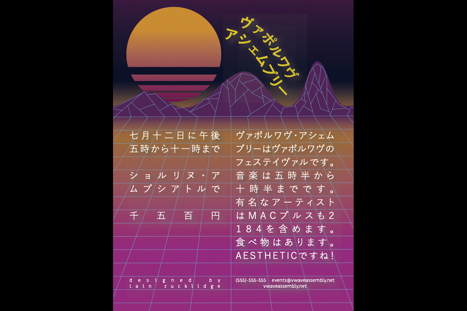
I chose to make a flyer for a vaporwave festival because I wanted to try making an illustration in the vaporwave style. This style includes the partially transparent sun, the color palette I used, a grid of lines leading into mountains, highly spaced-out text ( l i k e t h i s ), and Japanese text. Since I’m taking Japanese at the time of making this, I thought it might also be a good practice of that as well.
I’m most proud of how all the text aligns with the grid, as it makes the flyer look a lot more clean. I also managed to figure out how to use clipping on Illustrator to make the transparent bars on the sun. In the section referencing famous artists, I did research to find actual vaporwave artists (Macintosh Plus and 2184) to include.
I do realize that vaporwave is not the sort of genre to have a festival like this, but eh. This was pretty fun to make.
Related website