The watercolor effect assignment interested me right away. Unlike pastel painting or watercolor painting in and of itself, which I was dreading a bit because I had to draw and create out of almost thin air, this assignment was more about taking something that is already beautiful or interesting, and making it into a different art style. There is a game called “Legend of Zelda: Skyward Sword” that does a similar thing. While it is all unique textures and designs, it takes a lot of inspiration stylistically from other entries in the Legend of Zelda series, but alters it to have a watercolor look and feel. For instance while Link is still tall and realistic like the previous entry, he has the cell shading and vibrancy of water color. I was excited to do something similar with my paintings. This kind of filter technique feels like a way for watercolor to be more accessible, especially to people who don’t have the time or talent to do proper watercolor painting. But I don’t think it takes away from the latter either. It will never look exactly like a watercolor painting, but it also still crafts a scene with a certain feel and aesthetic, and I think it is incredible that something like that is this accessible.
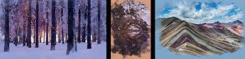
My first image that I imprinted with the watercolor effect was one of a Norwegian forest at sunset. One thing I looked for in all my photos was a nice contrast in colors and light. This photo has a snowy, and very blue forest being backlit by a stark red and orange sunset. It reminded me of a movie called “Klaus” on Netflix about the origin of Santa Claus. But mainly that he is an old man living deep in the woods mourning the loss of his wife. The beautiful sunset contrasting a serene forest felt like maybe some emotional contrast of pain to a calm outer life. The second was of a cherry blossom tree overlooking and being reflected on, what looks like, a calm lake. I loved the older feel of this photo and painting. It once again has almost a serene, but more traditional feel. The yellows and pinks and browns, make it feel like a more vibrant forgotten gem of a painting being rediscovered after a long time away. The little touches of light near the bottom of the tree give just a bit of contrast and pop to the image. My final one was of Vinicunca in Peru. This is a range of colorful and very unique mountains that I thought would simply work really well for a watercolor painting given the roughish landscape, and contrast between the mountains and the sky. For this one I imagined being a traveler who might use the canvas for many different paintings with this being their latest and greatest of the broad mountains before them.
Of all the photoshop effects and techniques we learned this year, this is far and away the one I am most likely to use again. While painting and blending are very neat, and will come in handy in certain situations, my love for the watercolor style, and lack of artistic talent will make this one that I might use somewhat frequently if I see a photo perfect for it. Hopefully, it’ll continue to be useful and interesting, and I will be able to get closer and closer to the real thing.
Related website