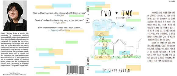
For design, we were asked to create a book jacket, should our short story end up being published. My story itself is simple and clean, and it was something I really wanted to reflect in the book jacket design.
I used Adobe Photoshop and inDesign to create my book jacket and was able to learn that I work best in terms of creating all my graphics and images in Photoshop separately, only to compile them later in inDesign where I have free reign of location without worrying about bleedlines and boundaries. I used to prefer making simply everything in Photoshop, boundaries included, and threw a single image in inDesign. With the book jacket, it was infinitely more efficient to use a template and adjust individual design aspects on there, instead of controlling them on Photoshop.
The overall design of my book jacket was based on the idea of light, pastel colors, and simplicity. I wanted something easy on the eyes and even seem whimsical. I have low opacity rectangles in just three colors, because I did not want to overwhelm the overall book jacket, but also not leave an absurd amount of negative space. My story that I had written in English was simple, and I really wanted the book jacket itself to reflect that and its genre, because it is a children’s story. I primarily used Adobe Photoshop CC to draw all the illustrations with a custom brush I made to replicate a pencil-like feel, along with creating the overlapping rectangulars at various opacities. Although Photoshop does have their own brush sets, none of them particularly did it for me with the aesthetic I wanted. Once my illustration was finalized, I compiled them onto Adobe InDesign CC and added the text from there, scouring the webs for a font that would be able to match my genre in terms of cuteness and simplicity.
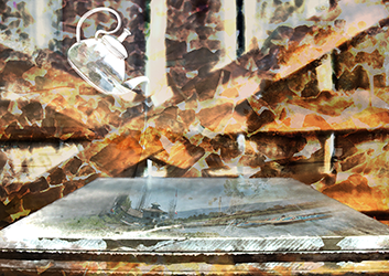
There is a cool, granite slate. Once a reflective surface, it now harbors a lakeside with a miniature port with small sails. A building is not far off. The setting is physically being poured by a ghostly, glass teapot suspended midair. Behind, there is a wooden fence, jagged lines and overlayed with broken rocks and tiles. Some patches are darker than others, with uneven gaps and holes from an imperfectly built fence. Even further behind the fence is the edge of the water. A bench is just visible between the cracks of the fence, peaceful. To create my composition, I used only Adobe Photoshop and its features with opacity, layer settings, and filters. The layer settings and opacity helped me create my textures, while the surrealistic and dream-like feel to my composition was created with distortion and warp tools, along with the filters.
You are the slate. The world all contained in a barely-visible teapot pours all its opportunities, chances, and hardships onto you in the form of a lake. It becomes a 'dip your toe in,' sink-or-swim situation for you. It scratches your surface and chips at you, but does not change your potential. I chose a battered, granite tile as my focal point to represent an individual to show how time can wear one down. The teapot is life handing you choices and events that might be out of your control and does not stop pouring. I decided to utilize a split-complementary color scheme, focusing on a cool blue as my base color, and warmer colors and its variations as its adjacent complements. They provide the piece with an interesting contrast and enabled for filters to show through certain colors and not others.

