Digital Media
The idea behind the Reflections unit was to explore the idea of “Who am I?” through the projects we completed in our Digital Media, English, and Elective classes. Our English class was the most direct in approaching this goal as we dedicated time to working on our common app essay.
Our work in Digital Media mainly focused on developing our skills in Photoshop and in Animation we learned how to use Maya, Zbrush, and Substance painter to model our own characters and props. I think my work thus far in Digital Media and Animation has reflected my growth as an artist and a willingness to try and experiment with new media/mediums. Our projects in English have allowed me to look back and “revise” how I view some of my past experiences.
Mandala
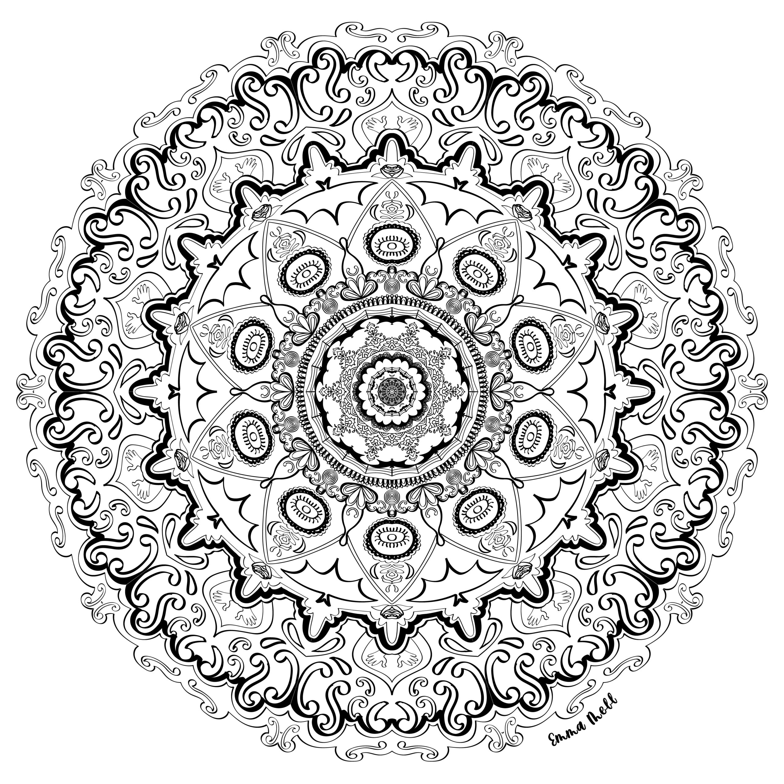
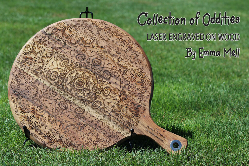
This year, our first project in Digital Media was to create a Black and White and Colored Mandala using Adobe Illustrator. the idea was to incorporate a list of core values into a Mandala design, which we would create using a set of templates we put together in Illustrator. From there we got to laser engrave our design in a choice of several different materials.
I think with this project, in particular, I struggled to think of a coherent theme. I wanted to do something a little spooky, with bats and cobwebs. You can see aspects of this in the final design, but I didn’t feel like that idea was strong enough to carry the mandala on its own.
I really wanted to create something intricate, since elaborate pattern design is out of my comfort zone, and I didn’t want the patterns to be generic, so I tried to get creative with the types of images I incorporated.
If I were to change my mandala, I would embrace a more gothic aesthetic/include gothic patterns, but I liked what I ended up with, especially the eye and swirl aspects. I’m really impressed by my peers’ mandalas, as working on this project has allowed me to gain a higher level of appreciation for the amount of painstaking detail that goes into these types of pieces.
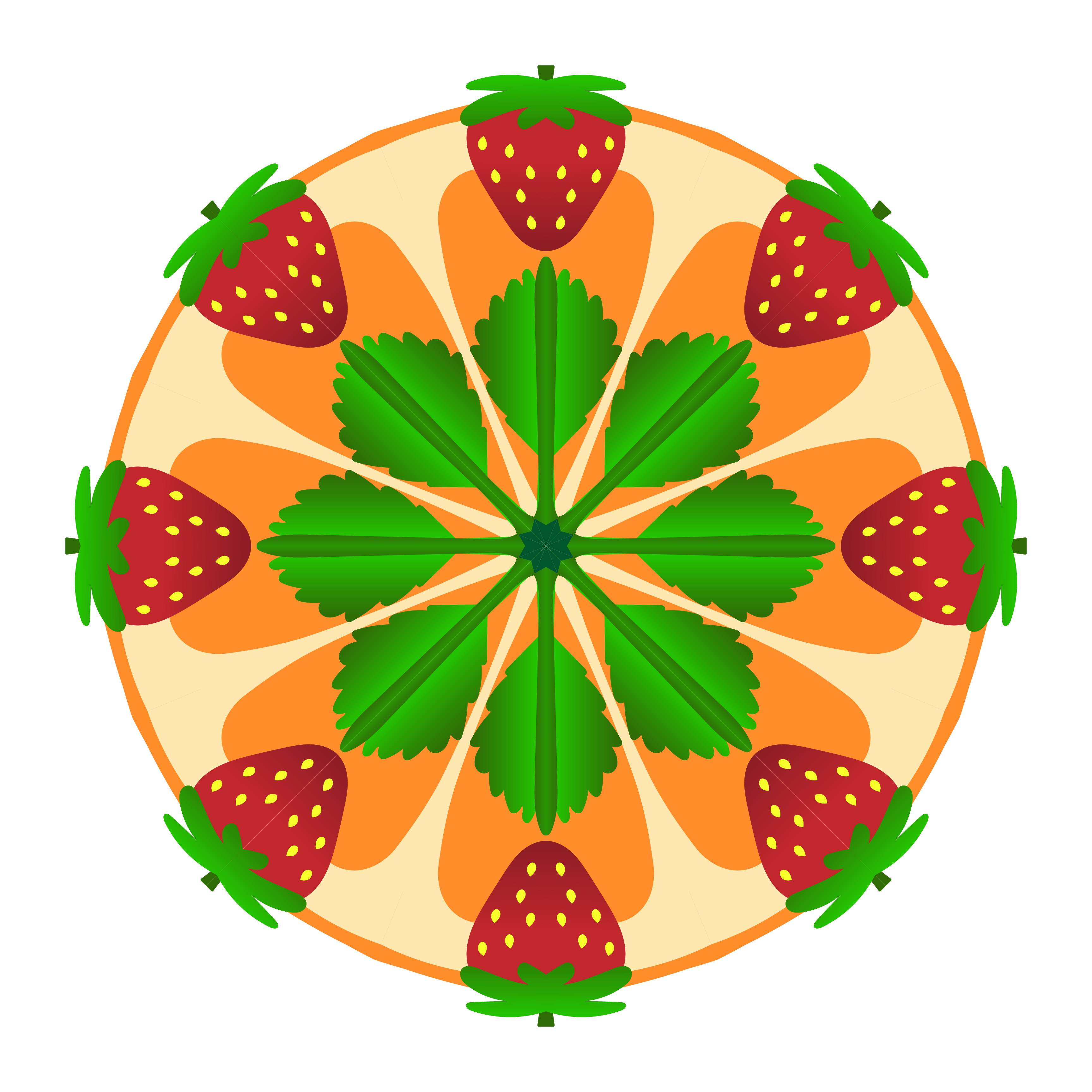
As you can see in the “Before/After” comparison, I didn’t end up coloring my original Mandala. My goal for my colored mandala was to create something simple relative to my B&W mandala design. For my B&W mandala, I wanted to make something intricate, so for this one, I wanted to do something a little simpler. The process was pretty straightforward, although I struggled to develop a theme initially.
I thought about motifs that I liked and came around to strawberries. I quickly realized, however, that this would be a little too limiting for what I wanted to make. I was playing around with shapes and, after staring blankly at it for a little while, realized that the background sort of looked like a sliced orange, so I made it such.
I really admire the people who had the patience to color their original B&W, especially because a lot of them are extremely elaborate—I did not have the willpower for this.
Photoshop Art
I’ve always really enjoyed using photoshop as a medium to create art. During quarantine I had been experimenting with the app versions of basic Photoshop and Photoshop Lightroom, so I was already a little familiar with the mechanics we utilized in these projects.
I now use it as my primary drawing program, so over the course of this year and last, I’ve really gotten the opportunity to get more familiar with it. I find the process of combining photos/creating seamless compositions the easiest in photoshop, and really valued getting to work more in-depth with these tools while completing these assignments.
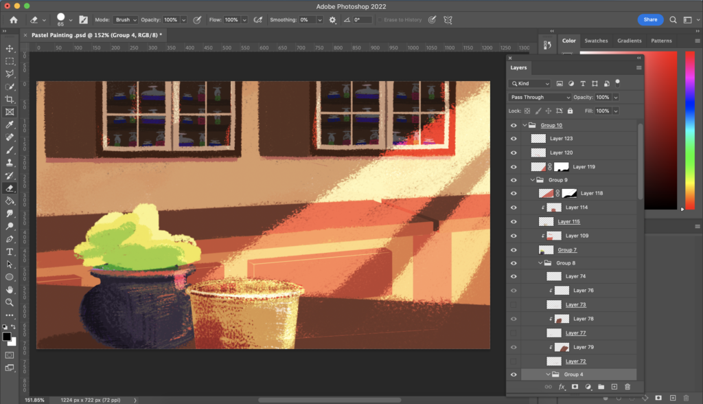
Photoshop Pastel Painting
I wanted to take a different approach to this project, so I chose to complete a background sketch that I had done previously. Given the type of brush we had to use, I opted for a more simplistic style.
I think it was a nice challenge to be limited to one kind of brush, and I found that I actually really enjoyed using it, even though it’s not the kind I would usually use. The most difficult thing about painting this was figuring out what techniques I wanted to apply and get the composition right.
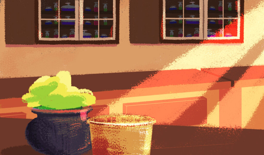
At some point, I started over because I didn’t like the shading technique I was using in the background (and the perspective was off). So, I moved some things in the sketch around and readjusted the perspective until I was happy with it. On a technical level, it was pretty straightforward. If I had to change anything I would add more objects on the counter, but aside from that, I’m pretty happy with it.
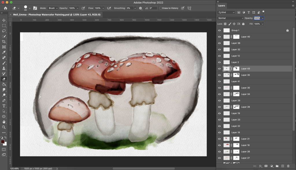
Photoshop Watercolor Painting
For this piece, I wanted to replicate real watercolor strokes as closely as possible. I chose to draw a scene with mushrooms because I have painted mushrooms in watercolor before, so I already had a frame of reference.
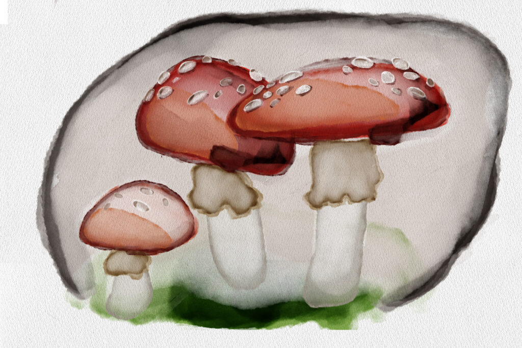
I found this process very relaxing and mainly used two brushes (Natural Edge Painter 4 & Soft Edge Natural Wash) to achieve this end product. Generally, I think it could look better, but with practice, I’m sure I could more closely achieve what I was going for. For my first time creating a piece in this way, I think I was relatively successful.
Watercolor Painting Image Effect
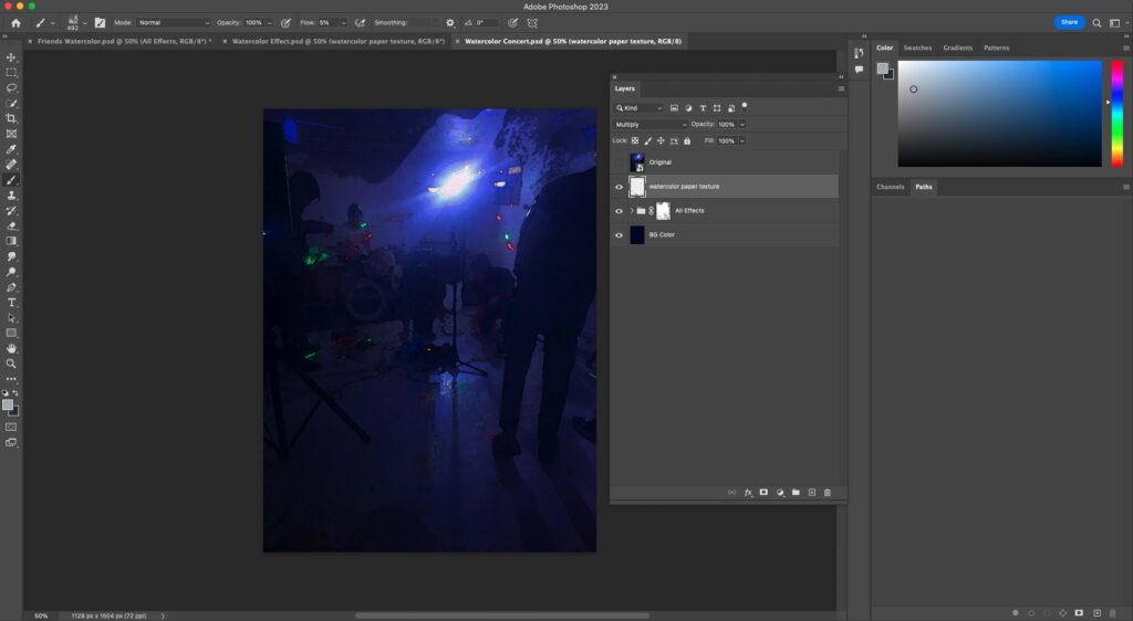
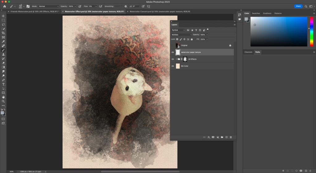
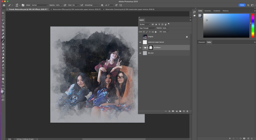
Using filters, clipping masks, brushes, and other techniques, we were able to transform ordinary photographs into “watercolor paintings” using photoshop.
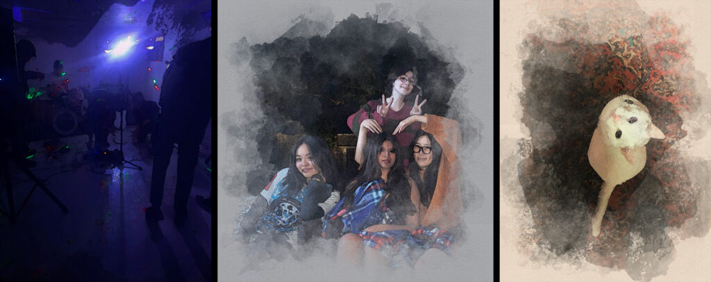
I wanted to use these techniques on a few simple photos from my camera roll. Specifically, I thought the concert and cat pictures would look pretty nice with the watercolor effects. I’m not entirely happy with how the first image turned out, as it’s a bit difficult to make out the “brush strokes” and texture because of how dark it is.
Otherwise, I’m pretty happy with the other two. I don’t usually take a lot of photos, but I am relatively pleased with the ones I was able to dig up. I’m going to continue applying these techniques on future projects, as it was a simple process to follow, and the results always turn out fairly nicely.
Photoshop Interface
Photoshop Compositing 2 Photos
Using the techniques we’d learned thus far in compositing images, our first task was to combine two of our own images. I blended a perfectly average photo of my friend Yuval with a photo of a concert venue I’d recently been to.
Photoshop Compositing 3 Photos
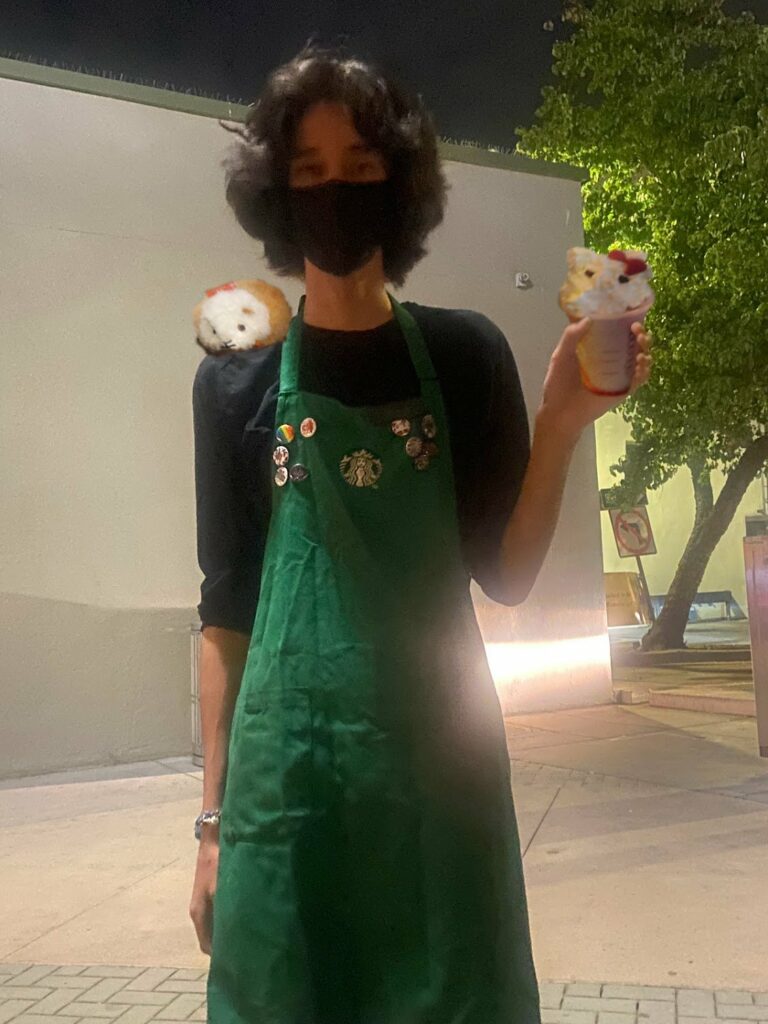
We continued broadening our skills in photo manipulation, which we demonstrated in a composition of three of our own photographs. In this piece, I combined a photo of my friend Josiah pretending to hold a Starbucks cup with a photo of a Starbucks drink my friend Viktor made me. I also added a photo of a stuffed hamster on their shoulder. (Josiah does not work at Starbucks)
Surrealist Photoshop Composition
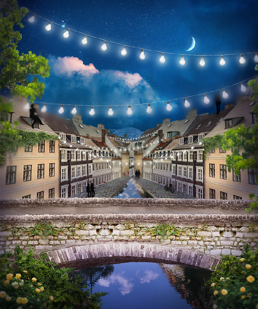
For this project, I wanted to create a piece related to my world-building project. I incorporated aspects of European architecture and was inspired heavily by places within Alsace–Lorraine, like Colmar, but allowed myself to be a little inconsistent with this (ex: the buildings I used are from images of Denmark streets). Originally the scene was in the daytime, but per the suggestion of a few friends, I changed it to nighttime instead, which ended up being the better move.
I have a friend who’s passionate about public transportation and walkable city layouts, so when coming up with ideas, I asked what would fit into their ideal vision to gain inspiration. I wanted the city to feel decorated, so I tried my best to include as much greenery as I could. In addition to that, I thought the hanging string lights would be a nice touch. I also wanted the city to feel alive, hence the silhouetted figures.
This took a long time to compose, but I think that’s mostly because my vision was a little inconsistent at the beginning. On a technical level, it wasn’t too difficult, but I had to get creative when it came to things like adjusting the perspective of certain objects. I don’t think I would change that much about the result.
Any changes/extra details I want to add could be more easily done by drawing the piece in its entirety, so in that regard, I think it’s fine as is. I’m most proud of how everything came together in the end. I was a little unsure how well I would be able to capture my vision given the medium but I think I was moderately successful in achieving what I went out to create.
Animation
Our prerogative for this year in animation has focused on creating characters, props, and environments in 3D using the programs Maya, Zbrush, and Substance painter.
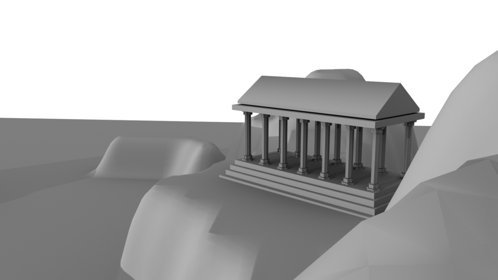
Modeling
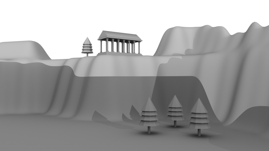
For this project, our task was to model a temple in Maya using a 2D template. Using the front-facing monitor view, we were able to match 3D shapes with precision, and using the duplicate tool we would replicate pieces to save time (like the columns).
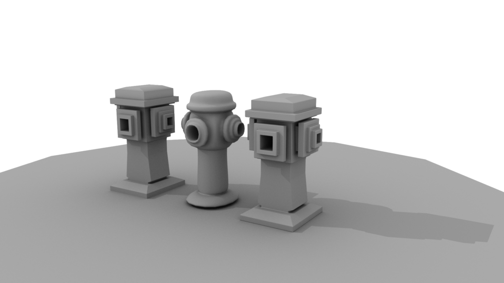
From there, we drew and raised a selected area to create the mountains and adjusted the display setting so they would appear rounded. We applied similar techniques to create fire hydrants and rendered multiple using different display settings.
Weapon
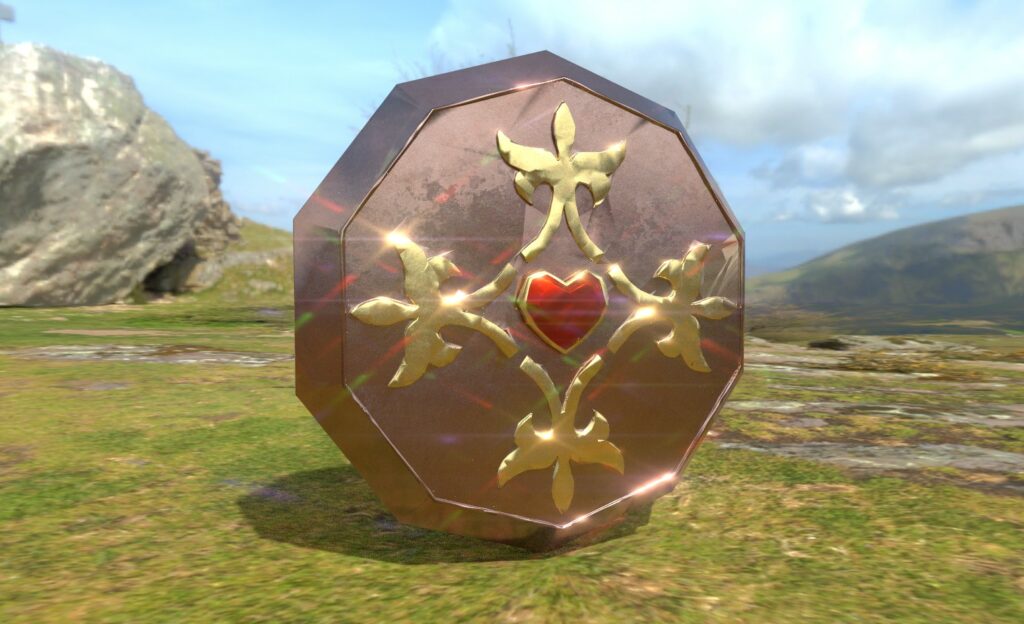
Now it was time to combine our skills from Maya and Zbrush to create a game weapon. I wanted to connect mine with my character, so I decided to make a shield that she could turn into a parasol, tho in the end I guess that aspect didn’t really come through.
I chose to put a red heart in the center to kind of elude to vampires being undead- and the whole idea about driving a stake into their heart, etc. I originally thought about playing into this by having “daggers” pointed toward the heart, but ultimately didn’t like how it was turning out. For the designs encircling the center, I took inspiration from different kinds of gothic patterns.
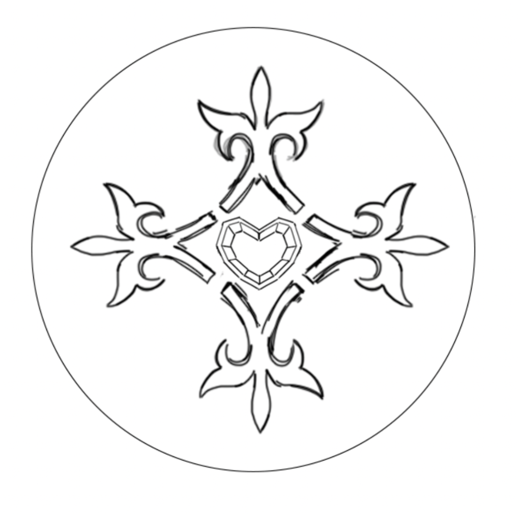
From there we translated our pattern into Maya. To save time, I modeled one-half of the decorative piece (design above the heart), then duplicated it and combined it with the other half. I then replicated it and arranged it around the center. This part was a bit difficult because the pieces didn’t really match up in the right shape.
Modeling the heart and the actual shield base wasn’t that difficult, but because I had spent so much time working on that one detail I didn’t have time to add more as I’d planned. Still, I’m happy with how it turned out.

From there we exported our weapon as a .obj and imported it into Zbrush. This process involved smoothing out rough details, adding texture, etc. After we were done with that, we exported high and low polygon .objs of our model.
For the low poly version, we had to decimate the object, which basically just lowers the poly count (and in some cases can affect how detailed certain parts of the model appear). We also had to unwrap it, which created a flattened-out version of the model that we would be able to paint in Substance Painter.
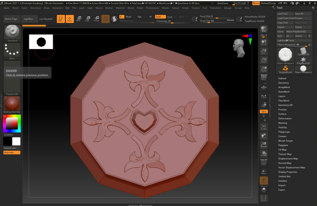
We then had to import the weapon into Substance Painter, first uploading the low-poly file, and then baking the high-poly version on top of it to restore some detail. From there I used texture brushes to add color, then, using the same program, placed the weapon in an environment where I could manipulate lighting and reflectivity.
Character
One of our next tasks was conceptualizing the character we would use as a reference for our 3D models. I wanted to create a new design for this project rather than using a preexisting one I had done, and I also felt very strongly that it needed to be a vampire. I wanted to give her a modern look that incorporated gothic and victorian elements.


After completing a few projects in Maya, we moved on to Zbrush. Personally, I found it a lot more difficult to learn how to navigate this program than I did for Maya. The controls were very sensitive, so much so that I had to turn off the touch sensitivity on my Cintique to be able to operate it properly.
First, we had to model a skull, starting from a basic circle and slowly etching away using keyboard controls & brushes. I struggled immensely with this, but I think it was a necessary challenge in order to get more proficient in using this kind of tool.
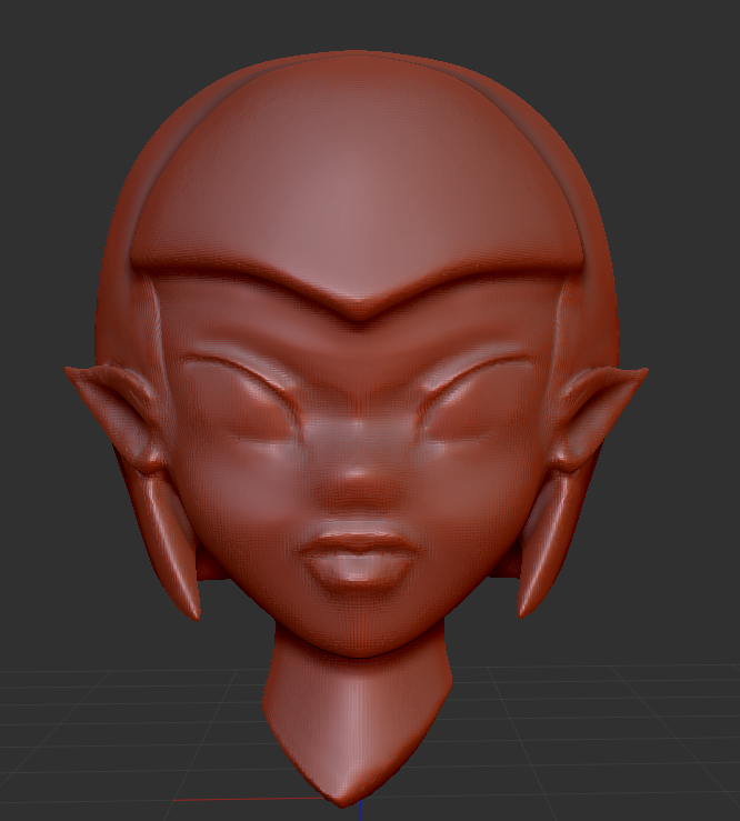
After this, we created a character bust. For this assignment, we could model whatever we wanted, but I chose to model my character’s bust, which ended up being a really efficient way to save time later on.
I did end up fixing parts of the eyes when doing my actual character model, but aside from that, I’m fairly pleased with how this came out.