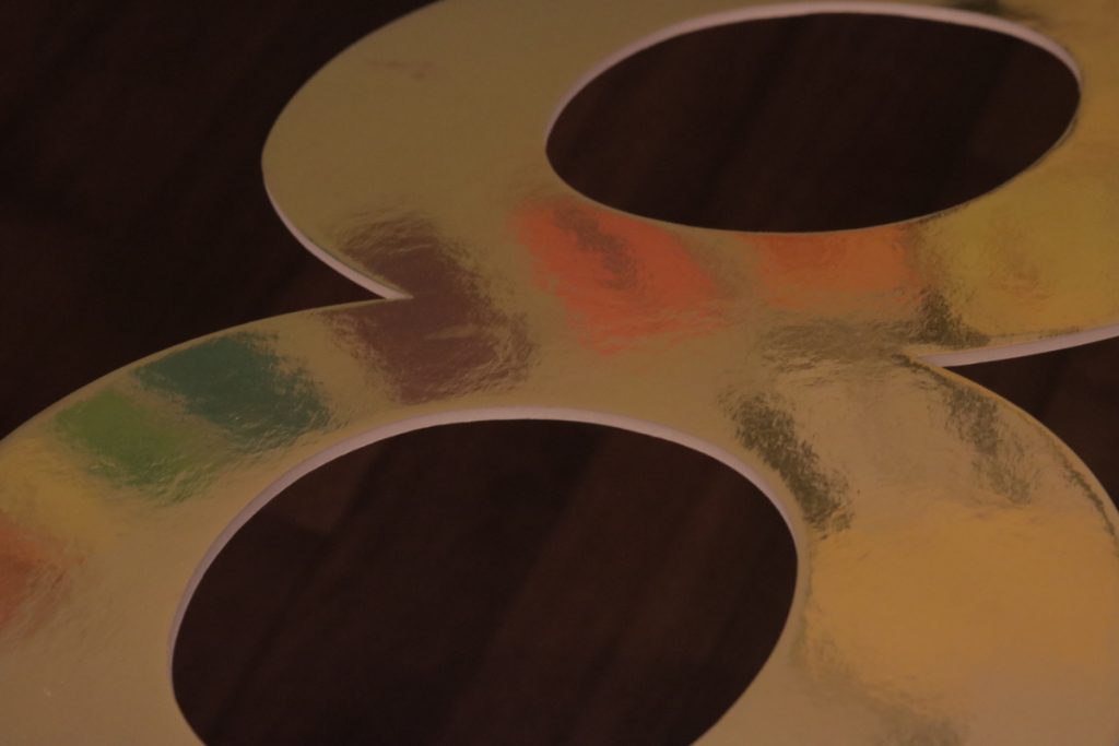
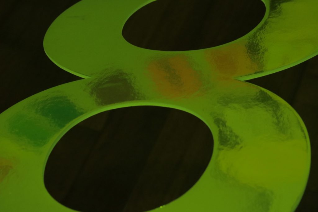
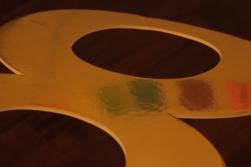
For this series, I experimented with how white balance can change the tone of an image. I chose a reflective gold sign with a dark background and a colorful reflection so I could see how different white balance settings affected each element and portray a different tone.
The right photo uses auto white balance and shows the scene naturally. In the left image, I manually used a white balance filter that would warm the tones so the gold shifted toward orange, however stayed close to the original, creating a warmer, yet realistic image. The middle image was the final setting. For this image I experimented using used a custom filter. This allowed me to drastically change the gold into a green that makes the subject seem more unnatural and grotesque. However, interestingly, this filter left the reflected banner mostly unchanged. The change of mood between the three images helped me understand how white balance can dramatically shift color and mood.