Aboriginal
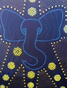
For this project, we needed to create our own pieces of Aboriginal dot art. During this project, I learned a lot more about Aboriginal culture and how this dot art was a connector to tribes around Australia. This helped us find out what mattered most to us and placed us into “the time without time”, helping us focus even more on our projects.
Collage
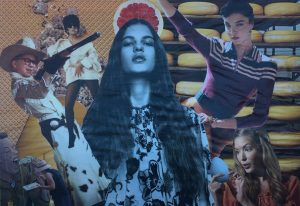
During the collage unit, we were asked to grab magazines and cut out images that were interesting to us in order to make an interesting, if nonsensical, collage at the end. This project was really fun, because I got to take serious advertisements and make something new and creative. The monochromatic painting was also a lot of fun to make. I made a base color then added white, black, and gray in order to paint the different shapes that made up my collage. That project helped me learn more about shapes and colors that are the basics for all art.
Digital Collage
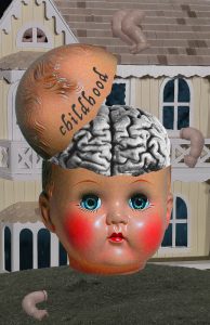
This collage is about childhood innocence and the way that it is often exploited for monetary gain. Children are taught from a young age what is expected of them, young boys playing with toy trucks and young girls playing dress-up with dolls. Gendering things for children is more for the benefit of companies than it is for children, and when children fail to meet the expectations that are set for them, they often feel isolated and alone. I showed this message by over saturating the babydoll’s head in the foreground, everything else is much less saturated. The doll whose limbs have been scattered on the house watches scornfully from the window as the color around it is sucked into the main doll. The brain inside of the doll is black-and-white to both symbolize the old traditions of gendering things needlessly and the monotonous ways of the past.
Citizen Project
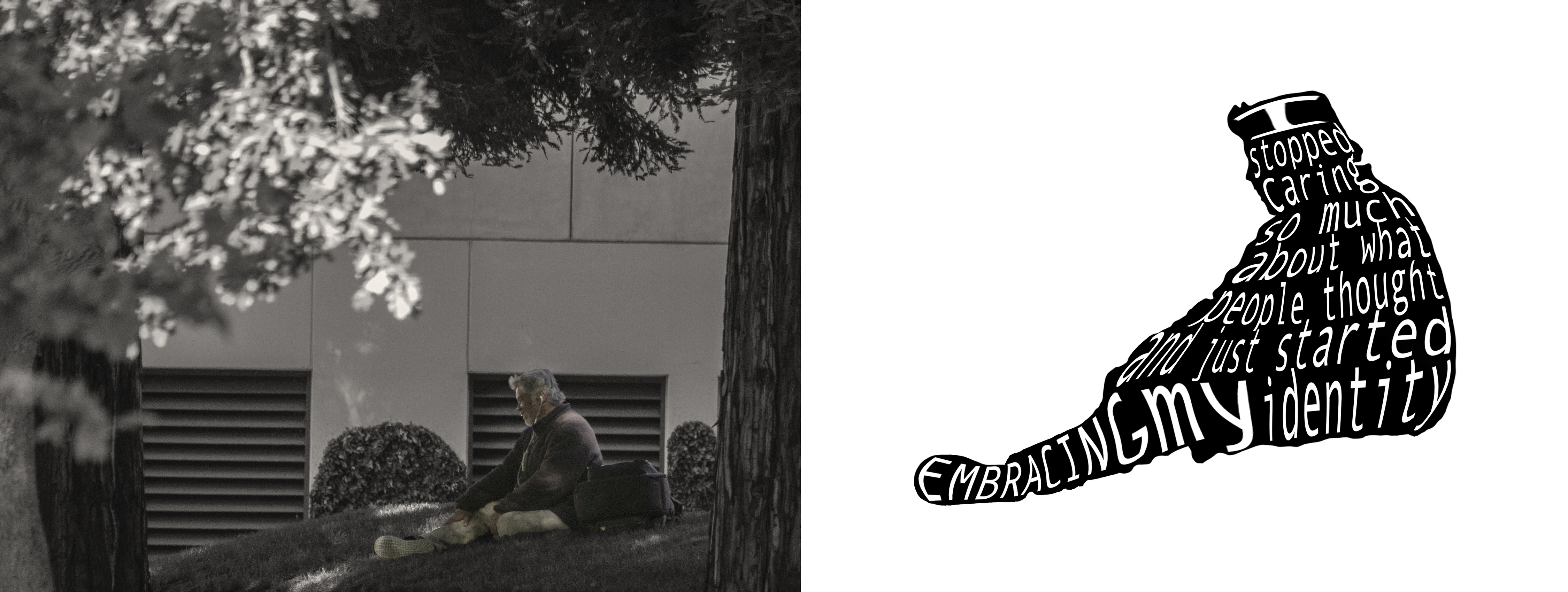
Something that my interviewee said to me towards the end of his interview really struck me. He said, “I stopped caring so much about what other people thought and just started embracing my identity”, that really made me think inwardly and reflect on how I had let others’ perception of me effect how I saw myself.
I chose a photo of a man smiling to himself surrounded by nature to show how embracing your differences can feel extremely freeing. The man is sitting by himself only the trees around him, but he still feels happy. He stands out starkly against the black-and-white scenery around him and that only accentuates his individuality and greatness. He has earbuds in so the world around him doesn’t disturb his peace or effect how he feels. How the world around him sees him is unimportant as he smiles and enjoys his time alone despite how others may or may not view him. This helps reflect the way that my interviewee felt as he grew up and started feeling okay acting like himself around others. He used to feel as though he needed to hide who he was or else feel ashamed of the way he was born, but now he knows that living to make others feel comfortable isn’t worth sacrificing your personality and happiness.
I altered the photo by making the background black and white, this makes the man stand out more in contrast. I also cropped the photo significantly, the man used to be smaller in the shot. I moved him to the lower right hand section of the photo to make him seem less important in the shot while highlighting him by giving him color.
Japanese book
ARVE Error: Mode: lazyload not available (ARVE Pro not active?), switching to normal modeMovie project
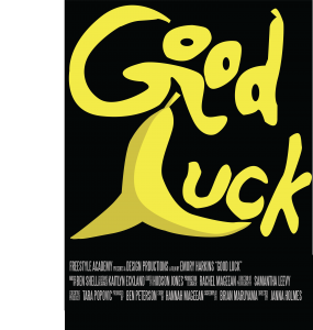
 In Design class, we were told to come up with a movie idea and make a movie poster, tickets, and a ticket package for our movie. For my movie, I decided to make an action-comedy about a superhero that has the ability to give people extremely bad luck. I used the symbol of a banana and, more specifically its peel, because it is a universal sign of bad luck and slap-stick comedy. The “O”s in the word “Good” look like they are tumbling off of the “G”, I placed the text that way to reflect the slipping imagery that is brought up with the banana peel.
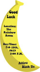
The text on my ticket mirrors the goofy and fun feeling of the poster’s text, but in a more mainstream and legible way. I wanted the text of the ticket to be a little less styled, due to the fact that it would need to be fit on such a small ticket. I decided to make the ticket itself a banana to keep with the theme of my poster. The black text also matches the back ground of my poster, I tried to connect the two in as many ways as I could think of.