Leading Lines in Food – Apr 17

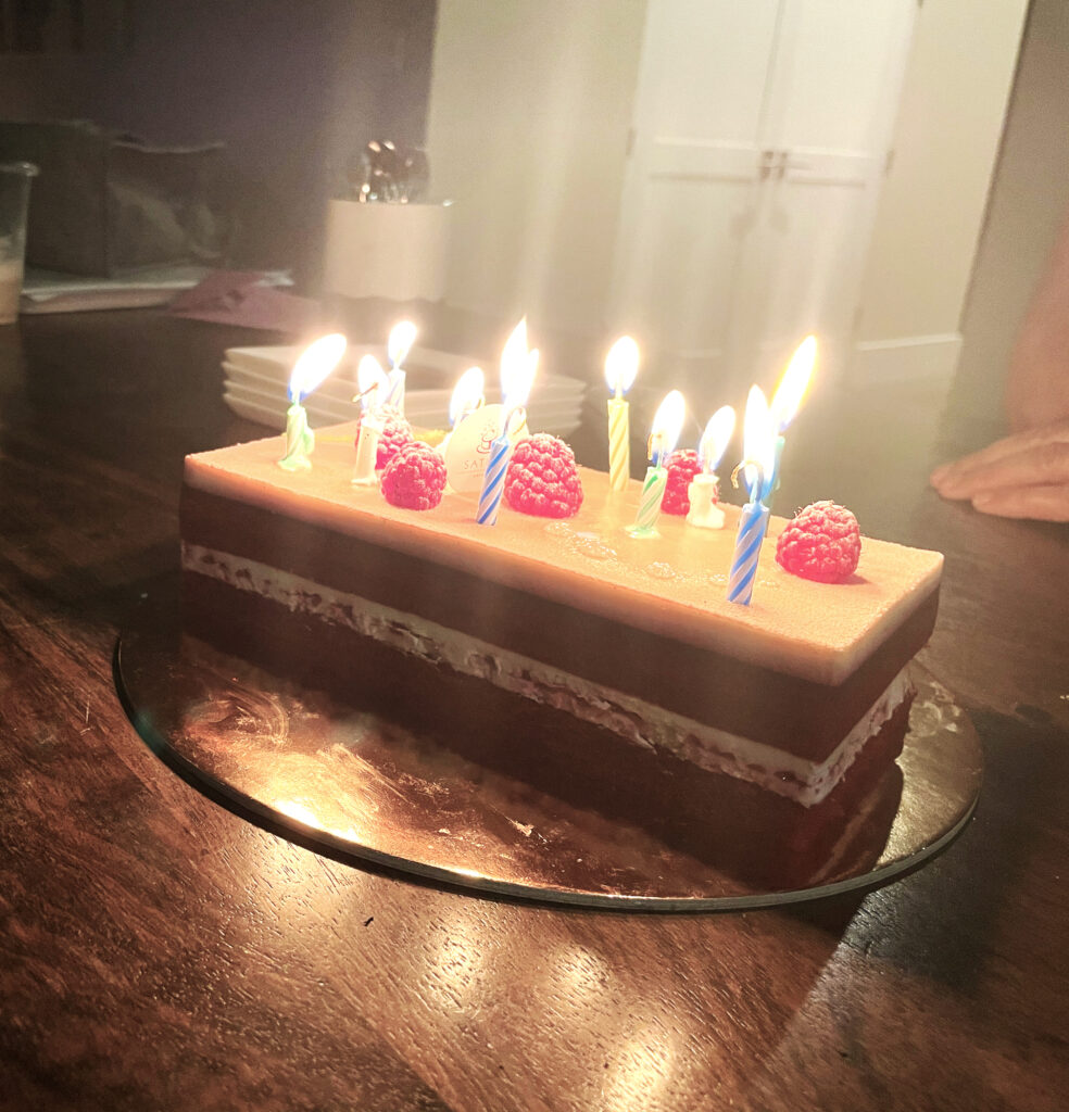
The first thing I thought about when I heard this prompt was spaghetti. However, my brother’s birthday was around this time, so when we were celebrating with a cake, I realized that the layers of the cake exhibited Leading Line as well. I think food photography is interesting because of all the variations of elements of art and principles of design that can be used. Texture is a very common principle that isn’t usually paid much attention to in other forms of photography, but in food, it is far more prominent – especially in close up photography. Food itself is such a unique art form, too, that food photography often can’t eclipse the entire masterpiece that is the dish.
Rule of Odds – Mar 17

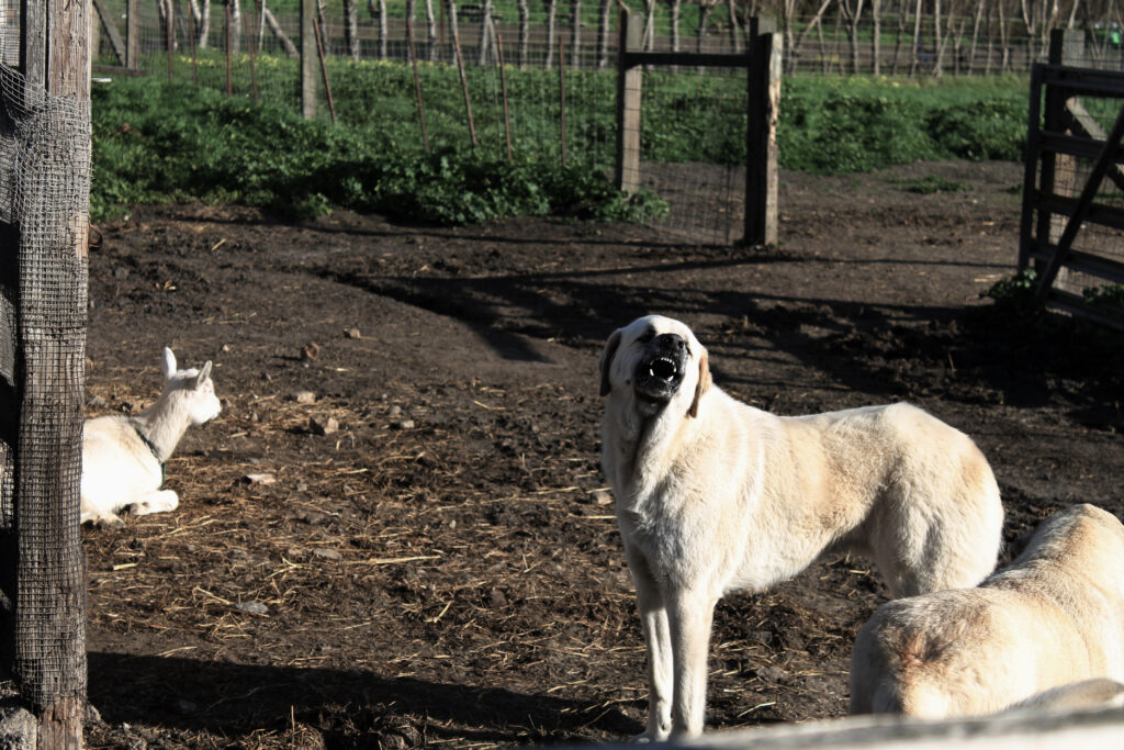
When I first found out about this prompt, I was very confused. In my head, I always thought that even numbers would be the most visually appealing, but after looking through volumes of photographs and paintings, I have agreed with whoever came up with this rule that odds are more visually appealing. In this photograph, I tried to have one main subject with two lesser subjects, keeping the main subjects at odd numbers, as well as the total. I think it is really interesting that a vast majority of people find odd numbers to be more visually appealing than evens.

Negative Space – Feb 10

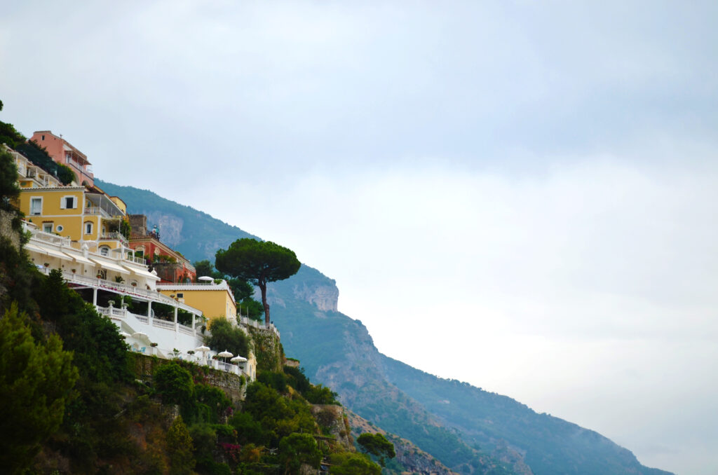
When I think about types of photos with negative space, I often think first about landscape and architecture photos, with the subject clearly bordering the negative space. So, I used this concept in this week’s photo, which is a landscape of a large mountain contrasted with a cloudy sky, which represents the negative space in the photograph. I think negative space is a great tool for artists to use to affect perspective and contrast, especially when considering the value of the negative space, and how it can be used to change how the subject actually looks. I really liked the way I cropped the photo as well, to be split diagonally across the frame by the negative/positive space border.

Center Frame Portrait – Jan 20

Framing the subject of the photo is often something that is taught to be not very good, as the rule of thirds is the most common form of framing. However, centered subjects give off a calming, tranquil energy, one that I used and captured in my photograph. The delicate water droplets hanging on the leaf represent the peace I get during storms or rainy days. For the rest of the composition, I obviously could not use rule of thirds, so I incorporated shape and repetition by including the other leaves and water drops as well.

Accidental Renaissance – Dec 9

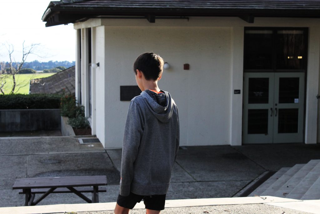
Accidental Renaissance is one of the most difficult prompts I’ve ever heard, because it is so hard to make that kind of photo on purpose, I think mostly it comes about as a result of other types of photography, especially street photography. Many of the examples I viewed seemed to be taken firstly as portraits or urban/street photography, but turned out differently than expected and fell into the “Accidental Renaissance” category.

Leading Lines – Nov 10

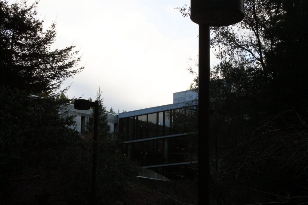
In my photo, I tried to incorporate leading lines as much as I possibly could – I specifically took a picture of a building with a lot of detail that included many lines all across my photo, and I purposely framed the two lighting fixtures on the thirds as well, because those are also vertical leading lines that work to bring the viewer to view the entire photo.

Symmetry Landscape – October 14

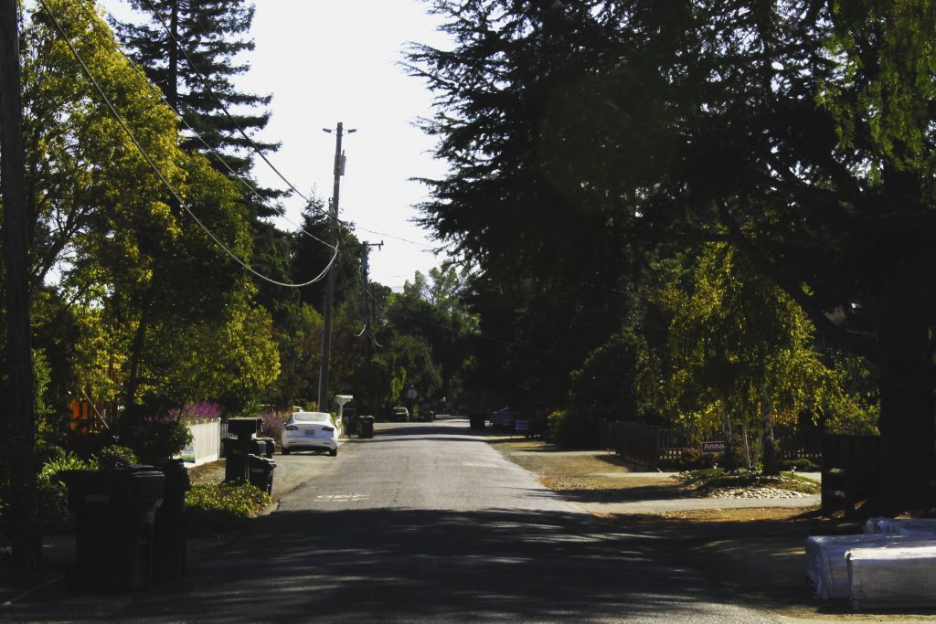
For this challenge, I took the symmetry part to not mean necessarily direct symmetry, but more of a balance or rough symmetry. So, on either side of this photo, there are houses, trees, and the road is roughly split down the middle. The main element of art/principle of design I used was balance, as that is very closely intertwined with the concept of symmetry. I thought the contrast and color looked really interesting on this photograph as well, as there are some really bright whites and some really dark blacks, like in the sky and in the shadows of the trees.