Lyrical Essay
A lyrical essay is an essay that relies on rhythm or poetry to emphasize storytelling elements. It is a modern form of creative non-fiction that reflects the change in how literature is consumed over time. My lyrical essay is written in the form of a letter to the professional tennis player John McEnroe, asking him about his career, anger issues, and regrets.
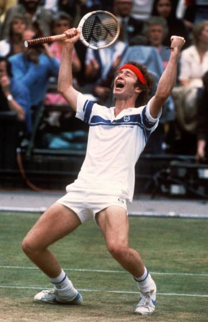
“You cannot be serious!” you cry out in anger. “Are you kidding me!?”
You don’t think about the consequences of your exclamation. You just know that the chalk blew up when it hit the ground, and you’re actually going to lose this game because of this stupid umpire. Captured in the heat of the moment, emotion capsizes your boat of logic, of manner, of reasoning. Who the hell does he think he is? Making calls like this. You mutter to yourself under your breath as you walk back to the baseline, head down, eyes focused on your grass-stained white tennis shoes. You point back at the umpire one more time and shout something, you don’t remember. You then walk up to the line judge and point in his face and scream at him.
Will you regret these actions? Who knows? You definitely don’t, not yet at least. Years later, you might joke about these incidents with your competitors on a talk show, or you might be sitting, head in hands, wondering if this very outburst was the reason you haven’t been inducted into the hall of fame.
Half an hour later, you walk off the court, head held high, with little to no recollection of the mid-game outburst you just had. You won. That’s all that really matters, anyway.
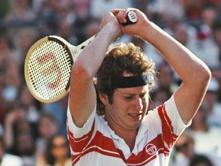
As you progress your tennis career and become one of the all-time greats, one thing really stays behind in your head. Why did you have to say that? You’ve retired this year, and the only thing in your mind is whether you’ll be inducted into the hall of fame eventually. Surely you will, surely such a great tennis player wouldn’t be omitted just for his anger issues.
Your discussions with many talk show hosts makes you nervous. It’s been four years since you retired. There has yet to be a mention of your name for the hall of fame ballot. You go on more talk shows, citing how much you regret your past actions, and how it was just the competition, and how you barely recall saying half of these things, and how you’ve mellowed so much since retiring. It might not be enough. Some would say the voters had had enough. After countless times mouthing off an umpire or linesman, or even your opponent, they decided they didn’t even want you there.
Never mind three Wimbledon titles, four US open titles. 5 Wimbledon doubles titles, 4 US open doubles titles. What can you do?
“I’ve never considered the Australian Open to be anywhere near as important as the US open… People act well, if Pete gets to 12 [Grand Slams] he’s breaking the all-time record when people don’t realize that… there’s not a history of people supporting the event.”
As you walk off the set of Charlie Rose, your own words replay in your head, over and over. Why did you say that? Impulse? You know you wanted to say something about this. To solidify yourself. Pete Sampras isn’t as great as you are, not close!
As you hike up to the stage of the tennis hall of fame induction, you ask yourself if you’re going to redeem yourself. You’ve already solidified your legacy. You’ve made it. There’s nothing else that can be accomplished. Do you want to be remembered as a bad boy? Or do you want to be remembered as a great tennis player?
“There is one [umpire] that did [a good job]… Has an umpire ever made the hall of fame? … I want to nominate the late great Frank Hammond… who was one of if not the only ‘player’s umpire.’”
Narrative Visual Perspective
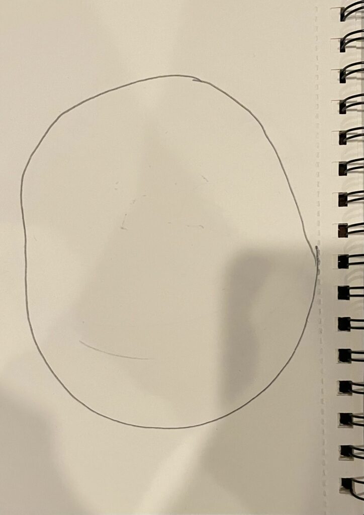
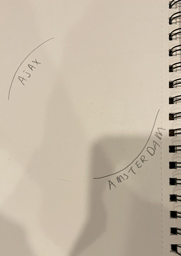
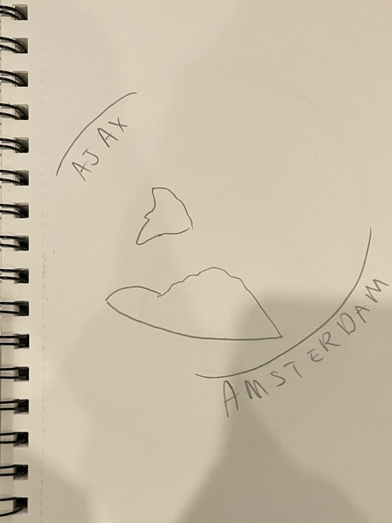
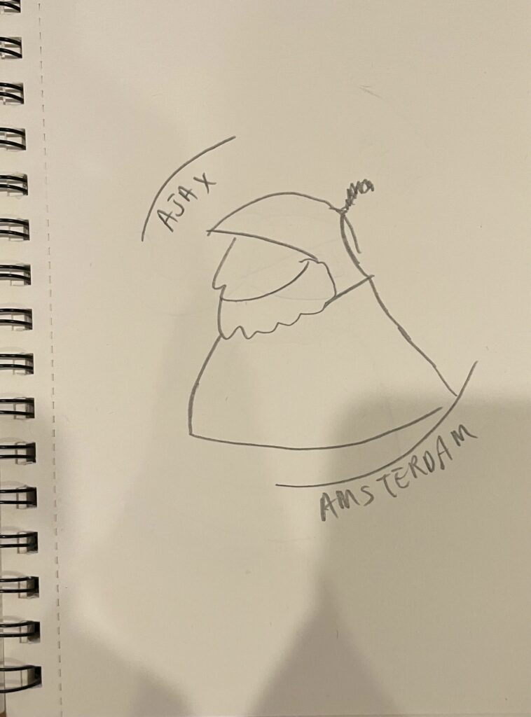
For the Multi-Layer Project, we were tasked to create a work of art that was multiple layers, then glue them together to create a three-dimensional effect. I decided to dedicate this project to my dad, so I created an Ajax Amsterdam emblem for this project. I started with just a few hand-drawn sketches:
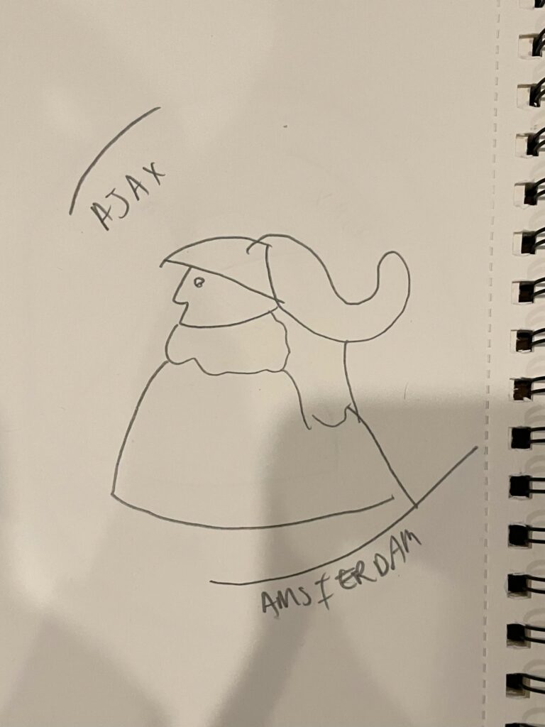
I went through the process of creating the layers of the image in Adobe Illustrator.
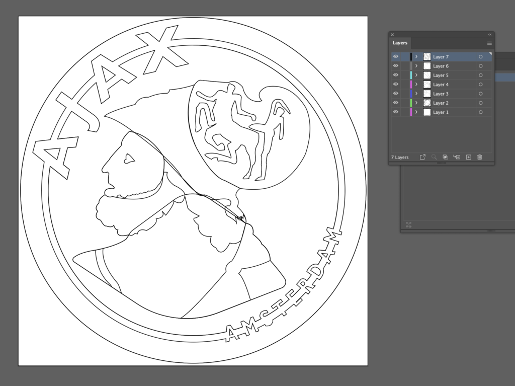
My inspiration for this project was the soccer club Ajax Amsterdam, which my family is big supporters of. Because much of my family lives in the Netherlands, soccer is very important to most of us. Me, my dad, my little brother are all avid fans of the club, so I wanted to commemorate the emotional connection I have to them with this project. I grew from this project because it is one of the few that I was able to get a physical product from that wasn’t just the image of my project printed on paper. My biggest struggle with this project was that I couldn’t wrap my head around how my digital image was going to turn into a multi-layered physical object. I had to re-do the Illustrator file multiple times because I didn’t have the correct formatting in the layers or strokes.
If I did this project again, I would probably have some empty spaces around the torso and hat of Ajax, and then underneath I would have some kind of overlapping pattern because I saw this in some of the other artworks and I really liked the way it looked. I am most proud of being able to create something that I have an emotional connection to, as oftentimes, I look at my work as an assignment, that I have to do, but with this, I felt like I really wanted to create the product.
This project changed the way I see others’ art by increasing the appreciation I have for my peers’ projects which may have had more intricate details than mine. I realize now how difficult and time-consuming it is to create an intricate piece for this project, so I would applaud any of my classmates who did that for their projects.
Design – Product Logo & Movie Poster
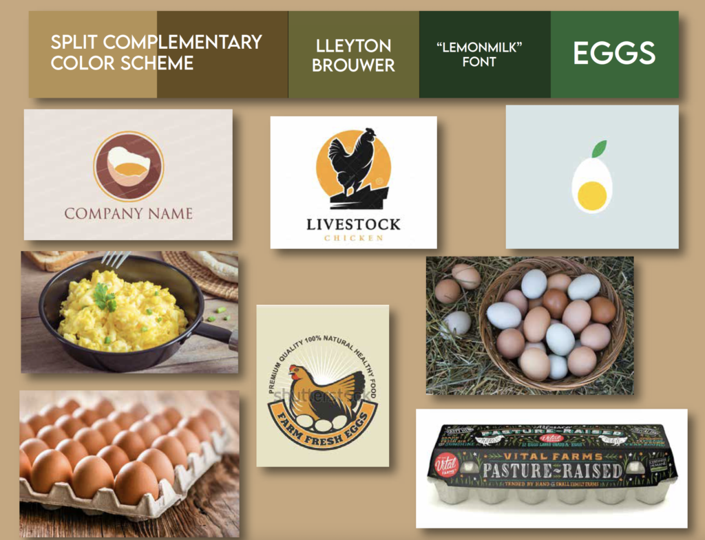
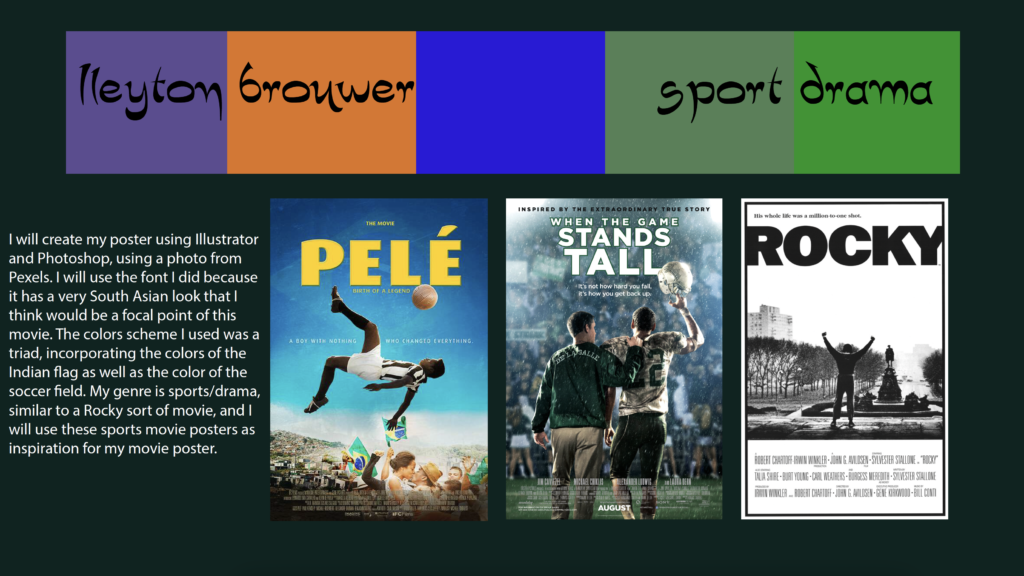
These are mood boards that I created in preparation for two of the big projects in Design this year, the Product Advertisement/Logo, and the Movie Poster. Mood boards are created to collect inspiration, color schemes, fonts, and a short explanation of them in a centralized location. As you can see, on the top of each mood board is a five-color color scheme, with colors I plan to use in my final product.
My product is emu eggs – which are pretty much just very large, blue/green eggs that come from an emu instead of a chicken. My market is mainly non-vegan families, kitchens, and non-vegan people who eat tons of eggs.
As for persuasive techniques and appeals, I would make my egg out to be a much easier way to consume eggs by emphasizing that you only need one egg for a whole family, rather than buying a dozen eggs at a time. I would like to use imagery of a happy family eating, showing consumers how they will feel if they buy the product.
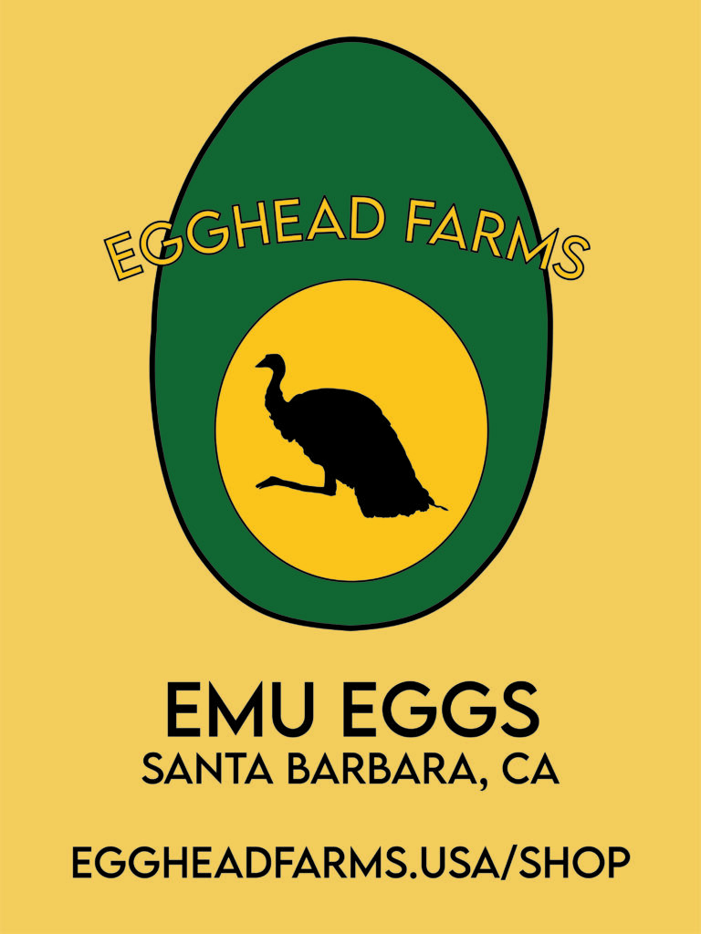
I created my original logo using Adobe Illustrator, with a variety of tools including brushes, pens, and ellipses. The first logo I created featured a cracked egg, with a ribbon across its center reading “Egghead Farms”. After some thought, I changed to my final logo, which includes an emu egg, and a silhouette of an emu within the yolk of the egg. Because of the mockups I used, I had to create two different labels, each of which used a different background color that was a shade of either the yolk or the egg itself. I incorporated a different design of an emu running for one of the labels, and I used the logo element for the other. One of the labels also had to include a relatively large amount of text, including a website and address on one of the mockups, and city and brand name on the other. It was a challenge reformatting the label to fit different mockups, especially the shirts which were hard to keep text visible.
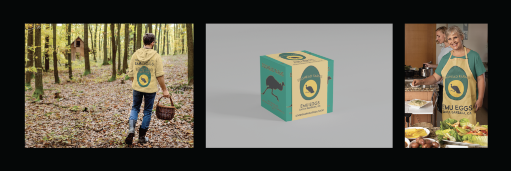
My triptych displays my product logo in the middle, as well as two people wearing Egghead Farms clothing. Egghead Farms is an emu egg farm that is providing massive eggs to people in the Bay Area. My magazine advertisement, on the other hand, depicts an advertisement for Egghead Farms that could appear in a magazine. It depicts the logo of Egghead Farms on the right, and an emu on the left, along with a tag line and recipe for an emu egg omelet.
I created these artworks using Placeit.com, Adobe Photoshop, Adobe Illustrator, and Adobe InDesign. I used Adobe Illustrator to create the original logo, which is an emu egg (which are famous for being a dark teal color) with an emu silhouette within the yolk of the egg. I went through a few revisions of the logo, and finally was happy with it when it got to this point. This was one of the more professional-looking drafts as opposed to a more “homemade” drawing style. For the other elements of the triptych, I used Placeit.com, which is essentially a stock imagery website on which you can add your own logos and elements to the images. I essentially uploaded slightly altered versions of the logo to different images, and matched the color of the shirts, aprons, etc, to the colors of the logo. This was tricky because I wanted to keep the same shapes as the original logo while still matching the image size to the size of the stock imagery. For the magazine advertisement, I used Adobe InDesign to add all my elements together and add text. I used Adobe Illustrator to create the emu illustration on the left, as well as the slightly different logo on the right. This was a fun project because there was a common theme that tied together a bunch of smaller projects, like the magazine ad or the triptych.
The poster I made is based on the story of a boy from outside New Delhi who aspires to be a professional soccer player. However, around his area, there aren’t many scouts looking for soccer players, so he has to give up on his dream at a young age. His parents also pressure him to study hard so that he can make a good life for himself. When he moves to a university in New Delhi, however, he picks up soccer again, and eventually is noticed and befriends an English scout. He has to decide whether to continue his education in New Delhi or take a massive risk and pursue his dream by moving to England and attempting to become a professional soccer player.
To create this poster, I mainly used Adobe Photoshop and Adobe Illustrator. I found the image used on Pexels.com, a stock imagery website, and I used Illustrator to transform it into a vector illustration, which I then transferred to Photoshop. I search Dafont.com for a font that matched the story that my poster was based on and decided on this script-like South Asian font. I used various logos at the bottom of my poster to make it look more professional, and added a credit block as well, all in Photoshop. This was a really fun project because there was a lot of variability in the artwork style, the subject matter, and nearly everything about this project.