Introduction
For the explorations unit, we get the chance to learn new skills and explore our passions. This unit incorporated a lot of creativity and risk taking. For my project, I decided to study color and lighting transitions. I liked the way lighting and color was handled in Steven Universe, so I wanted to figure out how to incorporate similar color and lighting into my own animation.
Process
My inspiration for this project came from my experience at Freestyle this year. I met some really amazing people this year. This project was made during quarantine due to the corona virus outbreak. I missed my classes and my friends, so I wanted to do something related to that. Another thing I was inspired by was my love for animation in general. The ability to create a world where anything can happen, I wanted to do something related to that as well. I decided to do a series of lighting transitions with Freestyle’s campus as my setting, and otherworldly storm in the middle to incorporate the surreal part.
I started by researching color theory and noticing the things that I liked about the lighting and colors in other media. I liked the way they made the colors in the background vibrant without it clashing with the foreground colors.
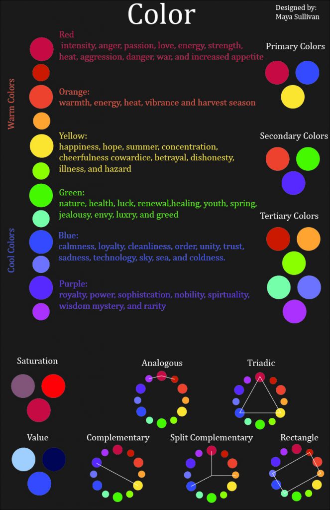
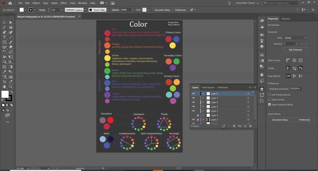
I used the results of my research to make an infographic explaining the psychological associations with different colors and different common color combinations. The more saturated a color is, the brighter the mood, but if they become too saturated the colors will clash. If a color has very little saturation, it makes the scene look desolate. I had to pay extra attention to this when working on my animation, especially during the sunset/sunrise parts. Since the main background color is orange, and the foreground is mostly blue, I had to make sure they didn’t clash, but I also didn’t want the scene to look sad or faded. I ended up using a more muted blue for the foreground and a pastel orange for the background. For the rainy parts, I tinted it blue to stop the scene from looking overly grey. During the surreal part of the animation, I decided to use green because of its connotation with renewal, it’s the color of Freestyle’s octopus mascot, and because it fit well with the cool colors of the foreground.
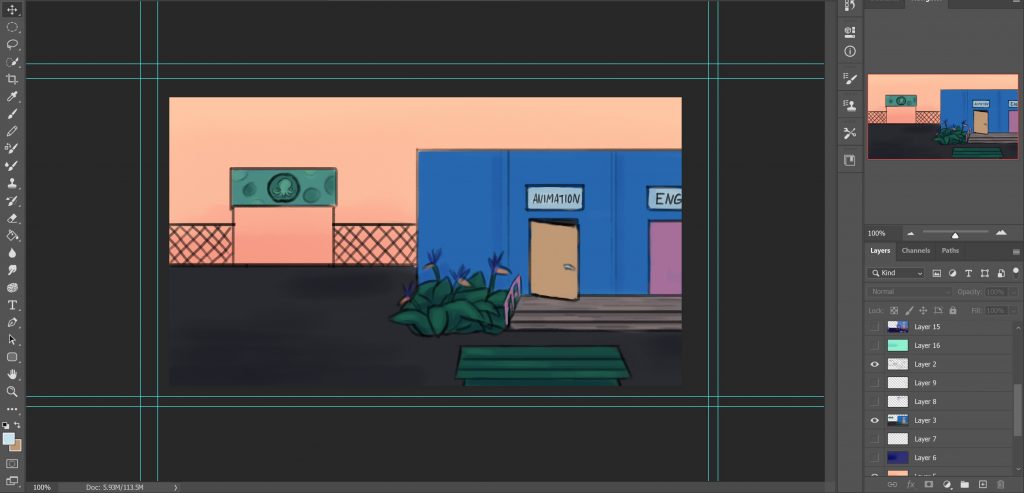
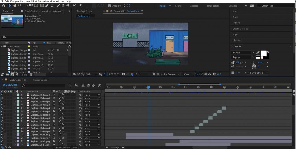
All the drawing for the animation was done in Photoshop. The animation for the hair and clothes movement was also done in Photoshop.
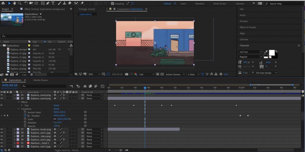
The bulk of the animation was done in After Effects. To create the background transitions, I placed part of one background on top of the other, and then used keyframes to change the opacity. Doing that alone made the colors muddy, so I used a tint effect to keep the colors from turning muddy.
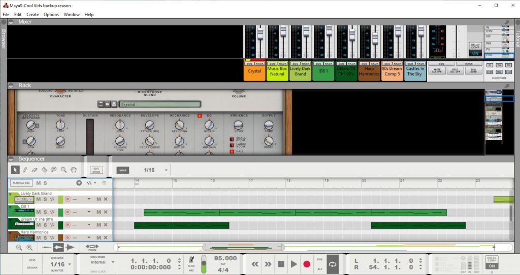
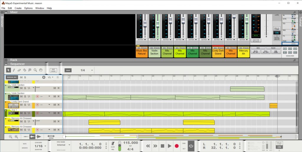
Although this project had a focus on color and lighting, I had some time at the end so I decided to create a song using Reason to put in the background. It’s inspired by the Steven Universe soundtrack, the Interstellar Soundtrack, and Lofi music.
Final Production
Experimental Music
My music was inspired by the soundtracks in a lot of the anime I watch. I liked how they could be in a really dark situation, but the music still sounds kind of hopeful. The world is in a pretty dark situation right now, so I wanted to do something that reflected that.
Reflection
Overall, I learned a lot about lighting and color by working on this project. I also learned about music production. I like that this unit allowed us to be really creative and do a project that’s almost entirely guided by ourselves that we’re passionate about. It allowed us to take risks and figure out a new skill on our own, and I thought it was a really interesting process. I’m also really happy with the way it turned out.