Reflections Unit Introduction
The Reflections unit experiments with answering the question “Who am I?” through various artistic mediums. We write essays exploring our motivations and past experiences that led us to creating the art we do today. We strengthen our skillset in technical communication through our continued use of Adobe Photoshop, Illustrator, After Effects, and more.
Digital Media Work
My Personal Mandalas
The mandala project consisted of four main parts. First, learning how to set up the Adobe Illustrator file for different numbers of repeating mandala sections. In the next part, we used pressure sensitive brushes and Wacom pen tablets to create the black and white version of our mandalas. After making the black and white version, we made the colored version by choosing a color palette and adding color to both the existing strokes and the negative spaces. The last part of this project was making a build video that shows all the layers of the mandala turning on, one by one, showing a close up gradually zooming out.
If the images do not display below,
On a Mac, press Command + (plus) then press press Command – (minus)
On a PC, press the Ctrl + (plus) then press the Ctrl – (minus)
Mandala Laser Engraved on Acrylic
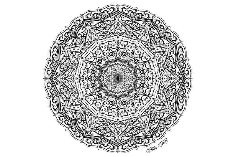
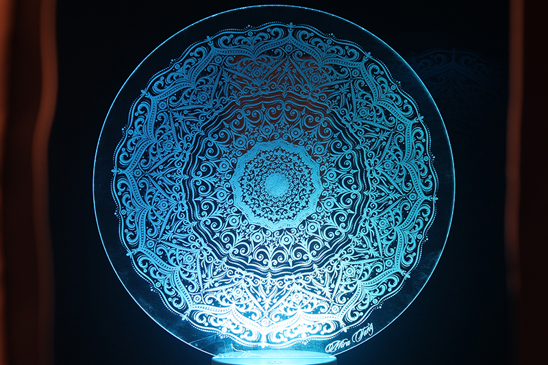
My initial reaction to seeing my final laser engraved mandala on acrylic with a light stand was surprise that it turned out so good because I was worried the small details I included wouldn’t translate well to being engraved. It was really fun to play around with the light stand, changing the colors to see how it changed the way my piece looked. I had my design also engraved on a second material, so I was also surprised to see how the finest of details looked even better on the one engraved on bamboo. When I compare my digital BW mandala and my physical laser engraved mandala, I really appreciate all the time and effort I put into the details because it gives the physical one much more depth and interest. I like that the light stand allows me to change the color because different colored evil eyes have different meanings, so changing the color is like changing the meaning of the whole piece.
My choice of acrylic for my laser engraved mandala best represented me because it allows the design to be dynamic and change with the different colors. It lets the artwork itself have more meaning with different interpretations. Through this project, I can apply what I have learned about pressure sensitive brushes to any future work I do in Adobe Illustrator, and use the techniques I learned to add depth and movement to this work. Seeing how other people included parts of their life and identity into their mandalas through little easter eggs was really interesting because I think it added so much meaning and thoughtfulness to their designs. I really enjoyed looking at other people’s work and trying to find all the things they hid inside it.
Colored Mandala Printed
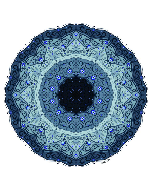
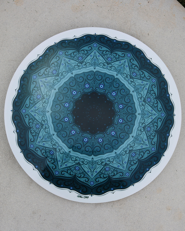
For this piece, I built off my original concept for the black and white mandala using evil eyes, and made the entire colored mandala look like an eye itself. This artwork is different from my black and white mandala in that it uses the shapes and sections along with color to create the appearance of a pupil and iris. For the most part, I really like how the printed version came out, but the blues did pull a little more teal than how they were in the digital version. I used a monochromatic muted blue color palette to go along with the traditional evil eye colors being bright blue. My idea was to make the mandala look like what an evil eye would look like if it wasn’t stylized, as in a more muted blue-grey iris. Specifically the blue evil eye represents protection and calm, which were core concepts I wanted to illustrate in my piece. Using a reference image of a real blue eye, I used lighter blues in the middle of the iris and darker blues both fading out to the outer ring of the iris and along the edge of the pupil.
Working with color allowed me to add much more depth in my mandala as I could change the shades and tints of both the background colors and the colors of the strokes themselves. This along with the different thicknesses of the strokes allowed me to pull some details out more and have others fade in. When I was working with only black and white strokes, it was difficult for me to have certain details or strokes grab the viewer’s attention more than others, because I could only change the thickness or style. Working with color changed my overall attention to detail because it forced me to really think about which details I wanted to be more prominent and which I wanted to exist more to fill the gaps but not be as eye-catching.
The brighter blues of the evil eyes stand out the best against the more muted background and stroke colors in my mind. I surprised myself with how well the evil eye motif works alongside the concept of the mandala being an eye as well. Overall, I really enjoyed this project and I hope to apply what I learned about color and strokes to other pieces I make in the future.
Mandala Build Reveal Video
This is the mandala build reveal video, which shows each small section or stroke of my mandala turning on individually. The video starts zoomed into the center of the mandala, showing the tiny details in the middle, and gradually zooming out to show the entire piece. To make this production, I used Adobe After Effects to add music, a title page, and a final image of the piece to the video.
Over the course of the entire project, from creating the mandala templates to learning how to use pressure sensitive brushes and color to my advantage, I think I learned a lot about features in Adobe Illustrator I didn’t know how to use or didn’t even know existed before. Also, I was able to improve my skills with these features much quicker than I was expecting. Overall, I am most proud of my ability to execute my vision for the project and capture the viewer’s attention with the details.
English Writing
Why I Paint Essay
This essay details the story of how I have come to where I am with painting over the course of my childhood through today. To write this piece, I went through a lot of phases of editing and revising to include many anecdotes from different times in my life and describe how I struggled over the years with being insecure about what I create. With this project, I explained a lot of vulnerable aspects of my life that apply to more than just painting, such as my insecurities, internalized self-criticism, and more. Throughout the process of writing this piece, I learned how to be more vulnerable and openly honest with my audience–something I have struggled to be confident with in the past.
Full Audio of Why I Paint
Full Essay
Design Projects
Concert Poster
With this project, we were challenged with the task of choosing a music artist or band from the 2010s or before and making a poster for them. We had to research the genre of their music and the time at which they were making said music to decide what the design of the poster would look like. The goal was to emulate the style of concert posters at the time. On the poster, we had to include the artist’s name, tour date, venue, and time.
Moodboard
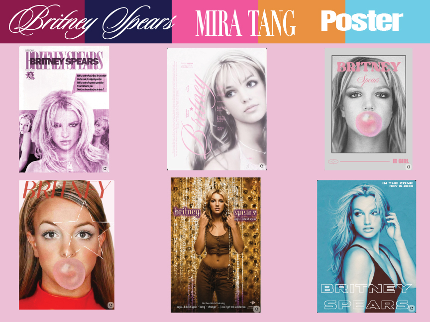
This is the moodboard I created for this project. I found various inspiration images of other posters of Britney Spears that I used to see what kinds of graphic styles were used in the early 2000s. I also chose a fitting color palette and a few fonts that I picked based on what seemed to be popular at the time.
Final Poster
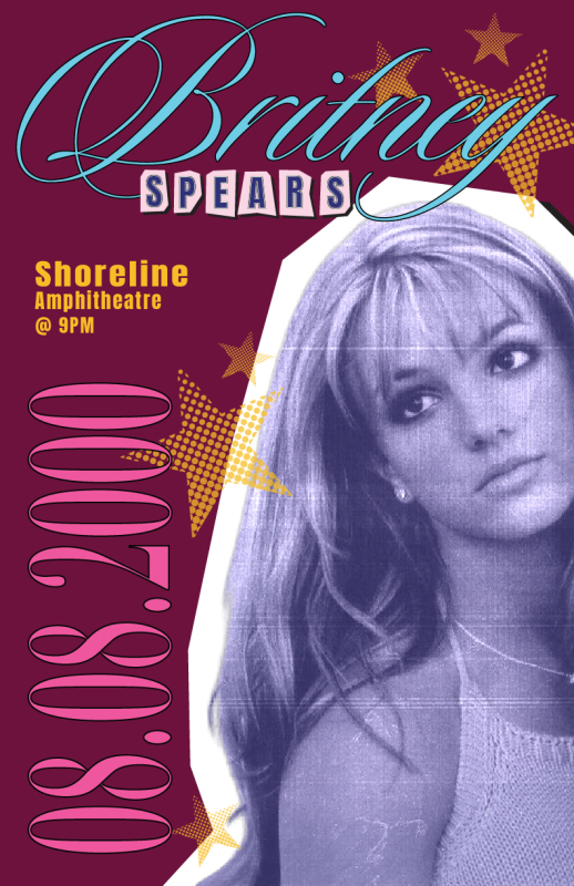
Britney Spears gained popularity in the late 1990s, peaking in the early 2000s. These years were defined by a variety of music genres, ranging from R&B and hip-hop to dance pop and club pop. Britney Spears was a y2k staple music artist, known for her energetic and catchy dance pop.
To create my concert poster, I used a combination of primarily Adobe Illustrator and some Adobe Photoshop. I found inspiration in concert posters from the early 2000s and combined multiple design concepts into what ended up becoming my final design. I used bright colors and eye-catching fonts to highlight important elements, and a cut paper or collage-esque style to add depth and interest. I found an image of Britney Spears from the internet and took it into Photoshop to overlay a scratched texture and color wash. I then put this into Illustrator along with other smaller graphics I used to fill the excess negative space on the artboard. After some small adjustments, I came to my final design that is advertising a real tour date Britney Spears had in the year 2000 in Mountain View, California.
During the creation of this piece, I learned about how helpful it is to use multiple Adobe programs together, specifically Photoshop and Illustrator because they have strengths and weaknesses the other program covers. Overall, I am very happy with how my final poster came out and I don’t think there’s anything glaringly wrong that I would want to fix.
Aboriginal Art
This project was inspired by the traditional Aboriginal painting style of using varying sizes of dots of paint to create images. In our digital versions, we picked an animal that we felt represented ourselves to be the main focus point of the piece. We included our astrological sign and constellation, along with multiple different Aboriginal symbols. The goal was to create an eye-catching piece that represents who we are.
Aboriginal Sea Otter
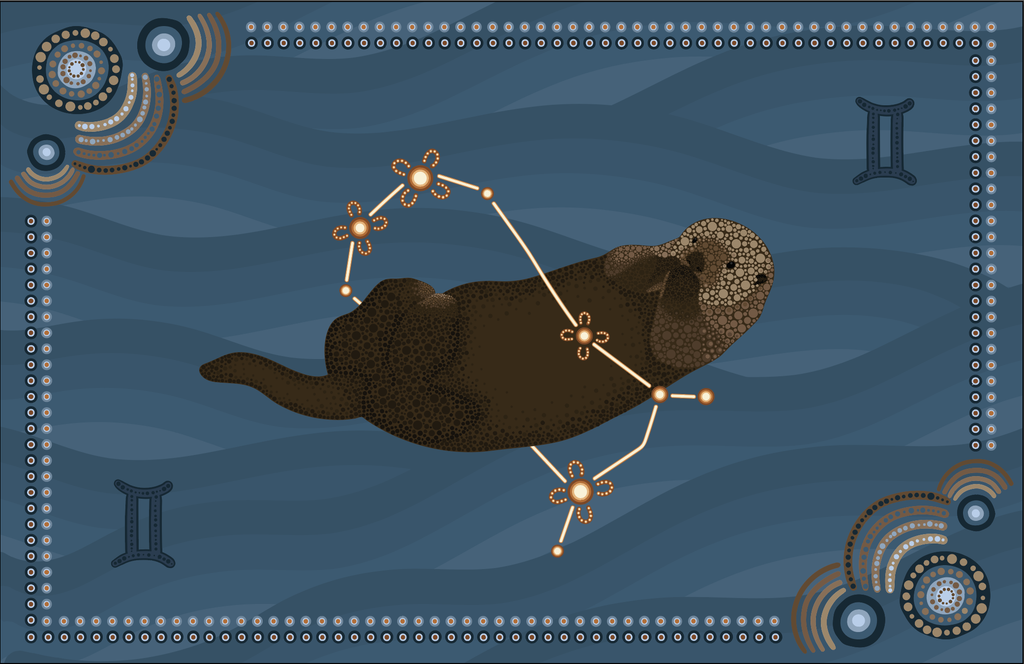
In my piece, I have included four aboriginal symbols, the gemini symbol, gemini constellation, and an animal I identify with – the sea otter. Of the four aboriginal symbols, the concentric circles represent a campsite, the stacked arches represent clouds, the stars of the constellation represent women sitting, and the waves in the background represent water flow. I chose a sea otter because they are known to be quite resourceful, playful, and family oriented, like myself. They are the one of the only non-primate mammal species that use tools, commonly using rocks to break open shells of their food and keeping their favorite rocks for a long time. Sea otters also often float and groom together in groups, which I would like to think is similar to my strong connection to my friends and family.
I created this piece using primarily the brush tool in Adobe Illustrator, making each dot individually by hand. It was difficult to figure out the size and density of dots that lent itself well to this design, as too small and too dense meant the area would look as though it was filled with a solid color. With some trial and error, I was able to find a happy medium that worked consistently, and would use previous sections I did as a reference for the size and density of whatever I was working on. If I were to do this project again, I would definitely create a better starting sketch of the entire design, with the symbols, background, animal, and frame planned out. While I had a rough idea of what I wanted to create, much of the smaller details were hard to figure out because I was essentially making them up as I went. However, overall I still like the final product I created and how I arranged all the components.
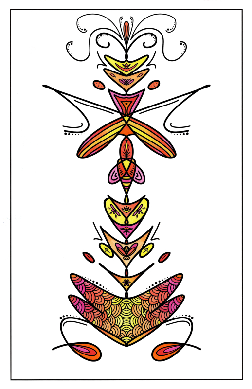
Watercolor Cursive Name
This project was the first this year to combine both digital and physical forms of art. We wrote our names in cursive in Photoshop and mirrored them to create interesting shapes. We then filled the shapes created with various kinds of zendoodling and patterns. After printing this out, we chose a color scheme and used watercolor to fill in the shapes and patterns we drew out digitally.
Mira Yin
Reflection on Design Projects
Over the course of the Reflections unit in Design, I like how we progressed from something we all were more comfortable with to more difficult and less familiar things. We have been working with Adobe Illustrator for a long time so the concert poster was a nice way to ease into the school year. Moving on to the Aboriginal art was a change in difficulty because drawing each dot out individually was incredibly time consuming and tedious, but also extremely rewarding at the end. The watercolor name project was fun because it integrated physical media into the class, which we hadn’t yet experimented with, including last year.
I really appreciated the progression of the works and how each one posed it’s own challenges in different ways. The Aboriginal art was particularly interesting because we had to include pieces of ourselves to represent who we are in the art, which is connected to the prompt of “Who am I?” that the entire reflections unit is built around in all the classes.