Reflections Project Introduction
For the Mandala project, we were asked to create both black and white and colored mandala designs with radial symmetry using the Transform Tool in Adobe Illustrator, which we then had physically printed.
My Personal Mandalas
I produced a 10-slice black and white mandala using a variety of pressure sensitive brushes. I took heavy inspiration from Ottoman ceramics/glassware and other Middle Eastern art for this piece, including motifs such as pomegranates, tulips, carnations, and evil eye charms. I chose this so my mandala could remain primarily abstract while also representing an aspect of my identity, being that I am half-Turkish. Additionally, I felt it would be a fun challenge to emulate a distinct visual style which I haven’t worked in before.
I was relatively comfortable with using pressure sensitive digital brushes thanks to my experience in Animation, but it was a first for me designing with radial symmetry in mind, and some of the specific shaped brushes took time to get accustomed to. Having to edit individual strokes for many small tweaks, this project also gave me an opportunity to continue building confidence with Illustrator path editing. Overall, this project was super enjoyable for me, and I’m pretty proud of how the final product turned out.
If the images do not display below,
On a Mac, press Command + (plus) then press press Command – (minus)
On a PC, press the Ctrl + (plus) then press the Ctrl – (minus)
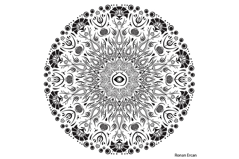
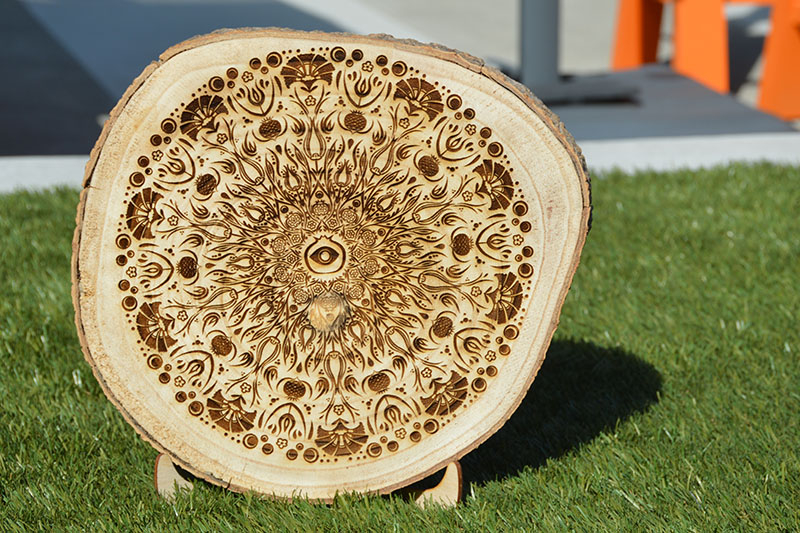
I was excited upon seeing the final laser engraved mandala on wood, and surprised that almost all of the fine detail was maintained going from digital to physical. The wood’s color and texture gave the piece a totally new look compared to the BW version, which I was pleased with.
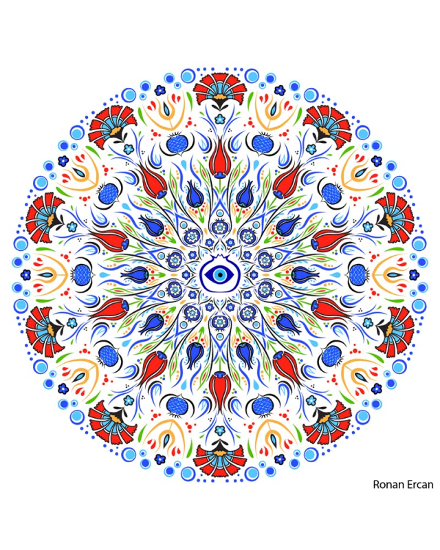
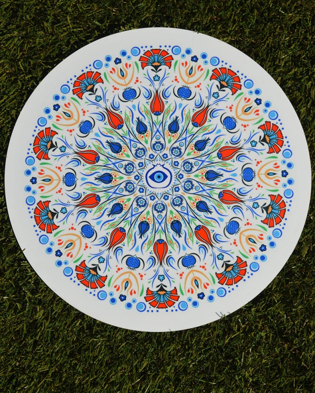
I produced a colored version of my BW mandala. I was super excited and satisfied to see that it came out with the look I was hoping for, because I’d anticipated the design would really pop once I added color. Similar to the design as a whole, my intentions with the color scheme were to evoke the aesthetics of classical Ottoman tile and ceramic art.
Working with color allowed me to give the design more areas of contrast and ensure the various sections of the piece remained distinct but cohesive. Color is a major component of the motifs I included, so`me of which just don’t really work without it (the evil eye, for instance), so its addition definitely made a big difference. I was pleasantly surprised by how much color elevated the mandala, and, overall, the process of coloring it was quite satisfying and enjoyable.
I used Adobe AfterEffects to produce a sped-up build video with music to show my process for the Colored Mandala.
The entire mandala project was a relaxing and engaging experience for me. In particular, adding color into my BW mandala was a satisfying design challenge. I’m proud of having achieved the exact aesthetic I was aiming for in my design, which in my opinion turned out quite pleasant. Overall, this was a great opportunity for me to experiment with a more abstract style through such a visually distinctive medium like mandalas.