digital media
introduction
This Reflections project pulls together the major productions from all my Freestyle classes and shows how each one answers “Who am I?” in a different way. In Digital Media, I created my mandalas in Adobe Illustrator using templates, clipping masks, and rotational transformations to build out the full circle from a single slice. I made both a black-and-white version and a colored version, then produced two physical forms: a laser-engraved wood print and a sublimated plastic print. I also made a Mandala Build Reveal Video that screen-records my layers and process, then edited it with effects, music, and transitions in After Effects. In English, I curated my own “personal museum” from works I photographed at the SF MoMA, choosing three pieces I would include and two I would leave out based on how they reflect (or don’t reflect) my identity and taste. [Insert Design class work here later.]
art curation for personal museum
For the Art Curation Project, we went to the SF MoMA and photographed five artworks, three I would include in my personal museum and two I would exclude. I chose the three pieces that genuinely grabbed me, either because they felt confident, intentional, or visually unified in a way I respond to. The two I excluded didn’t connect with me for the same reasons: if the idea isn’t clear or the composition feels messy, I have a harder time relating to it. My own habits as an artist definitely influenced my choices. I’m hyper-focused on cohesion, clarity, and purpose, so I end up expecting that from the art I admire too. Altogether, the collection I built says a lot about who I am, someone who values confidence, strong ideas, and a sense of visual order.
3 art pieces I would add
to my personal museum
2 art pieces I would exclude
from my personal museum
My own artwork and criticism of myself have influenced my choices about these pieces because I always strive for a look of confidence and a very solidified idea. When that isn’t apparent or obvious, I struggle a lot more to relate to the artwork. I constantly find myself unhappy with my work or redoing it over and over again if I feel like it doesn’t portray my idea clearly enough. Another thing I find myself worried about is unity or cohesiveness and a piece, and I always struggle with striving for perfection in that area, when that’s not realistic. Because of this, I noticed that I am sometimes overly critical of other artists’ ability to make whatever their subjects are connect in a way that’s visually pleasing and easy for your eyes to understand.
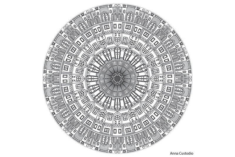
my personal mandalas
In Digital Media, we created personal mandalas that reflect who we are. We started by designing one slice, then used Illustrator settings that automatically repeated and rotated that slice around the full circle. From there, we added details, used clipping masks, and built up balance and rhythm. The goal wasn’t just to make something pretty, it was to represent identity through structure, repetition, and symbols that mattered to us. We produced a black-and-white digital version first, then created a colored version and printed both physically: one laser-engraved on wood and one sublimated onto plastic. Seeing the same design come to life in two completely different materials made the project feel way more real and personal.
“always around” BW mandala by me
To answer “Who am I?” for this mandala, I used buildings and architecture that represent places I’ve been and experiences that shaped me. For this piece, I first designed concentric rows of different structures and then used repeating and reflecting transformations to create balance and rhythm. The title, Always Around, reflects how every place and memory continues to circle within me.
This piece includes my core values of curiosity and exploration as represented by the different buildings. Each layer of architecture reflects experiences I’ve carried with me, whether from travel, community, or daily life. The rows illustrate how my identity is built from different spaces, stacked like bricks, each one necessary to the whole. I also added “easter eggs” of small symbolic details, like structures that hint at places special to me, because they remind me that identity isn’t just the big landmarks, but also the quiet corners of memory. To exhibit my belief that experiences shape identity, I used repeating transformations, boundary drawing, and clipping masks to give order and structure, just like memories shaping a pattern.
Using drawing tablets and pressure-sensitive digital brushes was challenging at first because I had to control stroke width and balance texture without making the piece feel messy. But through practice, I started to see how line weight, texture, and CRAP principles (contrast, repetition, alignment, and proximity) gave my mandala both order and movement. Before this project, my technical skills were pretty basic, and after, I’m more confident about layering, digital techniques like overlaying art, and paying attention to composition. I also confirmed that I’m patient enough to work through trial and error, and I actually enjoy problem-solving in art.
If the images do not display below,
On a Mac, press Command + (plus) then press press Command – (minus)
On a PC, press the Ctrl + (plus) then press the Ctrl – (minus)
laser engraved mandala
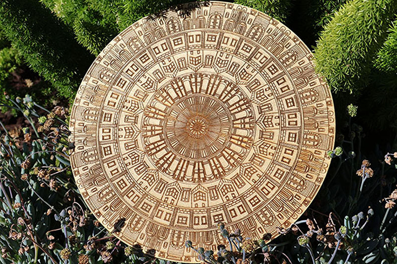
When I first saw my mandala laser engraved into wood, I was surprised by how real it felt compared to the digital version on my screen. The design had started with repeating slices and reference lines, but on wood it became heavier, like the memories and experiences it represents. My mandala, Always Around, is made of concentric circles filled with different types of architecture, showing the places I’ve been and how they layer together to shape who I am.
I chose wood for the engraving because it felt alive and grounded, unlike something shiny like acrylic or plastic. Buildings can rise and fall, but wood connects to history and growth, and it made the piece feel more personal. Looking back on the whole process, from making templates to experimenting with different strokes, adding color, creating the reveal video, and finally seeing it engraved, I learned a lot about patience and technique. Working in black and white made me focus on precision and contrast, while color showed me how mood and energy could shift. The part I’m most proud of is how the final engraving turned out. It actually felt more authentic than the digital version, because the natural marks of the wood added something I couldn’t have designed on a screen.
Through this project I’ve learned both technical skills, like transformations and pressure-sensitive strokes, and a bigger idea of what art can mean. I know I can use these lessons in future projects, whether in design or other classes, because they taught me how to build ideas step by step. Before, I only valued art for how polished it looked. Now I see the importance of process, mistakes, and personal history. This mandala helped me appreciate that every artwork is also a record of where someone has been.
colored mandala
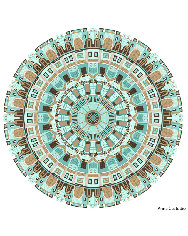
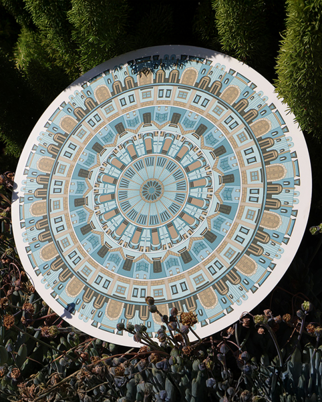
For this piece, I made my mandala with rows of buildings and architecture, but this time I added color with different fills and strokes. This piece is different from my BW Mandala because the color makes it feel more real and alive instead of just a design. When I first saw the printed colored mandala, I thought the muted blues and browns gave it a calmer, more realistic look, almost like a city map.
The color scheme represents how I connect to real places in my life. I chose blues to show calmness and stability, and browns to show the earth, structure, and everyday buildings. I wanted to keep the colors muted because I didn’t want it to look cartoonish or fake. I wanted it to feel realistic, since all the buildings in my mandala are based on real places I’ve been and experiences I’ve had.
Working with color changed the way I made the piece. With just black lines, I had to focus on line weight and symmetry, but adding color made me pay more attention to space, value, and blending. It also made me more careful about things like clipping masks, overlays, and brush pressure, so the colors would actually fit together instead of clashing. Through this project, I learned how much color can change the mood of a piece, and I can use that in my future artwork. Overall, the colored mandala feels more personal and connected to me than the BW version.
final reflection
To make the Mandala Build Reveal Video, I screen-recorded myself revealing the layers of my mandala inside Illustrator. Then I took those clips into Adobe After Effects, added transitions, timing adjustments, music, and a title card, and edited it into a clean reveal sequence. The video shows how the mandala develops from a single slice to the full final design, giving people a clearer look at the process behind it rather than just the finished piece.
This was one of my favorite projects at Freestyle. It’s rare to take something symbolic about yourself and actually see it become a physical object you can hold. The laser-engraved wood version especially made the whole design feel solid and meaningful in a way that a screen can’t. I learned a lot about Illustrator, transformations, textures, color, and just being patient with the process. More than that, it made me appreciate how personal artwork can be when you build it from your own experiences. I’m really glad this project is part of the curriculum because it actually feels like something I’ll remember.
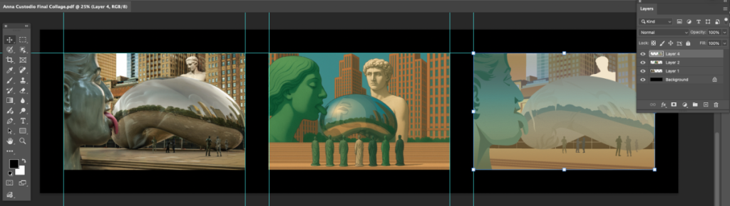
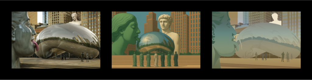
design
surreal summer triptych
concert poster
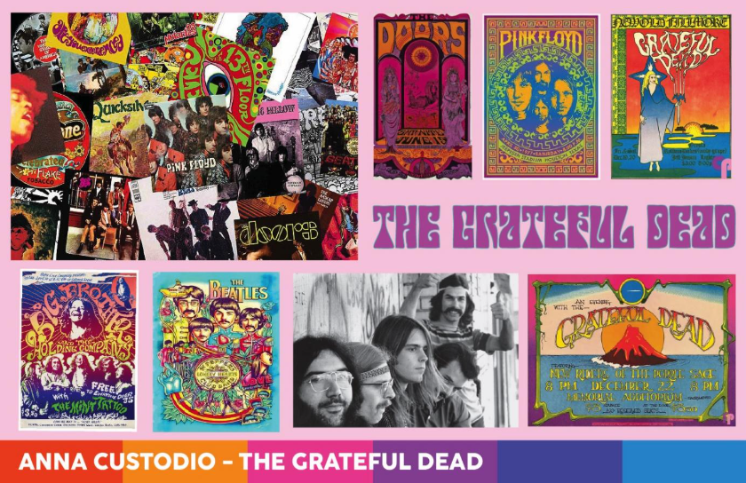
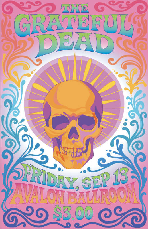
artist statement
The Grateful Dead were most popular in the late 1960s, during the Summer of Love. It was a time full of peace, protests, and experimenting with new ideas. The band really captured the spirit of that era with their laid-back style and focus on freedom, community, and creativity. Their music and attitude became a symbol of the whole hippie movement.
Their music was rock, more specifically psychedelic rock. It had long, improvised jams and a sound that felt dreamy and unpredictable. They liked mixing different styles and letting their shows feel loose and spontaneous. Each concert was unique, which made fans feel like they were part of something special.
I made my poster using Adobe Illustrator. I learned how important it is to plan things out because I definitely ran out of time near the end. I was still really proud of how it turned out, but if I could change anything, I’d add more detail to the background and the font, and just spend a little more time fine-tuning everything.
aboriginal art
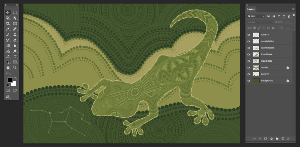
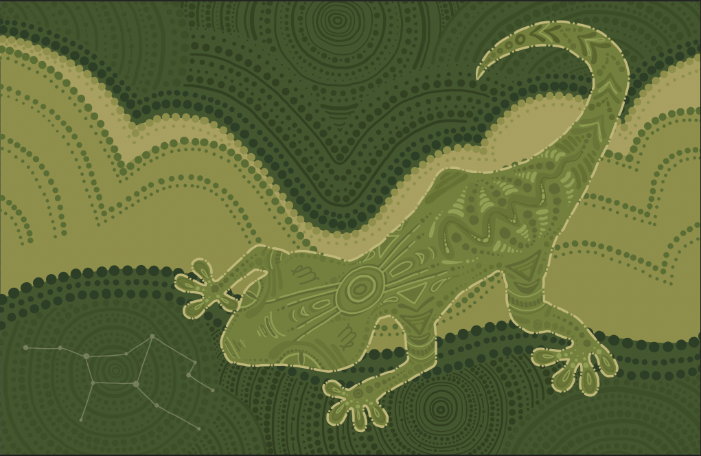
artist statement
My piece is a gecko in the style of Aboriginal art because I felt it was an animal that represents me. I included the Virgo constellation in the background and symbol twice on the gecko’s head to show my astrological sign. The light clouds in the background represent a free spirit. The circles stand for campsites and watering holes to show a love for nature and travel. There’s also a meeting place near the gecko’s head to represent friendship. I added a snake shape along its back as the spine because I thought it made the design more interesting.
I created this piece in Adobe Photoshop using primarily dots and lines inspired by Aboriginal art. At first, the colors were too blue-green, which didn’t fit the natural tones used in the authentic style. I fixed it by changing the shades to more earthy greens. If I could change anything, I’d add more detail and texture to the background to make it feel more alive and connected to nature.