Narrative Visual Perspective in Design
PRoduct advertising project
In order to learn how to market, we created a logo, a label, and a magazine advertisement in class. I wanted to create a spray paint company, centered on the idea of space, and directed more towards artists, rather than people using spray paint for utility. I wanted the design to be cool to look at, and to be used to create cool things as well.
Mood Board
I started with the concept of a vortex, and using the cosmos to represent creativity and spark inspiration. My mood board was meant to collect references for color and texture, and pick out fonts that I could use on the logo and label.

logo
I created a logo centered around vortexes as inspiration. I used Adobe Indesign to create my logo, using gradients and spray paint-like fonts. In the center, I added rings of white to replicate light. I used the main colors of turquoise and burnt orange, and black and white.
label
For the label, I created a new file in Illustrator, and with my logo, created a promotional image that would go on the spray paint can. I included a fake website, the logo, the name of the product: vortex ink, and the product itself, spray paint. I also included some example surfaces to use the paint on, advertised that it is quick-drying, and also included a warning of how flammable it is. I also included the amount of paint inside of the can, and the name of the specific paint color in the can. around all of that information, I created a flowing space inspired shape with the pen tool, trying to recreate the feel of stars and galaxies, so that the can felt as artistic as the product.

FInal product and Magazine ad
Finally, we created a magazine advertisement. For my ad, I wanted to express the expansive nature of the product, and how it would enable artists that bought it to improve their art exponentially. For my tagline, I decided to use the sentence “take your art to the stars” since my imagery was space focused. This allowed me to keep with the theme I had been creating. I also had a lot of trouble with Indesign and mixing my product photo with other promotional photos to make my ad more interesting, so I ended up sticking to my original product photo and added more promotional text and graphic design elements to it.


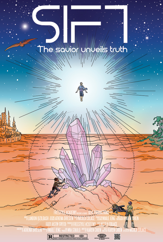
Movie poster
Our aim for this project was to take our world that we built in english, and present it in a movie poster format, in a way that would catch people’s attention and draw them in. I used my group’s world called SIFT, and depicted an important moment from the story.
Mood Board
I created this poster in Adobe Photoshop using the brush tool, and a lot of gradients. I was really interested in capturing the essence of a Moebius drawing, so in my mood board, there are a lot of photos of his art that I am referencing. I replicated the watercolor paper texture by using a texture png and overlaying it. I used a similar inking style where the line width is pretty standard across the whole image, and the font I used was very scifi and loopy in odd ways. I struggled a lot with the gradients, but the vibe I wanted to give was ethereal and bright, like you were witnessing something important. I didn’t want the people to be the focus really, so I made them super small, so that the image pushes you towards considering the larger context, just like how the characters must in the story.

final poster
This poster is of a story that follows a group of misfits in a world ravaged by a nuclear explosion. The population in the story is ridden by birth defects, resulting in a prosthesis centered society. Taye lives in a poor, cultish village that worships what they believe to be a sentient crystal. Silas is a traveling prosthesis doctor who helps the village often, and together, they find a boy named Ani, who has no brain, as it has been replaced by machinery. The pair then take the boy to a festival in the village. At the festival, Ani has a seizure because of the crystal, which is what I am capturing in this image. The group travels to the main city named Lisant, where they search for help, and then venture on towards a mine in the more radioactive part of the world. At the climax, Ani has another seizure, and a friend they’ve made along the way betrays them. This is also depicted in this image.
I valued the full process of creating these advertisements, as it gave me a rough idea of what companies have to think about in order to get attention to their work. I had to think about target audiences, taglines, and other ways of drawing in interest. I am overall pretty happy with the end products, and I am aiming to do some more work in this field in the future.