My first project as a junior was to develop an ability to express my ideas abstractly. I explored various forms of expression in this unit through poetry, music, art, photography, and web design. The work that I completed in all three of my classes – Design, Digital Media, and English – were interrelated; for example, I created a video in Digital Media and edited photos for Design out of a concept statement that I had written for English.
I gained several technical skills during this unit. For devices, I learned how to operate a DSLR Camera and a Tascam Audio Recorder. In the software application aspect, I learned how to use Adobe Photoshop, Adobe Premiere Pro, Adobe After Effects, and WordPress.
Poetry:
For the poetry unit, I wrote a haiku, two free verse poems, and collaborated with classmates on an exquisite corpse poem. I learned to communicate my ideas both concisely and more creatively. I produced two videos (one for the haiku, one for the exquisite corpse poem) using two different programs (Adobe Premiere Pro and Adobe After Effects respectively). For the other two poems (free verse poems), I applied my Photoshop skills to creating album art for the poems.
The intention statements for my poems can be found at this link.
Photo Haiku:
For the Photo Haiku project, I first developed a haiku in English, then produced a short video for the haiku with an accompanying image and music. While writing the haiku, I learned how to use seasonal clues, called kigo, to add a further layer of meaning to the poem, as well as using a cutting word, or a kiriji, to deliver an element of surprise. On the video production side, I learned to select fitting music and the surprising amount of effort it takes to work with text.
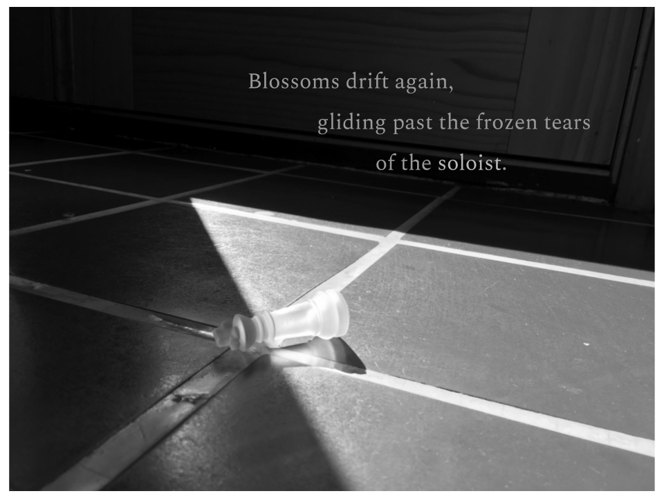
My Photo Haiku in an image format
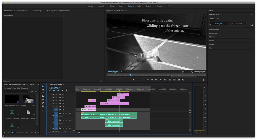
My haiku video production in Adobe Premiere Pro
Spoken Poems:
Poem 1 – “Metronome”:
“Metronome” is a free verse poem that I wrote about my metronome. A metronome is a device meant to help musicians ensure that they are staying on the beat while practicing; while it is a useful device, I wanted to convey my feelings of resignation when using it.
Poem 2 – “Presque Vu”:
“Presque Vu” is an ekphrastic poem that I wrote in response to the piece “Incomplete Open Cubes” by Sol LeWitt at the SFMOMA. Presque Vu is that tip of the tongue feeling that happens upon seeing something familiar but not quite being able to place it, and I experienced this upon seeing LeWitt’s structures.
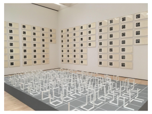
Sol LeWitt – Incomplete Open Cubes
1974 – Wood, paint, gelatin silver prints, and ink on paper with transfer type
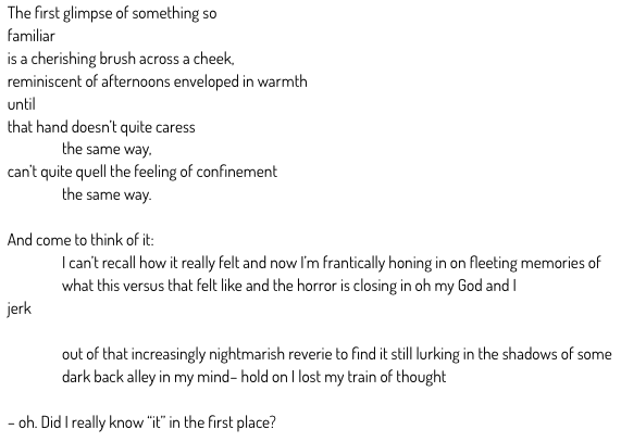
Exquisite Corpse Poem:
An exquisite corpse poem is a poem that is collaboratively created by multiple people. To create the exquisite corpse poem, each person in English wrote down their favorite line from one of their poems at the top of their paper and passed the paper around the classroom. Each person would write an additional line of poetry based off of the preceding line.
provider:    youtube
url:         https://www.youtube.com/watch?v=AZZ0KgYcI9k&t=0s&list=PL4UmbWlij-uQNNUmG2yeJuT0YTYslfsHb&index=44

src:         https://www.youtube.com/embed/AZZ0KgYcI9k?list=PL4UmbWlij-uQNNUmG2yeJuT0YTYslfsHb
src gen:     https://www.youtube.com/embed/AZZ0KgYcI9k?start=0&list=PL4UmbWlij-uQNNUmG2yeJuT0YTYslfsHb
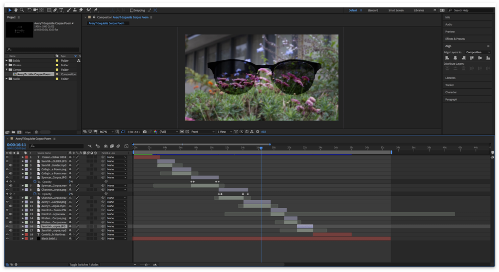
This is a screenshot of my workspace in Adobe After Effects.
Design Elective Projects:
After completing the macrophotography and conceptual photography projects, I have a better eye for the composition of a photograph. Since I now have basic command of Adobe Photoshop, I know which aspects to manipulate in order to achieve a desired effect. Because photographs can easily become ruined due to unwanted and unnoticed objects in the background, I learned that photography demands attention to detail. Developing the habit of ensuring that the conditions of your surroundings for your photography is the way you want it before beginning to shoot maximizes efficiency. Through writing an artist statement to help viewers understand the intent behind my image, I learned to write about the various elements and principles of art and how I had used them to convey my message.
Macrophotography:
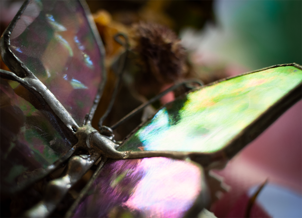
Macrophotography is photographing subjects at very close range. This type of photography is great for capturing bugs and very fine details in photos with a shallow depth of field. My chosen photograph is of a glass butterfly set atop a bundle of flowers. I used a macro lens to capture the photo outdoors. In Adobe Photoshop, I adjusted the saturation levels for green so that the green on the wing would not overpower the other colors in the photo. I then adjusted vibrancy and brightness to darken the photo.
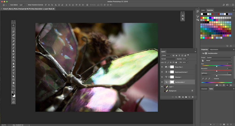
Here is a screenshot of my workspace in Adobe Photoshop
Conceptual:
The conceptual art movement is focused on figuring out ways of conveying an idea in a minimalistic fashion. The movement places greater emphasis rather than the visual components.
Conceptual Artist Study – Chul-Hyun Ahn:

The installation “Tunnel” was created in 2013 by Chul Hyun Ahn, a South Korean artist. This is the link to the website of the exhibition that “Tunnel” is a part of: https://www.artsy.net/artwork/chul-hyun-ahn-tunnel.
“Tunnel” is made out of cinder blocks, mirrors, and fluorescent lights. Its base measures 172.7 x 172.7 centimeters squared, and it stands 58.4 centimeters tall (approximately 23 x 68 x 68 inches). The components of the piece are all geometric, three-dimensional forms. The main body of the piece, made of cinder blocks, is an inorganic rectangular prism with a square base. Each layer of cinder blocks creates a continuous line in a square shape, and subsequent layers create the effect of concentric squares. Two rows of fluorescent lights stand vertically in two corners of the prism; the lights closer to the viewer (and therefore closer to the top of the prism) emit a yellow tint, while the lights closer to the bottom of the prism emit an increasingly deep emerald green. A ladder painted white is centered on the side of the prism opposite of the fluorescent lights, and also stands vertically. A green-tinted mirror at the base of the prism helps to create the illusion of elongation, and so there seems to be infinite space within the prism. Because the ladder and the fluorescent lights are reflected in the mirror, they draw the viewer’s eyes towards a vanishing point in the center of the mirror. In contrast to the seemingly rough texture and variance of color of the cinder blocks is the smoothness and uniformity of the fluorescent lights and the ladder.
I like the concept of infinity not actually being infinite in this piece. At first glance, the installation seems to be perfectly centered because of the concentric squares that the cinder blocks create; however, the ladder and fluorescent lights are not spaced in exact thirds around the inside of the prism, detracting from the supposed balance of the piece. I felt a sense of discomfort once I discovered this unbalance. I felt further thrown off once I determined where the mirror was, because the prism suddenly seemed much more cramped. Though feeling unbalanced is unpleasant, I think that that is what the piece is supposed to make you feel. Perhaps, the artist is conveying that we can lose ourselves in trying to chase after our ideals. The color green, at the bottom center of the prism, could have been chosen because it signifies heaven/paradise in some cultures. Therefore, this piece could mean that humans are enraptured by the concept of heaven and believe that they are being led down an illuminated path (the fluorescent lights) towards a paradise, but may not realize that they are sinking further and further down into oblivion and the unknown (the ladder leading towards the vanishing point). Once people discover that heaven is unattainable (like when I discovered the mirror and the imbalance of the installation), they must confront what they actually have in their lives (the true existing space in the prism).
The artist investigates infinite space by helping members of his audience to bring themselves “beyond the physical limitations of the world.”; this idea serves as the overall concept statement of all of his work. Much of his work is rooted in Buddhist doctrines, and I think that the Buddhist philosophy of nothingness preceding enlightenment is very well communicated through “Tunnel.” To fully appreciate the piece, viewers must first realize all of the components used to create the illusion of infinity in the piece. They then must grapple with the discomfort of finding imperfections within a seemingly balanced entity. If they are able to find peace with the shortcomings of the installation, then they essentially have experienced enlightenment at a smaller scale.
My Conceptual Photo:
Artist Statement:
I am exploring the feeling of dissociation through the experience of seeing a familiar sight.
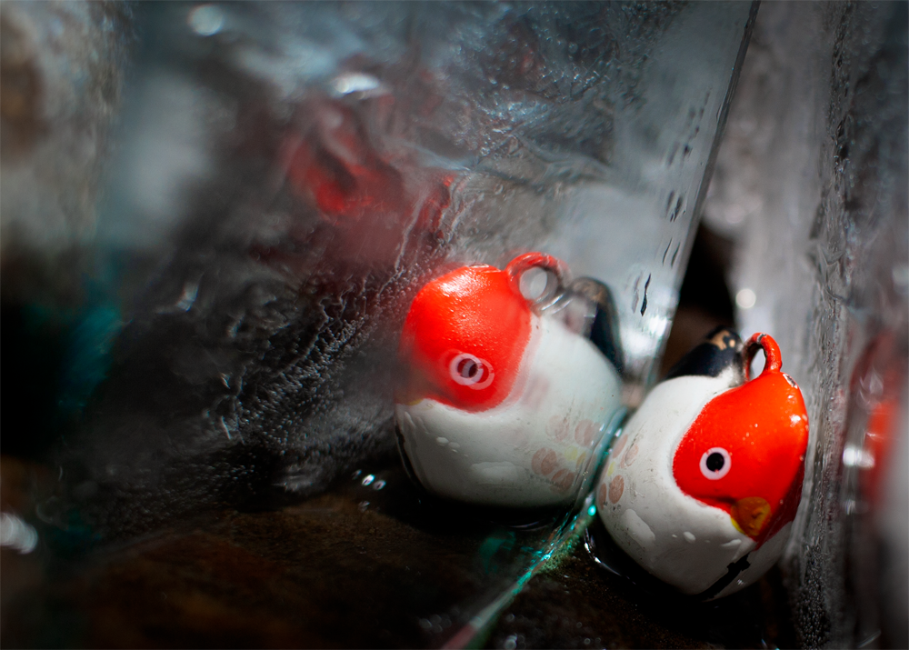
There are three objects in my photograph: the chicken toy, the mirror, and a sheet of ice with a tin foil backing. The angle of the photo may cause the viewer to feel claustrophobic because of their proximity to the toy wedged tightly between the mirror and the ice sheet. The numerous reflections of the toy within the mirror and the ice sheet represent a disconnection between one and one’s perception of oneself.
The chicken toy symbolizes a familiar sight as toys often are associated with the comforts of childhood. The jagged texture of the ice sheet introduces an element of danger and uncertainty. The blemish on the mirror that obstructs a perfect reflection of the toy exemplifies the doubt cast upon the toy as well as a tarnished perception of the toy. All of these elements combined give the viewer a great sense of dissociation.
I learned that Photoshop should be used to subtly enhance a photo; the viewer should not see a marked difference between the photo and the real world unless that was the artist’s intent. I used a few different tools in Adobe Photoshop to improve my photo while ensuring that it still looked realistic. I first cropped the image to the rule of thirds to emphasize the chicken toy and its reflection. I then adjusted the saturation of reds and of cyans to create tension, as well as curves so that there would be greater contrast between the darker and lighter areas. Lastly, I added a vignette so that the viewers’ eyes would be drawn towards the center of the photograph. By applying all of these changes, my concept statement is better relayed through the image.
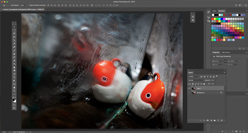
Here is a screenshot of my workspace in Adobe Photoshop
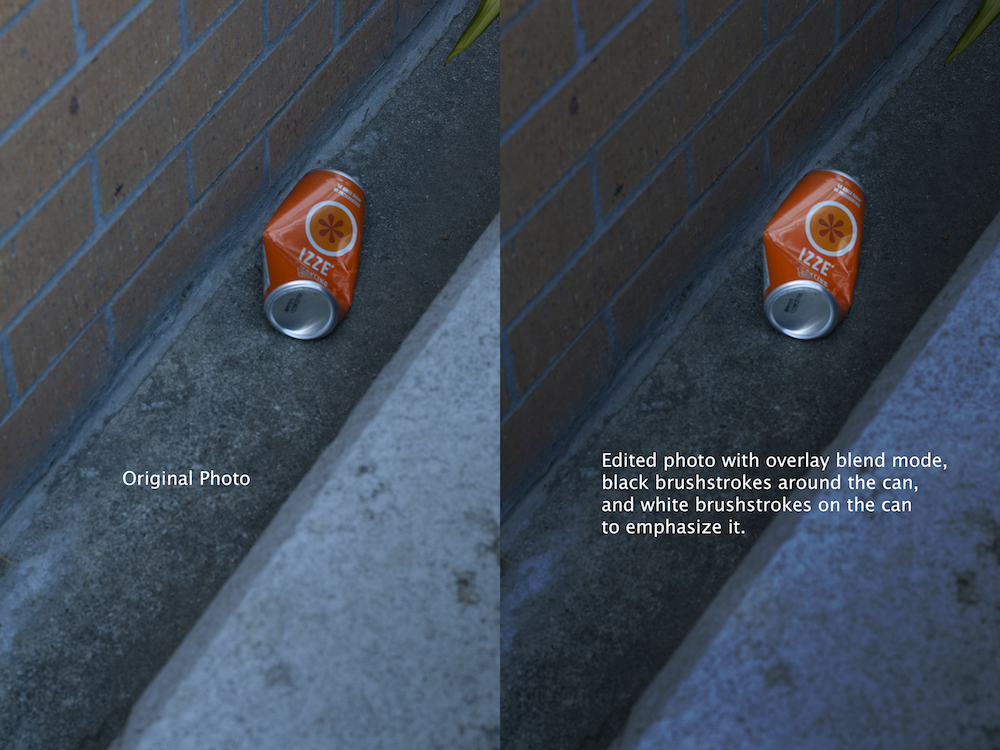
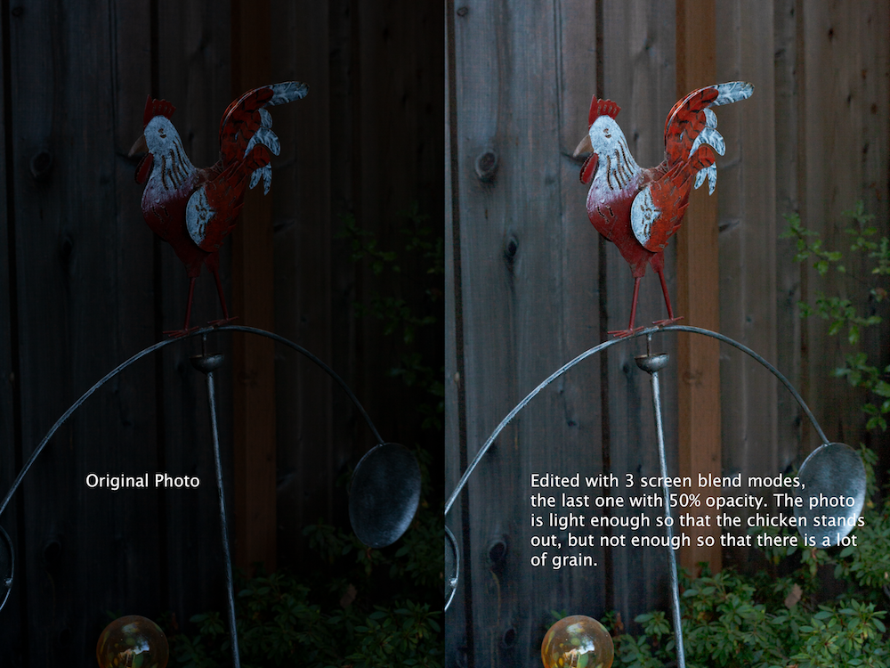
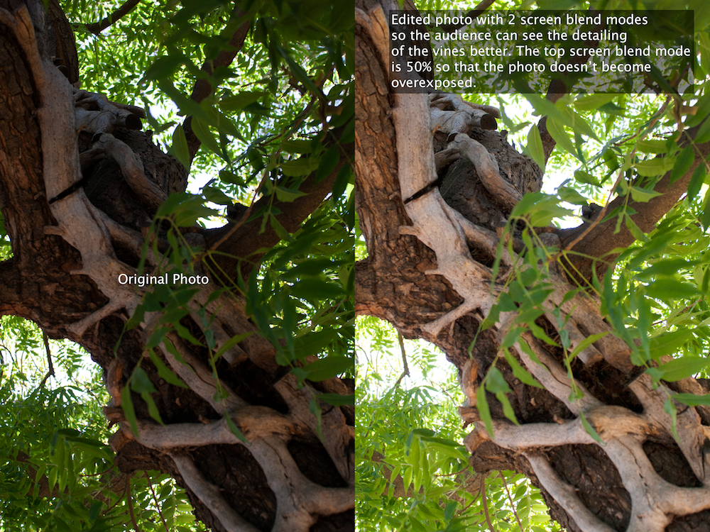
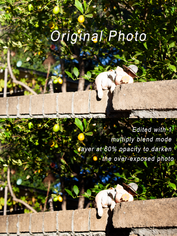
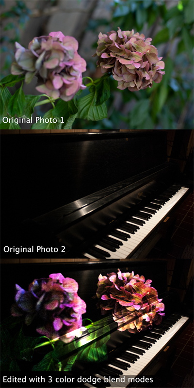
Photoshop Blending Modes Images:
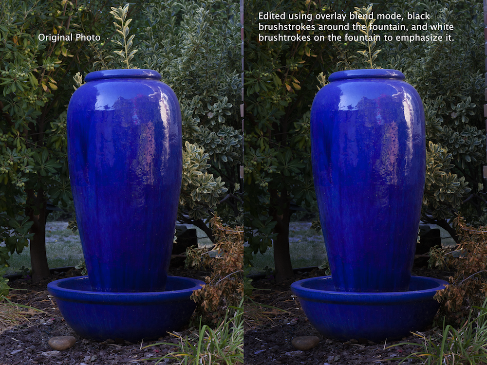
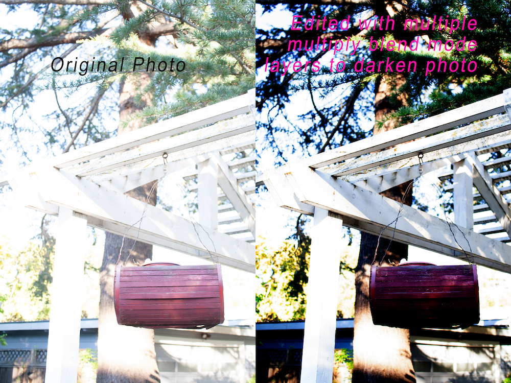
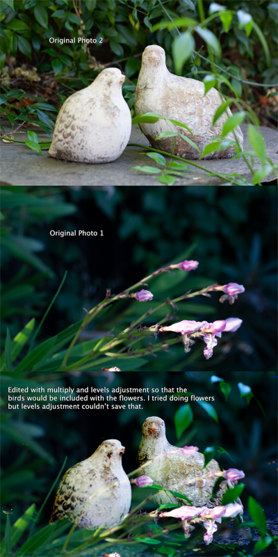
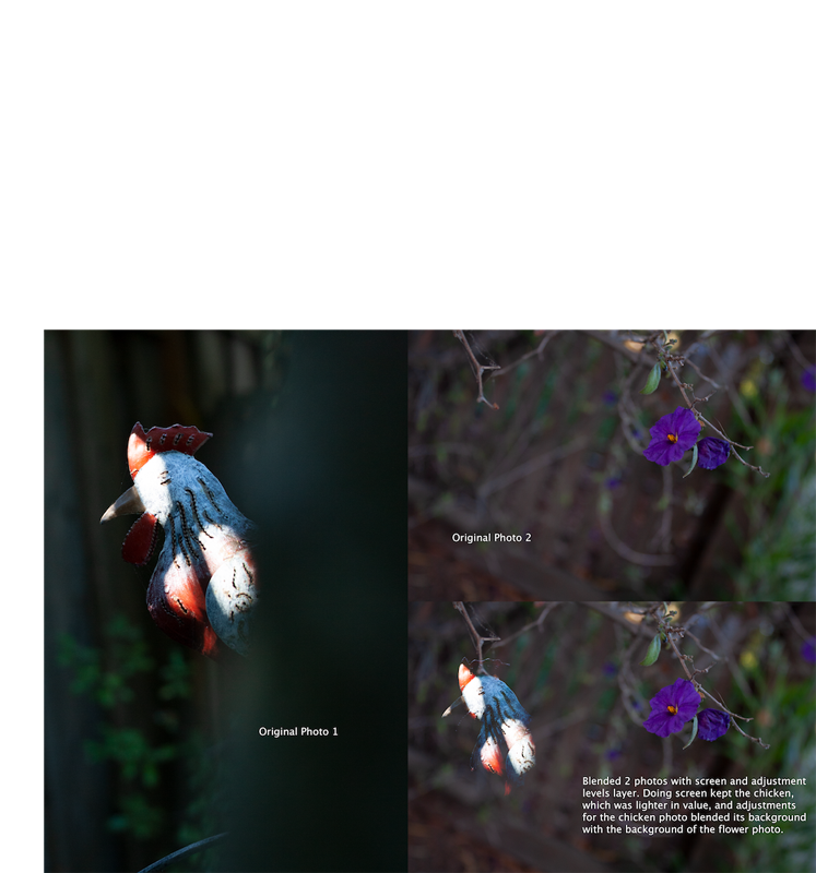
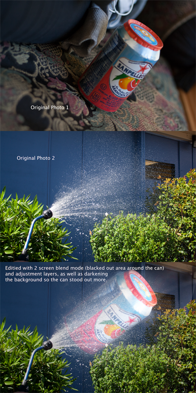
I learned how to effectively edit images using blend modes, which have to do with the way a layer is lit or darkened. If there isn’t enough emphasis on my photo’s subject, I now know how to use blend modes to resolve that issue. I came away from doing this work with a greater understanding of which settings (aperture, shutter-speed, and ISO) to manually adjust and by how much in less than optimal lighting.
Overlay Blend Modes:
Screen Blend Modes:
Multiply Blend Modes:
Blending Two Photos:
Creative Blend Modes:
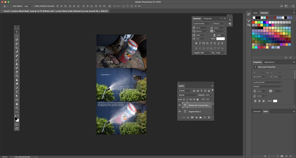
Here is my Adobe Photoshop workspace for blend modes