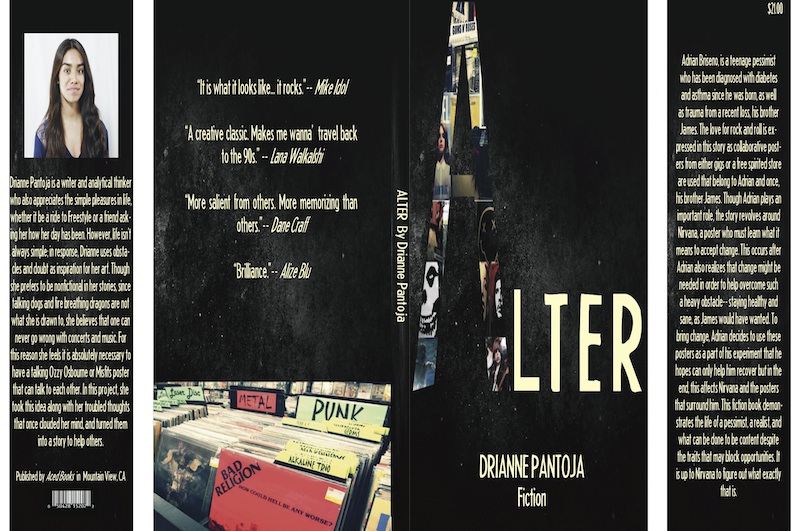
In Design class we were required to create a book jacket that reflected on our narrative. I wanted to get more familiar with Illustrator since I always rely on Photoshop, and so I did. After writing “Alter,” I knew right away I wanted this cover to be grunge looking.
The layout for the cover was created on Adobe’s Illustrator, however I ended up using Photoshop for the majority of my creation. I added a cooling filter and modified the lighting to the images on the back cover as well as the collages I made for the letter “A” on the front cover. This was to bring out the primary colors but at the same time keeping the tones dim and calm, not too bright and colorful or else I might have lost the style I aimed for.
To go more in depth about the process, I must say my greatest achievement doing this project was creating collages out of all the images I took at Rasputin, the independent music selling store. I took at least one hundred images of CD covers and posters, combined my favorites, then made collages and used Illustrator to give the illusion that this letter “A” has, that being the fact that it is designed out of images whereas the rest of the title is a typical font. In the end my desired "worn out" background for my cover was created, my “A” in “Alter” was designed perfectly, and each cover and flap of the book came out to look grungy and edgy- exactly how I imagined it.