
𝚁𝚎𝚏𝚕𝚎𝚌𝚝𝚒𝚘𝚗𝚜 𝙿𝚛𝚘𝚓𝚎𝚌𝚝 𝙸𝚗𝚝𝚛𝚘𝚍𝚞𝚌𝚝𝚒𝚘𝚗
In this unit, we learned how to further use the great Illustrator, and we had to answer the question “Who am I?” We were task to explain our experiences and identities into different kinds of image productions, aboriginal, and mandalas.
If the images do not display below,
On a Mac, press Command + (plus) then press press Command – (minus)
On a PC, press the Ctrl + (plus) then press the Ctrl – (minus)
𝙼𝚢 𝙿𝚎𝚛𝚜𝚘𝚗𝚊𝚕 𝙼𝚊𝚗𝚍𝚊𝚕𝚊𝚜
We were assigned to create a piece that was able to reflect ourselves. The piece was to be able to put things that we enjoyed. Our first thing that we had to do was learning about to create the slices and how if we draw on one slice it will reflect to the other slices. Then we had the option to choose how many slices we wanted to do on our Mandala. There were 8, 10, 12, etc., depending on how detailed you wanted your Mandala piece. After creating our black-and-white Mandala we are assigned to create a color version of you black and white or you could make a new one to color. Our black-and-white Mandala was then engraved into a material of your choice, with options such as a tree trunk, bamboo, pizza board, plastic with LED, and leather. We were able to look at the final piece and take photos. The final step was to create a video of our whole process.
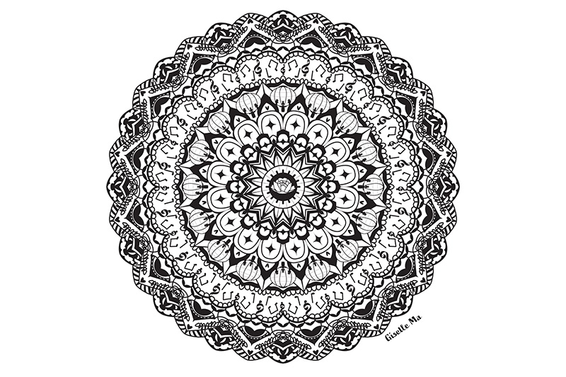
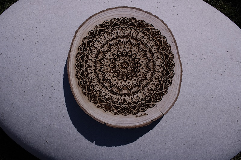
For this piece, we were assigned to create a Mandala, and I created a 16-slice Mandala. Some techniques that I used to create this piece were using bold lines and having more black spaces, so it has more depth.
I added one activity that I value a lot in my life, which is the piano, so I’ve included piano notes and also piano keys to show the value. Another important thing I added in the center was a flower since I enjoy drawing many different types of flowers. My thoughts about using the drawing tablets were much different than using the big Wacom, since this one is smaller; it has a smaller surface and also has a very high sensitivity. Some struggles that I have with it were that drawing straight lines can be difficult, and if you’re not used to it, some of the lines can be a little crazy. Something that I learned is that drawing digitally is harder and more challenging for me since I enjoy painting on canvas.
The best part of my BW Mandala was that I was able to learn new techniques such as the transform tool and the rotation tool. I also enjoy being able to do whatever I want and draw things that I like into a piece of art. This truly respects me because it allows me to show people my enjoyment and be able to share it with people who I don’t know.
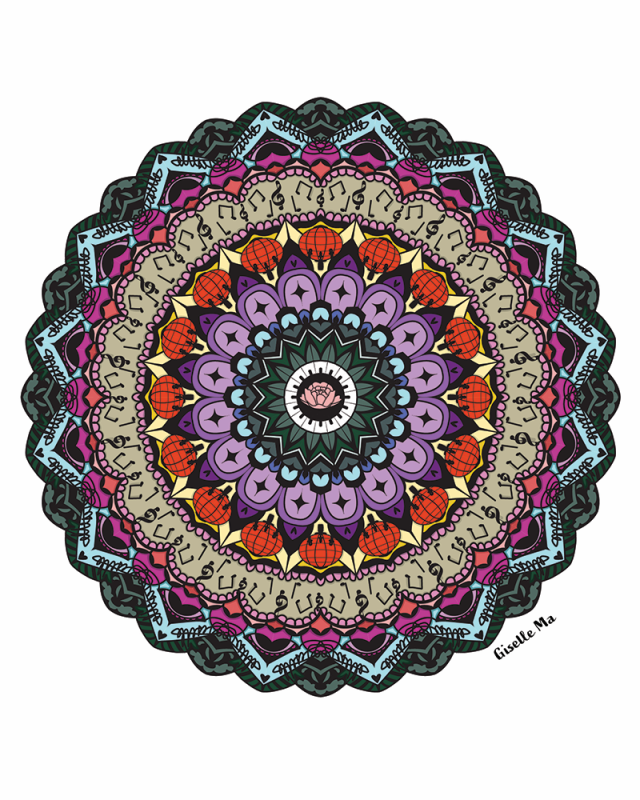
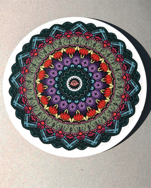
The art piece that I produced was a Color Mandala, which used my BW Mandala line art and turned it into a colored piece. This is so different than the BW mandala because that one is black and white, while the color version has different and multiple colors. After I saw my printed version of my mandala, it looked different, and the colors are bright and give contrast to my piece.
My intentions and visual expressions in my color scheme were to make the items that I added look like real things, such as the lantern, making it red so it looks like we are celebrating Lunar New Year. Another thing was that I kept the piano titles black and white because it that how it is in real life. Working with color changed my artistic technique because I wanted to add more shadow to my work since I want it to pop, so the middle shows more than the outer. Another thing that I try to keep is not using bright colors, which allows it to look neater.
The thing that stands out in my piece the most is the flower in the middle. The black and white titles and the lantern stand out because it looks very obvious; you can clearly see them. Other reflections about my mandala are that it has a lot of different colors and many small details.
𝙼𝚊𝚗𝚍𝚊𝚕𝚊 𝙱𝚞𝚒𝚕𝚍 𝚅𝚒𝚍𝚎𝚘
My initial reactions to seeing the final laser engraved mandala on wood were that there was this smell from burning the wood and that it was cool feeling the different textures. This piece answered “Who am I” because it shows what I enjoyed and what type of person I am. When I compare my digital BW mandala and my physical laser engraved mandala, it looks so different because of how its not as dark as the digital, and it’s like a dark brown. My choice of wood for my laser engraved mandala best represents me because it shows that I enjoy things that I can cherish for a long time. I felt that it could represent the years that I’ve lived and how the circle on the wood shows how time has passed by so fast.
My reflections about the entire mandala project, from creating mandala templates, the BW mandala build reveal video, colored mandala, and final laser engraved mandala, were that it was a cool experience to learn and that you can do so many different things on Adobe Illustrator. Working with different colors also allowed me to think about depth and how, if I could add shadows, it could show that there are many different layers to this piece. Through this project, this allows me to know what steps to create another mandala piece in the future and also “Who am I.” Before this project, I felt like people don’t know what I enjoyed, and now I feel like others can see that I who I am and what I enjoy.
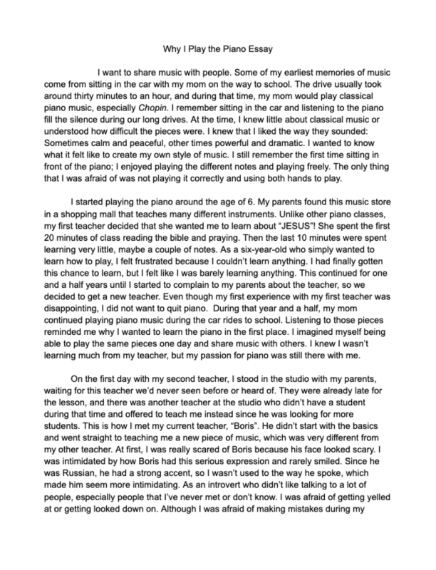
“𝚆𝚑𝚢 𝙸” [𝚆𝚛𝚒𝚝𝚎] 𝙴𝚜𝚜𝚊𝚢
In English class, we were assigned to read two different essays, “Positive Obsession” essay by Octavia Butler, and the “Why I Write” essay by George Orwell. We were tasked with using these essays to write our own essay, writing something that we were passionate about. I wanted to share my passion, so I chose the piano. I wanted to share my experience with people and show what music is. Different styles of piano, different genres, such as jazz and classical.
𝙳𝚎𝚜𝚒𝚐𝚗
𝙲𝚘𝚗𝚌𝚎𝚛𝚝 𝙿𝚘𝚜𝚝𝚎𝚛
In this assignment, we were required to select a pre-2000 music genre, any singer or group from that time. We used Adobe Illustrator to create a concert poster that emulates a particular art style popular during that era. We had to make our own concert date and choose a venue.
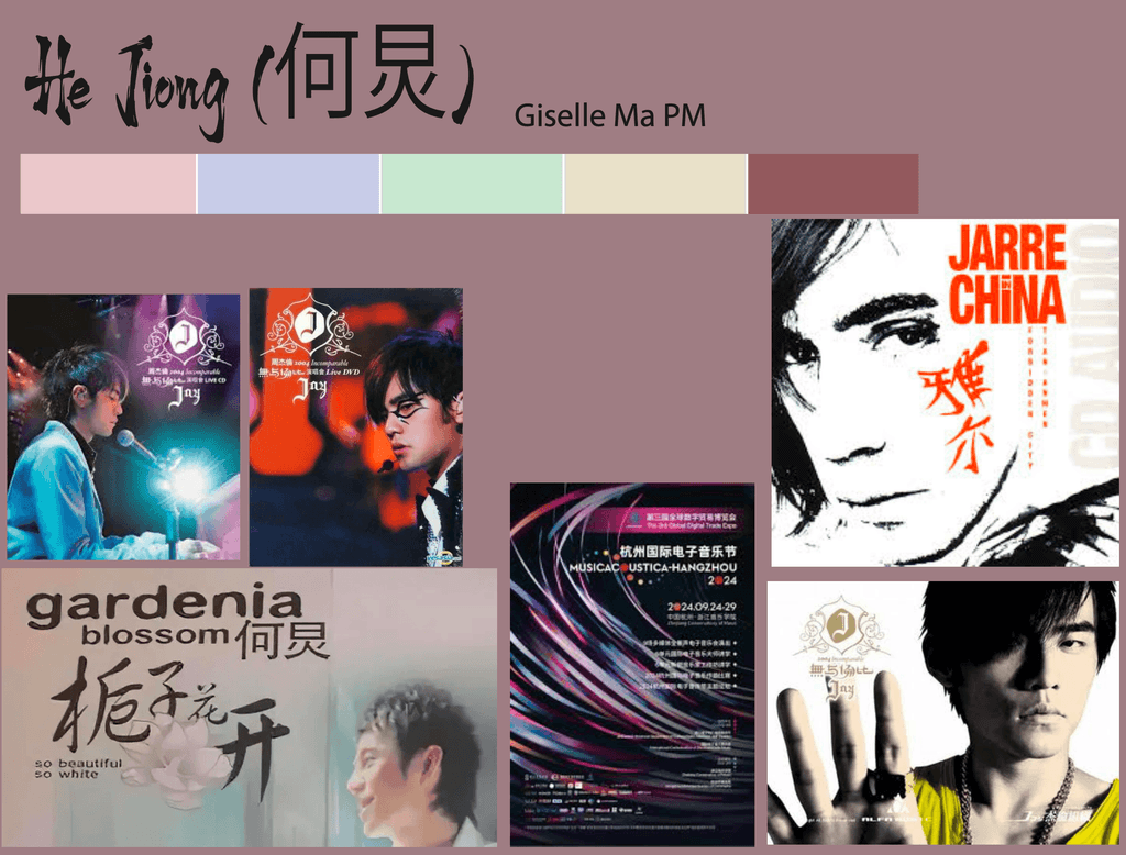
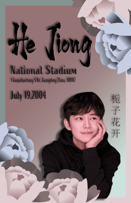
My poster is part of the 2004 era in Chinese history. The artist that I chose was He Jiong, who was a Chinese singer. In the 2004 era, this was when Mandopop became a breakthrough in mainland China and when R&B became popular.
The genre that I’ve chosen is Mandopop. Mandopop is a subgenre of Chinese-language pop music sung in Mandarin. I chose this genre because during this time I was in elementary school, and when my mother was driving me, she would always put on Mandopop songs for me to listen to . This was when I got into the song “Gardenia in Blossom”, since this song was playing multiple times every day in the car. I remember the lyrics and enjoyed the song, and it was the only Mandarin I was able to speak.
For the poster, I first had to find the singer that I wanted to do, which was He Jiong. Next, I chose my color palette, which I wanted to have similar colors to the song “Gardenia in Blossom”. In Illustrator, I made a border and background with pink and green colors. Then I found a picture of him, so I removed the background and put the picture on the poster. Next, I drew a flower since the song is about flowers. After that I add all the text such as the location of where the concert is, what day it is going to be, and who the singers are.
𝙰𝚋𝚘𝚛𝚒𝚐𝚒𝚗𝚊𝚕 𝙰𝚛𝚝
In this project, we were tasked with creating art to develop our own origin story or Dreamtime. Using Adobe Illustrator, we used traditional painting methods of dots, lines, and Aboriginal symbols to represent our astrological sign and constellation.
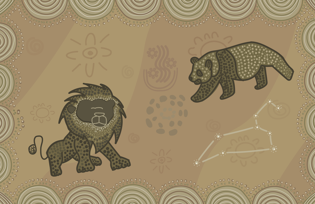
The symbols that I used in this piece were the Sandhill for the border of my background, where there are two different colors. It was to represent that they are in a desert and that there was sandhill all around the animals. Another symbol that I used was the Smoke, Campfire, and People Siting, so it can look like there is a campfire in the background, and it’s to show how they are dancing around the fire. I used the people sitting around the fire because it is like how, in the past time when they celebrate, some people dance around the fire and have a party. The panda in the right corner is to symbolize my spirit animal, and the tiger is to represent a Leo.
While creating this piece, some problems that I encountered were that the background and the animals looked too plain. Something that I did to fix this problem was to add more symbols in the background and lower the opacity so the animals could stand out more than the symbols; it’s so it can give more depth in the background. For the animals, something that I did to change them was to add more dots that get smaller and brighter. One thing I’d do differently is limit how many animals I add because there are too many, and the space is limited, so it doesn’t make sense to have two different animals that aren’t related in any way.
𝙲𝚞𝚛𝚜𝚒𝚟𝚎 𝙽𝚊𝚖𝚎
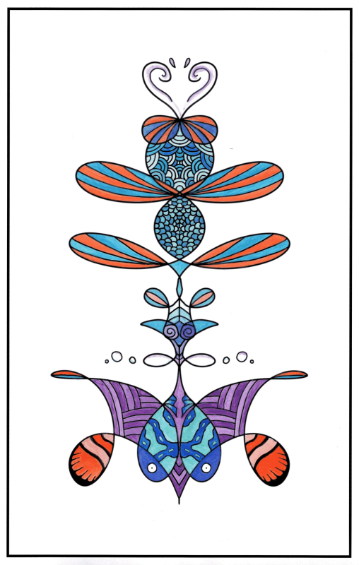
In this assignment, we used Adobe Photoshop to learn how to use the Symmetry tool that mirrored the writing on a horizontal axis. We were required to write our names in cursive, which would later be printed onto watercolor paper. Then we would use watercolor paint to fill in the various spaces.
𝚁𝚎𝚏𝚕𝚎𝚌𝚝𝚒𝚘𝚗
One thing that I value in my Design class is that we are allowed to use many different tools, such as tools that are digital and tools that are hands-on. We are allowed to experiences different types of tools and allow to use our creative perspective. This class also allows us to use something that we enjoy and make it our own project that reflects who we are.