Product Design

For this project, we were tasked with creating our logo/brand for any product of our choice. I decided to create a spray paint brand. For the basis of the brand, I decided that it would be targeted towards a younger audience of graffiti artists. What you will see when you first look at my product is the main logo up front which is inspired by graffiti lettering. The can itself has all the normal requirements that spray paint cans would normally have like a danger warning, the paint color, and the volume of the can. I chose this product because of the versatility of how it can be used to create art.
To create the logo I initially created some sketches on paper of what I wanted the logo to look like and then from there I drew my favorite sketch on an iPad where I could fully incorporate the colors and tweak some smaller issues. I was new to the iPad so it took a bit of getting used to. Once I finalized my sketch on the iPad I moved it to Adobe Illustrator on the computer and from there I developed the actual product label as well as the merch. For the label, the only things I needed to add were the product’s details and then I was able to attach it to the mockup. Lastly, for the clothing items I designed a graphic that depicted the logo spray painted onto a brick wall.
Movie Poster
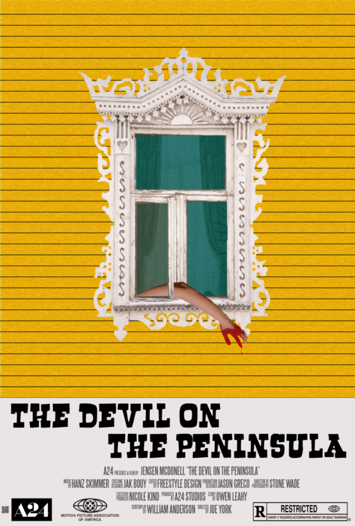
In the turbulent world of 1850s San Francisco, R.C. Chambers leads a seemingly ordinary life as a pharmacist in the affluent Barbary Coast neighborhood. However, his world is shattered when he witnesses a murder, setting off a chain of chilling events. As the city is gripped by a series of killings, Chambers finds himself entangled in the sinister underworld of opium dens, struggling to distinguish reality from illusion. Haunted by the specter of violence, he descends into a spiral of paranoia and confusion. With each passing day, Chambers grapples with the terrifying possibility of becoming the next victim. As the tension mounts, he is pushed to the brink, culminating in a devastating climax that threatens to consume him entirely.
In order to create my movie poster I used Adobe Illustrator. I was inspired by simplistic movie posters that leave the viewer intrigued while still not giving away everything the movie is about. I wanted to create a graphic that would show that the genre of the story was a psycho thriller. I put a bloodied arm hanging out of the window to make it clear that it is a murder mystery while still not giving away any major events that take place. Some of the tools in Illustrator that I used the most were the live paint tool as well as the pen tool to create some of the graphics. I would also use Adobe Photoshop to edit or tweak some of the images before putting them onto my final product.
PSA

When you look at my PSA you will see the beach on top with a towel, umbrella, and a scatter of plastic bottles all over. Below is a graphic of the ocean water flowing with more plastic bottles. Within the waves are the words “Restore our Shores” which is meant to address the international issue of plastic waste in our oceans. I hope that this piece will help the viewer understand how detrimental this problem is and make them more conscious of their own consumption of single use plastic products. My color scheme was meant to match the colors of the ocean and the sand. The red was used to make details on the trash to pop so the viewer would easily be able to see the trash floating around in the water.
I made my PSA using Adobe Illustrator. The most unique part of my design is definitely the waves in the ocean which I used the pencil tool to create. To create the trash I drew it in illustrator and then applied some effects to make them look weathered. I’m happy with how the PSA turned out and I think that it is successful at conveying my message to the viewer.
Narrative Creature

The entire process of creating the creature and background took many days in and out of class to create. In order to construct the creature and all of its different parts I used Adobe Illustrator. I traced over reference images using the pen tool to create the outline of the different body parts and then went over and applied color and gradients. I chose each separate animal by relating characteristics of my character and its animal counterpart. All the animals I referenced were a Cheetah, Pigeon, Shark, Rolly Poly, and Turtle. For example, I chose to incorporate Pigeon’s feet because they are impulsive animals and my story’s character makes very impulsive decisions that alter his life’s course. For the creature and my background we had to stick to specific color schemes that would contrast each other. While my hybrid creature consists of mainly bright colors the background is full of darker blues and yellows. I created the background using one point perspective in Illustrator. I did not have many difficulties throughout this process but, getting the hang of it proved to be a minor speed bump. I am pleased with how my work turned out and the only thing I would have changed would probably have been adding more buildings and skyscrapers to give it a more metropolitan feel.